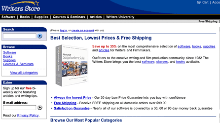
| The Writer’s Store is an extremely competent site serving a tightly-focused niche market. An offshoot of a brick-and-mortar retail store in Los Angeles, writers of all skill levels will find a comprehensive selection of products ”available online or in-person.
|
|
||||||||||||||||||||||||||||
Although competent in most areas, a few, relatively easily-implemented changes—described in the Recommendations section at the end of this review—could increase sales by building a stronger emotional bond between the store and its customers.
[text_ad]
- Purpose (5) The purpose of the Writer’s Store is immediately obvious when you visit. All text and graphic elements on the home page relate to the needs of professional writers. The site’s mission is immediately obvious: “Best Selection, Lowest Prices & Free Shipping.”
- Engagement (3) The home page of the Writer’s Store illustrates the difficulty of reconciling “engagement” with catalog content that includes thousands of products. There is no focus, or single starting point, for visitors to begin their exploration of the site. Various navigational tools permit visitors to explore different product categories, including articles and columns, but it’s “every man for himself.”
As a first-time visitor and writer, I wanted an introduction more than just a visual impression of “a lot of useful resources at fair and reasonable prices.” I wanted a “me-oriented” opening statement that showed understanding of my needs, rather than a variation of it’s “both better and cheaper!” claim.
I wanted to know more: who are the faces behind the products, who shops there, where do I start my visit to the site, what should I do first? Visiting during the first week of January, I would have liked a “Top Ten Resources For Greater Success This Year” type of summary timed to the season, or links to articles about forthcoming opportunities.
- Navigation (4) Navigation is one of the site’s strong points. As a database-driven website, content—articles, books, software, training, etc.—can be accessed by category, product name or keyword.
More important, taking a cue from Amazon.com, each product listing is followed by recommendations for similar products, introduced by the statement, “Writers who shopped for this item also viewed these items,” followed by five recommendations.
When appropriate, related products are displayed to the right of the featured product.
- Readability (4) Although the type is on the small side, it is easy to read. There is a clear hierarchy separating primary and secondary content on each page. Text is primarily black against a white background.
The only time readability problems arise is when line lengths grow to long, particularly in the articles section, where the absence of text to the right of the article creates lines of excessive length.
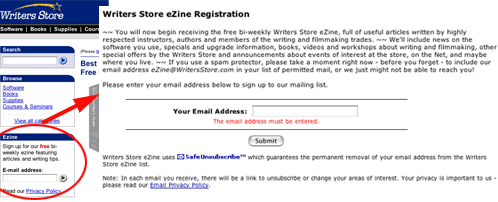
- Relationship building (2) The Writer’s Store falls into the frequently-encountered trap of offering an email newsletter, but doesn’t provide strong incentives to subscribe to it! If you click on the arrow next to the sign-up text box, the page that appears promotes the benefits of receiving the newsletter. Unfortunately, only those who have already decided to sign-up for the newsletter discover the “reasons to sign up! (A classic example of “preaching to the converted.”)

Worse, the text promoting the newsletter appears in the smallest typeface on the site, which means the Writer’s Store’s most important sales message is both hard to locate and hard to read!
- Freshness (4) Each time I visited the site over the course of a month, the “What’s New” section had been updated. Unfortunately however, the freshness of the “What’s New” section on the home page, and its continuation on a linked page, does not feature the newest articles to appear on the site. “What’s New” information is limited to new products and services.
- Design (3) A website with as many products can easily become cluttered and disorganized, with numerous colors and text elements competing for attention. That hasn’t occurred here, due to the restrained use of colors. The primary site color is a deep blue, which complements the numerous text links on each page.
The only area design falls down is with inconsistent line lengths. When the primary text element is limited to approximately 60 percent of the page width, the text lines are easy to read. But readability suffers when text extends in an unbroken line from “sea to shining sea,” i.e. from left screen margin to right screen margin.
A lack of writer’s guidelines, in particular, the use of short paragraphs and frequent subheads, also contributes to occasionally dauntingly-dense paragraphs.
- Action (3) With the exception of an opportunity to sign up for the store’s email newsletter, there is little to compel visitors to deepen their relationship.
My overwhelming response, when visiting the site, was temporary nostalgia for the focus of “sales letter” sites with their clear focus on a single action. Unless I was ready to buy today, or had the time to explore the nooks and crannies of the site further, I was unlikely to either sign-up for the newsletter or remember the URL and return again.
This is a shame because the site offers a wealth of resources, not only products and services, (i.e. seminars and training), but also useful articles and profiles of writers at various stages of success.
- Technology (3) Database technology is appropriately used to provide me with fast navigation plus numerous context-sensitive options and recommendations.
Where technology could have been used to greater effect relates to personalizing the site. Online audio could be used for a welcoming statement from the owner, customer testimonials, or short seminar excerpts.
A lot is going on in and around the store: audio could be profitably employed to “beat the silence of the Web.”
Likewise, given the advances of programs like Camtasia, short online videos could demonstrate use of some of the software programs available at the Writer’s Store.
- Connection (2) After several visits, I still feel I “want more” connection from the Writer’s Store website. Following my initial visits, I’m likely to bookmark the site and I feel positive about the site. The site is functional, but a bit too impersonal for me.
The content is competent and complete, and the articles are strong and both useful and personable, but there is no unifying emotional package to the site.
- Return visits (2) Whether or not I return to the site is entirely dependent on need for specialized software or a specialized book I can’t locate locally. I haven’t signed up for the email newsletter, because I wasn’t given a strong enough incentive to do so.
- Community (2) The articles offer a feeling of community with other working writers, but there is little opportunity for interactivity in the form of online events, chat sessions, or a question-and-answer forum.
Given the focused market, and the decreasing cost of audio recordings, it would be feasible for the Writer’s Store to sponsor a weekly online “radio program” or interview series that could be archived on the site for free—24/7 accessibility.
Recommendations
The Writer’s Store is great as it is, but because of a lack of emotional bonding with customers and visitors, it is vulnerable to price and selection competition from elsewhere.
Suggested improvements to protect the Writer’s Store’s franchise include:
- “E-Mail this Article to a friend” feature
- “Personalized working area” for articles and products I want to access
- “Printer-friendly” versions of articles and product descriptions
- Revising template to eliminate possibility of long-lines
- Interactive question-and-answer forum
- Stronger contributor’s guidelines emphasizing short paragraphs and frequent subheads
- Photographs and profiles of store staff, typical customers, “writer of the month,” etc.
- Tip of the day (or week)


