Business Management Daily has a strong online presence with a user-friendly website
Business Management Daily is a free news website from the National Institute of Business Management, providing news and advice since 1937.
Their goal is to help organizations and business professionals succeed. They deliver news, skills and strategies to tens of thousands of companies across hundreds of different industries.
Mequoda consulted with Business Management Daily on the strategy of this website, but we did not build the site ourselves. So we thought we’d review it against our scorecard, to see how well BMD’s in-house resources did on building a site compliant with our best practices.
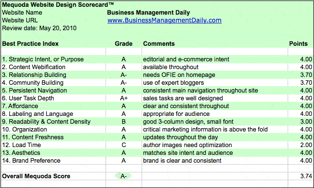
Turns out, we’re very impressed! This site is a great example of many of the Mequoda Best Practices, found on our Mequoda Website Design Scorecard, and because of this, has received an overall grade of an A.

1. Strategic Intent: A
This site is a hybrid site of free editorial content and premium e-commerce products. The key tasks that users would visit the site for include browsing, searching, registering for email updates or to purchase a premium product.
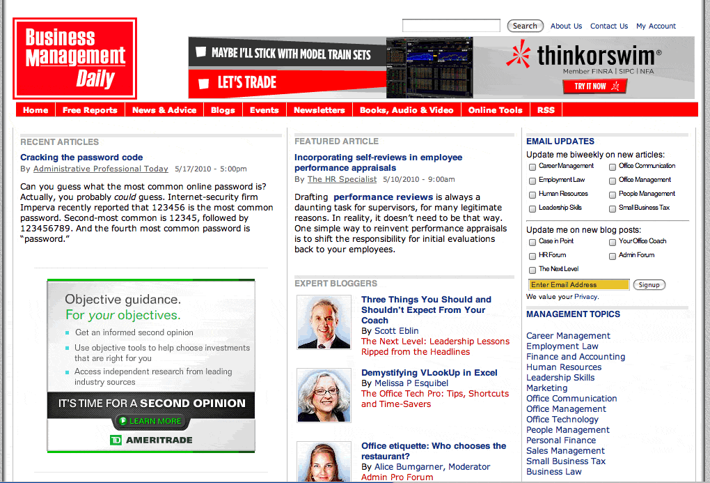
These tasks are all easy to find on the homepage. Labels like “recent articles” and “featured articles” help draw the eye to key items to browse. The site’s strategic Intent is clear and they get an A here.

2. Content Webification: A
A nice feature of webification involves products that offer a free 90 second sample clip to help the buyer decide. This is a great example of using the web to help support the selling process. The site offers online tools available as part of a premium membership.
[text_ad]
3. Relationship Building: A-
The site offers opportunities to sign-up for newsletters from the homepage. It uses a floater upon entry to the site, OFIEs throughout the site, and offers plenty of free reports as a freemium for signing up.
The only suggestion here is that an OFIE should also be on the homepage instead of just a small email newsletter sign-up. The OFIE advertisements could rotate to offer many of the different free report topics.

4. Community building: A-
The site has 10 bloggers who are aligned with primary target business management topics. Subscribers can follow the blogs via RSS feeds. I did not see a community forum on the site and this is something they might want to consider adding.
5. Persistent Navigation: A
Navigation is clearly defined to key tasks of the site and stays consistent throughout. The site also uses breadcrumbs that help the browser keep track of where they are in the site and allow easy linking back to previous pages.
6. User Task Depth: A+
As I mentioned above, the use of OFIEs is prevalent and when a user signs up they are presented with a matching product to the Free Report he or she just downloaded. This is another great example of a Mequoda best practice. I chose the Free Report “Microsoft Email: Outlook Tips and Training” and the matching product I was presented with was “Microsoft Outlook: Beyond E-mail to E-fficiency”.
Each product has a strong sales letter landing page customized for the specific product. These are key practices that take time to be developed for a site but are worth the effort to move subscribers from free content to paid product purchases. For this they earn an A+.

7. Affordance: A
It was easy to navigate the site with links and buttons doing what they were designed to do.
8. Labeling and Language: A
Language used is consistent with business management, but did not fall prey to too much jargon or terminology that may confuse a new visitor. The audience can understand the taxonomy clearly.
9. Readability: B
The site has a 3 column design and a good mix of images and text, however some of the text is small and I could not find a quick way to re-size it. This is an easy change to add to the site and correcting this will move them from a grade of B to an A.
10. Organization: A
Thought has been put into the design of the items that are available above the fold. The main tasks are all there and easy to find. However, when I opened a post to read it, I would have liked to see some contextual tagging to help me move deeper into related topics.
11. Content Freshness: A
Through the use of multiple bloggers, content freshness is easily achieved with multiple posts per day.
12. Load Time: C
Author pictures slowed down the homepage load time to about 9 seconds. This could be improved by spending some time optimizing images on the homepage.
13. Aesthetics: A
Layouts, colors, and typefaces are consistent with the business audience expectations for this site.
14. Brand Preference: A
Business Management Daily is using daily content, expert bloggers, and rich content to drive repeat visitors and brand preference.
Overall, this site is doing a great job of showcasing many of the Mequoda best practices from Free Reports, to Sales Letter Landing Pages to Conversion Architecture. A few small changes such as text sizer, homepage OFIE and the addition of a forum are suggestions that could improve the user experience.
If you are looking for examples of ways to implement some of the Mequoda Best Practices mentioned above, visit Business Management Daily for some help.


