Website Design Critique of UsedBoats.com Reveals Functional Design Lacking Personality and Appeals to Loyalty Beyond the Dollar.
Whether or not you’re interested in used boats, a website design critique of UsedBoats.com reveals numerous important lessons.
The commercial success of UsedBoats.com can be gauged by the claim that the site listed 87,058 searchable used boats, calculated from the total number of boats listed on the site, based on adding the total number of boats listed in the various categories. On the day I visited, I counted 25,000 boat listings.The primary concern, of course, is whether or not a website design critique of UsedBoats.com reveals lost opportunities—and, if so—what role does design play in creating barriers to a pleasurable and efficient user experience?
- The website’s intent is immediately obvious from the homepage title, “Used Boats for Sale: A Boat Trader Directory by Used Boats” and the site’s motto: “Thousands of boats. Millions of buyers.”
- Given the pleasure orientation of boating, even a generic 30 or 60 second video clip of a boat on a beautiful day, or a melody of the sounds that often accompany boating, would add to the site’s emotional resonance with visitor
- Navigation in this website design is logical and persistent—beginning with the “big three” on the homepage, and assisted by primary and secondary navigation links, the site can be efficiently utilized from the first visit
- The persistence of the assessment pop-up, every time I revisited the homepage, was very irritating—perhaps the pop-up disappears when you take the assessment, but it irritated me so much I refused to give in
- The website design is “all business” to a fault. It is surprising that there is no attempt to communicate even a touch of the “pleasure” or “recreation” that boating provides for male bonding or family enjoyment
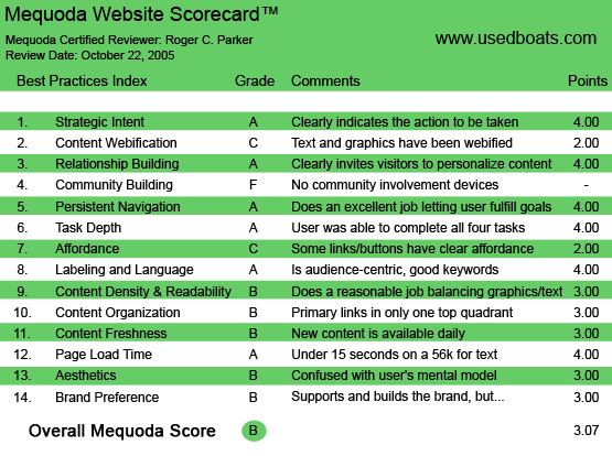
UsedBoats.com’s Mequoda Scorecard
[text_ad]
1. Strategic Intent – A
The website’s intent is immediately obvious from the homepage title, “Used Boats for Sale: A Boat Trader Directory by Used Boats” and the site’s motto: “Thousands of boats. Millions of buyers.”
The effectiveness of the site begins with its homepage, clearly divided into the three most common visitor actions: “Browse,” “Buy” and “Sell.”
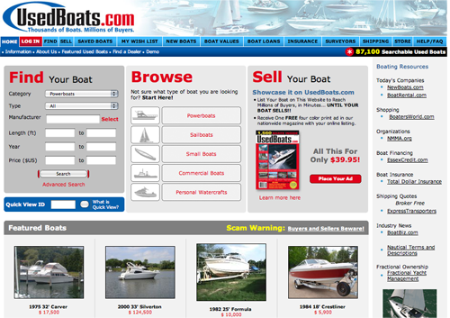
UsedBoats.com’s Homepage
2. Content Webification – C
After a strong start based on the homepage’s logic, it’s a shame that what follows is primarily a database-driven website.
Granted, the basic page template for displaying the search results—especially “browsed” searches—is superior to most database-driven pages, yet it is a shame that there has been no attempt made to incorporate Web audio or video into the site.
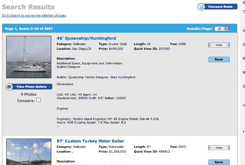
The basic page template for displaying the search results—especially “browsed” searches—is superior to most database-driven pages.
One such opportunity could have been the “Demo” link, which could be a Camtasia movie (TechSmith.com) that walked visitors through the process of searching for a boat or listing their boat. This video could have been accompanied by compelling audio testimonials from satisfied boat buyers and sellers who were pleased with the site’s ability to connect them with the boat, or new boat, of their dreams.
Indeed, given the pleasure orientation of boating, even a generic 30 or 60 second video clip of a boat on a beautiful day, or a melody of the sounds that often accompany boating, would add to the site’s emotional resonance with visitors.
Nothwithstanding lost audio and video opportunities, the site features robust database capabilities. For example, there’s a feature for determining a boat’s value, based on comparing desired criteria against a database of boat listings on UsedBoats.com. This can help buyers and sellers determine a “real world” starting point for pricing their transactions.
3. Relationship Building – A
Personalization takes place at several levels. Registration permits visitors to:
- Save boat listings
- Save search criteria
- Use the “wish list” feature for notification when new listings meeting your criteria appear
When searching for boats, visitors can organize presented information in terms of distance from their location to where the boat is located, or by whether or not a photograph is included in the listing. More important, listings can be organized in terms of ascending or descending price, length, year, etc.
Visitors can also compare up to three boats.
Registration also enables visitors to take advantage of Used Boat’s “Boat Rover” feature—nothing to do with dogs—that goes outside of UsedBoats.com and searches the Internet for relevant listings and attempts to provide a URL for viewing the listings.
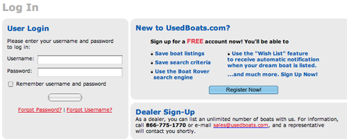
Personalization takes place at several levels.
4. Community Building – F
For all of its data display sophistication, there are no user forums or “user profile” features.
And, unlike Ebay, there does not appear to be any organized way for users to share previous experiences with buyers or sellers. In other words, “you’re on your own” (as far as I could determine).
There is a page of testimonials, but these refer to UsedBoats.com, not individual buyers or sellers, and not by boat dealers.
5. Persistent Navigation – A
Navigation is logical and persistent. Beginning with the “big three” on the homepage, and assisted by primary and secondary navigation links, the site can be efficiently utilized from the first visit.
6. Task Depth – A
With the exception of the constant distraction of pop-up boxes promoting assessments and surveys (see Points 13 and 14, below), this is an easy site to get around, regardless of whether or not you’ve registered.
7. Affordance – C
Several times, UsedBoats.com let me down.
In particular, I was disappointed when several links on the navigation bar didn’t take me where I wanted to go, or didn’t provide me with the information I expected them to offer.
The first eight links, i.e. “Home” through “Boat Values” delivered as expected and kept me at the site. However, the links for “Boat Loans,” “Insurance,” “Surveying” and “Shipping,” were links to off-site vendors.
Likewise the “Demo” link had a strong “sales” message to it, which was inconsistent with educating me to use the site most effectively. And the “New boats” link takes you to the site’s sister database-driven site, NewBoats.com.
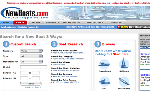
Part of what looks like persistent navigation takes you here: NewBoats.com, UsedBoats.com’s sister site.
8. Labeling and Language – A
With the exception of “diminished expectations” based on “promotion” instead of “education,” the site is characterized by clear and simple navigation.
9. Readability (Content Density) – B
Boat listings are easy to read. Shaded backgrounds are used to organize closely-spaced listings, making it easy to focus on one listing at a time.
The only problem areas concerned text-heavy pages, like the “Demo” page, which had relatively long lines of small type, interrupted with text wraps.
10. Organization – B
Pages are organized for easy navigation.
11. Content Freshness – B
Used Boats is not a “news” site. For better or for worse, it is uncomplicated by weather or economic news, or “news”—i.e. press releases—from boat builders. The primary “news” consists of a listing of upcoming boating events of interest to boat buyers and sellers.
12. Load Time – A
This is a fast site.
13. Aesthetics – B
The site is “all business” to a fault. It is surprising that there is no attempt to communicate even a touch of the “pleasure” or “recreation” that boating provides for male bonding or family enjoyment.
An occasional evocative photograph would add a missing element of emotional appeal.
As mentioned below, the assessment pop-up provided the primary distraction that occurred when returning to the homepage, or accessing other pages.
Another very annoying distraction was the presence of “Coming Soon” links and—worse—a placeholder for a future promotional link. This just projected “tacky” and uncaring design.
14. Brand Preference – B
There are no major problems, but—to me—boating is supposed to be fun, yet UsedBoats.com is emotionless and passionless.
The persistence of the assessment pop-up, every time I revisited the homepage, was very irritating. Perhaps the pop-up disappears when you take the assessment, but it irritated me so much I refused to give in.
One should not be irritated by a site selling a key “pleasure purchase!”
Conclusion
All in all, UsedBoats.com is a high-functionality site that is a bit too businesslike for my tastes.


