AOL’s New Entertainment Site, TMZ.com Has Everything Going For It. In Addition to Having a Great Background, the Excellent Website Design Scores for TMZ.com Make it Easy to Predict a Shining Future
On December 8, 2005, AOL’s expected press release announcing the launch of the new entertainment site, TMZ.com, hit the buzz-makers. The commentary? Only that AOL needed a massive influx of traffic, and that even in the crowded online entertainment space the subsidiary of Time Warner should be able to put up enough interesting new tidbits to draw in the ever-celeb-hungry masses.
TMZ.com, which stands for the “Thirty Mile Zone” around Hollywood (apparently in people know these sorts of things), claims to be a “new, first-of-its-kind 24/7 on-demand entertainment news network.” The interesting word choices here are “on-demand” and “network.” As shown in this review, TMZ.com does lives up to these claims, if falling a bit short on others.
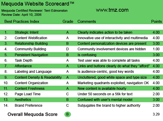
This Mequoda Website Scorecard Review points out some of the following best practices:
- A free content site with great content (continuously fresh headlines, exclusive videos and a well-stocked archive) and a good ratio of Advertising to Editorial exhibits an excellent implementation of Strategic Intent.
- Aesthetically TMZ.com is struggling with finding just the right style—no best-dressed awards here.
- Usability is near perfect, with As in Readability, Affordance and Labeling and Language—the extensive online experience of parent AOL is obvious.
- TMZ.com‘s overpowering parent AOL gives the site a leg up in the world by bringing an entire network’s worth of technology and skill to the newly launched site.
- But TMZ.com has to be allowed to stand on its own Brand to really fly.
TMZ.com’s Mequoda Scorecard
1. Strategic Intent – A
AOL’s strategy is to create as much online inventory to market to advertisers as possible. The 50+ sites in the network of brands puts TMZ.com on the same list as People and Entertainment Weekly for advertisers.
What is the business purpose of TMZ.com? Massive traffic inflow, and to either keep the viewers around or shuffle them off to other sites in the network. The visitor to TMZ.com is coming for the free content (very few star-stuck viewers are rabid enough to pay for gossip—so far). The revenue stream therefore is based solely on advertising dollars. At launch TMZ.com had signed on Revlon, Chrysler and Hilton Hotels.
[text_ad]
The editorial line-up covers everything entertainment related (celebrity hang-outs, music, movies, TV, etc.) and formats include still photos, video, articles, interactive polls and games and IM. The tilt of the content is definitely from behind the aggressive lens of the shameless paparazzi. By presenting the audience an almost stalker-like inside view of Hollywood celeb life, and using Web technology to deliver both breaking news and archived content, TMZ.com feeds a consumer desire. It fulfills the task that it was created for: a place to re-use existing content, bringing in more traffic and thereby creating additional online advertising inventory.
In an ad-supported site, design starts to play an even more important role as there are now two audiences with competing needs to serve. The advertisers want the best possible placement for their spot, and the consumers want to avoid looking at the ads and only see content. TMZ.com has built an experience that is very close to TV here. While ads run alongside content in a typical magazine model on static pages, in the videos is another story. For each clip, the viewer has to watch a commercial. Commercial first, then the content. Sort of like bribing your kid to eat their vegetables.

2. Content Webification – A
Ever wonder what happens to the hours of film and video the paparazzi take, but doesn’t make it onto TV? Via the partnership with sister company Telepictures Productions, archived video from the TV show Extra fills the newly born TMZ.com with an extensive amount of… well, one person’s trash is another person’s Library.
The interactive Games section pokes fun at celebrities with “Celebrity Mugshots,” “How much richer is Paris Hilton than You” and “How many Ho-Ho’s does Janet Jackson weigh?” The design of these games feels a little more like linoleum than red-carpet, but that belongs in the aesthetics section of this scorecard.
Although the site is peppered with polls and includes a forum, TMZ.com has made the most innovative use of interactivity in the video section. Clicking on a video link pulls up the AOL Video window, with options to IM, Email and save the video to a playlist. By using parent AOL’s existing technologies, TMZ.com can offer the non-paying viewer a state-of-the art experience right out of the gate.
3. Relationship Building – B
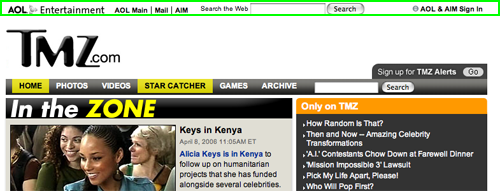
TMZ.com is a site born from a relationship-building fiend, AOL. The site therefore has leveraged AOL’s super relationship-building features by letting existing AOL members sign in, create playlists on the video and IM their contacts in AIM. If you are a user with an existing AOL screen name, you’ll feel right at home.
The design feels a bit cobbled together though. The sign-in is at the very top of the page, and it isn’t promoted as a benefit at any time. When a new user wants to use a registration-required feature—such as IMing a friend, they are brought to an AOL only registration page. Confusing, as it seems to a new user that you have to leave TMZ.com to create a relationship with TMZ.com.
4. Community Building – D
The polls all over the site were fun community building, but they don’t go far enough for this category. Community-created commentary on each celebrity, each photo, each video is a part of everyday life on pop culture blogs. Here the community was hard to find. From the blogroll, the user can zip off to dozens of sites with hundreds of others talking about the hottest gossip, but sending the user off-site for community doesn’t bring any benefit to TMZ.com.
5. Persistent Navigation – B
The site is shallow and deep, with hundreds of chunks of short celeb content bites just below the surface, and nothing that goes any deeper than a painted-on tan. This site sat lightly under the global network links on the top, the content within the center, and balancing on external links to (some AOL Time Warner, some not) other similar content websites on the bottom.
Specifically, the TMZ.com logo and the six main categories for site navigation remain consistent throughout the site. Second level headlines and content are scattered throughout the content blocks, easy to read and find. Navigation fails a bit when a video is watched. This brings up a new window, from AOL Video technology, and the navigation changes. That is, the user can’t easily surf back around on TMZ.com, they have to click back to the other window. It would be better to either stay within the window or keep more of the TMZ.com navigation on the new window.
6. Task Depth – A
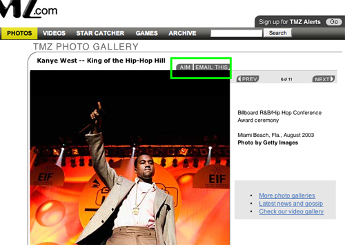
The user comes to TMZ.com to get the latest gossip headlines and find information about favorite celebs. Both are easy to do. Headlines are visible on the homepage, and throughout the site in the “Headlines” box. Celebrities can be searched for by name or users can browse in the photo galleries. One of the main tasks on the site for the business end is to make as much use of viral marketing as possible. This is facilitated by helping the user tell friends, by easily emailing anything on the site to a friend, be it photo, article or video or AIM, and “Email This” links appear next to all content chunks.
7. Affordance – A
For a site that has a lot of (forgive me) nonsense for content, TMZ.com is surprisingly no-nonsense about affordance. Web conventions used include:
- Getting to the full story via clickable Headlines, photographs, “Read More” links and icons at the end of a story intro.
- Viewing a video has multiple entry points including: an arrow icon and “Play,” “Click here to watch” as a link, and the name of the clip in blue link text with a video icon next to it.
- Groups of similar links are in colored text and put together in graphic boxes with bullets, all hyperlinks use color, underline and mouseover conventions.
- Browsing photo galleries use “Prev” and “Next” to flip through a series of celeb photos.
TMZ.com‘s only error in my book, is that a link occasionally brought up a new website, such as Moviefone, without warning the user first. I suspect this isn’t an oversight, but more a calculated decision that the user-hijack trick was an acceptable tradeoff to keep the traffic on the AOL network. Since every other affordance detail was meticulously attended to, they still deserve an A—the most clueless of users won’t have a problem on TMZ.com.
8. Labeling and Language – A
Not to put too fine a point on it, but the lingo here is the real deal. The catchy cliché-speak peppering this trend-forward zone comes across as cool-casual conversation; it’s just like talking to your fashionable gay cousin. At the same time, navigation follows the Keep It Simple Stupid principle: getting where you want to go is kept to elementary school vocab—”Home,” “Photos,” “Videos,” “Read More” etc…. The bottom line? Even though I’ve never been near a red carpet, I didn’t feel left out and I think my Cool-Q has gone up from just working on this assignment.
9. Readability (Content Density) – A
With two audiences to satisfy the ad-supported design is a constant battle of trade-offs. Consumers want content first and ads on the side, advertisers want their ads in front of the content. Keeping both groups happy requires a fine-tuned design.
On TMZ.com, the two column layout makes it possible for both large ad sizes and large content (photo and copy blocks). Additionally, the advertisers are given a short commercial spot right before the video clip, and a banner alongside it in the description. Consumers have long been trained to expect to watch a commercial along with their TV fix, so the offer works well.
10. Organization – A
Every quadrant of the page carefully shares the real estate between primary task links (content and actions) and advertising. Content links are interspersed with advertiser’s banners in almost equal shares. In all, this site has one of the most balanced layouts that I’ve seen.
11. Content Freshness – A
With date and time stamps on the headline articles, content was clearly updated several times a day. There is every reason for the avid audience to visit often and catch the latest buzz before their friends do.
12. Load Time – C
TMZ.com loads at a rate of 41 seconds on a 56K modem, barely scraping by with a grade of C.
13. Aesthetics – B
TMZ.com offers a blogroll of at least 50 other similar sites like Gawker, Celebritysmack, Popbytes, etc… Viewing sites with the same target audience made the visual comparison an easy job. The look is very visual, with large fancy logos, design-y and image heavy and the blah-grey-box style is just not done.
TMZ.com has done a fabulous job at designing a readable, usable site—but they missed the user mental model. The almost stoic insistence on a black, grey and blue palette feels Spartan, in total disregard of the party-loving eye-candy style that an entertainment site cries out for.
14. Brand Preference – C
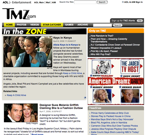
AOL or TMZ.com? I would think that anything named after the most glamorous Thirty Mile Zone in America has got to have a cooler, more “in” image to succeed than the everybody-in-the-country-with-a-modem-is-welcome parent America Online. In building the brand for TMZ, the more separation, the better.
Using TMZ.com to increase AOL network traffic, plus the content and technology re-purposing through the network is a great business tactic, but it can make for a hash of a branding experience. TMZ.com has its logo in all the right places, but the confusing message sent by the AOL logo splattered here and there is going to weaken the strength of TMZ.com as a stand-alone brand name.
Conclusion
AOL is a company that made using the Web easy way back when only techies at universities and the Pentagon found it useful. Their success and knowledge in creating a user experience can’t be argued, and TMZ.com in many ways shows the dividends of that history. The site also benefits from being part of Time Warner with content re-purposed from Teleproductions International’s Extra, and other B-roll clips. And it comes out of the gate with big names as charter advertisers.
In short, this new site has everything going for it. In addition to having all that great background, the excellent website design scores for TMZ.com make it easy to predict a shining future. With a little more attention to building a stand-alone TMZ brand, we expect to watch this site dishing the dirt for a long time to come.


There is certainly a lot to learn about this subject. I really like all the points you have made.