The Daily Reckoning Website, a Network Hub for its Financial Newsletters and Services, Demonstrates Effective Website Design and Site Architecture that Supports User Tasks and Goals
Agora is hands down one of the most successful online publishers in the financial newsletter industry. In just six years, it has grown from zero to nearly $100 million annually in online revenue. While compiling this impressive track record, the company pioneered many of the marketing strategies and website design techniques that have since become best practices in the publishing industry.
One of those is the website network hub and satellites, a fundamental element and defining characteristic used by top performers that is codified in The Mequoda System. The network organization here is The Daily Reckoning, as a hub, connecting to numerous satellite websites. But Agora executes this configuration in a fashion we have not seen previously, with solo marketing sites in orbit around a hub.
All at one site, The Daily Reckoning attracts the visitors, captures the email addresses of potential customers with the offer of a free email newsletter, and links them, not to a traditional shopping cart of Agora product offerings, but to the sales letters for various premium information products, and from there to individual order forms.
- The Daily Reckoning website design is busy but well organized
- Agora is a pioneer and innovator in building online relationships—they start an online relationship with the offer of free daily content
- Make no mistake—this is a commercial website and the user soon learns that all links eventually lead to a sales letter and order form
- This website design is light on graphics and uses plenty of soothing white space
- Website publishers can learn a lot from Agora and The Daily Reckoning‘s website design—there is always room for improvement, but this company doing nearly everything right
Introduction
The Daily Reckoning is Agora’s primary lead generator. It is written by William Bonner, the founder and president of Agora Publishing, and Addison Wiggin, editorial director and publisher. As a free, daily email newsletter, The Daily Reckoning claims more than 500,000 readers in the United States and Great Britain, and is translated daily into French, German and Spanish.
The Daily Reckoning is a model of engaging, upbeat writing and controversial—some would say “contrarian”—investment advice. It combines valuable information about investing with practical, folksy commentary about world events, and adds homespun advice on living life to the fullest. The Daily Reckoning makes readers ponder the curious and arcane of life in the 21st Century, as well as smile with amusement about the peculiarities of world politics. Devotees say they learn what to expect from today’s financial markets, and how to prosper in the face of uncertainty.
Primarily by skillfully promoting the The Daily Reckoning as its free email newsletter, Agora has built a targeted customer database of more than two million investors in just six years. Each issue of the The Daily Reckoning includes links to offers for at least one of Agora’s paid information products, either a book, newsletter, one-off report, membership program or seminar.
An examination of the Daily Reckoning website, which went through a major redesign during 2005, shows the same marketing strategy at work here as is used on the newsletter. The site is not a traditional website landing page, but a gateway to other landing pages, i.e., sales pages, for many of Agora’s premium products. Think of DailyReckoning.com as the hub, with numerous hypertext link… not to a traditional shopping cart, but to solo marketing website satellites, each promoting an individual Agora product.
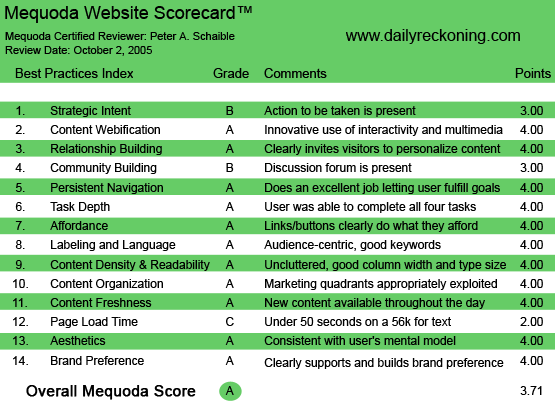
TheDailyReckoning.com’s Mequoda Scorecard
[text_ad]
1. Strategic Intent – B
The Daily Reckoning website is busy but well organized. The primary strategic intent is to capture the visitor’s email address for a free subscription to the The Daily Reckoning, Agora’s flagship free, online email newsletter, delivered each weekday afternoon. With a free subscription to The Daily Reckoning, the customer also receives The Rude Awakening, Agora’s morning edition, which is dedicated to highlighting phenomena in the financial markets.
A large, well-placed banner ad urges the visitor to “subscribe here” and requires them to click away to a second page in order to complete the enrollment process.
It is curious that the user can’t enroll right from the homepage, without having to undergo this two-step process, and this seems incongruent with the otherwise exemplary practices of the highly successful Agora Publishing Company. But perhaps they know something I don’t know. (See #3 below.)
If already a subscriber to The Daily Reckoning, and no additional sign-up is needed, the user is encouraged to have a thorough look around the website. There are numerous hypertext links to free archived articles, breaking news stories, an online “book store,” biographical sketches of featured columnists, press releases, etc. Each ultimately leads away from the hub to a sophisticated, copy-laden satellite sales letter for a paid product or service.
2. Content Webification – A
This site uses Internet technology to offer the user access to its database of previously published content. The user can search by keyword or browse five years of back issues by date.
Additionally, they can copy the code that will enable them to subscribe to an RSS (Really Simple Syndication) feed to monitor fresh Web content.
There are links to The Daily Reckoning U.K., South Africa and Australia editions, as well as French, German and Spanish language versions. In turn, many of the hypertext links from these editions lead to foreign language offers for additional Agora products.
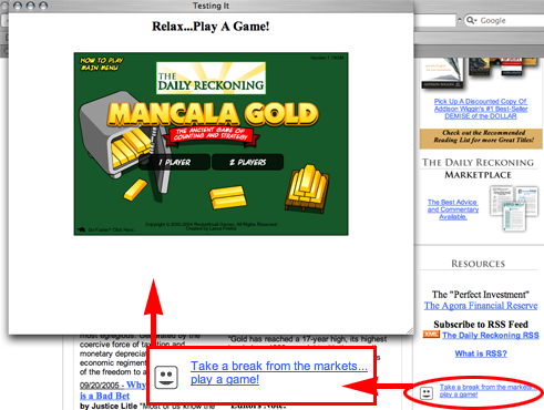
Finally, the website designer has incorporated an interactive, online game. “Mancala Gold,” for one or two players, provides users with an unexpected diversion. I couldn’t quite get the gist of it, but for gamers, it looks like fun! It’s certainly not something I would have expected to find here, but then again, this is not a typical site for investors.
3. Relationship Building – A
Agora is a pioneer and innovator in building online relationships. This publisher knows how to start an online relationship with the offer of free daily content. And knows how to nurture that relationship over time (with valuable free content for as long as it takes). And knows how to eventually monetize the relationship with the sale of premium information products.
With a free subscription to The Daily Reckoning, delivered weekday afternoons, the user also receives The Rude Awakening, a morning email newsletter. That’s a lot of free content to receive from one source. But that’s also 10 opportunities a week for Agora to sell the user its premium products.
I’m curious why the signup window doesn’t appear right on the homepage. (See #1, above.) It’s difficult to believe that Agora left this to chance. Is a two-step sign-up process somehow more effective? Have they tested it?
Perhaps the separate pop-up window for the email signup gives Agora the opportunity to assure the user that “We will not share your email address with anyone else, period.” And provide a link to the Agora privacy policy.
Whatever the reasons for the two-step sign-up process, I can’t argue with Agora’s success.
4. Community Building – B
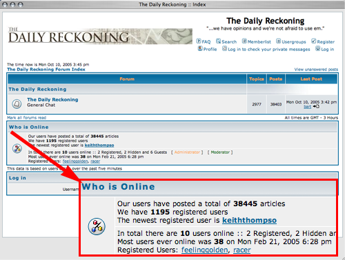
The Daily Reckoning website hosts a discussion forum that recently said it has 1169 users and 36,230 posts since the beginning of 2005. However, articles reprinted from The Daily Reckoning did not appear to encourage reader feedback via the forum. Still, it’s there if you want to register to use it and sound off.
5. Persistent Navigation – A
The Daily Reckoning website is easy to navigate forward and back. Make no mistake. This is a commercial website. The user soon learns that all links eventually lead to a sales letter, and ultimately, to an order form.
6. User Task Depth – A
The user can sign up for the free newsletters, obtain reader service information, subscribe to an RSS feed, join the discussion form, search archived articles and—most important to the publisher—easily buy premium products.
7. Affordance – A
The links and buttons on this site behave pretty much as the user expects them too. It doesn’t take long to figure things out, and then the site works as expected.
Hypertext links are consistently colored blue and underlined. However, they do not change to red when moused-over, nor do they change to purple (or any other color) when clicked.
I expected the top banner logotype on each page to be a link that returns the visitor to the homepage from anywhere on the site, but it does not. Photos of books and reports are employed as links to sales pages for those products. Photos of flags are used as icons that link to foreign language editions.

8. Labeling and Language – A
The world of finance and investing has its own jargon and technical vocabulary, so the use of some buzz words is unavoidable on a site such as this.
But the website is also about world news, politics, and the inter-relationship of government and economics. Because of the casual writing style, and the breadth of topics discussed, it is difficult for the editors to maximize the use of keyword phrases that might improve this site’s ranking in the search engines. The Daily Reckoning website doesn’t seem to worry about any of this and it probably doesn’t need to.
9. Readability – A
This site is light on graphics and uses plenty of soothing white space. The width is perfect. The typefaces and sizes achieve a comfortable rhythm. The pages are easy to scan or skim and there is a printer-friendly option for most pages.
10. Organization – A
The designer uses a two-thirds vs. one-third page layout that is very attractive. Major navigation links are used consistently at the top of each page; less used links appear consistently at the bottom of each page. The right navigation panel is reserved for links that take the user directly to premium products, the RSS feed or the interactive online game—an amusing and surprising diversion.

11. Content Freshness – A
The archive of past email newsletters is updated regularly. Additionally, there is a weekend edition—generally an article that did not make the Monday – Friday daily email newsletter.
12. Load Time – C
The download time for the Daily Reckoning website was 36.86 seconds at 56K as measured by the webpage analyzer. I’m surprised. The site is light on graphics. It seemed faster.
13. Aesthetics – A
This site is clean, information-rich and intuitive. Layout, colors and typefaces are all appropriate. It’s a huge improvement in every way over its previous graphic and engineering design, which I researched.
14. Brand Preference – A
This website is a fitting compliment to the Agora Financial website and is far superior in design to some of Agora’s other websites, including the Agora Publishing Company homepage. Perhaps the company has plans to redesign all its websites to present a consistent appearance and corporate brand. That’s a move that I would applaud.
Conclusion
Website publishers can learn a lot from Agora. While there is always room for improvement, this company is obviously extremely successful and is doing nearly everything right.
Agora sites are distinguished by the quality of the sales letters for each of their publications. There are links to all the Agora financial and investment information products from The Daily Reckoning website, and these sales letters constitute a textbook on persuasive copywriting.
Repeating the praise we lavished in the introduction, The Daily Reckoning website is the first time we have seen this exact design, with solo marketing sites in orbit around a hub. The site attracts visitors, captures the email addresses of potential customers with the offer of a free email newsletter and links them to the sales letters for various premium information products—all in one place.
The Daily Reckoning website is a perfect example of a Mequoda System website network hub and satellites, with DailyReckoning.com at its center. It skillfully uses teaser copy and hypertext links to connect the user to solo marketing website satellites, each of which promotes an individual Agora product.
Agora exemplifies proper execution of the Mequoda System as well or better than any publisher we have yet surveyed.
Lather. Rinse. Repeat.


