TheBookStandard.com describes itself as “the all-inclusive online destination for publishers, retailers, librarians, agents, authors, distributors, studio executives, screenwriters, publicists, book groups and more!” It’s an accurate description.
VNU Business Media, publisher of The Hollywood Reporter, Billboard, Computing, and other trade titles, launched TheBookStandard.com, its first solely online publication, in January of 2005.
VNU is a leading provider of marketing information and analysis. In 2001, it took over ACNielsen Corporation to become a leader in publishing information on consumer goods purchases.
VNU also owns Kirkus Reviews, founded in 1933, which publishes nearly 5,000 book reviews annually. Kirkus Reviews is a highly regarded resource for publishers, libraries, agents, film and television studios and producers, as well as commercial booksellers.
Additionally, VNU owns Nielsen BookScan, which it calls “the world’s first continuous retail sales monitoring service for books, with purchase information representing sales through a majority of the major retailers each week. In a typical week, sales of over 300,000 different titles are collected, coded and analyzed, producing complete market information for retailers, publishers and the media.”
All this augers well for TheBookStandard.com. Armed with these VNU resources, TheBookStandard.com takes direct aim at a venerable established brand: Publishers Weekly, which is more than 130 years old.
TheBookStandard.com brings together in one online subscription website every aspect of the book publishing industry: Nielsen BookScan-powered data, charts, and analysis; news and investigative reporting; industry resources, tools, and commentary—plus reviews powered by Kirkus.
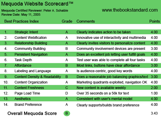
TheBookStandard.com succeeds on many levels as measured by the Mequoda Website Scorecard™. When measured against the 14 Mequoda best practices, TheBookStandard.com scores a solid “B.”

TheBookStandard.com’s Mequoda Scorecard
[text_ad]
1. Strategic Intent – A
TheBookStandard.com is a business-to-business membership site. It also accepts advertising, so under the Mequoda Model, it qualifies as a hybrid site. No matter. Arrive at the homepage and the intent is clear. Either login (if already a member), subscribe now, search for something on the site, or signup for free newsletters and a chart alert.
While this might seem to be too many options, the choices are very straightforward. If you’re a member, you know what to do. If you’re not, have a good look around. This site offers loads of complimentary information. If you’ve seen enough to know you want to join, click here and sign up. It’s all right up front, above the fold, above the nameplate. Only a rotating banner ad competes for your attention, and even that isn’t terrible annoying.
2. Content Webification – A
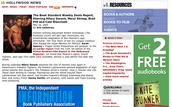
TheBookStandard.com offers a powerful search engine and comprehensive resources. The user can search books and authors, books-to-film, agents, etc. Also offered are numerous sales charts sorted by book type, news features sortable by author, publisher, retail, Hollywood, etc., book reviews and commentary.
Another feature: TheBookStandard.com offers an RSS feed (which stands for Really Simple Syndication). You can subscribe to The Book Standard’s RSS feed through personalized news sites, and if you have a personal website, you can use these feeds to add The Book Standard headlines to your site’s pages.
Want a list of the most saved or most popular stories? Just click a button. Or click to email an article to a friend.
If you’re a part of the book publishing industry, you’ll easily find what you’re looking for at TheBookStandard.com.
3. Relationship Building (Personalization) – A
TheBookStandard.com offers three—count ’em—three different free email newsletters, including The Book Standard Bestsellers Chart Alert, a free weekly e-zine with news and sales rankings.
Also free: The Book Standard Books-to-Film Newsletter, from writers at The Book Standard and The Hollywood Reporter. It includes up-to-the-minute reporting on rights and deals, film adaptations in all stages of production, plus, the scoop on the directors, producers, screenwriters and actors involved.
Additionally, The Book Standard Retail Report, which includes bookselling news, industry profiles and sales-trend analysis.
Surely, VNU could have lumped these into one free industry e-zine, but giving each it’s own identity is smart market segmentation and boosts personalization and relationship building.
See Content Webification (above) for TheBookStandard.com RSS feed, Saved Links, and Most Popular features, all of which also contribute to relationship building.
4. Community Building – B
TheBookStandard.com offers no discussion forum, but reaches out to its community with three other features. First, with chatty, industry insider columnists such as Adam Langer and The Book Babes. (Please don’t write and accuse me of being a sexist pig; that’s what Ellen Heltzel & Margo Hammond have dubbed themselves—The Book Babes!)
The second community building device is a People On The Move section, announcing job changes, employee shifts and company restructurings.
Third, a Careers section enables visitors to post jobs, search resumes, etc.
5. Persistent Navigation – A
Except for the Offer page and the Subscribe page, TheBookStandard.com uses the same navigation devices throughout. Users can navigate effortlessly from page to page, and, with those two exceptions, can move back to the homepage just as easily.
Customer service information, here designated Contact Us, is available from a link at the bottom of every page, as are links to Subscribe, Careers, Advertising Opportunities, About Us, FAQ and Site Map. It’s all repetitive, consistent and, with a little familiarity, intuitive.
6. User Task Depth – A
Users can easily browse, search, sign-up for a free e-zine, or subscribe. Each task is no more than three steps (at the maximum).
7. Affordance – B
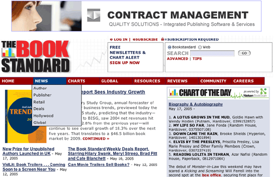
TheBookStandard.com employs drop-down menu selections from its eight main, top-level menu buttons. You must mouseover these top-level buttons to find the sub-level offerings, but it’s not difficult or objectionable. All things considered, I think the graphic designer handled the organization of this site admirably.
Links are underscored and color-coded. They change color as expected when clicked. Overall, the site “behaves” as expected.

8. Labeling and Language (lexicon and taxonomy) – A
TheBookStandard.com is a destination website for book industry professionals. While every trade has its own jargon, you can’t find traces of it on this website. So far, the toughest buzzwords I’ve encountered are backlist, genre and advance copy.
All of the buttons and menu items here are consistent with my mental model. TheBookStandard.com speaks Earth People talk to its users.
9. Readability (Content Density) – B
TheBookStandard.com is a very busy, content-laden website—all the more so because almost every page includes two or three large display or banner ads, as well as a few Google AdWord text ads.
The designers have eased the burden on our eyes by running a five or 10 percent grey tint behind some of the sections, thereby breaking up the intensity of the text.
The text typeface is small and tedious for the over-50 crowd. Printer-friendly options don’t change the typeface or size to make hard copy reading any easier. But users with good eyesight can skim and scan.
Given all the elements, I was surprised that the layout isn’t more objectionable. If you choose to devote some of your website’s real estate to large display ads and Google AdWords, you simply don’t have much remaining white space with which to make the site elegant. All things considered, the designers of TheBookStandard.com have done a reasonable job of packing a lot on each page without making the visitor feel claustrophobic—not an easy trick.

10. Organization (Marketing Quadrants) – A
As noted above, TheBookStandard.com is a content-heavy website. Wisely, the designers have placed the critical marketing information and contextual navigation above the fold. Form follows function. Pick your own cliché. This site works.
11. Content Freshness – C
The articles on TheBookStandard.com are displayed in reverse chronological order and appear to be uploaded as they become available, and not on any regular publication schedule. All the articles include a dateline, although these are not displayed consistently with the headlines and teaser copy.
Even so, if I were a book publishing professional, I’d probably want to visit this site at least three times a week in search of news.
12. Load Time – D
Owing to its heavy use of graphics (there are more than 25 GIF and JPEG files on the homepage), TheBookStandard.com clocked a load time of 35.28 seconds at 56K.
Designer take note: I ran a few tests and found that many of the site’s graphics could be compressed without noticeable loss of resolution using a utility such as Ulead Smart Saver Pro. This would speed up the load time considerably.
13. Aesthetics – A
What’s your mental model of a website for publishing professional and booksellers? I find TheBookStandard.com to be clean-looking, information-rich and intuitive. The choices of red, maroon, black, blue and grey all work for me to suggest a modern, authoritative business news source.
14. Brand Preference – A
Here’s what surprises me about my reaction to TheBookStandard.com. The site is very busy. It uses a lot of its real estate for advertising. It includes links to other VNU properties, including their logotypes.
Yet, despite all this chaos, a very attractive multi-colored “The Book Standard” logotype dominates the homepage and establishes authority. Even if TheBookStandard.com is a new online newsletter—relative to Publishers Weekly, Publisher’s Lunch or Publishers Marketplace—it is doing a fine job of establishing a strong brand.

Conclusion
The Book Standard is available only online. This is an irony, in that its target audience is comprised of people who write, publish, sell and read hard copy books. Can a strictly online newsletter satisfy the glamorous literati and publishing set?
The Internet has changed the rules for the packaging and delivery of information. Even hardcore book readers are now accustomed to going online to find information at their favorite websites.
TheBookStandard.com, although a new online publication, is a product of highly experienced researchers and publishers. It has exceptional resources and an excellent pedigree. Its design and execution, against the model of a Mequoda hybrid site, is well done.
If its content is appropriate to its audience—I don’t have an informed opinion on this factor, but I assume that it is—TheBookStandard.com will succeed handsomely.


