RealSimple.com Epitomizes Great Website Graphic Design and is a Perfect Partner to Real Simple Magazine. So is it a Brand Site or a Membership Website? Is its Objective Lead Generation or Customer Service?
The Big Lie of the 1950s was the forecast that life in the future would be easier—even effortless—leaving us with lots of free time. Futurists in the 50s looked at all the labor-saving devices that were being invented and predicted that Americans would have so much time on their hands—owing to machines doing all the chores—that we would have to find more leisure activities to fill up the hours.
But, as we all know, things didn’t quite turn out that way. Most of us are busier than ever. And while we enjoy a higher standard of living than ever before in history, it generally takes two jobs—and usually two incomes—for most families to afford it. For Americans who want it all—career, home, children and recreation—life can be hectic, complicated, expensive and exhausting. Many of us long for greater simplicity, serenity and time. Show us products that will make our lives simpler and save us some precious time and you’ll capture our interest—and probably make a few sales.
Like the magazine and the new PBS television program of the same name, RealSimple.com offers strategies to help make your busy life easier and better by presenting useful, smart solutions to everyday problems in an appealing, easy-to-follow way.
Here’s how it measures up against the Mequoda System Website Design Guidelines.
- RealSimple.com has a couple of very slick features that exemplify both content webification and relationship building, that augur well for brand preference and return visits.
- This site is easy to navigate whether your goal is to join, buy a book, browse or whatever.
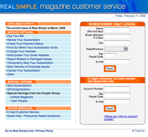
- Nobody does customer service better than Time, Inc. and this customer services page could serve as a model for the entire industry.
- There is some inconsistency in the design and color of the hypertext links and buttons on this site that diminish its otherwise beautiful graphic design.
- In the final analysis, the strategic intent of RealSimple.com is to sell magazines and other print products, and, in turn, to sell magazine advertising. And at that it does a great job.
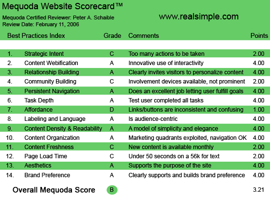
RealSimple.com’s Mequoda Scorecard
1. Strategic Intent – C
There is a continuing argument among members of the advertising community about which is more important—an engaging headline or an arresting graphic. Copywriters claim that without a great headline, an ad won’t get read, regardless of how beautiful its design.
Graphic designers and art directors claim no one will bother to read the headline or the ad if its beautiful design doesn’t catch the reader’s attention.
We copywriters generally win this argument (if only in our own minds), but RealSimple.com makes a good case for great design overruling copy. There is no arresting headline here, but there is an outstanding logotype and slogan—REAL SIMPLE: Life made easier. It’s simple, elegant, arresting, engaging and it works!
But soon enough, what should be real simple gets complicated. Should the first-time visitor sign up for the free Weekly Tips Newsletter, buy a subscription to Real Simple magazine, give Real Simple as a gift, find a local listing for the new Real Simple television program or simply explore this exciting, content-rich site?
[text_ad]
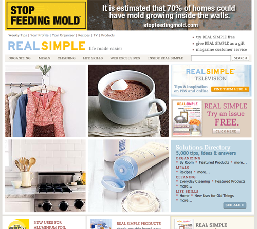
When a visitor arrives at RealSimple.com, it’s difficult to decide what to do first. This site is drop-dead gorgeous whether you look at the flash version or the no flash version.
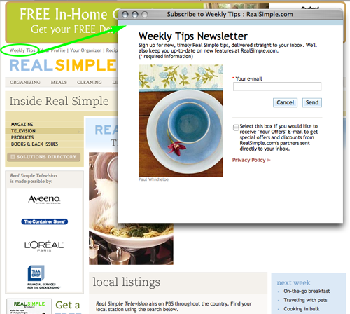
Here’s a real simple design tip from Mequoda: if your primary strategic intent is to capture the names and email addresses of site visitors, put a signup box on the homepage in the upper left quadrant. It shouldn’t be a two-step process. You don’t want the visitor to have to click to another page in order to sign up. You want her to do it right on the homepage.
RealSimple.com makes it a two-step process to get the free Weekly Tips Newsletter, which is not real simple.
2. Content Webification – A
This site uses Web-based technology to offer numerous options that inform and entertain. Some of these are not what you might expect, such as a photo gallery of winter scenes. No good reason for it, except it’s pretty. But since when do we need a reason to embrace beauty?
The site also offers downloadable checklists in the Adobe Portable Document Format (PDF files). And a terrific website finder—a one-click connection to every website featured in every issue of Real Simple. The user can find sites by date or by category.
Plus there’s a daily thought. Today’s is from the late pop psychologist Leo Buscaglia: “Only when we give joyfully, without hesitation or thought of gain, can we truly know what love means.” That kind of pithy, touchy-feely sentimentality is probably enough to get some visitors to return regularly, and is a good example of content freshness (see #11 below).
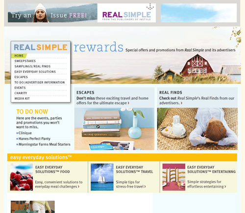
Additionally there are links to RealSimpleRewards.com, which offers special rewards and promotions from Real Simple and its advertisers.
But the site doesn’t give everything away. RealSimple.com also keeps much of its most valuable content on the private side of the turnstile. As much as anything else, this is a membership or subscription website for subscribers to the Real Simple magazine. So I immediately joined (subscribed).
3. Relationship Building (Personalization) – A
RealSimple.com has a couple of very slick features that exemplify both content webification and relationship building, that augur well for brand preference and return visits (see #14 below).
- An online “organizer” lets users quickly store, organize and retrieve the solutions on the site that are most important to them.
- A “kitchen assistant” enables home cooks to search Real Simple’s 800+ recipes, save them in personalized cookbooks, put together and print menus, and create shopping lists.
- The Website Finder categorizes every website featured in Real Simple magazine, providing direct links to more than 3,000 resources and products.
4. Community Building – C
Getting involved with the Real Simple community is a bit convoluted. Readers who interact with Real Simple magazine, through surveys or letters to the editors or as the result of being interviewed by the editorial staff, may find themselves quoted on RealSimple.com
The current online survey question: “We need inspiration from our readers for our upcoming issues. Your answer to the question below may appear in the magazine or on RealSimple.com.”
And the question is: “What’s your favorite piece of advice from your mother?
But there is no discussion forum on the site or other mechanism for uploading text or photos that would encourage community building.
5. Persistent Navigation – A
This site is easy to navigate whether your goal is to join, buy a book, browse or whatever. It’s intuitive and has a link to an outstanding online customer services page. Nobody does this better than Time, Inc. and this customer services page could serve as a model for the entire industry.
6. User Task Depth – A
Users will have no trouble completing tasks. Links that take the visitor to other Time-Life websites all open in new windows and leave no confusion about how to return to RealSimple.com
7. Affordance – D
There is some inconsistency in the design and color of the hypertext links and buttons on this site that diminish its otherwise beautiful graphic design.
Most of the links are not underscored. Some are black, some are maroon. Some are all caps, others are upper and lower case. Some change color when moused-over, some don’t. Some of the graphics are clickable, others are not, and the only way to find out is to mouse over each one.
This is a sorry state of affairs and wholly unnecessary for a site that in so many other ways exemplifies great design.
8. Labeling and Language – A
Real Simple magazine describes itself as “a leader in the category of women’s lifestyle publications… focus(ed) on making busy women’s lives easier, from preparing a fast, healthy breakfast to getting a good night’s sleep.”
Real Simple knows its audience. This website has an excellent representation of key words and phrases that help its readers do what they need to do, so they have more time to enjoy what they want to do.
9. Readability (Content Density) – A
Unlike so many websites that are married to the san serif typeface family of Arial, Helvetica and Verdana, Real Simple, in part, uses an elegant serif typeface that is very reminiscent of Palatino™—one of my favorites from the print world.
Palatino’s classical proportions evoke a Renaissance grace that always brings distinction to a page. There’s a certain sleight of hand at work here; the effect is achieved using artwork, not pure HTML typography. But it is a welcomed addition to an already very attractive website.
Additionally, the use of white space on this site is a textbook case for great graphic design.
10. Organization (Marketing Quadrants) – A
The major links are at the top of the homepage and most of the action is above the fold. The user’s eye sweeps easily across the homepage.
11. Content Freshness – C
This site looks fresh and clean despite the update schedule. And because there is so much great content here, I can’t imagine a frequent visitor getting bored or failing to find something of interest.
12. Load Time – C
Ordinarily, I don’t approve of splash pages, regardless of how pretty they sometimes are. The reason is they generally load slowly and confuse or confound the search engine spiders.
RealSimple.com offers both. The “no flash” version downloads in a respectable 29.20 seconds at 56K, according to the webpage analyzer.
It’s a small price to pay for beauty.
13. Aesthetics – A
Did I mention that this site is drop-dead gorgeous? Pure online eye candy.
14. Brand Preference – A
RealSimple.com certainly encourages return visits. It is designed as a perfect match to the award-winning magazine and the new PBS television program of the same name.
Conclusion
Real Simple magazine is recognized as one of the most successful magazine launches in U.S. history. It debuted in March of 2000 and its circulation has more than quadrupled, with a current rate base of 1.8 million. Real Simple is the recipient of numerous accolades, including four National Magazine Award nominations, Advertising Age‘s “Magazine of the Year” and the #1 spot on Adweek magazine’s prestigious “Hot List” in both 2004 and 2005.
Late last year (2005), Time Inc. launched three new international editions of Real Simple magazine in Greece, Japan and South Africa.
The Real Simple brand is expanding to other media. There have been two Real Simple books—the best-selling Real Simple: The Organized Home and Real Simple Solutions, a syndicated column in newspapers nationwide and the weekly Real Simple television show that premiered on PBS in January of 2006.
So is Real Simple primarily a brand site or a membership website? Is its intent lead generation or customer service? It’s a hybrid site designed to do many things in support of its business objectives.
The former president of Campbell’s once said, “I’m not in the business of making soup, I’m in the business of making money.”
In the final analysis, the strategic intent of RealSimple.com is to sell magazines and other print products, and, in turn, to sell magazine advertising. And at that it does a great job. It’s that simple.


You don’t need to worry about your credit score with title lenders.
Much like the call to action on a squeeze page when you are promoting
something in your email clarify with the email recipient what it is you are promoting.
If you have a Thank You page, ask them to share your capture page with
friends so that they may also benefit from your free
gift. With the easy video squeeze page system you can continue to have the
continuity of layout, images and logos to support and align with your
specific branding efforts on your squeeze pages rather than just any random design.