Personnel Policy Service Publishers is Plagued by Poor Organization and Uninspiring Graphic Design, Degrading a Site That Otherwise Offers Both Useful Free Content and Premium Products
Consider the challenges of being the personnel director for a U.S. company. The legal responsibilities are enormous: compliance with OSHA (the Occupational Safety and Health Act), ADA (the Americans with Disabilities Act) and FMLA (the Family and Medical Leave Act), for starters. Plus, administering policies covering the intricacies of employment law such as exempt and non-exempt employees, overtime, sexual harassment, wage and hour laws, termination, recruiting, employee hiring, etc.
Handle all those chores properly and I’ll bet nobody in higher management even notices. Get any of it wrong, and you invite the heat of government oversight and penalties, plus the possibility of lawsuits from disgruntled employees. What a quagmire! It makes me dizzy just thinking about it. Acknowledging the challenge of doing HR well, a number of specialty publishers have compiled the plethora of human resources policies into handbooks, special reports, newsletters, CD-ROMs and other information products. One such company is Personnel Policy Service, Inc. This website design review outlines how they do when up against the Mequoda Scorecard.
- The website design is unfocused and overwhelms with too many choices
- In addition to a free weekly email newsletter, there are at least two other free offers—Personnel Policy Service is determined to get the user’s name and other details, as it should
- The determined user can sign up for free offers, order premium products, search for content and contact customer service—but improvements in graphic design/organization, navigation and affordance would make this site much more attractive and user-friendly
- They should work out a color scheme and use it consistently throughout the website design, limit the use of different typefaces, weights and sizes
- The company succeeds in spite of its website design, which could be vastly improved with a change in its organization and a new graphic design treatment
Introduction
Acknowledging the challenge of doing HR well, a number of specialty publishers have compiled and codified the plethora of federal regulations, best practices and standardized human resources policies into handbooks, special reports, newsletters, CD-ROMS and other information products in numerous media. One such company, Personnel Policy Service, Inc., has served the human resources market since 1972. Its products include:
- The PPS 800-page Personnel Policy Manual, sold as a subscription and available both in print and on CD-ROM.
- HR Policy Answers on CD, over 800 printed pages of legal research, management practices and model policies on one CD-ROM.
- HR Answerline, toll-free access to the PPS editorial staff, sold as a subscription service.
- HR Matters newsletter, available in print, mailed 15 times annually.
- Instant HR Policies, a one-stop resource for creating fast, plain-English policies, available as a download or on diskette.
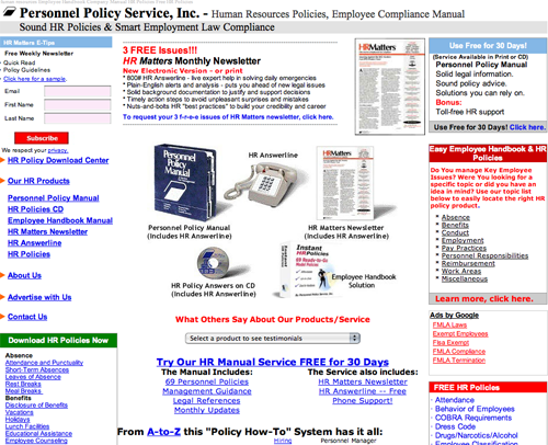
The Personnel Policy Service homepage is the company’s gateway to its online customers and prospects. Another of the company’s websites that sells legal guides and “writing and decision making kits” for employers appears at HRPolicyAnswers.com. Still another offers Instant HR Policies.
However, these separate sites do not constitute a Mequoda System website network and the Personnel Policy Service homepage is not a Mequoda editorial website hub. But it could be, with some judicious redesign.
Let’s see how the Personnel Policy Service homepage measures up using the Mequoda System Website Design Guidelines.

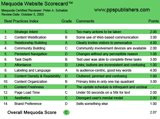
PPSPublishers.com’s Mequoda Scorecard
{text_ad]
1. Strategic Intent – C
The Personnel Policy Service website is unfocused and overwhelms with too many choices. It can’t decide whether to provide the visitor with free samples of useful content, or engage them in commerce by immediately and simultaneously selling specific premium products—so it does both.
Unfocused websites generally confuse, and this one is no exception. And as if all the other offers on this page aren’t too much, the Personnel Policy Service website also displays Google AdWords that when clicked, take the user away to offers for competitors’ products. What are they thinking?
In an attempt to squeeze a little additional revenue out of the site, the Google Search function also appears on some pages. This is another false economy that only serves to make the site more cumbersome and tedious.
This should be a cardinal rule for graphic designers in all media: when in doubt, simplify. The customer seeks the calm and the quiet reassurance of peace and harmony. At least, I do. Perhaps members of Generations X and Y prefer lots of disquieting activity. But even if they do, lots of choices are not helpful if they confuse the user. Cognitive dissonance diminishes confidence and sales. The confused website visitor clicks off to someplace else.
If this were my client, I would advise Personnel Policy Service, Inc., to redesign its homepage as a simple sales letter landing page and focus on only two objectives: telling its story (explaining to the user what business it is in) and offering its free email newsletter to begin the online relationship. From the landing page/homepage it could then offer links to each of its premium products, as well as its generous collection of free online resources.
Alternatively, Personnel Policy Service could set up all of its free sample content on its homepage as a Mequoda Website Internet Hub. And links to other commercial websites, where each premium product would be promoted individually, could be satellites.
Either configuration would work better than the existing site design.
2. Content Webification – B
True, the first-time visitor can 1) sign up for a free weekly email newsletter, 2) request three free issues of the HR Matters print newsletter or 3) use the Personnel Policy Manual free for 30 days.
Additionally, the user can immediately download model human resources policies, search the site for specific information, read customer testimonials or point and click to explore other products and offerings.
All this is good use of Internet technology. I simply wouldn’t crowd it all onto the homepage, where contrasted with the paid product offers and the uninspiring graphic design, it tends to overwhelm the user. (See #1 above.)
3. Relationship Building (Personalization) – A
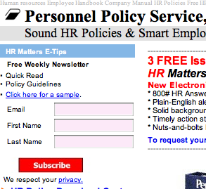
The offer of the free weekly email newsletter appears above the fold in the top left quadrant of the homepage, as well as on many other of the site’s pages.
There are at least two other free offers. Personnel Policy Service is determined to get the user’s name and other details, as it should.
If the user isn’t put off, as I am, by the look and feel of the website, then Personnel Policy Service probably captures their name and email address.

The offer of the free weekly email newsletter appears above the fold in the top left quadrant of the homepage.
4. Community Building – C
A Contact Us, or feedback form appears on the site, and is a welcomed feature.
Then again, I found no public forums that might encourage feelings of belonging, enthusiasm or loyalty. However, the company HR Answerline is a subscription product that enables members to call a toll-free phone number and receive more detailed information on a particular topic. The HR Answerline is also available during a free trial review of any of the company’s services. Smart policy, but not immediately clear.
Given the legal exposure that an online discussion forum could present, and the expense of maintaining a forum, I understand why Personnel Policy Service might have considered and rejected the idea. Still, I could make a case for this being a strictly members-only website, as is Diversity Inc., for instance. A member site is a viable business model for selling HR information, but the owners of Personnel Policy Service have not gone this route.
5. Persistent Navigation – D
Here’s another weakness of designing such a busy, unfocused website. The Personnel Policy Service site leads the user off in too many directions without a clear path back.
In some cases, the hypertext links connect to other websites owned by the company, where separate products are offered and sold from their own shopping carts. That would be acceptable if the hub and satellite model were used consistently, but it is not. This configuration is a hodgepodge.
Many pages at the Personnel Policy Service site don’t even include a link back to the homepage.
I recommend a company logotype or other graphic identifier be used at the top of each page, and that the graphic image be used consistently as a link back to the homepage. Such a device is sadly lacking here.
Overall, the layout is inconsistent and confusing. Additionally, there are serious deficiencies with regard to affordance. (See # 7.)
6. User Task Depth – B
In fairness, the determined user can sign up for at least three free offers, order premium products, search for content and contact customer service. But improvements in graphic design/organization, navigation and affordance would make this so much more attractive and user-friendly.
7. Affordance – D
More dissimilar ingredients on display here. Some hypertext links are blue, some are black. Some are underlined, others are not. Some change color when clicked; some don’t. The presence of Google AdWords adds to the disharmony and inconsistency. Yuck!

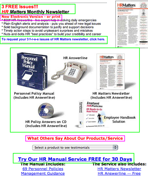
Very dissimilar ingredients on display. Some hypertext links are blue, some are black. Some are underlined, others are not. (Those in the green boxes are links, those in the purple boxes are not.)
8. Labeling and Language – A
In my model of the world, the Personnel Policy Service website has a good representation of key words and phrases of interest to its presumed audience of human resources professionals. The HR crowd uses a professional vocabulary (read: jargon) all its own. Sure, those words are found on this site. Totally appropriate. If you’re not an HR professional, you wouldn’t have any interest in visiting here.
9. Readability (Content Density) – D
There is generous use of white space, but that’s about the only design element I like. The size of the typefaces, the deficiencies in Affordance (see above) and inconsistencies in Navigation (see above) conspire to make this site difficult to use and impossible to love.

The size of the typefaces, the deficiencies in Affordance and inconsistencies in Navigation conspire to make this site difficult to use and impossible to love.
10. Organization (Marketing Quadrants) – B
The three free offers that capture the visitor’s email address are all present in the top two quadrants (above the fold), but that doesn’t translate into a navigation pattern that I approve. Redesign of this site by a website design professional is highly recommended.
11. Content Freshness – F
Absent any evidence to the contrary, it appears that the Personnel Policy Service website is stagnant until a new policy or product offering is developed.
12. Load Time – C
The Personnel Policy Service website loads in 26.25 seconds on a 56K according to the webpage analyzer.
13. Aesthetics – C
Recommendations for improvement: work out a color scheme and use it consistently throughout. Limit the use of different typefaces, weights and sizes. Organize the content around the user. Address the Affordance issues. (See #7, above.)
14. Brand Preference – D
The graphic design of the Personnel Policy Service website, the printed Personnel Policy manual, the HR Matters newsletter and each of the company’s other products is inconsistent. Branding is enhanced when one graphic design treatment is used uniformly throughout the product line. There is not much evidence of that here.
Conclusion
I have no doubt that Personnel Policy Service publishers is a successful business, or that its products are reputable and authoritative. The company succeeds in spite of its website, which could be vastly improved with a change in its organization and a new graphic design treatment.


