MotorTrend.com Demonstrates That a Mequoda Internet Hub Can Be Informative, Attractive, Engaging and Smart, While Linking Visitors to Both its Own Satellite Sites and Those of Other Publishers
I started reading Motor Trend, Car & Driver, and Road & Track magazines back in junior high school. My lust for fast, flashy sports cars began about the same time my hormones attacked me. That Freudian connection, which I was unaware of at the time, has not been lost on automobile manufacturers or car magazine publishers. Cars, youth, sex, speed and power all augur well for commerce. It wasn’t until many years later that it dawned on me exactly who subscribes to publications about exotic, expensive automobiles. It’s not the rich guys who already own and drive them; it’s the rest of us poor schlubs who want to. Magazines like Motor Trend help us indulge our fantasies and get us closer to our dreams.
So much for Psychology 101 and my misspent youth. Today’s question is, Who reads Motor Trend online and why? That turns out to be the guy researching a car to buy (or getting closer to his dreams of buying one). And what’s in it for the publisher to give away so much free content? Unlike Consumer Reports magazine, where access to the online content costs the same as a subscription to the print publication, MotorTrend.com is free. Well, almost free. But I’m getting ahead of myself. Let’s kick the tires at MotorTrend.com and run it through the 14 Mequoda Website Design Criteria to see how it performs.
- Browse, search, sign up for the free email newsletter, watch a video, or contribute to a discussion forum—they’re all quite easy to do on this site.
- With its 11 discussion forums, there is new user-contributed content available at MotorTrend.com every day.
- MotorTrend.com is a very busy site, but does not overwhelm or intimidate.
- As a card-carrying member of the terminally clumsy set, I discourage the use of drop-down menus and small hypertext links and buttons in website design.
- This site provides an encyclopedia’s worth of free information, yet finds ways to monetize (make money from) the user with links to other website properties.
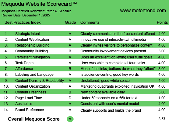
MotorTrend.com’s Mequoda Scorecard
[text_ad]
1. Strategic Intent – A
MotorTrend.com is a virtual online buyer’s guide for car and truck shoppers. It displays many of the same articles and reviews that are available in the print Motor Trend publication, but like any good electronic library, here the content can be searched, printed and emailed.
And why does the publisher give away so much content that the user must pay to receive in the print edition? They must have a business strategy that profits from this generosity, right? You bet they do! And it makes a lot of sense because MotorTrend.com is a powerful and effective Mequoda Internet hub.
This site drives traffic to dozens of other sites whose owners sell cars, insurance, financing, electronics, custom car conversions and driving schools. And unlike most Mequoda hubs, many of the satellites in this Mequoda network are not the property of Motor Trend or its parent, Primedia, Inc..
Primedia is a $1.1 billion media company that owns more than 120 publications, 115 websites, 100 events, 10 TV programs and 340 branded products. Primedia publishes such well-known consumer magazine brands as Automobile, Creating Keepsakes, In-Fisherman, Power & Motoryacht, Hot Rod, Snowboarder, Stereophile and Surfer. The company also produces approximately 180 email newsletters, more than 20 trade shows and over 450 books and directories. Clearly, these folks know something about publishing—both print and online—and MotorTrend.com reflects that expertise.
Many of the links from the MotorTrend.com hub go to IntelliChoice.com, which features even more prices and reviews for new and used cars, SUVs and trucks. Primedia owns IntelliChoice, which publishes the IntelliChoice Buyer’s Guide, a quarterly magazine, as well as the award-winning annuals, The Complete Car Cost Guide™ and The Complete Small Truck Cost Guide™. Notably, the IntelliChoice Buyer’s Guide does not contain paid advertising.
2. Content Webification – A
The Future Vehicle Forecast portion of this website is premium content. You can get access by entering a subscriber number from your magazine’s address label. Alternatively, you can agree to sit through a short online video from Honda about its newest line of pickup trucks. This is the same business model you are familiar with if you watch television—access to free content if you sit through the commercial messages.
Your reward at MotorTrend.com is “sneak” pictures and commentary about 2007 and 2008 model automobiles—some of them still on the designer’s drawing board.
Today’s online poll asks for your yes or no vote: Should Jaguar revive the XKSS? (A car described as a modern-day version of actor Steve McQueen’s favorite sports car.)
Other examples of content webification on this site include:
- A new vehicle buyer’s guide
- New car price quotes
- A survey about used cars
- Online video clips (very high production values; worth watching)
- Motor Trend Radio forum (Discuss the latest show with listeners and host Bob Long.)
- Eleven other discussion forums
- Downloadable gallery of photography (can be used as computer desktop wallpaper.)
- Additional online polls
- Archived columns, articles, and photos
- A powerful site search engine
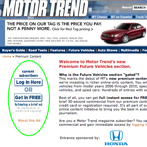
Alternatively, you can agree to sit through a short online video from Honda about its newest line of pickup trucks. This is the same business model you are familiar with if you watch television—access to free content if you sit through the commercial messages.
3. Relationship Building (Personalization) – A
Here’s a clever little headline that appeals to me: “Get on the inside track! Sign up for the Motor Trend newsletter!”
Isn’t that what we all want? To be on the inside track? To know more than others about what’s really going on? Exclusivity and scarcity are two powerful motivators.
If that weren’t enough of an incentive, signing up for the Motor Trend e-Newsletter today entered me in a sweepstakes for a mapping GPS combo—Microsoft Streets & Trips 2006 with a GPS locator. Additionally, the site wants me to subscribe to the print edition of Motor Trend, and offers 12 issues for only 83 cents an issue—a 79 percent savings off the cover price!
Also, when signing up for the free email newsletter, I had the option to receive special offers and promotions from Motor Trend and its premiere partners. Unfortunately, there was no auto-responder message that attempted to verify my new subscription with a double opt-in confirmation. That’s an oversight that MotorTrend.com can and should correct.
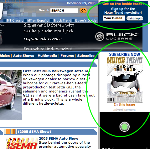
The site wants me to subscribe to the print edition of Motor Trend, and to sign-up for their free email newsletter.
4. Community Building – B
Some sites are more oriented toward relationship building than others. This one could require you to log on for access—even if that access is without charge—and then welcome you back by name each time you return. It does not, but I can’t decide with certainty if this helps or hurts the site’s popularity.
However, MotorTrend.com does have those 11 very inviting discussion forums, where enthusiastic users have made more than 17,000 posts. Plus, there’s enough terrific content here to encourage any car lover to bookmark this site.
5. Persistent Navigation – A
This site is simple to use. There are many levels, but it is not confusing to navigate or find your way back. Often, when a hypertext link is clicked, a new section opens in a new window, which is a design feature I always applaud.
6. User Task Depth – A
Browse, search, sign up for the free email newsletter, watch a video, or contribute to a discussion forum—they’re all quite easy to do on this site.
7. Affordance – B
Affordance means something does what it looks like it will do. Everything on MotorTrend.com conforms to this user’s mental model. There are no surprises or inconsistencies here.
But then there’s the matter of this site’s extensive use of drop-down menus. I am not a fan of drop-down menu items for several reasons. First, because they are not search-engine friendly. Second, because good affordance means that the site shouldn’t require the user to mouseover the page looking for links.
And third, of importance to seniors, because drop-down menus are often clumsy to use, requiring more dexterity with the mouse than many older people possess. As a card-carrying member of the terminally clumsy set, I discourage the use of drop-down menus and small hypertext links and buttons. So I awarded only a “B” in this category.
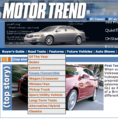
As a card-carrying member of the terminally clumsy set, I discourage the use of drop-down menus and small hypertext links and buttons.
8. Labeling and Language – A
How easy it might have been for MotorTrend.com to resort to using a lot of jargon that is only familiar to gearheads. (See, gearhead is a slightly derogatory word for automobile technician or hobbyist.)
I introduced that bit of automotive jargon, MotorTrend.com doesn’t. It sticks to plain old vanilla terms like buyer’s guide, road test, future vehicles and auto show. There are no rolled and pleated muffler bearings or other incomprehensible car jargon here. You don’t need to be an automotive engineer to understand or use this site.
That doesn’t mean the articles aren’t rich with the kind of descriptions and details that make car lovers salivate with anticipation. It simply means the site is labeled appropriately for the non-technical user.
9. Readability – A
Despite the sheer volume of information that’s offered here, the designers have found a pleasing layout that organizes the content appropriately and employs plenty of white space. Of course, part of the way they achieved this is through the use of drop-down menus (see Affordance).
10. Organization (Marketing Quadrants) – A
This site employs a relatively narrow width with an alternating two-column, then three-column format, which leaves a relatively wide, nearly-unused area of white space along the far right. This design seems to work just fine to focus attention and move the user’s eyes across the homepage in search of the most important information.
The critical navigation links are above the fold. And there are hypertext links everywhere else, as well. MotorTrend.com is a very busy site, but does not overwhelm or intimidate.
11. Content Freshness – B
With its 11 discussion forums, there is new user-contributed content available at MotorTrend.com every day.
It appears that the publisher adds some new content at least weekly, and the site is certainly updated monthly when the articles from the latest Motor Trend print magazine are added.
Also, there are references and links to upcoming car shows throughout the world, as well as current automotive news features. The online user poll changes frequently.
12. Load Time – D
MotorTrend.com downloads in 69.22 seconds, according to the Web Page Analyzer.
With 57 graphic images totaling 225,331 bytes on its homepage, this site is no speed demon. The designers might consider optimizing the images for size, combining them and replacing graphic rollovers with Cascading Style Sheets (CSS).
13. Aesthetics – A
This is an attractive website, consistent with this user’s mental model.
The colors and typefaces used are simple and smart. As with most great graphic design, it’s understated. Once again, less is more.
14. Brand Preference – A
The colors and homepage banner are consistent with the print magazine’s well-established brand. MotorTrend.com encourages return visits. If I were researching a new car purchase, this would be my jumping off point. I’ve already bookmarked the URL for future use.
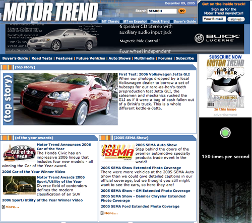
The colors and homepage banner are consistent with the print magazine’s well-established brand.
Conclusion
MotorTrend.com works well on many levels. It provides an encyclopedia’s worth of free information, yet finds ways to monetize (make money from) the user with links to other website properties. Some of these sites are wholly-owned, some are owned by others. Each is a potentially profitable opportunity for the publisher of Motor Trend.
This commercial enterprise is admirably supported by solid website design and graphics, easy navigation and “webification” features that are fun to explore and use.
I’ve now completed more than a dozen website design and landing page reviews and I haven’t been an easy grader. I think MotorTrend.com is the first website to which I’ve awarded a solid “A,” despite some of its evident weaknesses.


if you really need to become expert in driving, your really need to enroll in a driving school *`-