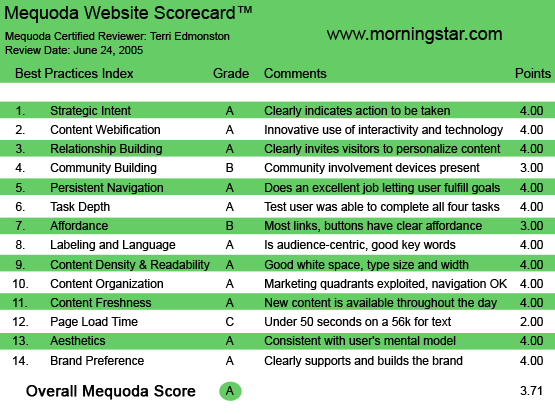
We are still in the dawn of the Internet age and Morningstar.com is one of the early lights in the crowded online investment information sky. A well-designed site with a Milky Way of investment tools, Morningstar.com earns a glowing A on the Mequoda Website Scorecard.
By using Mequoda’s 14 website usability and design criteria, we’ll see what Morningstar does well—and the few spots where the light isn’t as bright. Of particular interest is the well-articulated line between paid and free content, and the excellent webification of a publication that started its life in 1984 as a fund rating guide for investors.

Morningstar.com’s Mequoda Scorecard
[text_ad]
1. Strategic Intent – A
Morningstar is primarily a subscription and licensing business, with additional revenues from individual product sales and advertising. This 20-year-old public company had revenues of $179 million in 2004 from providing investment research via Internet, software and print-based products. Flagship print publications include Morningstar Mutual Funds, Morningstar StockInvestor and Morningstar FundInvestor. Content is also distributed via their websites: Morningstar.com (launched in 1997) and MorningstarAdvisors.com.
This website review looks at the Morningstar.com site from the perspective of one of the three customer segments: individual investors. This segment makes up a little less than a third of the revenue, with the rest coming from Advisors and Institutions. Furthermore, Morningstar.com has sliced the online investment information into free, registered and paid premium content areas.
The strategic intent for the company hybrid site is clearly two-fold: Morningstar’s first priority is increasing the number of paid subscriptions. Second, they want the greatest possible number of visitors to increase advertising revenues. As always, the former requires putting unique content behind a firewall, and the second requires giving great content away for free.
The goal of the individual is to find useful financial content, in the form of analyst reports, stock quotes, fund ratings, news, tools and charts to slice and dice the data. Users will pay for unique content when the benefit is clearly presented.
What is Morningstar’s score on designing the site to maximize strategic objectives? No question, they get a gold star on this one. What the company wants you to do—sign up or subscribe—is very clear to the user from the first moment you land on the page, and it is written with benefit-oriented copy. Note: I would like to add some kudos here for the careful prioritization of the free registration pitch vs. a paid premium membership. Priority is given to the soft-sell free registration.
For example, when landing on the homepage as an unknown user, a free registration pitch is the first thing I see. To test the site, I don’t register and instead just click the ad off and go on reading. Now, I’m shown prominent house ads (within the nameplate) for the 14-day free trial, and while I browse content I am constantly reminded of the content I can’t access without paying for it. Like WSJ.com, the house ads disappear once I’ve subscribed, however I am always aware that I am reading paid content, and that I’m getting something that others aren’t. The success of these strategies is seen in the 3.7 million registered users, and over 100,000 paid premium members.
As this is a hybrid site with two revenue streams, we also scrutinize usability factors for the other customer segment—advertisers. Many subscription sites leave the advertisers out in the cold, but we’re glad to say Morningstar shines brightly. Advertising inventory is well placed as we see in the marketing quadrants section, and the media kit is online and one click away from the homepage under “advertising opportunities” in the footer. The only improvement I would make is to add a link for advertisers to the company site pages, which is a more visible location as a global navigation link at the top of the homepage.
2. Content Webification – A
Financial websites have some of the best opportunities for interactive tools—think of all that data, ready to be crunched into a thousand different outputs. This audience loves spreadsheets, they love charts and graphs and they love seeing how the results differ when you change the inputs or add variables. A perfect audience for interactive tools.
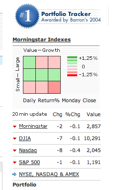
Morningstar’s well-known nine-square Morningstar Syle Box™ for categorizing Value/Growth over Small/Large stocks, created in 1992, is an example of excellent webification. This print-era graphic shows a quick view of the market using green and red for ups and downs, and is clickable, with each square calling up the list of stocks with current price quotes and other data, from that segment.
Another excellent—and a financial site standard—interactive tool is the Portfolio Tracker. Recently ranked as #1 by Barron’s, Morningstar’s Portfolio Tracker allows the user to import information from other software. Users can also learn more about their own portfolio using additional tools such as the Morningstar X-ray which shows views similar to Quicken, with asset allocation pie charts, style box diversification grids, sector views and world map graphics. Hours of fun for the numbers geek.
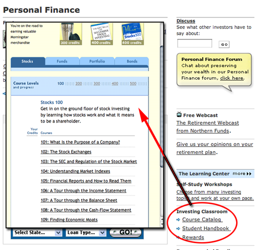
I am disappointed that I didn’t find much in the way of audio or video options, and if the rest of the tools weren’t so well done would mark them down for lagging behind their peers. However, glitz isn’t everything. Morningstar offers 16 interactive tools well targeted to the audience needs, along with easily sortable tables and charts throughout the site, and a rather amusing self-study classroom complete with quizzes. They earned their A in this category.

Morningstar offers 16 interactive tools well targeted to the audience needs, along with easily sortable tables and charts throughout the site, and a rather amusing self-study classroom complete with quizzes.
3. Relationship Building – A
The popular Portfolio Tracker acts as an excellent relationship-building device, Morningstar was smart to place their development attention on this tool, as it not only personalized my homepage for me (with very specific content that I come to the site to find), but it also gives me a reason to come back frequently, as I have invested time in building this portfolio and therefore have switching costs to go to another provider.
A misstep is the lack of acknowledgment that I am logged in and recognized by the site. There is no “Welcome Terri” message; the only way to tell I am logged in is the change of the “login” button to a “logout” button. This is a minor issue—unless I use a shared computer. At which point the user needs to be hit over the head with the fact that the site “knows” who they are so that they remember to logout and protect their own privacy.
4. Community Building – B
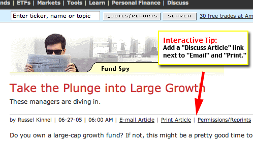
The community involvement device employed is a discussion board. Reasonably well promoted through a link on the top navigation “Discuss,” and occasional internal ad boxes displaying “Chat,” they are also reasonably well attended. In general, financial sites do tend to fall down a bit on this aspect, as they shy away from the touchy-feelyness of community building. We disagree with this premise, as sites like Amazon and WebMD have excellent community building technologies that have greatly contributed to their high numbers of site traffic. Users appreciate the opportunity to participate and to meet others with similar interests. Morningstar has done a better job than competitors here with 17 different forums, but I would like to see the forums more visibly integrated throughout the site. For example, in the article navigation, “Email Article, Print Article,” “Discuss Article” could also be included to encourage readers to start a conversation.

Morningstar has done a better job than most with 17 different forums, but the forums should be more visibly integrated throughout the site. For example, in the article navigation, “Discuss Article” could also be included to encourage readers to start a conversation.
5. Persistent Navigation – A
The global navigation links at the top of the page are an excellent way to immediately direct visitors to their appropriate site within the Morningstar network. I might not agree with every link they’ve placed there, but from a usability perspective, it’s a great first step to put links like Company Site and Company News separate from the rest of the content site.
Within the content areas of the site, a simple and consistent top navigation uses easy-to-understand words such as: “Stocks,” “Funds,” “Tools” and “Discuss.” Visitor actions such as Search, Login/out and Register are given buttons so that they stand out within the nameplate region. Content is displayed and linked throughout the center area.
All of the above navigation stays consistent throughout my visit. Area-specific navigation, which needs to change based on the page content (such as “Email” and “Reprints” links for articles, or forum navigation links like “Forum Archives”) are displayed within the center area directly next to the content they relate to.
6. Task Depth – A
Tasks:
- Get free information task: Yes. This was easy, as content links were well organized and clear.
- Change my email preferences task: Yes but… This was a toughie. I looked for “my account” or “preferences” or “subscriptions” or any other word I can think of in the site navigation. I couldn’t figure it out for a while. Finally I clicked on “Membership” in the global navigation above the nameplate. I was happy to see a well-designed, user-friendly way to manage all of my information preferences. But I don’t like how long it took me to find it. I would blame this on the link location; it was placed in a section that I had mentally prescribed as an area that would take me off the site. It was next to the Company Site, which I had clicked on, and already knew brought me to a different Morningstar website. It would be better to keep the link to my preferences next to the login, that’s where I logically looked for it.
- Subscribe task: Kind of. Subscribing to the sites’ Premium Membership is easy and well promoted. However as a site with print and online products, there is a huge missed opportunity/problem. Print subscribers often go to the Web property to manage their print subscription—in the consumer’s mind the website and the print products should not separate customer service options. There was no visible way to do this on the site, because Morningstar puts the print products on a different site—advisors.Morningstar.com. While this is an excellent segmentation for the content, subscribers will want to access their information from any company site. It’s like a company telephone operator telling you that you have to hang up and redial to call your extension. Not fun.
- Become a Site Advertiser task: Yes. I clicked on the Advertising Opportunities link and was given a full media kit with contact information.
7. Affordance – B
The very clear affordance on the site, obvious links and buttons and clear explanations of the few icons, was really a pleasure to be able to ignore. The less a user has to take conscious notice of the methods by which they must navigate, the better.
Sites that separate content into free, registered and paid user levels often face the dilemma of how to explain to users what they can get and what they can’t. They want users to see the amount of content behind the firewall, but also with a clear pitch to pay for that content. Like competitor site Hoovers.com, Morningstar uses an icon next to each paid content headline or tool. Their plus symbol icon doesn’t make a lot of visual sense by itself, but it is clearly labeled with “Premium Content” often enough that the message came through unobtrusively and clearly.
What knocked the site down from an A grade were the following problems:
- The Register and Logout buttons that appear next to each other in their own little upper right section of the site started out with my approval. Then I became a paid member. Now “Register” becomes a pink “Premium” button. What? Why? All I can think is that it wants to sell me something more—since it’s next to another action button, and the last time I clicked there I was brought to a form. But no, clicking on “Premium” reveals a pop-up with a list of the premium content. I am thrilled they are reminding me what a good deal I’m getting as a premium subscriber. But I hate clicking on something and being surprised by the result.
- Again, Click + Surprise = Bad. Right next to the search bar on the top of the page is a text link advertisement. This might be a great place to get click-thru for advertisers, but to a user it seems like part of the navigation. It isn’t clearly marked as an advertisement, and as a user I assume by the location that the link relates to the Search function. For example, one text link stated: “Need help managing your money?” And the first thought in my head was that they would search for money management articles within the site. Nope, I went to the advertisers’ landing page. Unexpected, and unpleasant, usability.

Right next to the search bar on the top of the page is a text link advertisement. Unexpected, and unpleasant, usability.
8. Labeling and Language – A
Labeling and language on the site were excellent, content and navigation contained a good dose of audience-centric keywords without losing clarity.
9. Readability (Content Density) – A
The site is exceptionally readable—plenty of white space without being sparse. Section heads are graphically separated and everything flows well.
The one complaint involves the text color, which is a dark grey (#333333 for you HTML jockeys). Putting on my aesthetic critique hat from art class, I believe the red logo and heavy black nameplate have given the page a stark look, and the designer is using the grey text as an attempt to counteract that. But it isn’t a fair trade-off from a readability standpoint. The visual prioritization of elements based on eye-catching colors puts content at the absolute bottom!
- Advertising – Multi-colored and animated
- Logo – Bright Red
- Nameplate – Heavy Black
- Navigation bar – Light Blue
- Content – Dark Grey
10. Organization – A
All four quadrants above the fold are well exploited for primary links, content and marketing tasks. Content of course is in all four sectors as it is in the center of the page. The upper left, right and lower right all contain both house, and advertiser, ad space, using banners and text. The lower left quadrant is used for additional content navigation and internal feature promotions.
11. Content Freshness – A
It’s pretty hard to publish stock information without excelling in the content freshness category. As I write this, my computer flickers every 15 minutes as the site refreshes itself with NASDAQ quotes. I also notice the 3×3 grid slowly changing colors from green to red—not a good day I gather.

I notice the 3×3 grid slowly changing colors from green to red—not a good day I gather.
12. Load Time – C
Uh-oh. Morningstar is barely scratching by with a C here. Web Analyzer results show a 47 second download time for the homepage on a 56K modem.
13. Aesthetics – A
Serious and open is the general aesthetic impression. The color palette is not frivolous. A bright red logo on a black bar visually communicates a strong authoritative voice. The grays and blues on the rest of the site soften it enough for easy reading, and a generous use of white space keeps the eye relaxed. The style matches the high-end user mental model (average annual household income is over $100,000) and is quite attractive to boot.
14. Brand Preference – A
Morningstar.com, Morningstar Fund Investor, Morningstar StockInvestor, Morningstar Mutual Funds, Morningstar Advisors, Morningstar Associates, Morningstar Managed Portfolios, Morningstar Principia…I could go on, but I think the point is made. The extensive product line clearly supports the brand. The Morningstar.com site design also exhibits this clear, strong brand management strategy.
Conclusion
I’m happy to give Morningstar.com an A on the Mequoda Scorecard. As we’ve seen, this star shines brightest in the strategy and content webification sections, and dimmest on page load time and community building. My lasting impression after combing through the pages is one of a well-executed site that matches the audience, manages strategic goals, and provides a pleasant and usable information service.


