Rattling a Stick in the Internet Swill Bucket
It’s a small wonder that Monster.com posts multiple millions in revenue from its efforts to unite employers and job hunters. The TV spots are downright seductive… just plain folks talking about their dream jobs and fairly gurgling with sincerity and hope. What could be simpler? Post your resume and wait by the phone.
At first blush, Monster.com appears to be an unemployed person’s best bet… hundreds of thousands of jobs just a few keystrokes away. But let’s take a moment to run it through the merciless Mequoda Website Scorecard™ system and see how Monster.com stacks up. For this test, we’ll be visiting the job seekers’ section only.

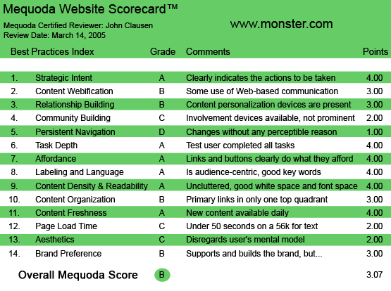
Monster.com’s Mequoda Scorecard
[text_ad]
1. Strategic Intent, or Purpose – A
Someone once said, “Advertising is the rattling of a stick in a swill bucket.” In other words, a successful advertisement must answer the question that is on the mind of every current and potential customer: What’s in it for me?
To be effective in a website, we have to let our customers know what it is we want them to do and why it will benefit them to do it. That’s the essence of “strategic intent” and I’d have to say that Monster.com does a good job of answering those very important questions.
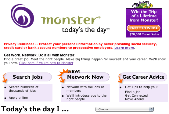
“Today’s the Day,” says the opening page. “Get work. Network. Do it all with Monster.” Three simple invitations follow that optimistic proclamation: Search through Monster’s “hundreds of thousands of jobs,” Network with “millions of members,” and “Get career advice.” Nothing too complicated here. The site is telling potential customers that it has scads of jobs and a ton of help… just click on the button and here we go.

2. Content Webification – B
Monster.com has a big job when it comes to moving visitors through its staggering volume of available information. Type in just about anything into their keywords box, select a wide geographical area and you could easily be looking at several hundred jobs… maybe even thousands. Narrow your search and the numbers become more manageable. I can’t say that I was dazzled by Monster’s use of available technology. The “apply online” function is handy, as are features like the “about us” information on the individual jobs. Most of the site’s functions work on a workhorse level that gets the job done without a lot of flashy technology… and that’s probably not a bad approach. People come here for jobs… not to be dazzled by technology.
3. Relationship Building – B
When it comes to encouraging visitors to cough up email addresses and other personal information, Monster is downright relentless. On my first visit, it seemed like I was filling out form after form. Subsequent visits—once they had wrung some of the desired information out of me—were less aggressive. Now, when I sign on, there’s a nice little “Welcome Back, John Clausen” message, followed by directions on what to do if I don’t happen to be John Clausen. Personally, I think they go a little overboard on that first visit. I found it a bit off-putting. I can imagine that someone dealing with job-hunting stress would find it even more so.
4. Community Building – C
Monster.com gives a lot of people lots of chances to put their information in front of the public, which is pretty much the definition of community building. The networking pages let you type in keywords and define your geographical search area. The times I attempted to use it to network in my area, I came up with prompts that said there were no such pages. Probably a computer glitch either on my end or theirs, so I’m not necessarily prepared to condemn them for it. Also, the geographical search wasn’t very tight, with information slipping in on people who were far from the area I indicated. If everything worked exactly as promised, Monster.com would be an excellent community builder. As it is, the system doesn’t quite live up to its own hype.
5. Persistent Navigation – D
I frequently found navigating Monster.com to be frustrating. Users on any effective site should be able to know exactly where they are at all times and understand intuitively how to get where they wish to go next. It often seemed like the site took me to information-collecting forms and sign-up pages when I really wanted to see specific information on one of the networking members or some other hard data. I hit the build-a-resume button at one point and was shifted to an advertisement for Kennedy-Western University. I had the feeling that the site was impatient with me if I wasn’t handing over my email address when it demanded that or some other piece of personal information. I didn’t feel in control of the navigation process. This would be particularly annoying for someone bogged down in the process of finding employment or switching jobs.
6. User Task Depth – A
User tasks on Monster.com are easy to define and are clearly described: browse the huge database of prospective employers, network with people who can help you and get career advice from people in the know. The site definitely encourages visitors to “take the next step.” Monster.com is obviously aware of what brings the visitor to the site.
7. Affordance – A
The Monster.com links and buttons are clearly marked. It’s easy to see what’s linked and what isn’t. Underlining and color-coding are used effectively.
8. Labeling and Language – A
Labeling and language on Monster.com are consistent and well within the frame of reference one would expect from its audience. The vocabulary is easily understood by anyone from construction laborers to company presidents. They have resisted the urge to use computer jargon and acronyms.
9. Content Density and Readability – A
This is a very readable website, particularly in the Career Advice section. The articles are designed with plenty of white space and paragraphs of varying sizes. The reading level is that of a typical consumer magazine. There are plenty of topics from which to choose and some surprisingly useful information imparted.

This is a very readable website, particularly in the Career Advice section. The articles are designed with plenty of white space and paragraphs of varying sizes.
10. Content Organization (Marketing Quadrants) – B
Monster.com is definitely a “take-care-of-business” outfit, full of banner advertising and opportunities to spend money on various services. They obviously never lose track of their marketing mission. I personally found the site a little too eager to market. A little more subtlety might help foster the impression that Monster.com cares at least as much about finding you a job as it does about liberating some of your dollars. I also would have liked to see some testimonials from people who have found their dream jobs through Monster.com. Perhaps there are such things somewhere in the site, but I didn’t find them… and, as a colleague is fond of saying, “If your visitor can’t find it, you don’t have it.”
11. Content Freshness – A
Obviously, a site that offers job information has to be as up-to-date as possible. Monster.com does a good job of letting job seekers know when a job has been pulled from the database. I like the practice of providing the dates when the individual jobs were posted.
12. Page Load Time -C
Monster.com loads with blazing speed… at least on my broadband connection. I checked it on the Web Page Analyzer and it came up at 38.29 seconds for a 56K. This made the grade a C.
13. Aesthetics – C
In general, the site is clean looking and information rich. I absolutely loathe their little trumpet-nosed mascot. Some of the banner ads—particularly the mortgage-selling ad featuring the undulating pig—are hideous and quite distracting.

I absolutely loathe their little trumpet-nosed mascot.
14. Brand Preference – B
As I mentioned earlier, I don’t like Monster.com’s tendency to drag me to pages that sell other products and services… especially when I’m trying to get to the section they promised. That said, however, I have to admit that they do a good job of keeping their name in front of the visitor. The thing that really drives brand preference on a site like Monster.com, though, is the job seeker’s degree of success. There again, a testimonial page—perhaps using streaming video—would be useful in building brand preference.


