MarthaStewart.com Stands Out for Integration of TV and Magazine Content Online, but Otherwise the Site is Doing Poorly on Some Key Usability Guidelines.
You almost can’t have a dinner party without someone making a “Martha Stewart” comment at some point during the evening. Beyond being a mere household name, Martha Stewart has become synonymous with home decorating, cooking and gardening—bringing beauty to all things domestic. Martha Stewart Living Omnimedia, Inc (MSLO), is an integrated media company distributing the “art of everyday living” to us in many different channels, broken down into business segments:
- Publishing – Magazines (Martha Stewart Living, Martha Stewart Weddings, Everyday Food, Body + Soul, etc..), Books, DVDs and syndicated newspaper columns
- Broadcasting – MARTHA on the Style Network, Everyday Food on PBS, Martha Stewart Radio on Sirius, etc…
- Merchandising – Home and garden products, Signature paint colors etc…
- Internet/eCommerce – websites sell advertising against content, also direct sales through the Martha Stewart Store and Martha Stewart Flowers
All these channels circle and promote each other, as Martha talks about her paint color used in the kitchen on her show, advertisers buy across the media outlets, content can be re-purposed in books and DVDs, and so on.
Looking at it from this point of view, the usability of the site MarthaStewart.com has a potentially big impact on the other business segments, so how does the website do against the Mequoda Scorecard?
- Great online video and content integration
- Weak usability in navigation and affordance
- Simplistic community tools
The video segments are hands-down the most impressive part of the site. From the first page, visitors can’t help but be sucked in to watching some MARTHA segments on the streaming video. The low points in the review are found in basic usability—the form-over-function values of the designers leaves affordance behind. While there is a nice garden of content to explore, the path is unnecessarily rocky. MarthaStewart.com is also a site with great potential in terms of community. The current online community offerings, message boards, are not sufficient. However the company has announced plans to create new functionalities, much like MySpace, for their target audience of 25- to 45-year-old women. Their strong brand has created an existing community-minded following that is desperate for an outlet. The site re-launch is scheduled for Fall of 2007 and hopefully we’ll come back then to see this scorecard grade greatly improved.
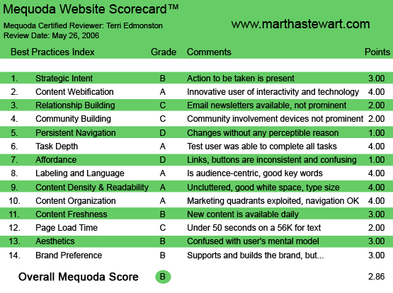
MarthaStewart.com’s Mequoda Scorecard
1. Strategic Intent – B
Integration is something that is said a lot more often than it’s practiced. MSLO uses their rich, media-content library to feed a feast to the guests at MarthaStewart.com. The company sees the website as part of a circle—for example, Internet traffic spikes with mentions on the TV show. The intent of the site is just as much about brand extension as it is about providing content to sell advertising against, and as a vehicle for product sales and subscriptions. But what are the goals of the user?
[text_ad]
User Goals:
- Find trusted information, community and entertainment
- Manage Magazine subscriptions, Subscribe, Renew
- Buy branded products
MarthaStewart.com is designed to have all of the actions present, but they are not optimized. The first-time visitor will get that there’s content here right away, but the other two aspects are not so obvious. For example, there are plenty of content entry points, graphic headlines, streaming video and beautiful images, and the integration between TV, radio and magazines comes together like a multi-course meal. The user task of subscribing/managing subscriptions is subtly served up with a link to “Subscription Services” and Subscribe house ads. The greatest weakness comes under Sales. The store is linked only from the homepage, with a separate URL MarthaStewartStore.com. The lack of promotion and limited offerings in the store seem more like a bunch of daisies than a bouquet of roses.
2. Content Webification – A
MarthaStewart.com makes good on the promise of integrated media. Almost before you know it, you’re watching video segments on how to make a great salad dressing (tip: squeeze in half a fresh orange at the last minute). The content is available to the user in multiple formats: text (articles), images (photographs and slide shows), video (MARTHA TV show) and audio (on Sirius radio, 24/7). In the plans for the re-launch they promise to improve Search so that a user will see results from all the different media (good idea, the search function was a bit undercooked).
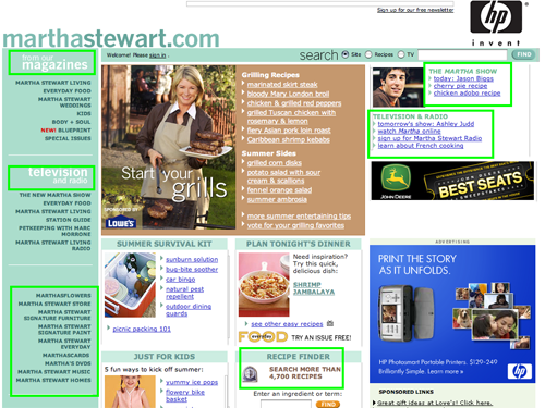
The content is available to the user in multiple formats.
3. Relationship Building – C
MarthaStewart.com could do a much better job of building the relationship with users. The site does offer a newsletter but it doesn’t do much to encourage visitors to sign up. It’s more like a plate of wheat crackers than a plate of decorated sugar cookies. For example: “Sign up for our free newsletter” is in the upper right and there is “Welcome! Please sign in.” along the top. It would be better to have a colorful graphic or pop-up ad with a premium. Nowadays, a user needs to be given a better reason, a juicier teaser, to hand over their email address than just the words “free newsletter.”
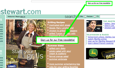
It would be better to have a colorful graphic or pop-up ad with a premium.
4. Community Building – C
MarthaStewart.com is very weak in this area, and they know it. As mentioned above, there are plans for a re-launch which promises community tools on the level of MySpace. It’s badly needed as currently there are rather messy, old-fashioned message boards that are hard to navigate around. Even so, many of the boards are busy enough, with the more popular boards enjoying daily posts. I look forward to the site improvements that I know will be wholeheartedly embraced by this loyal audience.
5. Persistent Navigation – D
I think someone at MarthaStewart.com must know what persistent navigation is, because there are moments when it slips in—probably an oversight. From the homepage MarthaStewart.com, every link brings the user to a totally new navigation scheme. To be fair, the strategy was probably that of a gateway to the specific sub-sites such as MARTHA, Everyday Food or Body + Soul, and within each of these the navigation is persistent. But as they all fall within the MarthaStewart.com URL, the result is a cut-and-paste, student-scrapbook feel. There are too many times that a link will change everything that I’m looking at and the experience is very jolting. With such inconsistent navigation, the ‘Back’ button is your best friend on MarthaStewart.com.
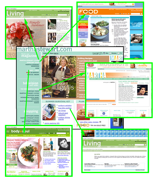
From the homepage MarthaStewart.com, every link brings the user to a totally new navigation scheme.
6. Task Depth – A
MarthaStewart.com makes it easy for a user to fulfill tasks.
A short scenario. There’s a 34-year-old woman who is searching online at work for a recipe for tonight’s dinner. She finds one she likes at MarthaStewart.com, and then emails it to her home email address. When she’s online at home, she thinks to herself that she likes the site and should sign up for a newsletter so that she doesn’t forget to go back now and then. So she clicks back to the site, and signs up for the newsletter. While she’s there, she decides to also subscribe to that new Blueprint magazine, because her house is getting a bit small and she wants to start thinking about the next move. She subscribes, and then starts dinner with the recipe that started it all.
We have tasks including finding content, emailing to a friend, signing up for a newsletter and subscribing to a magazine. All successfully accomplished on MarthaStewart.com
7. Affordance – D
The inconsistent affordance on MarthaStewart.com makes an already confusing site much worse. Some of the bad design decisions include:
- Links in the same (darker) color as the background color.
- Links in grey, all caps.
- Color, all-caps headlines that look like links but aren’t.
- No change in link for hover or visited pages.
Usability has taken a back seat to beauty here—form over function is the rule. To expand on some of the bullets above: the navigation links are just a darker tone of the “Agave” green on the navigation bar. This means that a lot of people will have trouble seeing these primary navigation links. To be certain that the greatest number of people will be able to see and use the links, the designer has to consider contrast, monitor variability and the differing ability levels of color perception. Another problem is that some links don’t look like links, such as all-cap grey text seen intermittently on the site for global navigation. After establishing color, all-cap text as a link style, it feels almost like a trick when the site presents text in this format that then isn’t a link within the center block.
Parts of the site do follow some Web conventions such as blue underlined links, and the buttons to operate the online TV are standard, so there must be some designers who know what they’re doing in the room. Maybe in the next redesign the beauty police will work with them instead of ignoring them.
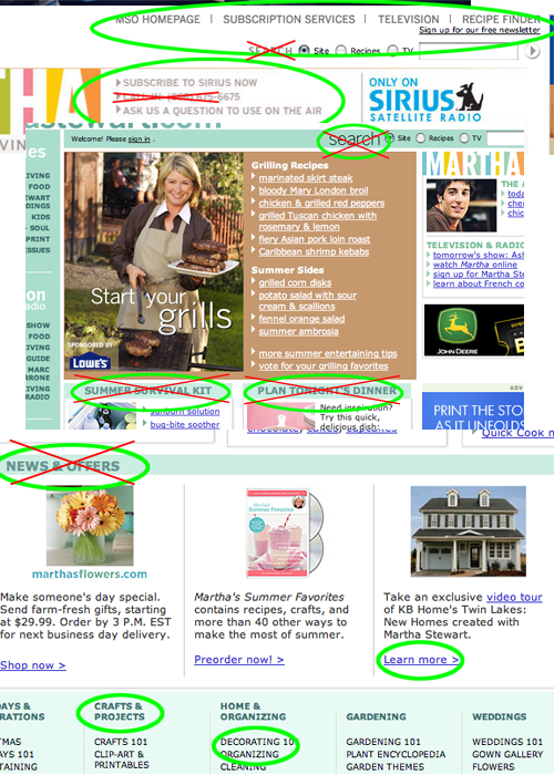
Another problem is that some links don’t look like links, such as all-cap grey text seen intermittently on the site for global navigation. After establishing color, all-cap text as a link style, it feels almost like a trick when the site presents text in this format that then isn’t a link within the center block.
8. Labeling and Language – A
Is there jargon in the worlds of gardening, cooking, home decorating and wedding planning? Theoretically there must be, but Martha isn’t stooping to that level. She is the ultimate hostess, never using language that would alienate a guest. The brand is at base about how-to, helping others to make their own lives more beautiful. Any overly erudite word choices that closed the doors to a tentative Martha-in-the-making would ruin the entire Martha Stewart promise. Simple, elegant and fun, MarthaStewart.com is selective, but never snobby.
9. Readability (Content Density) – A
Reading a Martha Stewart Magazine is more a visual experience than a intellectual one, MarthaStewart.com maintains this style with a higher graphic-to-text ratio than most content sites. While sometimes disappointed at the short text blocks, the articles are very readable and the images generally stunning and unique. The photo galleries, with large high-resolution photos, are an especially enjoyable example of online content. The nemesis of readability—advertising —is kept in the sidelines, with an occasional TV-style commercial break. Content can be pleasantly consumed in the well-balanced pages.
10. Organization – A
The layout includes a standard three columns, broken by a nameplate and leaderboard at the top. Marketing elements—either internal or external—are included in all four quadrants. Navigation and primary content links are placed on the nameplate and along a side navigation column, as well as deeper content links within the center content block. A standard eye-path across the screen would see all these elements without having to strain. As a woman known for well organized garden sheds, it’s not surprising that she didn’t let the site fall down in this category.
11. Content Freshness – B
Daily updates keep MarthaStewart.com a fresh experience encouraging frequent visits. New content isn’t explicitly promoted by a date stamp (although it should be), but it’s visually obvious with a new picture in the center of the screen every day, and new pictures in the lower section boxes. A few blogs can also be found deeper in the site content. As Martha Stewart comes to mind first as a monthly magazine, it’s particularly impressive that they’ve embraced the Web-world’s daily requirements.
12. Load Time – C
MarthaStewart.com downloads at a speed of 33 seconds on a 56K modem. The page uses minimal scripts, so the real time hog here is the graphics. A little attention to the number and size of images could bring this time down to a more seemly level. It really isn’t very polite to ask your audience to wait while you get dressed.
13. Aesthetics – B
This brand is all about looks—and not just average prettiness, but a particular type of tasteful, attractive, everyday Beauty is being sold with every publication and product. An ugly site would be in complete contradiction to the entire customer value proposition. The attractive, subtle color palette, and the liberal use of beautiful photographs start MarthaStewart.com down that path. There is something slightly off though, a little too much white space around ads, graphic elements that don’t line up well, a general lack of cohesion—pages that have slightly ratty-looking bottoms. The site, in general, looks and feels like the Martha Stewart brand, but I can’t help but think it falls a little short of the true, details-matter Martha standard. In other words—the brand here calls for above and beyond the ordinary aesthetically, and it doesn’t quite reach it.
14. Brand Preference – B
Consumers know and trust the Martha Stewart brand. The success of Martha Stewart-branded flower arrangements in a competitive, online flower selling space is an example of the power of this asset. That’s why it’s a pity that the site lets this particular category slip. For the most part the logo is consistent with the URL, the user always knows who’s publishing this content, but there are some bad user experiences as well. For example, when on Body + Soul (which is under the MarthaStewart.com URL), one of the top navigation bar links brings up (with a new URL) Dr. Andrew Weil’s Self Healing. After a bit of reading you can find out that these two sites have a content partnership. But the average user doesn’t care about that. “How did I get here?” or “Is Dr. Weil published by Martha Stewart?” are the kind of questions that might pop into the mind after this user experience. Hardly a good thing.
Conclusion
MarthaStewart.com stands out for integration of TV and magazine content online, but otherwise the site is doing poorly on some key usability guidelines. Community tools, navigation, affordance and relationship building are some areas that could use a good coat of paint. Hopefully the re-launched site in 2007 follows up on the high-quality promise of the strong Martha Stewart brand.


We are a group of volunteers and opening a new scheme in
our community. Your web site provided us with useful info to work on.
You have performed an impressive process and our whole community will likely be grateful to you.