Our Campaign to Stamp Out Bad Website Design Turns Ugly with a Visit to ManagingYourHR.com, Which In No Way Resembles What This Reviewer Imagines it Should=
For me, the two most important of the 14 Mequoda System Website Design and Usability Guidelines address strategic intent and aesthetics.
I want a website to 1) immediately communicate what its purpose is and 2) conform to my mental model of what it should look like. Admittedly, the latter is very subjective, but if a website doesn’t look right to me, I immediately experience cognitive dissonance—that state of psychological discomfort arising when a consumer tries to reconcile two conflicting states of mind.
Media experts tell us that the average consumer is bombarded with hundreds of advertising impressions every day. That’s a lot of competition for our attention. As a result, most of us have developed an anti-advertising defense. We tune out when we sense someone is trying to sell us something. Even when we’re actively searching online for a product or service to solve a problem or sooth a pain, we are cautious and skeptical.
Added to this, consumers of my generation (“baby boomers“), are often put off by frenetic activity. Advertising messages directed at us are generally more effective when they help simplify or organize the numerous choices available.
Don’t overwhelm me with too much information. That’s my plea. Help me whittle down the options. Help me focus and I’ll be more receptive to your marketing message. So it is particularly disconcerting for me to visit a website like ManagingYourHR.com and be 1) unable to figure out what’s going on there and 2) repulsed by the colors and layout.
Here’s a litany of all the ways the publishers of ManagingYourHR.com get it wrong, as measured against the 14 Mequoda System Usability and Design Guidelines.
- Managing Your HR sends all the wrong messages. It starts with an obnoxious crawling text message that is virtually unreadable and goes downhill from there.
- Whatever its intent (still not clear to me), ManagingYourHR.com doesn’t make a strong case for why you should request one of its free email newsletters.
- Sign up for the online newsletter and take an online survey are the two tasks users can complete, if you have enough patience.
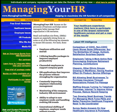
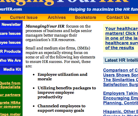
- There are too many different typefaces, type sizes, type weights, column widths and colors.
- In my conscious mind ManagingYourHR.com isn’t entirely without value. It’s an excellent example of how not to do it.

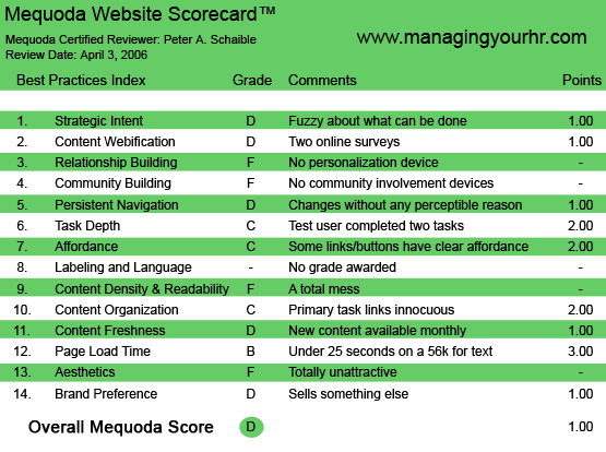
ManagingYourHR.com’s Mequoda Scorecard
13. Aesthetics – F
OK, we’re going take things out of our usual order because the visual impression of this site overwhelms me and, I predict, will prevent many visitors from ever getting any farther than having a cursory glance.
Years ago, Michael Gerber explained to me the need for every successful business to develop a consistent sensory package.
A sensory package is the way your entire business appeals to the senses of your customer. It includes how you package your commodity or service; the colors and shapes on your stationery, business cards, logo, ads and vehicles; the way you dress and the words you use on the telephone or during your face-to-face conversations with your customers. It’s everything with which your customer will come into contact.
[text-ad]
Today, more than ever, your sensory package includes your website and landing page.
Managing Your HR sends all the wrong messages. It starts with an obnoxious crawling text message that is virtually unreadable—aren’t they all?—and goes downhill from there.
The colors are inappropriate. While most men associate blue with reliability and intelligence, the shade used here is more electric than IBM blue. It doesn’t inspire confidence.
The orange hue, while highly visible, rates low in preference by both men and women. Green rates low in visibility, retention and preference by both men and women and is generally associated with leisure.
The entire look and feel of this site is inappropriate to anything having to do with human resources.

1. Strategic Intent – D
Oh yeah, I finally figured it out. This site has something to do with human resources—but exactly what, I’m not sure.
The headline says “Managing Your HR focuses on the processes of business and helps senior managers better manage their organization’s HR resources.”—whatever that means (and it’s redundant, too).
According to Gerber, in a print ad, 75 percent of buying decisions are made based on the headline alone. If those few words don’t work, it doesn’t matter what’s in the body copy. It’s already too late. The sale is lost.
In TV commercials, the buying decision is made in the first three to four seconds. What happens after that doesn’t matter. It’s too late.
In your sales presentations, you make or break a sale in the first three minutes. What happens after that doesn’t matter. It’s too late, according to Mr. Gerber. And I agree.
I spent more than an hour at ManagingYourHR.com before I could tell you its strategic intent. Maybe I’m just slow.
The strategic intent appears to be to capture your email address so the publisher can send you a free email newsletter about human resources, or one of seven other niche topics for business managers.
According to the website, “Managing Your HR is published by Information Strategies, Inc. (ISI). ISI is a media and marketing company serving small and medium businesses as an information center, and large corporations as an advisor and marketing channel.
“A majority of its efforts focus on small business and healthcare, offering corporate clients advice, strategies and unique channels into specific industrial sectors. This last service is facilitated by a proprietary community of 2.2 million monthly readers of the company’s award-winning newsletters and associated websites.
“The company does no marketing for itself or its newsletters but gains traction and new readers through referrals based on the quality and usefulness of its editorial content. More than four out of five readers are presidents and/or owners of their firms. The result is an online channel particularly useful for corporations trying to reach and influence decision makers in the small and medium size business sector.”
Translation: I think that means their newsletters are free to subscribers and the publisher is supported by advertising revenues and participation in a co-registration program.

2. Content Webification – D
This website looks vaguely like a book, magazine or other old media.
There are a couple of user surveys on this site, and the promise is “each week, a respondent who completes one survey will be selected to receive a coupon good for any book in our library.” Not much of an incentive.
This offer breaks the essential promise of an online survey, which is that the publisher agrees to share the results with the survey taker.
There are links on the site to a so-called “discount bookstore” but I couldn’t find a way to buy a book online without being led away to another unfamiliar website. And that site’s shopping cart and payment process didn’t indicate any security authorization for the transaction. Not very reassuring.
3. Relationship Building (Personalization) – F
Whatever its intent (still not clear to me), ManagingYourHR.com doesn’t make a strong case for why you should request one of its free email newsletters. There is no free download, no convincing sales pitch for the free email newsletter, or anything else of interest.
4. Community Building – F
Other than the surveys—the results of which are not shared—there is nothing here that resembles a community building device.
5. Persistent Navigation – D
It’s truly annoying how this site links and jumps the user around to other websites—presumably others that its publisher owns—without a clear route back. But then again, why would anyone want to return?
6. User Task Depth – C
Sign up for the online newsletter and take an online survey are the two tasks users can complete, if you have enough patience. Neither process is streamlined or designed to be easy and enjoyable.
7. Affordance – C
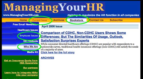
Some of the links and buttons have clear affordance. Which is like saying the brakes on a car should get a passing grade if they work some of the time.
Consistency in design and function should be the goal. This site falls short.

8. Labeling and Language – No grade awarded
The question here is whether the site uses jargon or language reflective of the organization, but not the reader.
“Channeled employees,” “employee relationship management,” “generational shifting of employee, employer needs,” “managing work force PEOs,” “independently managed custodial account,” etc.
Are these phrases part of the everyday jargon of the average human resources manager? Perhaps. I have no clue, but I doubt it.
9. Readability (Content Density) – F
There are too many different typefaces, type sizes, type weights, column widths and colors—plus that horrible scrolling content at the top of the homepage. Is it too late for them to ask the website designer for their money back?
10. Organization – C
The primary task links—assuming that means subscribing to the email newsletter—are present but not well designed or defined.
Marketing quadrants are a function of graphic design, which is this site’s major weakness.
The designer’s job is to organize the content in a way that makes it attractive and inviting to read.
He didn’t. See #13 (above).
11. Content Freshness – D
New content is available monthly. But even if this site were updated hourly, there would be little incentive to return. And presumably once you’re signed up for the free email newsletter, you get the same content delivered that way.
12. Load Time – B
Download time was 20.5 seconds at 56K as measured by the Webpage Analyzer.
14. Brand Preference – D
Links from ManagingYourHR.com to other websites abound. One is to the website of a postage meter manufacturer.
Another is to a health insurance provider. A third goes to a co-registration program bingo card.
Once again, ManagingYourHR.com sends out mixed messages that confuse and confound the user.
Conclusion
If it weren’t my job to review such poor online businesses, I would have clicked away from ManagingYourHR.com less than 10 seconds after arriving at this website.
As Mr. Gerber taught me—and I firmly believe—all buying decisions happen in the unconscious mind. Once the unconscious mind makes an emotional commitment to “yes” or “no,” it sends the conscious mind out into the world to gather all the rational reasons to support that decision. We call this rationalization.
In my conscious mind ManagingYourHR.com isn’t entirely without value. It’s an outstanding representative of a perfectly dreadful website. It’s an excellent example of how not to do it.
But your unconscious mind may come to a different emotional commitment about ManagingYourHR.com. Either way, please share your thoughts with us below.


