Knitters Review is a Great Web-product for the Target Audience of Knitters. It’s Easy to Use, Easy to Read, Easy to Interact With and the Brand has Integrity.
Knitter’s Review is a six-year-old site run by a small group of enthusiasts. Their story in the About pages tells of publishing veteran Clara Parkes, who left the rat race where she produced large scale websites and escaped to the peace of rural Maine to focus on doing something she loved. She has two compatriots who represent the operational and technical ends of KnittersReview.com (KR), and the support of her friends, family and postmistress, but not much else. In other words, a true hands-on, do-it-yourself success story.
The success of the site is readily apparent in the plethora of forum posts. This is the real deal, a community site that has been brought together via KR’s weekly editorial product reviews. The site makes its revenues through advertising and their own store. It is a true Mequoda network that is run without a large publishing company behind it—just good old-fashioned know-how.
KnittersReview.com follows the Hub model, with three spokes:
- Editorial—Knitter’s Review Magazine
- Ecommerce—Knitter’s Review Boutique
- Community—Knitter’s Review Forum
Each of these sections of the network serve a different business purpose (selling advertising, selling products, bringing in traffic) and therefore require a specific site design and navigation. Since KR is relatively small, we can cover all three micro-sites in a single review and take a look at some particular issues like global navigation, persistent navigation and branding.
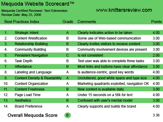
KnittersReview.com’s Mequoda Scorecard
1. Strategic Intent – A
The site is obvious for what it is on first glance—a knitting enthusiast site. The homepage shows the three sections with bullets to make it clear what is available and how to get it. Magazine, Boutique and Forum are all clearly presented.
People come to KR because they have a love of knitting. They want to learn more about it, talk to others who feel the same way, ask questions and get honest opinions, it’s just to generally take a break and enjoy. This means for the site, that content has to be free, participating has to be easy and upsell and advertising has to be carefully managed. If the site looks and acts too slick, they’ll lose the audience. The site of course does want to make a profit, so the balance of the revenu-producing activities with the service provided to the audience has to be just right. There are dozens of other knitting sites out there, so the quality of the product (in this case the size and strength of the community and the honesty of the editorial reviews) is KR’s competitive advantage.
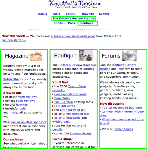
The homepage shows the three sections with bullets to make it clear what is available and how to get it. Magazine, Boutique and Forum are all clearly presented.
[text_ad]
2. Content Webification – B
Knitter’s Review is simple webified text and graphics. While the site maintains a high level of content quality with extensive, free and unbiased information, there is still a lot of growing room to fully take advantage of the interactivity made easy by Web technology. For example, as of this writing the “First Audio Report from the 2006 Maryland Sheep & Wool Festival” was available on the site. If KR turned this into a regular podcast, or even a videopodcast, it would expand audience reach.
3. Relationship Building – B
The free weekly newsletter is offered on almost every page. In the magazine site, the subscribe link appears as a link in the editorial at the top or bottom of a story and in the side navigation. However in the forum and boutique sites, the newsletter is not well promoted. While the store certainly won’t put a newsletter subscribe action in front of a purchase action, it misses the opportunity to opt-in buyers in the checkout process.
Getting an email address, permission for future contact and dropping a cookie to create a personal experience for each user is essential in building relationships with users. In a small site like KR without a large advertising budget, building a relationship to encourage repeat visits and keep each new user that finds the site is even more important.
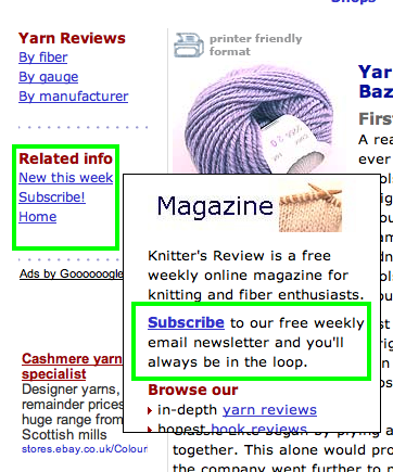
The free weekly newsletter is offered on almost every page.
4. Community Building – B
There is the stereotype in my mind of knitting as a solitary activity, most likely performed in a rocking chair by a window. Browsing the KR forums reminds me just how foolish stereotypes are. One of the clearest examples of real-world community building is seen in the “Seeking Nearby Knitters” forum thread. Knitters from all over North America find each other locally to meet up in knitting groups. If no local knitter happens to read the post of say, a lonely knitter in Montréal, then another kind knitter will post a comment on how she has a friend in Montréal, and here’s a link to the “very active knitting community” there.
A forum is a great way to create community without breaking the bank on development costs. With private messages and IM integrated into the forum, there are plenty of ways for the far flung to start close conversations. The score is only a B here, because the forum isn’t well promoted across the network. Forums can also be daunting to new users, so clearly inviting new visitors to join must be part of the process.
5. Persistent Navigation – C
The network of three KR sites do not make it easy for users to jump between them. In the Knitter’s Review Boutique, I couldn’t even find a link that went to either the Magazine or Forum sites. The Knitter’s Review logo on the Forum site does include links back to the other two in the network, however it has a different look from the logo and navigation on the main and Magazine homepage.
In as much as persistent navigation is a tricky task for small sites, KR has done well by separating the conflicting navigation needs into the three sites: the Magazine, the Boutique and the Forum. Each microsite has specific navigation schemes that are particular to the purpose of the site. Because each purpose is clear to the user (buying, reading, community) the change in navigation will also make sense. But that also means that the global navigation is all the more important if the site wants to take full advantage of the traffic generated by one part of the site—say the forums, to increase conversions on other parts of the network, say sales in the boutique or subscriptions to the newsletter. Therefore persistent global navigation is just as important as the navigation within each site.
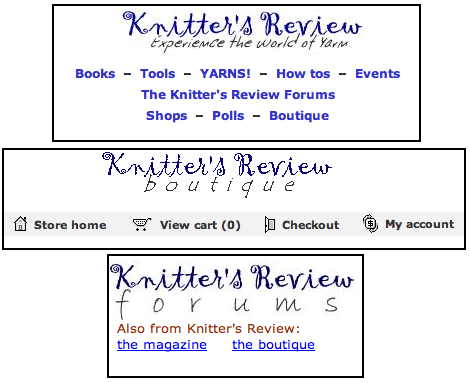
The Knitter’s Review logo on the Forum site does include links back to the other two in the network, however it has a different look from the logo and navigation on the main site.
6. Task Depth – B
What type of tasks will a user take on KnittersReview.com? The usual suspects—signing up for a newsletter, posting on the forum, buying something, and of course, searching for information. The newsletter and the forum were standard short forms and simple. The forum has a quirky down-home kind of feel to it, sort of handmade more than automated in the method chosen to handle passwords and usernames. The purchase process, which is more professionally done, is basic and painless.
The straggling thread hanging from the bottom of the sweater is Search. The site uses the Google search plugin, which will search the local site or the Web, depending on the radio button selected by the user. This works fine. The trouble is the placement. Why is the search box placed below the fold, below the ads, way down on the right hand side? Search is the favorite activity of most users. This site has six years of knitting content, there’s every reason to suspect that users will find what they’re looking for faster on search than by browsing.
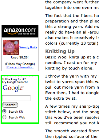
The straggling thread hanging from the bottom of the sweater is Search. The trouble is the placement. Why is the search box placed below the fold, below the ads, way down on the right hand side?
7. Affordance – B
KnittersReview.com would be getting an A on affordance if not for the random use of off-site hyperlinks. In general, links are blue underlined or bold, they say what they are and the color conventions for visited and active links are used. Graphic buttons are used for actions such as Buy and Add to Cart (I suspect these are third-party generically generated buttons. Hey, it works.)
Where the ability of the user to get what they expect falters is within an article in the magazine. In an effort to be helpful, the site links many of the words in an article to an outside website. This isn’t even a new window—it’s in the same browser window and all of a sudden the poor user finds themselves looking at a definition of an Ewe on Wikipedia, or even worse, on a totally different knitting site. While encyclopedia definitions and related articles (even from competitors) are nice additions, the link should visually indicate to the user that clicking it will take them off of KR. These links can be just as useful at the end of the article, clearly indicating that it is an off-site link. The exception to this rule is when the entire editorial article is about the off-site link, for example a calendar entry where the link goes to the homepage of the event mentioned.
8. Labeling and Language – A
All groups develop their own language and knitters are no exception. The keywords and phrases that indicate authority and a high level of expertise in product reviews and store items were sprinkled throughout the writing. This gains the respect and trust of the audience. Some knitting keywords include “fiber,” “gauge” and “needles.” I’m delving a bit into content here, but the site does a great job of by mixing education with audience-centric language in an article where seven different types of needles are reviewed (I now know the relative attributes of nickel-plated aluminum knitting needles vs swallow casein needles). This brings the keywords into the editorial, establishing expert credentials, and at the same time educates newcomers without scaring them off.
9. Readability (Content Density) – A
KR uses a fixed three column layout on a white background with black text. White backgrounds always enhance a page’s text readability, and in KR it also enhances the images, acting like a gallery wall. The index pages for each section include a blurb for a featured article with a graphic, and the rest of the page is used for topic navigation, visually balanced with bold subheads and bullets. The articles themselves are also uncluttered, with a product shot (most articles are reviews). A very nice layout feature includes key facts bolded out in the right sidebar. There, adspace on the left column doesn’t conflict with the readability.
10. Organization – A
The marketing quadrants in KR are balanced well. In almost all sections of the site, primary tasks such as content navigation, and marketing tasks such as internal and external advertising, appear in all four quadrants.
11. Content Freshness – B
New content is published weekly via the newsletter. On the site the “New This Week” navigation link takes the user to the weekly emailed newsletter presented on the site directly. The forums include daily content via user posts, which encourages the user’s feeling of immediacy—the need to return to the site frequently. A daily tip or a blog from the editorial side would bring this grade to an A.
12. Load Time – A
Knitter’s Review hasn’t let the Web get them all knotted up in a snarl, this site loads fast—on a 56K modem, load time was a speedy 7.3 seconds. And here I thought knitters were a patient bunch.
13. Aesthetics – B
If you’re into knitting, you’re into texture, color, fiber—you’re into the look and feel of things in a way that goes beyond the usual meaning of that phrase. KR serves this value in some ways: the photos of the yarns reviewed really do give a good sense of color and touch in a way that’s hard to do digitally. But the rest of the site is too bland and basic. This is great from a readability perspective, but sites need to please the user aesthetically too—they need to match the values of the audience on a subconscious, almost carnal level. A quick check at competitor’s sites shows a bit more attention to color palettes and layout.
14. Brand Preference – A
Three sites—the Magazine, the Boutique and the Forum—all hold together and support each other under the brand Knitter’s Review. The KR network exhibits this continuity with the logo and color scheme. If you look closely the logo actually changes very slightly from one site to another, which is a bit sloppy, but then maybe contributes to the handmade feel of the site. The overall sense of a single brand is strong, with consistency in editorial voice, aesthetics and subject matter. The subtle brand message—that this is the site of a fellow knitter who loves the subject and will give honest and considered reviews—is not strongly pushed into the user’s head. It simply comes through in the quality of the content.
Conclusion
Not having a big budget and dozens of programmers, marketers and editorial staff doesn’t stand in the way of a smart enthusiast publishing a great site. KR is a great Web-product for the target audience of knitters. It’s easy to use, easy to read, easy to interact with and the brand has integrity. Success isn’t always about flash and big names, sometimes a good homespun yarn is all you really need.


