Your destination for airport information.
IFly.com is a good example of a Mequoda Editorial Hub. A place to get free information about every airport in the U.S and Canada, IFly.com exemplifies most of what we describe as a successful Editorial Hub:
- The information is 100 percent free to users.
- Using a combination of advertising and affiliate commissions, they make money primarily by pushing off to other retailers.
At first glance, it looks like they are generating revenue primarily through Google’s AdSense program, as “Ads by Gooooooogle” are taking up a good portion of the homepage real estate.
Once I dive deeper into the site, I realize that they may also be making money through affiliate commissions by referring users to Hotwire.com to book flights.
Let’s see how this website is constructed and just how successful they are as an Editorial Hub by running it through the Mequoda Website Scorecard.
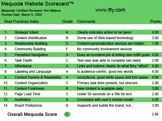
IFly.com’s Mequoda Scorecard
[text_ad]
1. Strategic Intent – A
The homepage is very simple, and the intent even more so. If the tagline, “Your destination for airport information” isn’t clear enough, directly under it, you will find an Airport Search option. You can enter a city name or airport code. If you are unsure of the code, or the exact city that you’d like to fly into, you’re given an interactive map to search. In the Interactive Map, you’re given the option to either click on a location on the map, or to click on a specific state name to the left. OK, they want me to search for information on airports. Great! And if for some reason I didn’t understand their intent, they have a convenient paragraph on the homepage that details exactly who they are and what they do:
- Welcome to IFly.com, your premier destination for airport information. Simply pick your airport and let Pilot Pete lead the way. Find everything from maps, directions, weather, parking, airport amenities, layover ideas and shops and stores in a few quick clicks. With helpful links to book flights and ground transportation, IFly.com lets you travel with ease. IFly.com…the Web’s best “passenger information card” for every leg of your trip.
On the About page, they go into greater detail about who they are and why they got started:
- About IFly.com: IFly.com was created to fill an informational void felt by many frustrated air travelers. While many websites had a piece of the information needed for a business or leisure trip, no single site offered each slice of the travel pie. IFly.com combines air travel planning, trip purchasing, and monitoring into a single Web portal. We hope you enjoy our site. IFly.com is based in Denver, Colorado.
2. Content Webification – B
The interactive map on the homepage seems like the highest level of Web-based communication technology on the website. You click on a state, and up pops several small numbered circles that represent the airports in that particular state. Once you choose an airport, they have road and map directions that are powered by MapQuest.com. Their search feature is pretty comprehensive, allowing you to search for hotels, rental cars, taxis and public transportation. This is what bumped them from a C to a B.
3. Relationship Building – D
If job number one for an Editorial Hub is to capture email addresses, then in all actuality, this site should receive an F. Yes, there is an option to sign up for a free newsletter—but not on the homepage! Available only on the features page, is a newsletter sign-up box. This is how you get to it: if you’re on the homepage, way, way down at the very bottom, you are given several links:
- About | Features | Customer Support | Privacy | Terms and Conditions
If you click on Features, you are brought to a page listing the past two months’ features and the newsletter sign-up box.
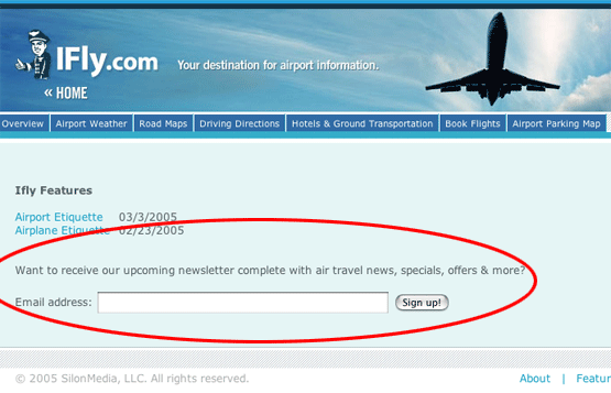
This option, to susbscribe to their newsletter, is only available on one page—and it’s tough to find.
I am very interested in signing up… if only I can find the sign-up box! I gave them a D, because technically, a relationship builder is available.
4. Community Building – F
There are no community involvement devices on this site at all. Given the nature of the site, it would benefit them to have a community feature, such as reviews of airport experiences, or a forum to discuss travel woes.
While the website is pleasing to navigate and browse, it doesn’t necessarily encourage feelings of belonging, enthusiasm or loyalty. Users are not encouraged to ask questions or contribute comments.
5. Persistent Navigation – A
This site does a decent job of letting users achieve goals. They make it easy to search for airport information. Once you find the airport you’re looking for, they make it just as easy to get all the necessary information about that particular airport. They have “second tier” navigation that allows you to click on General Info, Services & Amenities, Layover Ideas and Shops & Stores for the larger, international airports, and just General Info for the smaller, regional airports.
When you’re on the homepage, all other navigation is removed—the only option you have while on the homepage is to search for airports, either by name or location, or by using the Interactive map. Below the fold you will also find a Quick Links section, which lists all the states in the U.S.. You will also find Quick Links to Canadian airports.
At the very bottom of the screen, you will find links to About, Features, Customer Support, Privacy and Terms and Conditions.
6. Task Depth – C
If the purpose of IFly.com is to fill “an information void” by combining air travel planning, trip purchasing and monitoring into a single Web portal, then I will attempt to do just that. For the purpose of this exercise, let’s pretend I’m flying from my home in Massachusetts to Hermosa Beach, California.
To determine their grade on task depth, I assigned myself three tasks based on their mission statement:
- Plan my air travel
- Buy my airline tickets
- Monitor my flights
Having lived in Massachusetts my entire life, I know very well that I need to fly out of Logan airport in order to get to California. However, having been to California only once, let’s assume for the sake of this assignment that I’m not sure where Hermosa Beach is in relation to California airports.
So I do a search for Hermosa Beach, California, and I get no results. OK, this may be obvious since there’s no airport in Hermosa Beach, so they suggest that I do an interactive search on the map. I click on California, and I’m shown a list of airports, but still no indication of how close Hermosa Beach is in relation to any of the airports. I had to go to MapQuest to see a map of Hermosa Beach to learn that it is only about seven miles from LAX.
Maybe using Massachusetts and California was a bad example, seeing that the big airports are more obvious. What if I was flying from Boston to Middle-Of-Nowhere, Missouri, on business and I had no clue what airport was closest?
Wouldn’t it be neat if they had a feature that allowed me to search for the easiest route? It could be as simple as this:
- Find the Closest Airport or Find the Easiest RouteWhat city or town are you visiting? (enter city or town and state) What city or town are you leaving from? (enter city or town and state)
This way, I would really consider it “helping plan my air travel.”
If we tossed the coin around and assumed I knew exactly what airport I was flying to and from, then they would deserve a good grade for planning. From airport weather to road maps, driving directions, hotel and ground transportation information to airport parking maps, they really do provide a very comprehensive resource for all your airport information needs.
OK, I’m ready to book my flight. I click on Book Flights, and I’m brought to a page where it looks like I’m only given one option: to buy through Hotwire. To the right of the Hotwire box, there are Google Ads that link to other travel booking sites, but it appears as if I’m only given one option. If part of IFly.com’s mission is to help with purchasing tickets, then shouldn’t they offer more inclusive booking options?
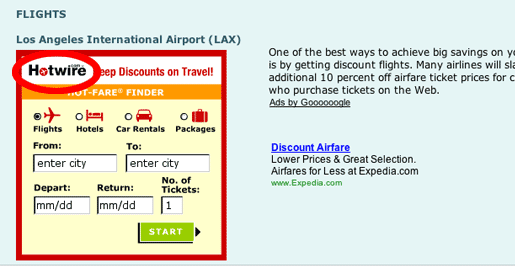
When you click on Book Flights, it appears as if IFly.com is only providing flight prices and information from one provider—Hotwire.com. Granted, there are Google Ads with additional travel sites to the right of the Hotwire box, but an unexperienced Web user may or may not realize this.
Ideally, it would work like this: Ifly.com would ask me where I was flying to and from. Then, they would yield a comparative chart that listed price quotes from various Web-based airline booking services, such as Orbitz, Expedia, Travelocity, Hotwire, Cheap Tickets, etc. This way, I’d have the option of choosing my best deal from thier list. Once I decided, then Ifly.com would link me off to that particular site to complete my transaction. If, for some reason, I decided not to book, I’d be able to go back to Ifly.com, where they saved my results, and I could continue browsing for my best and most convenient deal.
If Ifly.com is in fact supported primarily through affiliate commissions, or Google’s Ad sense program for that matter, then they could be very upfront with their users by saying something like…. Help support Ifly.com by booking your travel through these links. (Much like Bookreporter.com has done with suggesting their users buy at Amazon through their affiliate link.)
The third task is to monitor my flights. The only option to monitor them is listed under airport weather. It’s part of the second tier navigation titled Airport Delays. On this particular day, it looks like there may be some high winds delays at LAX on Saturday afternoon. OK, at least I know it’s working…but how useful is it?
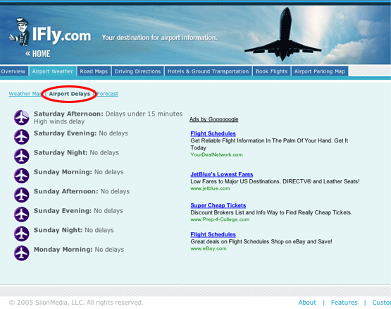
IFly.com’s flight monitoring could use a little work—as opposed to just the weather from your airport, they should be able to look up information for your specific flight.
They make a bold statement by saying they do flight monitoring. My assumption was that they had a field where you type in your airline and flight number to get exact monitoring… but maybe I’m being too pedantic, perhaps that would be too far-reaching for this site’s purpose.
I give them a C because while I was technically able to complete all three tasks, I think they have the potential to improve their task functionality.
7. Affordance – A
Links and buttons clearly do what they afford on this site. The search buttons are very clear, the interactive map is laden with mouseover features, so that as you roll over each state, the state is highlighted a different color and the name becomes visible. When you click on a state, it enlarges and you’re able to view the exact locations of all the airports. Very nice.
8. Labeling and Language – A
The labeling and language on this site is audience-centric, and has a good representation of key words and phrases. There is no use of jargon whatsoever.
9. Readability, or Content Density – A
The readability of this site is great (at least for my eyes). By breaking up their detailed information into its own section, they were able to limit length to improve readability. They also number the majority of their suggestions, making for even easier reading.
10. Organization – C
Seeing that one of their primary goals should be to capture email addresses, I had to dock them on their use of Marketing Quadrants.
While I’m a fan of their very simple homepage, I wish they would’ve had their email newsletter sign-up available on the homepage. In our opinion, as an Editorial Hub, this offer should be placed in one of the two top quadrants. Not only is it not visible above the fold, it’s not on the homepage at all! We have to scroll all the way down to the bottom of the homepage, get interested in clicking on the Features link, and only there will we find the newsletter sign-up.
11. Content Freshness – B
Based on what I saw in their Airport Delays section, it looks like they’re updating this site daily. It might be a stretch to give them an A, but I would imagine that someone is keeping tabs on the national weather all day long in order to truly determine flight delays.
12. Load Time – C
It took IFly.com 35.92 seconds to load on a 56K modem. Naturally, I felt no pain on my high-speed connection.
13. Aesthetics – A
The aesthetics of the site are very pleasant. They definitely support the purpose of the site and are consistent with the user mental model. As high-strung and stressful as flying can be for most people, it’s almost as if this site purposefully uses simplicity to generate a feeling of calm.
Their use of white space is almost too good, and the layout and colors (a mixture of blues and grays) tend to promote a feeling of tranquility and ease—exactly the feelings we all wish for when we’re flying!
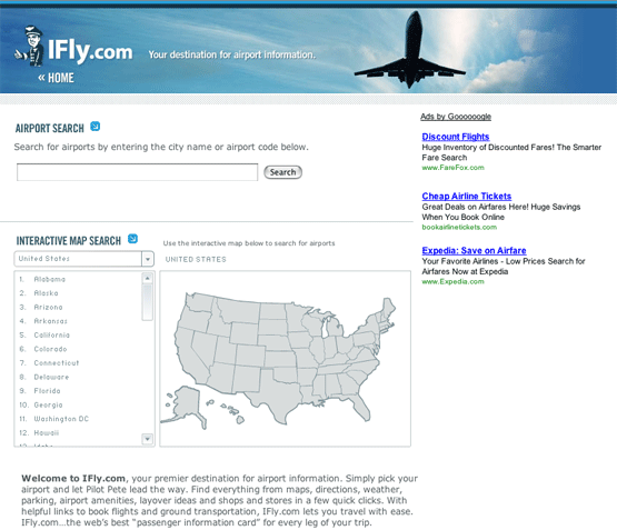
IFly.com’s homepage makes excellent use of white space and relaxing colors.
14. Brand Preference – B
I would have to fairly state that they do a decent job supporting their own brand, but they don’t encourage me to repeat my visit. With their newsletter sign-up so buried that I’m surprised I found it, they really aren’t doing anything to capture my information and encourage me to return. It’s a shame because I think they offer a great service—especially for someone who is flying into an airport for the first time, or has a long layover.
Conclusion
Their final grade is a C. As an Editorial Hub, they should be doing more to capture email addresses. Because of their great content, I can assume they’re doing a good job of keeping visitors on the site. But they’re doing absolutely nothing to make sure visitors come back.
If their primary revenue stream is making money through Google’s AdSense program, then perhaps they are meeting their goals, because they’ve got the ads on almost every page.
On the other hand, if their primary revenue stream is intended to come from linking off to affiliates, they should be doing more to expand their efforts, perhaps hooking up with more travel sites.
Aside from that, this site has some great information—it just needs some TLC in strategic website design and management.


In the business sector alone, technology played a great role in the shift of marketing
strategies done to promote a product or a service from
the traditional use of TV, radio and print. Using an affiliate marketing program, you agree to pay your affiliate associates a referral fee for each lead or
purchase which is generated. Making the viewer leave their contact information as a result of a
personal rapport being built is an engagement for further buyer conversion. You can also
submit your ezine to an ezine directory that will link back to your
site and provide you with more free incoming links. Every day, new advancements are made, and most industries now employ the use of a solid online presence
to promote the products and services they make available.
I am the owner of the gift shop and would like to somehow give you info pertaining to the gift shop that would better represent it. How is that possible? ALl you have is ‘store’ underscored which guides everybody to a store, anywhere. Please assist me. Thank you.