GMarketing.com Does a Great Job of Educating Visitors and Providing Practical Applications of the Guerrilla Marketing Concept, a Concept That Can be Very Successfully Applied by Most, if not all, Businesses
What exactly is guerrilla marketing? Well, Jay Conrad Levinson, father of guerrilla marketing, describes it thusly:
“I’m referring to the soul and essence of guerrilla marketing which remain as always—achieving conventional goals, such as profits and joy, with unconventional methods, such as investing energy instead of money.”
Mr. Levinson has been busy practicing, developing and evangelizing guerrilla marketing since 1984, with great success. Many startups and small companies use Mr. Levinson’s techniques to produce tangible results with minimal cost. However, established companies such as Smirnoff and Vodafone have also integrated guerrilla techniques into their marketing mix. The concept of guerrilla marketing has been especially well received by Internet companies, which typically operate on limited marketing budgets, and has given rise to other marketing techniques such as viral marketing and search marketing. Guerrilla marketing is characterized by extreme statements that are intended to grab the audience. For example, “‘Guerrilla Marketing for the New Millennium’ is quite literally a blueprint for business immortality. You’ve got to have it!”
You may not agree with or even believe a statement such as the one above. But you will notice and remember such a statement. Note also that the guerrilla marketing concept has given rise to a new category of consulting. Various independent practitioners have hung out their guerrilla marketing shingles. Another measure of acceptance is the fact that many traditional marketing companies have added guerrilla marketing practices.
All this being said, Mr. Levinson continues to expand his guerrilla marketing empire, most recently partnering with Michael McLaughlin to create guerrilla marketing for consultants. GMarketing.com is one of the primary vehicles supporting the expansion of Levinson’s guerrilla marketing. This site is your entry into the world of guerrilla marketing, but be forewarned, there is a price to enter!
- The main objective of the site is to collect leads, and in so doing, create customers for the various products and services offered on this site.
- GMarketing.com offers visitors the opportunity to sign up for email subscriptions, newsletter subscriptions and subscriptions for premium content by purchasing membership in the Guerrilla Marketing Association
- Unfortunately, the GMarketing.com website has overlooked an important and powerful marketing technique. There are no opportunities for visitors to engage in dialog with other visitors.
- GMarketing.com emphasizes simplicity of design and content. There is little on the site, including navigation and content, that isn’t presented in a simple, clear and understandable fashion.
- GMarketing.com does a very good job of educating visitors and providing practical applications of guerrilla marketing concepts.

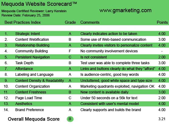
GMarketing.com’s Mequoda Scorecard
1. Strategic Intent, or Purpose – A
When users come to GMarketing.com, they want information. They want to know how to fulfill the promise of guerrilla marketing, i.e., have impact and gain visibility at little cost. They seek guidance; they want to get smart about guerrilla marketing quickly. On the other hand, the publisher of this site wants visitors to become subscribers. There are various offers and options available on this site. The main subscription offer is membership in the Guerrilla Marketing Association. This membership costs $49.97 per month and provides subscribers with various premiums, publications and consulting. As a “visitor,” one can view the first few paragraphs (teasers) of published articles. One can also sign up for an online subscription and gain access to site content as well as a free “Weekly Insider” email newsletter. There are also numerous purchase opportunities, including CD collections such as Guerrilla Marketing for Franchises, Guerrilla Marketing for Financial Advisors, Guerrilla Marketing 101 and one hour of personal consulting from Jay Levinson for $1000.
[text_ad]
This site clearly falls into the Mequoda membership category. The main objective of the site is to collect leads, and in so doing, create customers for the various products and services offered on this site. This strategy is, for the most part, clearly realized in the design and architecture of this site. All of the purchase offers have clearly delineated actions associated with them. That is, visitors know how to buy on this site. What is somewhat less clear is how to sign up for an online membership. It appears that one must subscribe to the Guerrilla Marketing Association in order to obtain access to site content. This confusion could work against the site strategy of collecting sales leads, as this is the main source of visitor information.
2. Content Webification – B
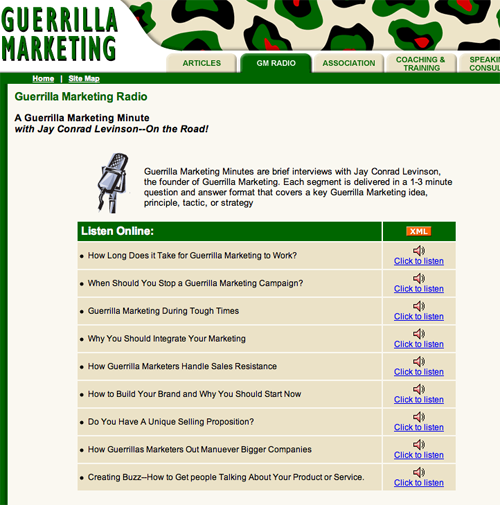
GMarketing.com creates unique user benefits primarily through the variety and volume of its content. A quick review of the main site menu communicates great variety to the visitor. The site offers numerous articles, including featured articles updated weekly, as well as a library of all articles published to date. Under the “news” menu, there is a long list of publications with articles about guerrilla marketing. Unfortunately, none of these articles is republished on the site. This is a serious oversight that should be corrected. The site also offers “tips of the day” which are published daily, as well as being available in a comprehensive archive accessible directly from the site’s front page. One technique not employed by GMarketing.com is word-of-mouth marketing from direct user interaction. Significant word of mouth momentum can be achieved through visitor participation in an online discussion board. Finally, the website provides access to a series of audio interviews, taking advantage of the digital capabilities of the Web, and providing visitors with not only the words of Jay Levinson, but his voice as well.

The website provides access to a series of audio interviews, taking advantage of the digital capabilities of the Web.
3. Relationship Building – A
GMarketing.com offers visitors the opportunity to sign up for email subscriptions, newsletter subscriptions and subscriptions for premium content by purchasing membership in the Guerrilla Marketing Association. In each of these instances, the site publishers are encouraging visitors to establish ongoing relationships with the website and with the Guerrilla Marketing Association. These relationships represent value to both parties. Visitors who subscribe to either a newsletter or to premium site content obtain access to high quality content that reflects the proven and powerful techniques of guerrilla marketing. A subscription to GMarketing.com provides visitors with personalized access to Jay Levinson, one of the most highly respected proponents and practitioners of guerrilla marketing in the world. On the other hand, visitor subscriptions provide the GMarketing.com publishers with an ever increasing list of potential customers that are well qualified and ready to buy. This synergy produces the potential for impressive growth in visits and revenue for GMarketing.com month over month.
4. Community Building – F
Readers of GMarketing.com have characteristics that would suggest potential for a high level of communication and interaction. Visitors come to the site seeking information and understanding. They come to learn about guerrilla marketing and to test the value of this marketing strategy. They engage in dialog with the site, or at least would do so if they had the opportunity. And make no mistake, the opportunity to engage visitors in dialog with the site publisher and with other visitors can be extremely valuable. The more communication, the more visitors become engaged, the more likely they are to get in the habit of visiting the site on a regular basis. Unfortunately, the GMarketing.com website has overlooked an important and powerful marketing technique. There are no opportunities for visitors to engage in dialog with other visitors. This site is exclusively focused on content publication and transactions. Each of these elements is crucial to the success of the site. However, without incorporating site elements that enable visitors to participate in community building, the publishers sacrifice the opportunity to create loyalty and repeat visits. Visitors to this site don’t get the opportunity to answer the question, “What do I do with all this knowledge and useful information once I have consumed it?” A feedback link at the bottom of each article and weekly Web discussions led by Jay Levinson and his certified guerrilla marketing coaches could provide visitors with the opportunity for interaction that the site currently lacks.
5. Persistent Navigation – C
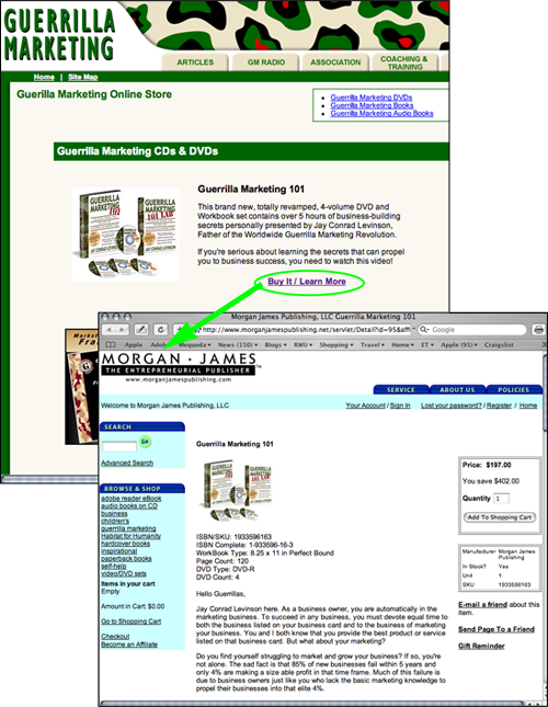
GMarketing.com does an excellent job of maintaining continuity in main navigation from page to page and sections to section. The navigation scheme on this site is really quite simple and implemented in a consistent fashion. The main navigation at the top of page is really the only navigation on the site and it is presented in the page header of each and every page. Things get somewhat inconsistent, however, when the visitor clicks on one of the buy buttons. In each instance, the visitor is transferred to a new page, not in the GMarketing.com domain. Each of these pages is different in design and structure, and none of these pages provides direct navigation back to the GMarketing.com domain. This approach is less than optimum with respect to continuity, consistency and ease of use.

Things get somewhat inconsistent, however, when the visitor clicks on one of the buy buttons. In each instance, the visitor is transferred to a new page, not in the GMarketing.com domain.
6. User Task Depth – B
As primarily a membership site, GMarketing.com must make it easy for visitors to accomplish their objectives, that is, to understand the value of membership and to subscribe. The subscription process is simple and straightforward, leaving aside the navigation issues noted above. Browsing the site is equally straightforward. The navigation scheme on the main site is simple enough. As noted earlier, however, it is not at all clear how one obtains full access to the content on this website. It should be unequivocally clear that online registration provides this access. Given the design of this site, it appears that a Guerrilla Marketing Association subscription is required in order to access site content. There is some confusion around registering and logging in. Once logged in, a log-out link appears in the header on the right. Upon logging out, this link changes to “register,” rather than login. Also, one must click twice on the log-out link in order to log out.
7. Affordance – A
GMarketing.com uses a limited number of navigation elements with consistent design characteristics. The main menu tabs are active links. The rest of the site incorporates inline links that are consistently presented as underlined blue text, the most widely recognized presentation of linked text. The site is packed with content, and there are several opportunities for the user to become confused about navigating the site. This site, however, never makes navigating the site the user’s problem. Inline linking helps provide additional context, giving the navigation experience more meaning and making navigation easier. People who favor design over simple utility may object to the use of underlined linked text. However, this type of presentation has the highest relevance and greatest ease of use.
8. Labeling and Language – A
GMarketing.com emphasizes simplicity of design and content. There is little on the site, including navigation and content, that isn’t presented in a simple, clear and understandable fashion. The site does not use jargon or terms of art. In fact, the purpose of the site, from an editorial perspective, is to explain and clarify what guerrilla marketing is and how to implement it. Importantly, the publishers of this site emphasize concept application over concept presentation. There are numerous case studies and application stories. There are also numerous examples of how to apply guerrilla marketing concepts. This approach ensures that visitors come away from this site understanding how to apply the concepts of guerrilla marketing and how guerrilla marketing will benefit them.
9. Content Density and Readability – A
The design of GMarketing.com employs a three column grid. This design approach is the most commonly used by successful websites. As such, content is presented in a consistent fashion, increasing ease of use and site continuity. On pages presenting articles, the design reverts to two columns, ensuring that there is sufficient space available for content. White space is judiciously applied, ensuring readability of each page on the site. This site presents a nice combination of utility, supporting the commerce elements of the site, and accessibility of design, ensuring ease of access and readability for published content.
10. Organization – A
The three-column grid format of GMarketing.com offers numerous opportunities to display advertising and marketing material. The site makes exclusive use of the top page area to display permanent navigation. Left and right columns present the various offers made by the publishers of this site. The left column also presents a secondary level of navigation, providing access to featured articles. The two most important front page elements, time-sensitive content and the Guerrilla Marketing Association subscription offer, are presented above the fold, guaranteeing that visitors will view this content. Also appearing above the fold is the registration window, another of the elements crucial to the publishers of this site.
11. Content Freshness – B
This site is updated daily and weekly. There is no question about the freshness of content, in that the main content area on the front page presents a section titled “Guerrilla Tip of the Day.” Articles presenting more in-depth explanation and application of guerrilla marketing concepts change weekly. However, most of this site is dedicated to transactions and all of that content is static. Not being a site that publishes news stories, daily updated content is sufficient. Daily updates of content articles would be better than weekly. In either case, however, there is no question that the content on this site is updated frequently. In addition, online subscribers receive a weekly newsletter that further reinforces the freshness of this site.

This site is updated daily and weekly. There is no question about the freshness of content, in that the main content area on the front page presents a section titled “Guerrilla Tip of the Day.”
12. Load Time – C
The load time for the homepage is 28.03 seconds over a 56K connection. The total number of HTML requests is 31, and there are 115,854 images that are loaded with the page, including banners and navigation menu rollovers, and this is increasing the download time for the homepage, as well as interior pages. The total size of the homepage is over 140 K, and the optimum size for rapid download is below 100K. Layering content by loading the most relevant content for users first helps reduce the perceived delay in download time.
13. Aesthetics – A
GMarketing.com is clean looking, information rich and intuitive. As such, the design of the site will meet most people’s expectation for professionalism. The site reflects the design of a direct marketing publication. The professionalism of design is achieved largely through the judicious use of color, the use of complementary colors and the liberal use of white space. The design of this site reflects the priority assigned to commerce and transaction. This site could benefit from a more information-oriented presentation. Headlines emphasizing content and the application of guerrilla marketing concepts would increase context and interest. As noted earlier, more visitor participation and more concentration on conveying the successful utility of guerrilla marketing techniques will increase interest in the products and services offered on the site. Proof points will increase credibility.

GMarketing.com’s homepage
14. Brand Preference – A
GMarketing.com strongly reinforces the brand equity of the guerrilla marketing concept. A recognized expert and founder of the guerrilla marketing concept, Jay Levinson is featured prominently on and throughout the site. In addition, other practitioners are identified and given visibility. Because guerrilla marketing is an intangible, branding of this site can be derived only from the positive experiences of consumers of Jay Levinson’s products and services, and from Jay Levinson himself. The publishers of this site understand this dynamic and successfully implement this type of branding throughout the site.
Conclusion
Guerrilla Marketing is a new concept that can be very successfully applied under the right circumstances by most, if not all, businesses. Like any other new concept, market acceptance guerrilla marketing is predicated on proof of effectiveness and is based on the expertise of its practitioners. GMarketing.com does a very good job of educating visitors and providing practical applications of guerrilla marketing concepts. The site also emphasizes credibility, helping visitors feel comfortable with the idea that guerrilla marketing may be for them. One area the site fails to leverage is community building. Given that guerrilla marketing is a grassroots type of concept, it would only seem natural that the publishers of this site would employ discussion boards and discussion groups, some of the Internet’s most effective grassroots techniques. The site should also emphasize its content more, getting visitors more engaged with the successful application of guerrilla marketing concepts and techniques.


