A Well-Planned Strategy, Attractive Website Design and Thoughtful Attention to User Tasks Makes GardenGateMagazine.com an Absolute Blueprint for an Effective Magazine Marketing Website
Creating a marketing site with effective website design for a print magazine seems like a simple task. Unfortunately, too often the result is anything but elegant. The typical site starts with the best of intentions, but slowly “content creep” invades the process and the links grow like weeds, creating an overgrown mess that serves no one well. August Home Publishing has proven equal to the task of building an excellent magazine marketing site for the print magazine GardenGate, growing a perfect rose of a site. A well-planned strategy, attractive website design and thoughtful attention to user tasks have created an absolute blueprint for magazine marketing sites.
- GardenGate Magazine is one of several magazines published by August Home Publishing, owned and founded by Donald Peschke.
- Today the company publishes five print magazines, a retail store, mail order business and a host of websites for the at-home builder, gardener and creative cook.
- With $35 million in revenues, the company has twice been named one of the fastest growing privately owned companies in America by Inc. magazine.
- Peschke says he sees the future of the company’s growth in “ancillary sales of editorial content in various repurposed forms.”
- With the Internet as the natural distribution point for this editorial sales growth, we look to the Mequoda Website Design Scorecard to see if the publisher of GardenGate Magazine is planting the right seeds.

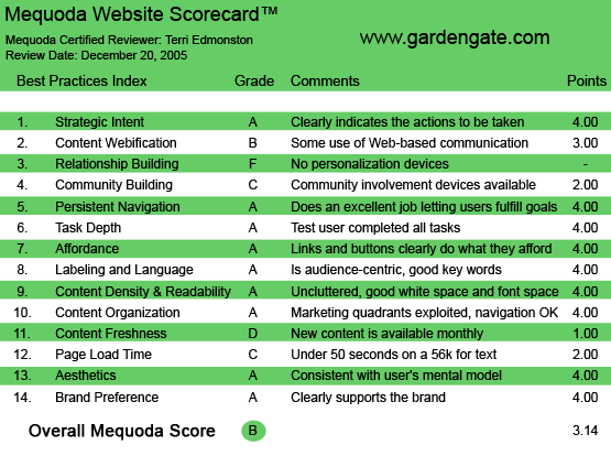
GardenGateMagazine.com‘s Mequoda Scorecard
[text_ad]
1. Strategic Intent – A
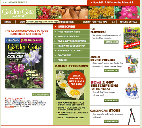
GardenGate Magazine accepts no advertising. With a circulation of 325,000, we estimate revenues of the bimonthly publication at around $5 million. The URL www.GardenGatemagazine.com, lands you on the marketing site for the print publication. The goal of the site is to sign you up for a magazine subscription (or two). The immediately visible options used to bring in subscriptions or leads include:
- Pop-up window with a subscription promotion
- Two for the price of one promotions (The pop up, in red at the top right, and bottom right with a graphic)
- Gift subscriptions (center of the page)
- Free Tips by email (top navigation)
- Subscription account management, including Renew (center of the page)
The above tasks take up the bulk of the functionality on the site, which is right in line with the strategic goals of a marketing site:
- First—get subscription(s)
- Second, if you can’t get a subscription, get email permission
- Third, serve the needs of existing customers with customer service, account management and additional content
There is of course a great benefit in not having to cater to advertisers—the site doesn’t have conflicting requirements as in a typical hybrid site. All design elements can be focused on servicing the subscriber. Nice work if you can get it. GardenGate Magazine hasn’t let the opportunity go to waste; the site gets an A+ for clearly indicating the action to the visitor. Subscribe to the magazine and get great gardening content at a great price.
This magazine marketing site doesn’t exist in a vacuum. Links within the site take the user to other sites in the network: GardenPlans.com and GardenGateStore.com. Each of these sites has a different strategic intent (selling garden plans or selling gardening books and products, respectively) and a unique site design to facilitate those actions. This publisher has determined what each site should get from the visitor, and designed the site accordingly.
2. Content Webification – B
As this is a marketing site, devoted to selling the print magazine to visitors, and not to giving away free content, you would think the ‘content webification’ criteria would have the effect of a sinkhole on the total grade here. Actually, the answer is more like an elegant bridge in a Chinese garden—quality over quantity.
Web content includes:
- A Sample Issue.
- The large clunky images of the print magazine spreads—typically this style is not user friendly—are improved with yellow stickies which clearly explain the contents.
- The magazine spread image can be enlarged for online reading.
- The sample issue can be browsed via clicking to turn the pages or navigated with links along the right.
- The entire sample issue can be downloaded in PDF and printed out.
- Online Extras.
- Six recent issues are highlighted with two to three stories linked from each.
- Almost every issue has an easy-to-play, high-quality online video, a benefit for current subscribers as well potential ones.
- The free partial archive goes back to 2002, with videos starting in 2003.
I think the videos in particular are well done, and in keeping with the how-to ethic of the magazine’s audience. I would like to see the videos offered as a video podcast (I’ve gotten addicted to these lately—much better than TV) to really bring this grade up to an A.
3. Relationship Building – F
One of the most difficult tasks of this type of site, is to differentiate between the new visitors who are not yet subscribers, and the existing subscribers—or known users. This could be managed with one of the most basic relationship building techniques—a cookie that recognizes me and displays: “Welcome Terri” at the top of the page. Other options include swapping “Subscribe” sections with the “Online Exclusives,” helping the current subscriber find content fast, without actually changing/eliminating any site functions. My advice? Plant some cookies GardenGate, and see the relationship bloom.
4. Community Building – C
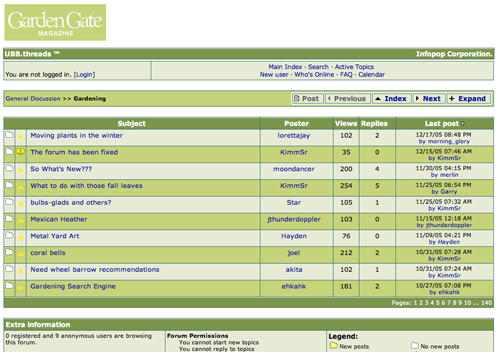
For a marketing site, the purpose of community building tactics is to function as word-of-mouth marketing tools. GardenGate Magazine does have a forum, which earns a few points here. Unfortunately the forum isn’t well done. (I thought it might be a browser issue, but after looking at three different browsers, I decided it really did look like that. Ick.) It’s a good idea that should be placed in the online extras section (the current link location is not logical) and given some attention to make it user-friendly. Forums can be a challenge, and if it isn’t done right, well, then just don’t do it. Other options for community building could be to include a few comment forms to allow users to participate and feel a part of the site. Comments could be either for comments/testimonials about the magazine, or to discuss an online article or video. This community building function would be easy to implement and would build the word-of-mouth benefit.

5. Persistent Navigation – A
GardenGate is an excellent example of persistent navigation. The top navigation bar stays consistent, I always know where I am and how to get back. This is easier with only five options and a remarkably flat site structure. In addition, GardenGate has made the most crucial decision of removing all navigation from order flows, preventing unnecessary abandonment from easily distracted users.


6. Task Depth – A
The goal of GardenGate is to get a subscription. It’s all about conversion on this print magazine subscription marketing site. I took on the persona of a hard sell, and set myself some tasks.
- Find out the price and terms.
- Read a sample to make sure I really wanted to subscribe.
- Sign up for some free tips because I’m still too cheap to subscribe.
- Subscribe already.
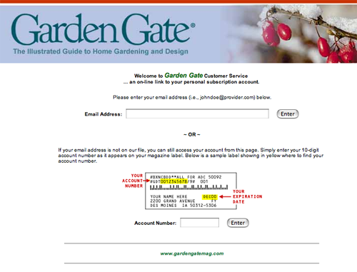
All of the above was easy for me as a new user, and well put together. The order form was a single page with ‘Credit Card’ or ‘Bill Me’ options, the sample content was easy to find and read and the free email was a double opt-in with a text-only autoresponder. Nicely done.
I want to make a special mention of the “How to Subscribe” page. This well-designed page clearly laid out four common subscription options:
- “Subscribe now”
- “Get a free issue”
- “Give a gift”
- “Renew”
All of which had their own column, were explained well, and made my job as a customer, of figuring out how to do what I wanted online, much easier.
7. Affordance – A
Every link was clearly a link, and I knew exactly where it would take me before I clicked. I wasted no time mousing around or interpreting cryptic wording. When there were unusual navigation requirements, such as “flipping” the pages of the sample issue online, not only was I given small icons, but also a word “previous” and “next” that clearly told me what would happen—I was “flipping” a page. Along with breadcrumb-like “Spread 2 of 27” indicating where in the magazine I was.
There is one task that usually throws site designers off—how to link off-site without confusing the user? Users feel angry when they click on a link placed in the navigation that they think is part of the site, and then find themselves on what looks like a completely different site. GardenGate has some links that take the user off site (GardenPlans.com and GardenGateStore.com), but didn’t fall into the trap. The links to the network sites were indicated with buttons that came in graphical context, and the transition was very user friendly.
8. Labeling and Language – A
The site could not be more clear in the labeling and language. I especially loved “Online Exclusive” because it not only tells me there is some cool webified content here, but also that I’m going to get a bonus, something that I couldn’t get in the magazine.
9. Readability (Content Density) – A
GardenGate is easy to read with an excellent balance between text and graphics. Overall the site felt very clean with just enough images to entertain my eyes. The only bit that was troublesome was the occaisional text in a graphic, both in house ads and in the pdf magazine spreads, text as a graphic is hard to read. However the important parts of the site, subscription, account management and online content, is always given enough air to breathe and is visually easy on the eyes.
10. Organization – A
If you’ve been paying attention to Web design, you know that the most viewed area of any page is dead-center. So for this marketing site, putting “Subscribe” in the center, in red no less, is a perfect placement. Below subscribe follow other important subscribe-related links, such as viewing a free preview issue, how to subscribe, gift subscription, renew subscription, manage, contact, etc… it’s a list that indicates well-thought-out priorities defined by the site manager.
The rest of the page is a virtual spiral of priorities, as the eye circles around the page, new links to other, secondary actions are presented in a well-spaced out and non-competitive manner. From “Special!” to “Shop Now” to “Order Now,” no matter where my wandering eye lands, there is a benefit touting action for me to take, benefits for me leading to revenues for the company.
11. Content Freshness – D
OK—this is where the marketing site has fallen flat. There is no time device, no “Act Now!,” no deadline for me to meet to get in on a great deal. I know the current issue is recent by the date, but other than that, I have no reason to think anything on this site will change from one month to the next. Why should I take any action, or feel compelled to return to order before the end of the month? The typical consumer will just put down a mental check mark—oh yeah, Garden Gate, I’ll get to that later. And “later” is going to be much later. We’re talking seasonally here. The one saving grace is the weekly, free emailed tips.
12. Load Time – C
GardenGate loads in 30 seconds on a 56k modem, earning a grade of C.
13. Aesthetics – A
If I were to sit down and pick the colors, images and style for a how-to garden magazine, I would come up with exactly the visuals that I found on GardenGateMagazine.com. Earthy brown and various shades of green for texture, and a rich red for highlighting text or links put me in a garden mindset. The colors are balanced by the mostly white screen, with an occasional, lovely close-up image of colorful flowers. The site design is nice and simple, the readers of the how-to genre want to feel like they’re talking to a friend and sharing tips between like-minded enthusiasts. The low-key design answers that user mental model.

14. Brand Preference – A
I close my eyes and look away from the screen. The image that hovers behind my eyelids is the cover of the magazine. GardenGate uses their attractive magazine covers for much of the art on the site, not only building the brand, but being frugal with the art budget. GardenGate fully integrates with the brand built by the print publication.
Conclusion
Carefully balancing the layout needs of subscription tasks and online content, this marketing site is a like a well-arranged garden. GardenGate has built a very user-friendly site that serves the purposes of the publisher (increase magazine subscriptions) while respecting the needs of the subscribers, both current and potential. The simple site design holds together a surprising variety of tasks in a clean and elegant design.


