With Advertisers Footing the Bill, Forbes.com has Built a Website Offering a Superior—and Free—Online Content Experience for Users.
Forbes.com is part of (do I really need to say this?) the Forbes family publishing business. Including the familiar Forbes magazine, the websites Forbes.com and ForbesAutos.com, spin-off magazines such as ForbesLife, business and investing specialty newsletters, a business conference division and Forbes on Fox TV. This is a typical Mequoda publishing pyramid—with a very rich family sitting on top.
Well the family hasn’t let the money get to their heads, Forbes.com is a commendable site from a design and usability perspective. With 15 million unique visitors worldwide, Forbes.com is an exceptional example of how providing first-rate free content turns the site into “must-buy media.”
The site passes the Mequoda Website Design scorecard with enough A’s to make it to the top of the Mequoda 400 list—if there was one (not a bad idea). Unsurprising were the top grades in strategic intent and brand preference for the prominent business magazine. The criteria that upped the ante were the A’s earned in content webification and relationship building and readability. With advertisers footing the bill, Forbes.com has built a website offering a superior—and free—online content experience for users.
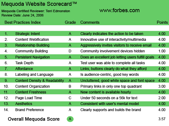
Forbes.com’s Mequoda Scorecard
1. Strategic Intent – A
Forbes has chosen the free content/advertising model for their website. Forbes.com is designed to garner subscriptions to the print magazine. However, since payment is not required to consume any online content, subscriptions are treated like a house ad. This advertising revenue strategy creates specific design requirements—namely to create as much online ad inventory as possible, to offer a variety of options for advertisers and to have a deep library and interactive content to keep visitors on the site as long as possible.
[text_ad]
The first time user will get the message immediately. The prominent space allotted to, and high-production quality of, the advertisements make it visually obvious who’s footing the bill for this free content ride. (Users do have to register to access some parts of the site, indicated either by a login wall, or an icon on a link.) The site strategy from the user point of view, “come, read, hang out, maybe sign up or subscribe, view some ads,” is clear, and Forbes.com earns their first A.
2. Content Webification – A
A laundry list of content webification tactics are found on Forbes.com. All of the below functionalities are well integrated within the content, and well promoted.
- Blogs – especially useful to keep the site fresh
- Audio – purchased by article, by issue or yearly subscription in MP3 format
- Video – the video network is streaming and feels like watching TV (including the ads!)
- Slideshows – from hottest cars to best beaches, pictures tell a thousand…
- Tools – Portfolio tracker, people tracker, fund screener, personal finance planning tools—the finance site basics
- E-Learning – Business Learning Center featuring free courses from protecting your computer from viruses to the basics of personal finance to starting your own business.
Additionally, Forbes has a niche in the business magazine world. They are famous for their lists: Forbes 2000, 400 Richest Americans, 100 Most Powerful Women, etc…. These lists represent a lot of legwork and are treated as a definitive research tool. Branded evergreen content like this will bring a constant stream of [social climbers, yacht salesmen, hedge fund managers] to the site.
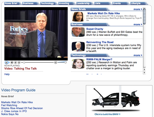
A laundry list of content webification tactics are found on Forbes.com, including extensive use of videos.
3. Relationship Building – A
Forbes.com aggressively invites visitors to start a relationship. Some components:
- Subscribe: a) “free trial issue” right above the top search box, b) “Subscribe to Forbes Magazine Only $19.99 click here” ad above membership/login link and c) subscribe options also appear at the bottom of every article.
- Free Newsletters: Email Alerts box between the content and the two rows of ads. This “can’t miss” spot includes a graphic, and the hot words “free” and “new stories.” Users can then select specific topics—increasing the personalization component of relationship building.
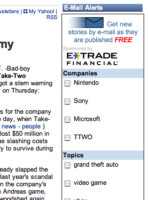
Free Newsletters: Email Alerts box between the content and the two rows of ads. This “can’t miss” spot includes a graphic, and the hot words “free” and “new stories.”
4. Community Building – D
You can’t just put up a forum and hope that the community builds itself. The only thing that will grow in an untended forum is spam, spam and betting on spam. Once the actual reader who has an honest question pops in and sees nothing but spam, guess what they’re going to do? Leave. Even with almost 90 percent of the posts in the discussions using words like “casino,” “make money” and “lotto” in their headlines, I still found a few honest folks trying to keep it real, writing responses to posts that most people would know at once was spam.
For example, a post about looking for a mentor (spelling/grammatical errors included): “I been trying to collect money from investors for a start up company, but investors are very gretty and all want at least half of the company.” To this highly suspicious post came 10 reasonable, considerate and real answers. The audience is there, they want to participate, they are just overwhelmed by spammers abusing the functionality that Forbes is providing.
The forum is the barest of nods towards building a community on the site. There are no other methods to connect with other members, users are simply not encouraged to participate. The sense of “camaraderie and belonging,” created by good community usability, is not the feeling a member of this site will have when they click away.
5. Persistent Navigation – A
The key to persistent navigation is to help the user find anything on the site, fast. No clicking about, desperately hitting the back button. Make it clear where they are, and how to get somewhere else. Even with deep layers of content, multiple topics and content formats, covering three continents—Forbes.com answers this challenge. The navigation strategy includes:
- A drop-down to types of content (for example “IT Research Library” or “Video & Audio”).
- A search content or quote box.
- Top navigation bar with topics and rollover to see sub-topics.
- Topic index pages with deeper content presented as bolded headline links, with photos, to highlight feature stories.
- Within an article, the breadcrumbs indicate the article’s location within the site.
All of these are standard website navigation and earn high usability marks.
6. Task Depth – A
These are the tasks tested on Forbes.com:
- Get free information: Users can easily find content by browsing by section, searching or being drawn in to video and headlines from the center of the homepage.
- Subscribe: Subscription to the print magazine is promoted on the homepage, and throughout the site. The Subscribe form is a simple one page form, with images of the magazines.
- Change Preferences: As a logged in user, I clicked on “My Settings” in the upper right, (next to Log Out). The rollover kindly told me in yellow text what I could do if I clicked this link. All email options (including all the newsletters) were presented on one page. This makes it easy to check, uncheck and save new settings.
- Advertise: On the footer of every page is a link to the online media kit via “Ad information.”
All tasks were easy to complete. The results show that the site helps customers to fulfill typical content website tasks easily.
7. Affordance – A
Forbes.com is a deep site, which means there’s a large load of content that has to be easily found by the user. That makes affordance a challenge, and is most likely the rationale behind the somewhat excessive use of mouse rollovers on the top navigation.
Affordance means that every user can see everything easily, and one visual pitfall is when sites choose colors unwisely. So there are two technical knocks here, a) too much mouse-over required to find content and b) white type on a coloredd background can be hard for people to see.
I can’t give Forbes.com a bad grade, though. Because all the content links were blue/bold or blue/underlined, buttons were obviously buttons and almost everything from videos to advertising was clearly marked. When I play on a site all day with no surprises and don’t mutter under my breath about bad affordance, I know they got it right.
8. Labeling and Language – A
Keywords on Forbes.com include “entrepreneurs, “business,” “technology,” “markets,” “finance” and oh yeah, “millionaires”… oops, I meant billionaires. From “compensation” to “estate planning,” everything a “high-net worth individual” needs to know is written in the target-audience’s language.
9. Readability (Content Density) – A
Forbes.com is heavy on the adspace. Glancing at an article page, I see about 20 percent of the screen on external ads, plus another 20 percent for house ads. Scrolling down maintains the ratio, with the bottom of the page a little bouquet of “delivered by,” “market data by” and “powered by” third-party linked logos. This isn’t even mentioning the advertisements on the video, or the number of rich media ads that occasionally cover the editorial.
And yet, the layout still serves the reader well. Article content starts with a flush left headline, byline and date. The main content of an article is centered, with a somewhat narrow column width for the first few paragraphs. The balance between the colorful moving blinking things that try to drag the reader away from the boring little black letters on a white background is tenuous, but works.
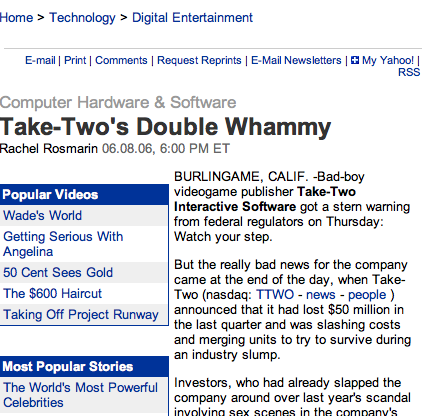
The layout serves the reader well. Article content starts with a flush left headline, byline and date.
10. Organization – B
The top two quadrants, upper left and right, are well balanced between primary links and advertising/marketing links. The lower two quadrants (before scrolling) are splitting the screen with content on the left, advertising on the right. Content starts fairly low on the screen, appearing only in the lower left quadrant, or 1/4 of the screen above the fold. Organization improves on the content index pages, as the links to articles use more of the screen.
11. Content Freshness – A
Forbes.com is a monthly magazine, but the site has content updated throughout the day with time stamped AP headlines under “Global Business News.” It also has its own bloggers and articles updated daily. There will always be something new for the return visitor.
12. Load Time – C
According to the Webpage Analyzer, Forbes.com loads on a 56K modem at 41 seconds. I personally noticed that there was a longer wait than I’m used to, even on a fast connection.
13. Aesthetics – A
The color palette takes no risks. The businesslike blue tones with grey and black for text and outlines create a non-noticeable backdrop from which to hang the colorful ads. User eye candy needs are met with photographs for feature stories. The business reader doesn’t generally want fancy visuals, they expect a serious look with just enough color to keep them awake.
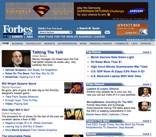
The businesslike blue tones with grey and black for text and outlines create a non-noticeable backdrop from which to hang the colorful ads. User eye candy needs are met with photographs for feature stories.
14. Brand Preference – A
Forbes.com builds the existing Forbes brand identity—a brand that has been created in the minds of their audience from 90 years of the magazine’s history. The editorial focus is the same as the print publication, and brings in relevant sections from the publisher’s other properties, such as American Heritage, without disturbing the distinct Forbes brand on the site. The interactive tools and fresh content add value to the brand in the audience’s mind. Nowhere on the site are other content providers, or other logos, allowed to confuse the reader about whose site they are on and whose brand is being presented. The usual print/online problem also doesn’t exist here, Forbes and Forbes.com stand together and build on each other seamlessly.
Conclusion
Looking back over the results here are the standouts on Forbes.com: advanced content webification with an abundance of functionalities for the user to enjoy, commitment to relationship building with the large opt-in box and ever-present links to email newsletters by topic and the attention to the user’s needs with readable articles and sound aesthetic choices. The takeaway shows that a site can optimize both for the reader and for the advertiser. Forbes.com is an interesting place for the visitor to spend their time, each article read creating more ad inventory and paying the for user’s “free content ride.”


