Firehouse.com translates a best-selling book into a successful niche market website.
It’s a truism that income opportunities from trade books, i.e. books sold through channels like Barnes & Noble and Amazon.com, are very limited. To earn a fair and reasonable living, even if a book is successful in publishing terms, enterprising authors who desire more have to develop their own back-end revenue-generating opportunities that capitalize on their book’s visibility.
One of the best examples is the route that Dennis Smith took. During the mid-70s, Dennis Smith, a New York City fireman, wrote a very fine “occupational biography” entitled: Report from Engine Co. 82—the firehouse where he was stationed.
Following the popularity of Report from Engine Co. 82, Dennis wrote a few more books, then started a magazine, Firehouse, targeting both emergency service personnel and civilian “fire buffs.” Firehouse Magazine has since morphed into a highly successful, niche-market website, Firehouse.com, that covers all the information bases—and most of the revenue opportunities that community service and timely content creates.
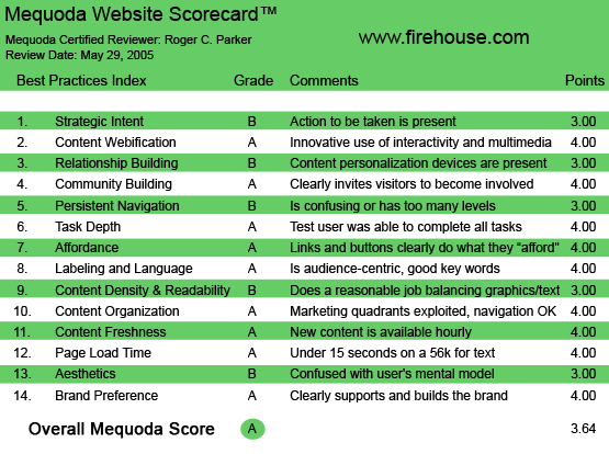
Firehouse.com’s Mequoda Scorecard
[text_ad]
1. Strategic Intent – B
At first glance, the site looks cluttered, but it’s intent of keeping visitors informed about the latest news and resources immediately becomes obvious. The contents of the upper left navigation bar lists the important categories to be found: news/headlines, forums, training, jobs and careers, etc.
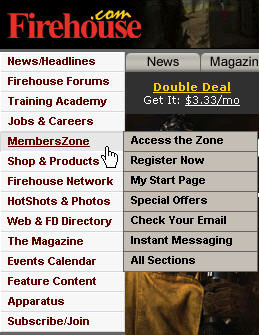
The contents of the upper left navigation bar lists the important categories to be found.
Although there isn’t a tagline or positioning statement, i.e., “Our mission is to keep firemen informed,” the intention is obvious. Actions speak louder than words. You can see from the adjacent content that this is a content rich site for information, resources, and employment.
2. Content Webification – A
Firehouse.com has done a good job of adapting web technology to their mission of keeping firemen informed. Perhaps the most important way the site takes advantage of the Web technology is to frequently update the homepage content. On an “active day,” repeat visits throughout the day show that the home page content is frequently updated. The site also displays a variety of training videos to members.
3. Relationship Building (Personalization) – B
Fire and rescue personnel can make Firehouse.com “their own” in numerous ways. Members can customize their homepage, and also subscribe to email alerts that address their specific areas of concern. Members can also get a free email address and post a profile, which can be accessed by geographic region as well as specialty.
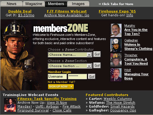
Fire and rescue personnel can make Firehouse.com “their own” in numerous ways.
Notice that there are two categories of membership: one “free,” requiring simple registration, and variations that include Memberzone benefits with, or without, a subscription to the monthly print magazine.
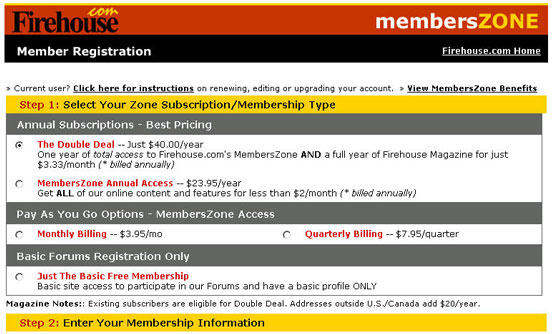
Note the variations that include Memberzone benefits with, or without, a subscription to the monthly print magazine.
4. Community Building – A
The number and activity of specialized Firehouse.com forums is a major community builder. Dozens of forums address specialized aspects of the emergency services: fire safety, EMS extrication, health, training, staffing, and new technologies.
A testament to the success of the Firehouse.com forums is the fact that—on a recent Sunday morning—over one hundred members were online at one time!
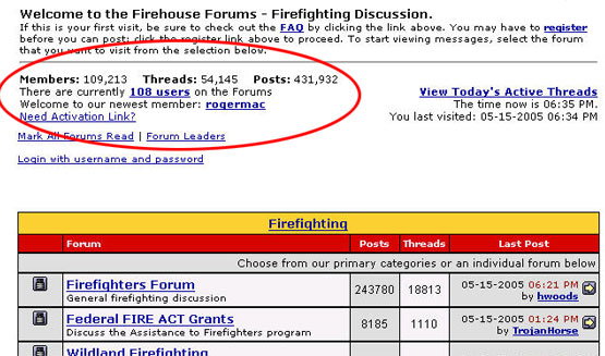
Forums are an example of a very effective community-building tool.
Another major community-building tool are the extensive employment listings which permit members to search for job opportunities in their area, adjacent areas, or around the country. A final community builder is the fact that visitors can email copies of articles to their peers, which simultaneously promotes communications and good feelings as well as promotes the site.
5. Persistent Navigation – B
For the most part, Firehouse.com site features “no surprise” navigation. The use of Flash-based navigational sub-menus makes it easy to pinpoint desired destinations. The only frustration I encountered was when a new page was opened, and I couldn’t use the “back out” to the previous page. Unfortunately, I had closed what I thought was a duplicate window, which actually was the one I had wanted to return to, so I had to revisit the site.
6. User Task Depth – A
Whether you are interested in the latest news, the impact of the latest political and governmental regulations, safety tips, or researching tools and resources, the site makes navigation easy.
7. Affordance – A
There were no confusing or misleading links. Everything worked as it should. Articles could be accessed either by clicking on their text link titles or by clicking on a related photograph.
8. Labeling and Language – A
Clear, simple labeling through. No problems.
9. Readability – B
At first glance, clutter might appear to be a problem, as there are so many text and banner ads to the top, left, right, and bottom of the articles. However, readability was uniformly good, thanks to a comfortable line length and consistent white background behind the text.
Design is appropriate for short, “bulletin-oriented” visits where the primary intention is to get quickly brought up to speed on an event or topic.
Most important, every major article offered a Printer-Friendly version, making it easy to concentrate solely on article content, if desired.
10. Organization (Marketing Quadrants) – A
Although it is possible to scroll down several screens on most pages, key—context specific—navigation links were always present at the top left of each page, duplicated by overall category links along the top of each page. Each visited page also described the “bread crumbs” showing the context of each page being visited.
11. Content Freshness – A
Because the site is database driven, and supported by correspondents and news wires, content is always fresh. The site is frequently updated. At noon on a Sunday, for example, there were photographs and details about numerous events that took place late Saturday night or early Sunday morning.
12. Load Time – A
Very fast. Photos and new pages snap into place.
13. Aesthetics – B
Pretty is as pretty does. This is not an “image” site, it is an extremely pragmatic site offering in-depth coverage of an important employment sector facing daily challenges the rest of us would rather than get involved in.
The wealth of banners and links might appear daunting, but they are part of the reason that emergency services personnel visit the site! It doesn’t make sense to penalize this site for its “clutter,” when it is precisely the availability of a wealth of resources that is the basis for the site’s success.
The Firehouse.com site is not “branded” by its appearance, it’s branded by its utility. So, a little clutter can be welcomed. The site would be far less useful if the banners and links to products and services were removed, because they’re part of the Firehouse.com story.
One of the reasons that the numerous banners and text link appear as resources, rather than clutter, is their organized with color, size, rows, and columns, clearly separated by white space. Careful alignment and grouping creates nodes of interest, that don’t compete with the primary articles or photographs.
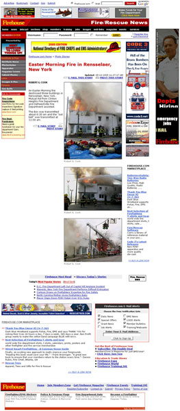
The site would be far less useful if the banners and links to products and services were removed, because they’re part of the Firehouse.com story.
14. Brand Preference – A
This site gets an A for function, community, utility, and resources. It clearly is a site intended for loyalty and frequent, return visits.
Conclusion
Given its focus, comprehensive resources, and functionality, Firehouse.com has a lock on its market. I can’t think of any weaknesses that potential competitors could exploit in order to create another site addressing the emergency services market.


