EskyGuide.com, the Online Home of Executive Travel Magazine, While Demonstrating Good Readability and Affordance, Tries to do Too Much From One Site, Causing Brand Confusion, Task Incompletion and Lack of Relationship Building
“Executive Travel Guide”, or is it “eSkyGuide,” or maybe just “Executive Travel”? And we’ve already hit on one of the jet sized website design holes in the site eSkyGuide.com. Executive Travel SkyGuide is trying to do too many things from one site, and not managing any of them well. Some of the Mequoda Website Scorecard criteria with turbulence: Brand (too many destinations), Task Depth (can’t find the gate), Relationship Building (the flight attendants are on strike).
Owned by American Express Publishing, eSkyGuide should have the backing to do this website design right. While some of the more basic criteria such as Readability and Affordance earned a respectable B, the more complex relationships with visitors have not been kept up to speed, and the frequent executive traveler will be considering changing his/her travel plans and flying a different URL.
- eSkyGuide.com is owned by American Express Publishing, a private subsidiary of American Express Company. They have several other titles, including Food & Wine, Travel & Leisure, T&L Golf and T&L Family, with total sales of about 63 million.
- Completely invisible on eSkyGuide.com’s website design is anything resembling community building devices. There are no comment forms, boards, anything that would bring the rather specific group of high-flyers a sense of camaraderie or belonging to a unique groups of individuals.
- eSkyGuide.com has done pretty well on persistent navigation. Primary task links are consistently placed on the pages, and easy to find.
- Although the language is simple and easy to understand, I don’t see any audience-centric words, nothing to represent the educated executive readers, no keywords or phrases specific to the frequent flyer/executive traveler.
- While the basics are in place and the site is functioning, I want to see a single name brand promoted, a single site strategy and purpose clearly articulated and executed, and I want more relationship building and content webification to give me reasons to return.
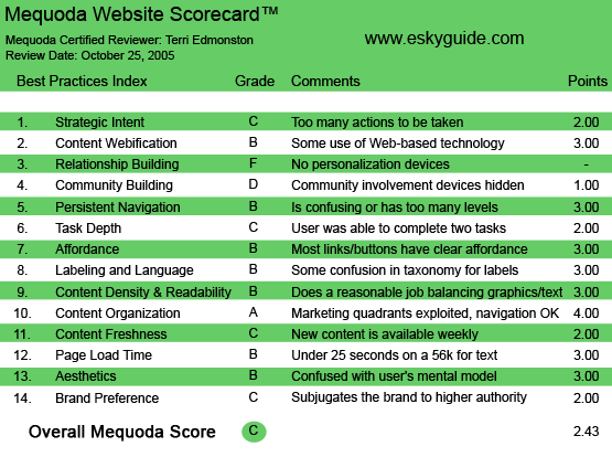
eSkyGuide.com‘s Mequoda Scorecard
[text_ad]
1. Strategic Intent – C
eSkyGuide.com is the online home of Executive Travel Magazine, a print publication with a circulation of 135,000 executives with an average HHI of $175,000. Like many print publications, the distinction between the online site and the print version of the content is fuzzy, at best (See Branding). How does this matter for Strategic Intent? Because in the eyes of the reader, if they share the name and the URL, they should be the same. If you type in “www.executivetravel.com” or “www.eSkyGuide.com,” you go to the same page. The user will come to the site with the same intentions of any print reader:
- Find content that they read in the magazine
- Subscribe/Renew or change their subscription information
- Get webified content, interactive features that are only available via the Internet
The strategic intent of the publisher is a different story. eSkyGuide.com is owned by American Express Publishing, a private subsidiary of American Express Company. Am Ex Pub has several other titles, including Food & Wine, Travel & Leisure, T&L Golf and T&L Family, with total sales of about 63 million. eSkyGuide.com and all the other sites in the Am Ex Pub network share a footer that links to every site within the family, clearly marked “Visit Other American Express Publishing Websites.”
The strategy of the publisher will be:
- Increase print subscriptions and circulation
- Create an entrance for advertisers to find contact information and the media kit
- Build a free opt-in database of email addresses for continual or cross-marketing efforts
eSkyGuide.com earns a C on the Strategic Intent criteria because there are too many actions for the user on one page. The main problem is that the site hasn’t decided if the homepage is the front page of an editorial site—which would include headlines and lead-ins to content, or a sales landing page—which is what it looks like as they’ve allocated about 90 percent of the space for this task, shoving the editorial tasks to the edges. As I’ve mentioned, this is the URL that a print subscriber will land on, they expect an editorial site and want to complete the tasks mentioned above. If the publisher wants something different, in this case apparently signups for their downloadable Flight Schedules, then that should be handled via a pop-up, or other advertising spots on the site and within their content. Users will be put off by the confusing intent of the site, is this an editorial homepage or just an ad?
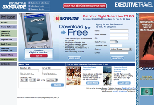
The main problem is that the site hasn’t decided if the homepage is the front page of an editorial site—which would include headlines and lead-ins to content, or a sales landing page—which is what it looks like as they’ve allocated about 90 percent of the space for this task, shoving the editorial tasks to the edges.
2. Content Webification – B
The main selling point for this audience of frequent flyers is having a comprehensive flight schedule at their fingertips no matter where they are. They’re always between cities on business trips and plans change frequently. The price of the company paid business class ticket isn’t as important as the when/where of the next flight. OAG is the market leader in this field. ESkyGuide is going head-to-head with OAG, providing this content both online and as a download for mobile devices, with a current price point of $29.95 a year. These schedules used to be carried around on paper by these types of business executives. Now, content webification at it’s best—they can have it on their laptop, mobile phone, blackberry, Palm or Pocket PC, or all of the above. ESkyGuide has done the right thing here.
Again, the turbulence comes in the editorial sections of the site. If this site is only about the schedules, great. But no, they have the editorial content, they just treat it like a flyer on a school billboard. The additional information that their audience would appreciate is indeed mentioned: Airport Clubs and Amenities, Airline Hubs and Routes, Plane configurations, Frequent Flyer specials and International Weather are all available under the Travel Reference link. But presented as a lame list of links, most of which are external links. (And they aren’t paid advertising links either, they are just direct URLs.) This is a waste to the publisher and to the user. Other information listed above is on the eSkyGuide site, but as a part of an article—which can’t be searched! Users love search, they hate to navigate by article title. The editorial content here is just not webified. It’s old media pasted into HTML.
3. Relationship Building – F
There are no personalization devices on the site.
4. Community Building – D
Completely invisible on eSkyGuide.com is anything resembling community building devices. There are no comment forms, boards, anything that would bring the rather specific group of high-flyers a sense of camaraderie or belonging to a unique groups of individuals. Oh, all right. There are polls. At least they told me there are travel polls and surveys in the About Us page. I didn’t see any in my many hours playing around on the site though, so they’re landing in gate D—hidden community building devices.
5. Persistent Navigation – B
eSkyGuide.com has done pretty well on persistent navigation. Primary task links are consistently placed on the pages, and easy to find.
On the top of the page we have some subscriber housekeeping tasks such as Subscribe, Login, Customer Service and Renew. The rest of the navigation is along the left, unfortunately the layout and design leave something to be desired. The links are listed with the same emphasis although they have nothing to do with each other, and would not have the same priority in the user’s mind (Honestly, do you think “About Us,” “Articles” and “Special Offers” are in the same class and should be given the same visual treatment?). Finally, some of the links take the user off site, without warning. This is a complete disregard of usability standards and of the comfort of the reader.
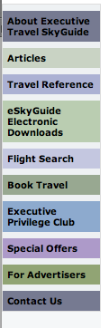
The links are listed with the same emphasis although they have nothing to do with each other, and would not have the same priority in the user’s mind (Honestly, do you think “About Us,” “Articles” and “Special Offers” are in the same class and should be given the same visual treatment?).
6. Task Depth – C
Tasks:
- Find a flight
- Download a flight schedule
- Sign up for e-Alerts
- Search for information from a specific article
The first two were easy. To find a flight, I click on the link located in the left navigation bar, labeled “Flight Search.” I’m given a short form and see my flights by the third click. Great.
The second task, to download a flight schedule was similarly easy to accomplish. Although you do have to register to do this (and I had to wait a few days for my login information—tsk tsk, not OK in this age of instant information!).
Now we run into some more turbulence. The third task, to sign up for an e-Alert, is only available if I subscribe. The free e-Alert exists, why not offer it to users who are not ready to subscribe yet? It’s permission to contact them again. But there’s no way to just click on “get free e-Alert.”
eSkyGuide.com also fails on the fourth task, since the only search on the site was for flights. They have a print product, it’s a common user expectation to be able to find an article they read in the print product online at a later date. A reader might remember an article they read on the plane, and want to email it to someone. Of course they will go to the site, and try and perform a search to find the article. Without the search article function, eSkyGuide has failed user expectations.
7. Affordance – B
The choices in color and contrast here aren’t the best, white on dark blue links at the top, and black on dark pastel colors along the left for navigation links (which mouseover to white—black and white are rarely equally readable on the same hue background. A very risky choice). However they are readable, and clearly links.
Within the content areas we have more standardization, with blue text links that mouse over with an underline. Although the treatment was inconsistent, sometimes the mouse over included a color change and sometimes not. This indicates sloppy code.
The B is earned because of the links that go off-site without warning, (see Persistent Navigation). eSkyGuide.com has not clearly indicated to the user what will happen when they click. For clear Affordance, a user should always have a good idea of what they will see on the next page when they click a link.
8. Labeling and Language – B
Although the language is simple and easy to understand, I don’t see any audience-centric words, nothing to represent the educated executive readers, no keywords or phrases specific to the frequent flyer/executive traveler. Speak in your audience’s language to build your relationship. eSkyGuide.com is a bit delayed, and only deserves a B in this criteria.
9. Readability (Content Density) – B
eSkyGuide.com is a basic, clean site. Not too much text, not too many ads, not too many colors. Maybe just “not to” is the way to describe this ho-hum site that is easy to read but deathly dull on the senses. The user is not going to want to spend much time here, which is the goal of readability, to be comfortable and inviting, to be pleasantly readable. (See Aesthetics).
10. Organization – A
All four quadrants are used for the main tasks, user primary task navigation, on-site advertising and content.
11. Content Freshness – C
I’m sure there is new content on eSkyGuide.com, they have a print magazine that comes out on a monthly basis that shares content, and an e-alert system. But other than opening each article and looking at the date, I can have no idea how often this content is updated. This refers of course to the editorial content.
The content that is arguably the more important to the user, is the flight schedules. The update frequency is hard to find, but finally I found it—WEEKLY. The main competitor in this area, OAG, updates daily. (Better pour a little more fuel in that engine eSkyGuide, you’ve got to hurry up!)
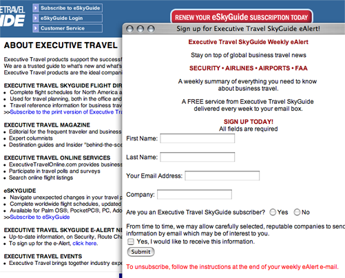
They have an e-alert system, but it’s tough to find.
12. Load Time – B
Don’t bother to fasten your seatbelts, all passengers take it easy, because this flight is going to take a while. Arriving at 22.6 seconds on a 56k, we’re just barely coming in on a B folks. Thank you for waiti—cough—I mean surfing with us today.
13. Aesthetics – B
As I look at eSkyGuide.com, I see a professional palette of serious-looking colors. What I’m not seeing is the glossy, high-end design flair that would fit the mental model of the target audience. I expect that a site targeting executives with an average HHI of $172,000, would want to visually acknowledge their superior wallet power. I want to see expensive photos of modern cityscapes, or sumptuous hotels. I want to know some money was spent on a top-flight design firm. Because I’m an executive traveler, I don’t care about prices, I care about status. Where’s the status on this dull and flavorless site? While the site facilitates the purposes of the user, it completely misses the user mental model.
14. Brand Preference – C
While writing this review I didn’t know what to call this site. Should I go by the URL? But the nameplate? The nameplate actually wasn’t much help, as on the left side is one logo “ExecutiveTravel SKYGUIDE” and on the right side—in a slightly larger font but with the same design treatment—is another logo “ExecutiveTravel.” Reading within the site, and the URL, lead me to think the brand is called eSkyGuide. Even deeper in the site, I found the title ExecutiveTravelOnline. So, which is it? This might seem trivial, since they all contain similar words, but just go tease some Fortune 500 marketing executive about messing around with the colors or fonts of their logo and see how trivial they think it is. I can see the veins beginning to pop already. And one last comment—we are operating in the online world where a Google search result can be killed with one wrong letter. Being specific about your brand name online is crucial. This site is simply too confused about their identity.
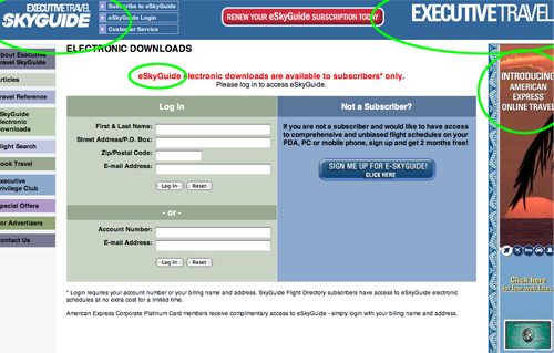
Being specific about your brand name online is crucial. This site is simply too confused about their identity.
Conclusion
In conclusion, eSkyGuide.com needs to spend some time in the hangar and schedule some major maintenance and upgrades. While the basics are in place and the site is functioning, I feel like I’m flying Southwest instead of the Concord. I want to see a single name brand promoted, a single site strategy and purpose clearly articulated and executed, and I want more relationship building and content webification to give me reasons to return to this schizophrenic, confused child-of-an-otherwise-first-class-parent company American Express Publishing.


