The Site that Earned a Top Score in 2004 Hasn’t Lost Too Much Ground. The Lesson Here is Simply a Wake-Up Call—for Online Publishers, Continuous Improvement is a Requirement Just to Keep Up.
Readers familiar with Mequoda as Internet Media Review (IMR), might remember that Discover.com was given the number one Best Practice Ranking for Consumer Magazine Website Design. Since that time, a lot has changed—for Discover.com, for the Mequoda website design scorecard and for magazine websites.
The changes: Discover.com was bought from parent Disney by Bob Guccione Jr. at the end of 2005; IMR changed its name to Mequoda and has increased the scorecard to include 14 categories instead of the original 10 and finally the drastic improvement of media websites in the last two years has raised the bar for all entrants considerably. At the end of the review, Discover.com has lost a little ground, but not much. This scorecard shows that Discover.com still brings the right strategy to their site, increasing subscriptions and consumer reach.
Bob Guccione Jr. (founder of Spin and Gear) bought Discover and its respected, intelligent science and technology editorial because he wanted to “eradicate the preciousness of the science category.” He wanted to make a magazine accessible and interesting to a mass audience. Readability, labeling and language and relationship building are some of the good grades on this scorecard that bear out this argument. But, If he really wants to follow through on his promise to make the magazine site more “exciting and entertaining,” Discover.com has some work to do in community building and content webification.
- Discover how they balance their homepage real estate for in-house advertising and external advertising – page 8
- Learn how Discover.com takes advantage of personalization features to build relationships with users – page 10
- Understand why Discover.com is leaving a great opportunity on the table by ignoring this one very viable community building tool – page 12
- Avoid the mistake Discover.com is making in their website navigation – page 14
- Find out what’s missing from the Discover.com site that could have users coming back for more everyday – page 21
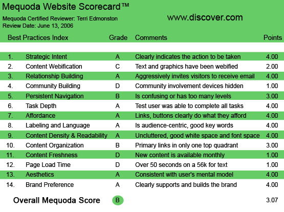
Discover.com’s Mequoda Scorecard
1. Strategic Intent – A
Discover.com is a hybrid site with revenues coming from both advertising and subscriptions. The user coming for content will see both the advertisements on the top and right side of the page, and the subscribe actions on the nameplate and menu bar. In addition, unknown users will be encouraged to subscribe on the content wall that appears before subscriber-only articles (most of the content on the site).
Visually, the actions that satisfy user needs and business needs are prioritized well. The site real estate for in-house advertising (for subscribe) and external advertising are well balanced with the user’s desire for content browsing and readability.
[text_ad]
2. Content Webification – C
The way that people expect to consume content online is changing rather fast—in case you hadn’t noticed. Discover.com hasn’t kept up—there are no podcasts, blogs, not even an RSS feed to be found.
I did see a link to a video on one story, but the link was to a partner site “For video of this story, visit our partner, www.sciencentral.com.” Partnerships are a viable option to conserve costs—we’d just like to see the videos promoted better and more of them. Users love interactive and multi-media sites, that’s why they’re hurting their eyes reading a screen and not reading the print magazine, after all.
3. Relationship Building – A
Discover.com is very effective at acquiring email addresses and opening relationship building conversation. The site offers some content for free, but most of the articles are behind the content wall. After reading a paragraph, unknown users are shown a login/register wall with options for free registration for partial access or subscribing for full access.
Discover.com also has some neat personalization features. The user can create their own library of articles, and can add new topics to their newsletter alerts on the fly as each article has an “article Tools” box (including: Email article, Print article and Rate article). The user can access their personal selections via the “My Discover” link on the top navigation.
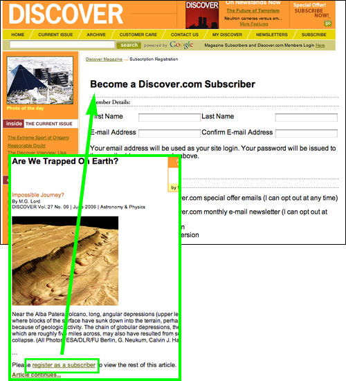
After reading a paragraph, unknown users are shown a login/register wall with options for free registration for partial access or subscribing for full access.
4. Community Building – D
The old Discover.com had forums—I checked on the wayback machine just to be sure. I couldn’t find them on the current site, nor for that matter much community building at all. The one way that users are encouraged to contribute is the article rating system. Users rate the articles on a one to 10 scale, and the results are presented next to the headline along with the total number of votes. This interactive community building tactic could create more enthusiasm and loyalty if it also allowed users to communicate directly about their votes. Real community building would help users connect to each other, using the site as the context. Let them argue, defend and champion their beliefs to create an enthusiastic and loyal community.
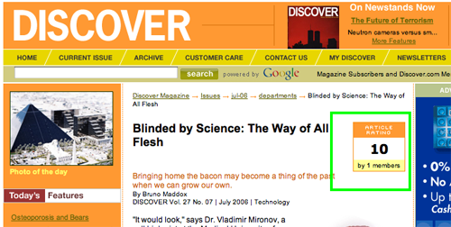
Users rate the articles on a one to 10 scale, and the results are presented next to the headline along with the total number of votes.
5. Persistent Navigation – B
In the previous review Mequoda (then IMR) said this about Discover.com:
The persistent navigation on the Discover.com site is exceptional. The sidebar navigation covers the site-wide navigation and there is a contextual menu that appears as breadcrumbs and a horizontal ribbon above articles, helping the user navigate or take action with the article.
The site has made some design changes since then, unfortunately losing ground in this category. The top navigation and contextual menu (breadcrumbs) still exist, which is good; however the left hand navigation does some funky tricks.
There is one group of sub-sections: “Today’s Features,” “Editor’s Picks” and “Current Issue,” and then another group: “Inside The Current Issue” “Online Exclusives” and “Top 5 Articles.” It wasn’t clear why the left navigation changed. Users have to learn the navigation on each new site they visit, websites are really interactive pieces of software and require effort to learn. Making it harder for the user by changing the menu for no obvious reason doesn’t help. Discover.com gets dinged a grade on this criteria for creating an unnecessary confusion.
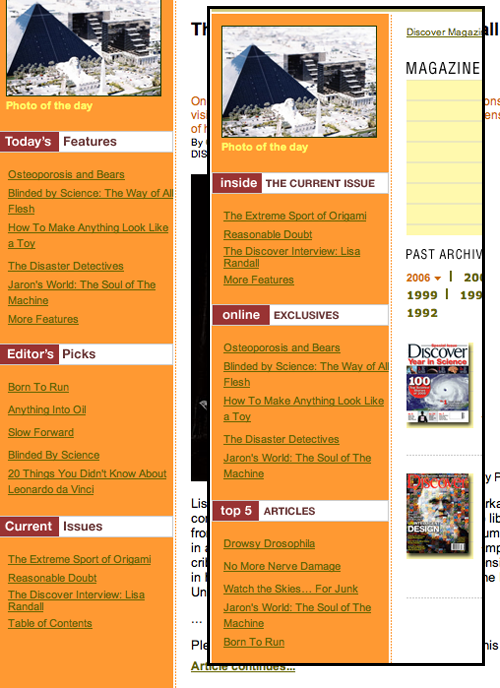
There is one group of sub-sections: “Today’s Features,” “Editor’s Picks” and “Current Issue,” and then another group: “Inside The Current Issue” “Online Exclusives” and “Top 5 Articles.” It wasn’t clear why the left navigation changed.
6. Task Depth – A
Discover.com allows the user to easily complete all of the common magazine site tasks, including subscribing; customer service such as changing mailing address or email address; changing newsletter topics and of course, searching and browsing for content. The process for all of the above follow Web standards and were easy to find.
7. Affordance – A
Affordance on Discover.com is very clear and enables a user to click where they want to go without having to think twice. Almost every link is underlined or a bold headline using standard Web conventions.
Two small complaints:
- Some color choices were hard to see—for example the olive green links on an orange background in the left navigation.
- Action buttons “Go” and “Search” have no mouseover change, which made me stop and think before clicking on them.
Neither of these seriously got in the way of traveling around the site, Discover.com still earns an A.
8. Labeling and Language – A
Discover.com is a science magazine aimed at the general public. The inherent conundrum for a pop-science book is to use language sophisticated enough to make the intelligent, knowledge-seeking audience feel they’ve found the smart club, while staying basic enough to welcome those who might not have had the luxury of a higher degree. On the site standard Web-speak, “Home,” “Archive,” “My Discover,” will help any websurfer navigate correctly—no need to reinvent the wheel.
The headlines and articles are where the language line is tested. The success of it lies in the fun pop-speak of headlines such as “Fat Belly Genes” and “:dark Side of the Sun,” balanced with the wise-old professor nod over the bifocals in headlines such as “Vox Populi” and “Drowsy Drosophila.” The audience feels welcomed with the fun and simple words while also built up with a little bit of Latin.
9. Readability (Content Density) – A
Discover.com is very readable. The by-now ubiquitous sans-serif black on white copy is usually a good column width, and stories are balanced with sub-heads and interesting photos to break up the text. Advertisements take the right column, and the leaderboard space on top, keeping them out of the way of the content.
10. Organization – B
Dividing the screen into four quadrants gives a quick measure of the balance of marketing and primary links on the page. In house marketing, for subscriptions, is found in only one quadrant, plus on the content wall login page. External advertising is found in three quadrants, and primary content in all four. The balance favors user needs, although the publisher is letting the business needs suffer a bit.
11. Content Freshness – D
Articles on Discover.com are date stamped, usually by month, not day. The stamp also typically includes the print magazine Vol. and No.—how old school media is that? Missing from this set-up is the sense of up-to-the-minute intensity found with a time-stamped daily post—the reader needs to know that the content is new. I did see the lead story change day-to-day, but without a date next to the headline the schedule is lost to the reader on the homepage. Online readers need context and frequency for their information—there must be new information daily and the date has to be on every point of entry to each article.
12. Load Time – D
Discover.com is taking the long view—as in the turning-a-stream-into-a-canyon sort of time scale. At over a minute (64 seconds) download time on a 56K modem, they must think the audience likes watching dust accumulate on the monitor.
The Webpage Analyzer’s analysis points to images and total page size as the culprits.
13. Aesthetics – A
Discover.com’s friendly color scheme of orange, yellow and tan is fun, friendly and maybe a little reminiscent of a high school science textbook (and maybe I’m just saying that because of the yellow-lined paper background that is used on the homepage). In any case, the design suits the purpose of the site and doesn’t cause any cognitive dissonance with the user mental model. Although a college textbook look might be a nice step up.
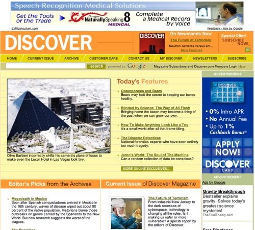
Discover.com’s friendly color scheme of orange, yellow and tan is fun, friendly and maybe a little reminiscent of a high school science textbook.
14. Brand Preference – A
When Mequoda gave Discover.com a great score in 2004 (as IMR), Brand was one of the criteria they excelled in, and nothing has changed on this score. The cover page of Discover the magazine is used frequently to connect the brand across the online and print platform, and Discover.com constantly refers to the print edition’s Vol. and No. on each article. The site builds on the print brand, increasing marketing reach and product value.
Conclusion
Discover.com has some work to do, particularly in the categories of content freshness, load time and community building. The other categories, for example strategic intent and relationship building, are still strong. The site that earned a top score in 2004 hasn’t lost too much ground. The story here is simply a wake-up call. As an online publisher continuous improvement is a requirement just to keep up.


