ClickZ is a Formidable Online Resource for Internet Marketers—It Publishes Internet Marketing War Stories, Told in the First Person, from the People in the Trenches of the Internet Marketing and Advertising Industry
ClickZ.com is a leading news site and a resource for analysis about the online marketing and advertising industries. It was launched April 1, 1997, by Internet marketing pioneer Andrew Bourland, who was also the cofounder of Andover.Net and MarketingVOX.
In 2000, ClickZ was acquired by what today is the industry behemoth Jupitermedia Corporation (nee Interent.com). Jupitermedia properties include more than 150 websites and over 150 email newsletters that are viewed by approximately 17 million users and generate over 290 million page views monthly. Also, Jupitermedia owns JupiterResearch, a leading international research advisory organization specializing in business and technology market research in 18 business areas and 14 vertical markets. Jupitermedia sold ClickZ last August (2005) to London-based trade publisher Incisive Media Plc.
- With 14 free email newsletters, ClickZ almost overwhelms the user—but the intent in its website design is clear; you’re expected to sign up for as many as you want.
- Everything we found in this website review about the site architecture seems intuitive and consistent.
- The top nav panel at ClickZ.com uses a drop-down menu configuration that is clumsy to use and are search engine unfriendly.
- Collectively the ClickZ’s pages comprise a powerful online brand.
- ClickZ.com succeeds because it provides huge amounts of authoritative content from writers who are working in the trenches.
Introduction
The ClickZ Network describes itself as the largest resource of interactive marketing news, information, commentary, advice, opinion, research and reference in the world, online or off-. ClickZ’s properties include the highly respected Search Engine Watch, which was founded and is still edited by Internet consultant and journalist Danny Sullivan, another online pioneer.
[text_ad]
Here’s some of what the ClickZ Network offers today:
- ClickZ Internet Advertising News—Breaking news, information and analysis.
- ClickZ Internet Marketing Experts—Advice and opinions by, and for, marketers.
- ClickZ Internet Marketing Solutions for Marketers—Blog covering interactive marketing news and trends.
- ClickZ Stats—Facts, figures, research and data on every facet of the online industry, domestic and worldwide.
- ClickZ Internet Marketing Features—In-depth profiles, interviews, case studies and features on products, companies and trends.
- Search Engine Watch—Tips about Internet search engines and search engine submission.
- ClickZ Email Marketing Resources—An archive of thousands of email marketing articles and columns, organized by topic.
- SEM Archives—Extensive Search Engine Marketing archives.
In all, ClickZ now offers 14 free email newsletters and sponsors the Search Engine Strategies conference held at least half a dozen times annually in major cities around the world.
ClickZ was intended to be pronounced “clicks.” It was named in that era of the early Web when it was very much in vogue to use “z” to indicate a plural: gurlz, warez. It was also accepted wisdom at the time that what marketers sought online were…clicks. Bottom line: It became “click-zee” by default. What was a mispronunciation is now the correct pronunciation.
The ClickZ websites comprise an effective Mequoda Website Network. Here’s how it stacks up against the 14 Mequoda Website Design Criteria.
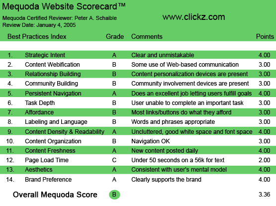
ClickZ.com’s Mequoda Scorecard
1. Strategic Intent – A
With 14 free email newsletters, ClickZ almost overwhelms the user with too many choices. But the intent is clear; you’re expected to sign up for as many as you want.
I would have preferred to see the signup or “subscribe” button a little closer to the top of the page, where instead there is a drop-down menu offering eight categories of content, as well as a site Search function. Nevertheless, the intent is unmistakable. Users visit this site for information and are offered as much additional content as they can assimilate.
2. Content Webification – B
There’s plenty to do at ClickZ.com. You can read, search and visit a huge archive of previous articles. Or signup for the 14 free email newsletters.
You can choose to receive news via any of six XML/RSS feeds. You can post comments in response to nearly every ClickZ article, although not an awful lot of users do (see User Task Depth below). (Hey, this site is visited by working people; we don’t have time to comment on the advertising business; we’re workin’ in the advertising business!)
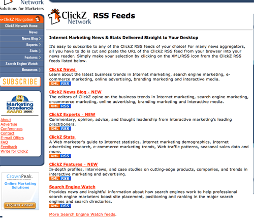
You can choose to receive news via any of six XML/RSS feeds.
3. Relationship Building – B
ClickZ.com clearly invites visitors to sign up for email newsletters. These free messages, delivered in the HTML format, usually replicate the current ClickZ homepage with its well-crafted headlines and teaser copy and links to four or five articles du jour.
Most issues include two advertisements for paid ClickZ products—usually membership in Search Engine Watch, a ClickZ property, and another, non-ClickZ entity. This is an effective Mequoda website hub strategy.

ClickZ.com clearly invites visitors to sign up for email newsletters.
4. Community Building – B
There’s no all-out effort to convince users to comment on articles or engage in a dialogue with the writers, or to encourage feelings of belonging, enthusiasm and loyalty. The opportunity is there, but not many users make the effort (see User Task Depth below). But this doesn’t seem to matter very much. The content provided by the writers is reason enough to return often.
5. Persistent Navigation – A
I had no trouble finding my way around this site. Everything about the site architecture seems intuitive and consistent.
Of course, this aspect of any website is best measured in a usability lab that employs testers of varying ages and experience. I’ve been navigating my way around websites for some time now, so anything that works reasonably well and doesn’t aggravate me seems adequate. Your mileage may vary.
6. User Task Depth – B
Browse, search, sign up, email an article’s author, email an article to a friend, print it out. These are the main user tasks and all are straightforward and unremarkable.
However, registration is required to post an online comment about any ClickZ article or blog. Registration is handled by a separate (non-ClickZ) entity, Six Apart – TypeKey, a free, open system that provides users with a central identity for posting comments on weblogs and logging into other websites.
I signed up for TypeKey, and that was easy enough, but when I tried to make a comment on a ClickZ news blog, I got caught up in an endless loop of being asked to login, clicking on a link to do so, and then being returned to the same page that asked me to log in.
No wonder there are so few comments posted on the ClickZ.com site. It says it invites comments, but then makes it impossible to log in. Outrageous!
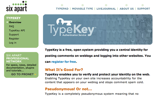
Registration is handled by a separate (non-ClickZ) entity, Six Apart – TypeKey.
7. Affordance – B
The top nav panel at ClickZ.com uses one of those drop-down menu configurations that I generally disapprove. One more time: drop-down menus are clumsy to use and are search engine unfriendly.
The hypertext links here are not blue and do turn red when moused over or maroon when they are clicked. Why won’t website publishers adopt this simple convention? This should be as routine as traffic lights that use red, amber and green.
The blue, red, maroon hypertext link protocol should be adopted by the World Wide Web Consortium. I’m going to lead the campaign! Get the petitions circulating!
8. Labeling and Language – B
Considering the intended audience (advertising and marketing wonks), the language and labeling seems perfectly appropriate here. The writers are all subject matter experts and marketing pros, so the headlines are generally smart and descriptive of the article content.
9. Readability – A
This site is no great beauty but the design is simple and airy. The pages are relatively clean and easy to read. The layout and typefaces are appropriate, and there is sufficient white space. There’s a printer friendly option for every article.
10. Organization – B
Other than the drop-down menu in the top pane (see #7 Affordance above), all the navigation is confined to the left nav panel. This seems to work well enough, although with ClickZ’s many offerings, some links, of necessity, are located below the fold. The second of two opportunities on the homepage to request for newsletters is a sign-up box in which the user can enter her email address. The first opportunity is a button that takes the user off the homepage to a separate, dedicated email newsletter signup page. I would reserve the order of these two devices, but only testing would determine definitively which is more effective.
11. Content Freshness – A
News feeds provide new content almost hourly. Ditto the blogs. Plus there is a stable of columnists (ClickZ Experts) providing new advice and opinions daily.
Alternatively, some of the individual departments within the ClickZ.com site are rather stale. When I last looked, there hadn’t been a new book review posted in the Critical Eye section (“People, Products, Campaigns, Controversy: Inside, In Depth.”) in the last six months.
Plus, ClickZ is still linking to/displaying Jupitermedia Corporation’s privacy policy, even though the site was sold to Incisive Media Plc nearly six months ago.
12. Load Time – C
The ClickZ.com homepage downloads in 39.50 seconds at 56K as measured by the webpage analyzer. (Yawn!) This is surprisingly slow inasmuch as the page is mostly text and a few black and white photos. Could be improved.
13. Aesthetics – A
The ClickZ sites are functional and utilitarian. They’re understated, but not unattractive. I don’t care for the combination of colors (two blues, grey and orange). In fact, I really dislike the orange, but that’s a very subjective judgment.
14. Brand Preference – A
Collectively the ClickZ’s pages comprise a powerful online brand. This is accomplished through the consistent use of simple graphics and page layout, as well as useful and up-to-date content.
The user who wants and needs this site’s encyclopedic content will return again and again.
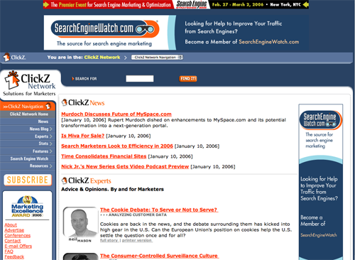
ClickZ displays consistent use of simple graphics and page layouts, as well as useful and up-to-date content.
Conclusion
ClickZ.com succeeds because it provides huge amounts of authoritative content from writers who are working in the trenches. Any website design inadequacies here are overcome and compensated by their subject matter expertise.


Our attitude toward life determines life’s attitude towards us.