Although it Scores Well in Many of Mequoda’s Website Design Guidelines, ChristianityToday.com as a Whole is not as Satisfying as its Individual Parts
A fascinating blend of religious goals and secular marketing, ChristianityToday.com offers an interesting look at providing resources and community in the Internet Age. The site is maintained by Christianity Today Incorporated, backed by over fifty years of publishing experience.
ChristianityToday.com is a curious mix of successes and frustrations. The site is a huge one, effectively divided into sections that serve its various submarkets: pastors, married couples, teens, etc. Each can find relevant content, and easily communicate with others who share their concerns.
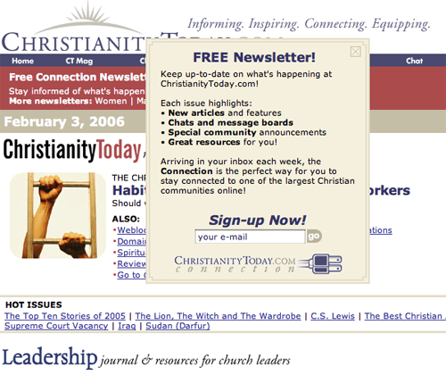
Yet, it’s this diversity that prevents the site from projecting a strong and engaging image, other than “everything Christian.” Added to this, there are some annoyances, such as newsletter subscription pop-ups that keep showing up on until the visitor either finally breaks down and subscribes, or goes away in disgust.
- Although it scores high in many Mequoda Website Design criteria, ChristianityToday.com is a site where the whole is not as satisfying as the individual parts.
- Because of the breadth of the site’s mission, the site functions mainly as a relatively innocuous conduit for content and community.
- Perhaps the ambivalence of my feelings towards the site is rooted in the very breadth of the site’s mission and markets.
- As described below, perhaps an alternative organization within the site, or between several sites, might provide the basis for a more satisfactory arrangement.
- The overall impression left by the site is “neutral.”

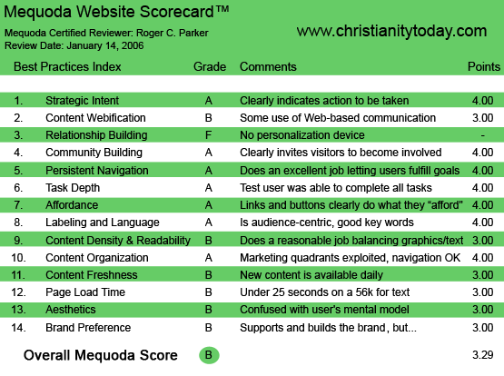
ChristianityToday.com’s Mequoda Scorecard
1. Strategic Intent – A
Within seconds of arriving at ChristianityToday.com, you know what the site’s all about and your options have been identified. Clearly associated with the site’s title, but strangely located on top of it, rather than below it, the site’s motto is stated: “Informing. Inspiring. Connecting. Equipping.”

2. Content Webification – B
Many sections of ChristianityToday.com, such as the music store, reflect effective use of Web technology. For example, you can preview musical offerings online, and—more important—you can also purchase individual tracks of extended musical offerings, such as Handel’s Messiah. Although there are extensive chats and forums, this remains a text-intensive site.
[text_ad]
3. Relationship Building – F
I paid particular attention to this, but was unable to locate an obvious way to personalize subsequent visitors to the site. Given the numerous topical, gender, and issue specific chats and forums, I would have expected that I could personalize my homepage permitting instant access to my particular interests, but that doesn’t seem to be the case. You can, of course, bookmark individual pages, but that’s hardly a unique feature implemented at this site.
4. Community Building – A
Niche marketing is yet another way that CTI Publications encourages community. Instead of a one-size-fits-all mentality, the website contains specialized chats and forums focusing on different aspects of contemporary ministry: books and culture, campus, parenting, leadership, marriage and separate features for men and women are examples of content aimed at specific market segments.
Classifieds are yet another way that ChristianityToday.com uses community to encourage repeat visitors. One of the strong features of this site is the frequent “Email this to a friend” link found on most pages, which encourages pass-along readership and—with it—a constantly growing base of registered users.

5. Persistent Navigation – A
The site is a large one, with thousands of links. Yet, they are presented free from distraction and clearly identified. This makes it easy to locate information at this site. Visitors can easily drill down to the specific content or site features they desire. There is also a handy site search option.
6. Task Depth – A
Whether searching for information or subscribing to one, or more, publications, navigation at this site was very straightforward. Even when drilling down within a market category, there were no surprises.
7. Affordance – A
No problems were encountered.
8. Labeling and Language – A
No problems were encountered, other than the frustration of multiple newsletter pop-ups. One of the site’s strongest features is the frequent presence of “links to related articles,” which makes it easy for readers to go deep into a topic.
9. Readability (Content Density) – B
The narrow/wide/narrow layout creates a comfortable line length for extended reading. Unlike many sites, the navigation links to the left, and advertising banners to the right, do not distract from reading the center text.
Most important, printer-friendly versions of most pages are available. It would be interesting to find out what percentage of visitors print out pages for offline reading.
10. Organization – A
Although there were no navigation problems, the inability to personalize the homepage to a specific visitor category—teacher, pastor, married woman, teen, pre-school child, etc.—detracted from the site’s usability, as described in the conclusion.
11. Content Freshness – B
One of the reasons that ChristianityToday.com is so important as a Christian portal to the world is its up-to-date news content. New topics are posted daily, and attention is paid to topics currently in the news.
12. Load Time – B
The site performed admirably quickly.
13. Aesthetics – B
On the plus side, colors and layout are non-distracting. Yet, there are some frustrations. There are subtle inconsistencies in the formatting of the various sections. There isn’t 100 percent consistency of color and layout of the banner at the top, yet the colors are not consistently different enough to form a visual differentiate among the major categories.
More important, the placement of the category banner and standing navigation differ depending on whether or not there’s an advertising banner for the category. This leads to “banner jump” as you go from category to category. This can be doubly frustrating if it occurs at the same time that a pop-up screen opens, inviting you to subscribe to the free email newsletter.
All in all, this is not a strongly branded site. It’s not offensive, but neither is it memorable nor loyalty-building.
14. Brand Preference – B
My primary concern was the constant presence of newsletter subscription pop-ups as new sections, and pages, were visited. I can understand the need for category-specific pop-ups, but their constant presence was annoying.
The primary lesson of ChristianityToday.com is that sites with a broad mission and a wealth of resources tend to be—perhaps, have to be—relatively characterless in themselves.
The overall impression left by the site is “neutral.” Yes, it offers a wealth of specialized information that is clearly and logically organized, and easy to read or print. Yet, the site fails to excite or engender strong feelings of loyalty. It lacks a verbal or graphic “voice” that draws me in. The site fails to make me feel grateful for the wealth of resources it offers; the organization behind the content is relatively anonymous.
This could be the site’s greatest vulnerability, as smaller sites, with more focus appeal to specific markets, and with more “story” and more “personality,” might be able to attract significant numbers of ChristianityToday.com’s visitors.

Conclusion
I suspect that an arrangement based on a broad-based “who we are” site, that was linked to a strongly-branded “market category” site—branded with more text and graphic personality—might be far more satisfying than trying to serve everyone within a single design.
Alternately, perhaps the present site could allow registered visitors to personalize their homepage, and permit them to choose a homepage that focused on their needs, with links back to the “generic” topics featured on the present homepage.


