Blue Nile makes it a pleasure to buy high-quality diamond jewelry online
A confession: I am not the target prospect for bluenile.com, an online marketer of jewelry, because I don’t like or wear jewelry (my wife is not a jewelry “nut” either, and I have two sons and one nephew, and no daughters or nieces). I’m going to try hard to make sure that doesn’t color my review of their site.
Let me admit to another prejudice before I start: I don’t like complicated, busy, crammed websites. And that’s one reason why I was so dazzled by Blue Nile: it’s a model of effective simplicity for online marketing.

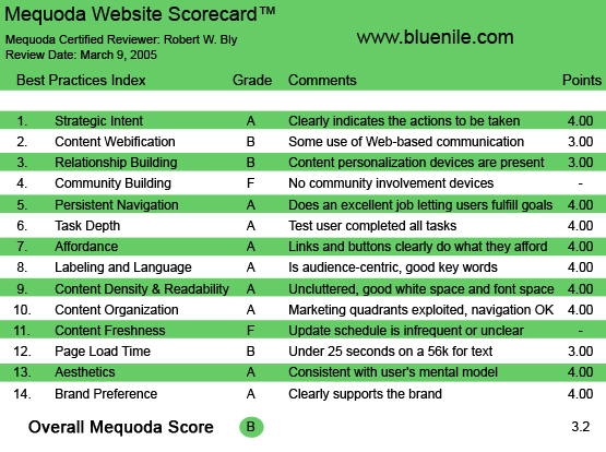
bluenile.com’s Mequoda Scorecard
[text_ad]
1. Strategic Intent – A
The mission of the website—to help the consumer shop for, and buy, a diamond or other jewelry online—is crystal clear. The entire site is designed to make the transaction as easy and painless as possible.
Most of the hyperlinks on the homepage go to specific products, so you can see what stones and jewelry are available. These pages are augmented by a useful, but not overwhelming choice of some helpful content and functionality—mainly tips on buying diamonds, product searches and interactive jewelry design. 
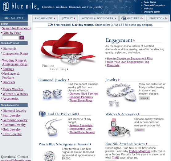
Bluenile.com’s homepage.
2. Content Webification – B
To me, the site uses Web-based technology judiciously and appropriately.
Sure, you could think of features to add: links to other websites on diamonds; a bulletin board for jewelry buyers to share experiences; the ability to get questions answered via email by a Blue Nile jeweler or gemologist.
But it’s all unnecessary. The site is not an information resource; it is a place to conveniently buy diamonds and jewelry online. And it fulfills that mission brilliantly.
3. Relationship Building – B
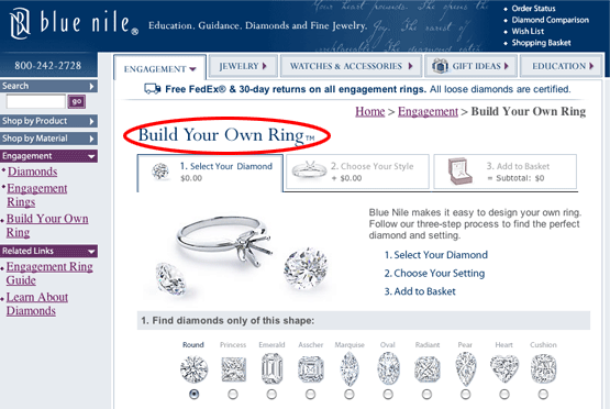
The major personalization feature is “Build Your Own Diamond Ring,” which allows the consumer to mix and match stones and settings to personal preference, rather than buy a ring “off the shelf.” There’s not much other personalization, nor is it needed.
One neat idea would be a tool where I could enter the names and dates of major events (birthday, anniversary) for friends and family. Then, when it is my assistant’s birthday, Blue Nile could send me an email reminder with a gift suggestion.
The website does allow you to enter your email address to receive reminders of major holidays, but it is not customizable to your personal list of gift recipients. 
Build Your Own Diamond Ring
4. Community Building – F
A site for people with a strong interest in diamonds as collectibles, investments or gems would be a good candidate for a bulletin board or other community-building device.
Blue Nile, being a pure shopping site, might make you assume that they don’t need a community-building device. But, Amazon.com is also a shopping site, and it has the community-involvement device of allowing customers to post product reviews.
Could Blue Nile do the same? Of course. Is the lack of such a product review feature sorely felt by the jewelry shopper visiting Blue Nile? Maybe not. But allowing users to feel like they’re part of a community would only improve Blue Nile’s chances of creating customers for life; much like Amazon has done.
5. Persistent Navigation – A
It’s fun and easy to shop for jewelry on Blue Nile. You can easily find what you are looking for, the shopping cart works well, and there are always links that let you drill down for more product detail and consumer information, whether it’s a close-up photograph of a ring or a schematic diagram showing how a certain setting holds the stone in place.
Navigation isn’t perfect: there are some valuable content pages you can’t easily find from the homepage, and they are only brought to your attention once you’re on other pages within the site (e.g., a page explaining how to read independent diamond grading reports). I might expand the menu of choices on the homepage to make more of these content pages easier to find when you first log onto the site.
6. User Task Depth – A
On a commerce site, the major tasks the user wants to complete include (a) shopping for and finding products, (b) learning more details about products, (c) completing a purchase and (d) handling customer service-related activities, such as reporting a problem with delivery or canceling or returning an order. The Blue Nile site gets an A+ for the first three tasks and an A for the fourth.
7. Affordance – A
All links, buttons and menu choices are clearly labeled. When you click on them, you get exactly what you would expect.
8. Labeling and Language – A
The language throughout is well suited to the target audience: the consumer buying jewelry. Jargon and technical terms are avoided. Everything is simple, easy to follow and crystal clear.
9. Readability (Content Density) – A
The page layouts are nearly perfect. Adequate use of white space creates a clean, uncluttered look and makes the images—photos of jewelry—stand out. You never feel overwhelmed by the text or graphics, and so are inclined to spend more time browsing and shopping—a very pleasant experience.
10. Organization (marketing quadrants) – A
The homepage is divided into classical marketing quadrants. There is a horizontal series of standard buttons hyperlinked to major menu choices (e.g., jewelry, watches and accessories) along the top of the homepage under the banner. That’s the first quadrant.
The second quadrant is the series of menu items in the left column, which are headings (e.g., diamonds, earrings) that are underlined to indicate a hyperlink. There is some redundancy between these two quadrants.
The third quadrant is the main homepage space, which has photos and lists of items (products, consumer information, tools), again underlined to indicate a hyperlink.
The fourth quadrant is a horizontal series of items at the bottom of the homepage, mainly to do with customer service (returns, financing).
11. Content Freshness – F
It’s not clear how often the selection of products on the website is updated, which items on the site are new, or where to find new items.
12. Load Time – B
When tested using the Website Analyzer, the Blue Nile website took 17.51 seconds to download at 56K. That means it’s a pretty fast downloading site, not burdened by overuse of graphics.
13. Aesthetics – A
The design fully complements the function and mission of the site: showcase and sell high-quality diamond and other jewelry online.
14. Brand Preference – A
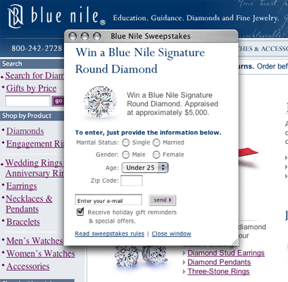
When you click into Blue Nile, you are immediately served a pop-up window with an irresistible offer: in return for entering your email address, sex, age, zip code and marital status, you are entered into a sweepstakes to win a diamond with an appraised value of $5,000.

There is a check box where you can opt in to receive offers and announcements by email, but this is already checked off. So you’d have to uncheck it to get off their list.
The homepage is cleanly and clearly laid out—in fact, it’s almost a little too stark. One could argue a jewelry site should be more elegant in design. But I don’t: the jewelry shopper is well-served here.
At the top is a banner with the Blue Nile logo and the tag line, “Education, Guidance, Diamonds, and Fine Jewelry.” It does an adequate job of positioning the site, but it doesn’t engage me in a powerful way. 
Copy under, and to the right of the banner, positions the site more effectively: “As the largest online retailer of certified diamonds and fine jewelry, we offer outstanding quality, selection, and value.” Interestingly, they make no mention of saving money or time by buying online vs. going to a local jeweler.
From there, the homepage has pictures of jewelry and product descriptions that are hyperlinked to pages showing and describing those products. Simple and basic, but sensible; I wouldn’t do it any other way.
There are also three additional value-added links on the home page:
- “How to Choose a Diamond Ring” is a useful, informative guide to purchasing a diamond ring.
- “Build Your Own Diamond Ring” lets you customize and then order a ring online with the stone and setting you select.
- “Diamonds” searches for diamonds based on cut, color, clarity, carat weight, and price.
Conclusion
Using the Mequoda Scorecard, I rated Blue Nile an A in every category where I felt it was critically important to get an A; it only received lower ratings in categories that I felt were not as critical to the site or its objectives. Although I was partial to giving the site an A, the overall grade using the scorecard is a B, due mostly to the F grades it received in community and content freshness. Clearly, the site is successful without either of these two criteria, but in order to take full advantage of the Internet as a medium, building a community and clearly indicating how often your site is updated are necessary.
Perhaps a free newsletter would pull back those customers who may have only been considering making an online jewelry purchase the first time they visited Blue Nile. Aside from that, the only other major addition I would suggest is a page giving the visitor reasons why buying your diamond ring online at Blue Nile is preferable to just visiting your local jeweler.


Hi there! Do you know if they make any plugins to
assist with Search Engine Optimization? I’m trying to get my
blog to rank for some targeted keywords but I’m not seeing very good success.
If you know of any please share. Kudos!
Its a lovely analysis of an e-commerce website and throws invaluable light on the manner e-commerce websites should be created and designed.
I would surely give the article – A+ grade if I ever was asked to do so.
Rraj SIngh