We revisited Better Homes & Gardens’ website design to see what’s been improved since our last review
Using the the Mequoda Website Design Guidelines, we are revisting the Better Homes & Gardens website, or BHG.com, to see the changes they have made to their website design over the past few years. It’s been a while since we took a look at this site, but the last review had a strong showing with only the categories of affordance and organization needing improvement.
The real beauty of Better Homes & Gardens is that the print product and the website are consistently complimentary—they’ve tackled the tricky problem of differentiation in a manner that makes both of their versions valuable to their readers.
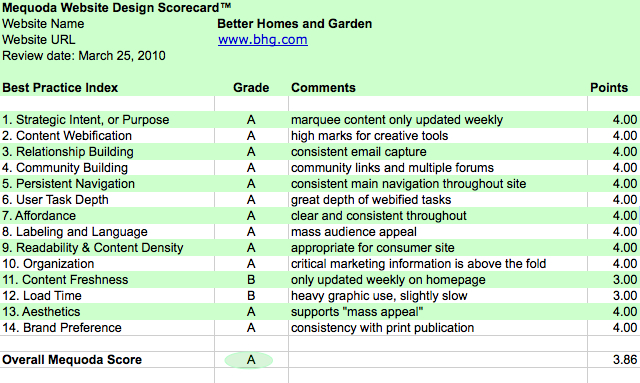
Using the Mequoda Website Design Scorecard, here is what we found:
Better Homes and Garden Scorecard

Better Homes and Garden Scorecard
BHG.com’s Mequoda Scorecard – Overall Grade is an A
1. Strategic Intent – A
BHG.com does an excellent job of communicating their strategic intent. The four top things we get from this site are:
- They want us to get the magazine
- They want us to sign up for newsletters
- They want us to shop the BHG store
- They want us to search and browse the website so we will come back
The intent is clear and all the tasks are easily identifiable “above the fold”.
This is a Hybrid site model with revenue goals tied to advertisements and to subscriptions and store sales (shop.bhg.com).
The big red “shop BHG store” would be hard to miss.

Shop BHG
They really seem to know what users want to do and make the corresponding links easy to find.
2. Content Webification – A
Wow, nothing but positives to say here. This site is chock full of interactive tools that match the site goals beautifully. Each of the main categories: Decorating, Home Improvements, Food & Recipes, Gardening, Crafts, Holidays, and Health & Family have a quick link to their related “top tools” in the right navigation.

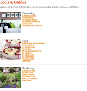
BHG Tools
There is also a tools page that shows all the tools condensed into one page for easy browsing. Engaging tutorial style videos are found throughtout the site for those inclined to “do it yourself” or “try this at home”.
I must confess, I got lost in the “Color-a-Home” tool for quite a bit and almost forgot I was reviewing the site. Can’t wait to return and try the “Color-a-Room” and “Try-A-Window-Treatment”. The website has lots to do, is easy to use, and provides plenty of reasons to return.
3. Relationship Building – A
All of the tools mentioned above require email address collection which is a big plus for them. Follow up email contact with “check out our most popular features” newsletters, gets visitors to return. They get an “A” on providing incentives to encourage visitor email registration.
4. Community – A
Each of the main categories has a Commnunity link in the left navigation which goes to the BHG Better Blog. The blog is consistent with the main categories found on the site and contains editorial content that’s updated daily. There are widgets for Facebook and Twitter users as well. The recipe site has a commenting section and an “I Like This” rating option. It also has a nifty “clip this” feature that allows for saving items to a personal profile for easy retrevial on a return visit. Another easy “A” for BHG.
[text_ad]
5. Persistent Navigation – A
The site has a consistent main navigation and a similar left navigational breakout. The site has great use of tagging for categories and lots of related keywords. It makes searching and browsing easy and intuitive.
There are two categories that seem to be in a “test mode” for a new navigation. In this test, the main site navigation and the text based above the nameplate is small. It allows the main tab navigation below the nameplate to be category specific. It looks like a test is in progress for them to see which type of navigation will get more page views.The next time we review the site we’ll have to see which site navigation has become the site standard.
6. Task Depth – A
The user task depth is nicely done throughout the site. Massive depth is found in all the main categories with a strong use of webified content. The slide shows are used extensively to tell a story with a good mix of graphics and text. This site lends itself to realistic, sharp photos that entice the audience to take action, or at least believe “I can do that”.
7. Affordance – A
Site affordance is in line with the audience and easy to use. There’s plenty of linking within the site and it’s easy to differentiate when clicking. No recommendations for improvements here.
8. Labeling/Language – A
BGH is conistent in their use of terminology and careful to stick to the basics. They clearly speak their readers’ language.
9. Readability – A
Overall, the site is consistent with what’s expected for an advertising-based site. The amount of white space, especially on article pages, could be improved for easier readability, but it isn’t enough of an issue to negatively impact the site. The choice of fonts, colors, and design lends itself to the purpose of the site.

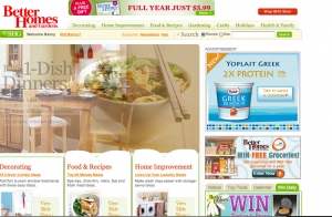
BHG Homepage
10. Organization – A
The main tasks are all easy to find above the fold. The advertisements are labeled and not distracting to the user tasks. This is a well-designed site that follows the principles of using primary marketing quadrants for the key tasks of inreasing brand-related revenue and building relationships with users.
11. Content Freshness – B
There is so much content here that they get points for content freshness. There are new posts being consistently updated on the editorial blogs but these are not on the homepage.
However, the homepage of the site has a 3-part rotating marquee with visual graphics for each headline: gardening, decorating, and home improvement. Although Better Homes & Gardens is a monthly magazine , there is plenty of content within the site to rotate the 3-part marquee much more frequently. Each of the 3 parts opens to a 20 screen slide show that could be rotated on a daily basis.
Because of this, the grade for content freshness is only a “B” but can be easily improved upon.
12. Load Time – B
Due to the complexity—the number of graphics, the interactive sections—this site does not load incredibly fast. There are tools that can help them improve the load time without compromising on the graphics, flash advertisements or tools. They are downgraded to a “B” for load time.
13. Aesthetics -A
Because of the graphics, the site easily gets an “A”. The gardens and recipe pictures lend themselves to the stunning realistic pictures that users know from the magazine.
The color scheme and font choice lend themselves well to this consumer-oriented site. The site generates warmth and comfort that reflects the “better home” everyone desires with a “down-home Main Street USA” feel.
14. Brand Preference – A
This is the flagship site for Meredith and it really shows. It’s a beautiful site with tremendous use of Web 2.0 tools, in-depth content and purpose that matches the audience well. The web version, BHG.com, continues to provide essential home and garden information, advice, creative ideas and tools. Today, Better Homes & Gardens is still staying true to its roots and it shows by having the print product and the website consistently compliment one another.
The website allows you to do things no print magazine could. Furthermore, the print magazine does what it has always done by providing gorgeous full-size images, helpful advice and great ideas in a portable, long-lasting format. BHG has made both of their versions valuable to their readers so that brand loyalty logically extends to both media.
Conclusion
A few years is a long time in the Internet world, and BHG.com has been made many improvements in order to keep pace with the changing face of the web. This is why we ultimately awarded them an overall grade of an A.
The major scorecard item BHG.com needs to address is Content Freshness. The three rotating graphics are eye catching and entincing, but if you return to the site the next day they are the same. Updating this more than weekly would be beneficial for repeat visitors. There is plenty of content behind the sections, so they should demonstrate it.
Another area that can use improvements is the site Load Time. There is a direct link between page load time and sites that are becoming heavy with graphics, flash, advertisements, and videos. Lots of tools are popping up in the industry to help websites address this emerging issue, but it takes time to become educated and learn how to optimize websites. As the industry on the whole addresses these concerns, I am sure BHG will address this as well.


