BeliefNet.com Is Not Your Typical Ecommerce Website—or Is It? The Business Model is Based on the Internet’s Holy Trinity: Content, Community and Commerce and its Website Design is Perfectly Suitable
Beliefnet.com describes itself as “a multi-faith e-community designed to help you meet your own religious and spiritual needs—in an interesting, captivating and engaging way.” The site says it’s independent, not affiliated with a particular religion or spiritual movement, and not out to convert you to a particular approach, but rather to help you find your own. Further, it says it hopes “to help people meet their own religious, spiritual and moral needs by providing information, inspiration, community, stimulation and products.”
Indeed, the site excels a providing all these. Beliefnet.com’s business model is based on the Internet’s holy trinity: content, community and commerce. Let’s run it through the 14 Mequoda Website Design Criteria to see how faithful it is to these principles.
- Beliefnet.com is a virtual megaplex of videos, audios, books, newsletters and other online products. It’s also a Mequoda Internet hub that sends traffic to the various membership websites of Waterfront Media.
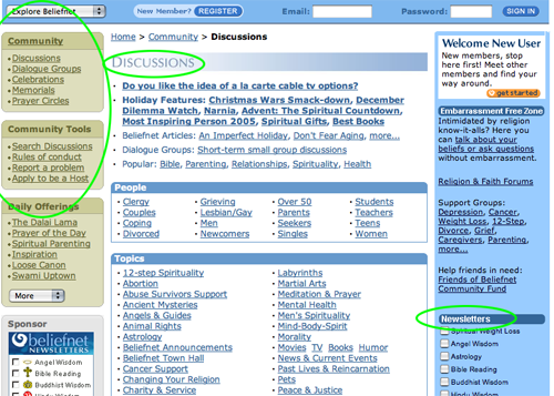
- Nearly every link from the homepage takes the user to a page that urges him to register as a new member. Registration is free and only then can BeliefNet and its affiliate partners begin to market its multitude of products to the new member.
- Beliefnet.com claims more than 2.5 million unique monthly visitors to the BeliefNet network, five million unique email subscribers, 225 million monthly network ad views and 11 million email newsletters sent daily.
- In Beliefnet.com they have created an effective Mequoda Internet hub that monetizes a huge online community of spiritual seekers by selling both its own products and those of numerous joint venture partners.
- The Beliefnet.com website design is well executed and an example of capitalism at its best, even if it makes some believers squeamish about exploiting America’s spiritual hunger for commercial purposes.
Introduction
Sociologists have observed that America has a deep spiritual hunger. Scientists have observed that nature abhors a vacuum. Ergo: Capitalists have proven that religion sells. Six years ago, a couple of publishing entrepreneurs surveyed the online landscape and decided to stake out a market niche comprised of inspiration seekers, the spiritually bereft and the religiously devout.
Beliefnet.com was launched by two experienced journalists. Steven Waldman, a former correspondent for Newsweek and editor for U.S. News & World Report, had taken note of the increased sales of books and magazines that delved into religion and spirituality.
“The problem, but also the opportunity is that there is no multi-faith distributor of spiritual-themed products,” said Mr. Waldman at the site’s launch in 2000. “That’s part of our value.”
Co-founder Bob Nylen had been publisher of New England Monthly. He is also a combat veteran of the Vietnam War and a cancer survivor who has written about the effect of both experiences on his life.
“We want to be the America Online for the soul, the Yahoo! for the internal life,” Mr. Nylen said in 2000. “We think we will be a powerful destination for people to find answers to questions and goods to purchase.”
At the dawn of the new millennium, Beliefnet.com’s co-founders were already looking beyond selling religious products online. “Over the long run we’re not a website, we’re a multimedia company,” Mr. Waldman said then.
Nearly six years later, that prophesy has been proven true. Beliefnet.com is a virtual megaplex of videos, audios, books, newsletters and other online products. It’s also a Mequoda hub that sends traffic to the various membership websites of Waterfront Media, on whose board Mr. Nylen serves. These include The South Beach Diet Online, Get Fit Forever with Denise Austin, The Zone Diet Online and What to Expect (during pregnancy).

Beliefnet.com’s Mequoda Scorecard
[text_ad]
1. Strategic Intent – B
There’s no doubt that the strategic intent of Beliefnet.com is to capture the user’s personal information and begin a permission-based dialogue, both for its own products and those of other online information publishers. But the process is somewhat unconventional.
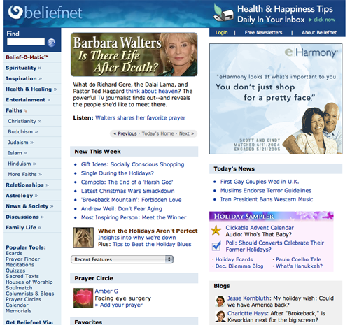
The top graphic banner on the Beliefnet.com homepage offers “daily health tips and tools in your inbox” and urges you to “click now.” This is an unfortunate graphic design for two reasons. First, the message is a reverse or drop-out of white text from a blue background. That makes it easily overlooked as part of the banner.
Additionally, it requires a second step—the “click,” which takes the user to a new page that describes BeliefNet’s Health and Happiness daily newsletter and requests the user’s email address and zip code. Just those two items, for starters.
Once all that information has been entered, the user clicks and is taken to a third page—a bingo card, co-registration page that offers 18 additional email newsletters ranging from a daily Bible reading, to Jewish wisdom, to Chicken Soup for the Soul, to a daily horoscope.
After making those choices, yet another click brings up eight more co-reg free offers ranging from “Nestle Toll House cookies baking advice” to “Free Digital Video Recorder when you sign up for Dish Satellite now!” If the user responds to those offers—whether opting in or opting out—then yet another page of offers appears. These include links to specific “spiritual” products available at Audible.com, Beliefnet Greetings and Amazon.com.
The top left quadrant of the homepage is a better place to put the sign-up box, but Beliefnet.com uses that space for a site search function. Do they know something we don’t know? Have they tested a two-step, second-page signup process? I imagine they have. And if they don’t get your signup from the homepage banner’s offer, they’ll get it eventually.
Nearly every link from the homepage takes the user to a page that urges him to register as a new member. Registration is without charge, but this time requires all of the following: email address, requested password, “community” username, password reminder, first name and last name, zip code, birth date (month, day and year) and agreement to BeliefNet’s Terms & Conditions.
Only after that process is complete can a user fully participate in all that this site has to offer. And only then can BeliefNet and its affiliate partners begin to market its multitude of products to the new member.
The signup process apparently works. Beliefnet.com claims more than 2.5 million unique monthly visitors to the BeliefNet network, five million unique email subscribers, 225 million monthly network ad views and 11 million email newsletters sent daily.

Nearly every link from the homepage takes the user to a page that urges him to register as a new member.
2. Content Webification – A
There is a heavenly multitude of innovative uses of multimedia technology on this site. Some examples:
- Meet today’s heavenly companion at Angel of the Day.
- Answer 20 questions about the afterlife, human nature and more, and Belief-O-Matic will tell you what religion (if any) you practice… or ought to consider practicing. “Warning: Belief-O-Matic™ assumes no legal liability for the ultimate fate of your soul.”
- Check out the most recent commentary from the best religion and spirituality blogs at Blog Heaven.
- Read cartoons on religion (Faith in the Funnies).
- Watch films clips from hit movies (e.g., Behind the Magic of Narnia, The Story).
- Take any of more than three dozen online quizzes (e.g., “What’s your ayurvedic type?” and “How much do you know about Pope John Paul II?”).
- Download the Angel Wisdom screen saver (was $16.95, now $12.95).
- Vote for the most inspiring person of the year. (Candidates include civil rights pioneer Rosa Parks, rocker and activist Bono, and Hurricane Katrina hero Mable Brown.)
- Participate in an online poll (e.g., “Should gay men be Catholic priests?”)

There is a heavenly multitude of innovative uses of multimedia technology on this site
3. Relationship Building – A
Once Beliefnet.com has a user’s contact information, the spiritual and commercial messages arrive regularly via email.
BeliefNet’s daily Health and Happiness email newsletter has a different theme for each day of the week. Monday: emotional wellbeing, Tuesday: heart health, Wednesday: general health, Thursday: aging gracefully, Friday: women’s health, Saturday: chronic illness and Sunday: weight loss. This is Friday so today’s message is about “coping with miscarriage,” which is not exactly pinpoint targeting to a niche group.
Each email newsletter arrives in HTML format complete with sponsored product ads, invitations to subscribe to more free email newsletters from BeliefNet, links to additional stories on the Beliefnet.com website and Ads by Google. No opportunity to upsell or monetize the subscriber is left unexploited.
Heads up, eHarmony.com. You’ve got some competition for the spiritually lovelorn market.
One of the links takes the user to BeliefNet’s Soulmatch, “where we are dedicated to helping you find better dates and more meaningful relationships. Soulmatch was founded in 2004 to continue the primary mission of BeliefNet: helping people meet their spiritual needs. Perhaps no spiritual need is greater than our need for companionship, connection and love.”
If you’re not looking for a relationship, perhaps you have a friend who is. “Do you know someone looking for companionship and love? This holiday season, help a friend or family member find spiritual chemistry with someone special,” the ad copy reads. Gift subscriptions begin at $29.95 monthly.
Ironically, eHarmony, a competitor of Soulmatch, also advertises extensively on the Beliefnet.com homepage.
4. Community Building – A
Beliefnet.com is a paragon of community-building virtue. At the various departments on this site the user can:
- Participate in any of a countless number of discussion forums on topics ranging from abortion to yoga and from African religions to Zoroastrianism. Or start your own short-term, small-group discussion. Recent topics: “Let’s Put The Soul Into Solstice!” and “As A Christian: What Does The Birth Of Christ Mean To You?”
- Find, edit, create or join a prayer circle.
- Pay tribute to a loved one by building an online commemoration. Invite friends and family to contribute their thoughts.
- Announce the birth of a child, and provide others with a place to offer their congrats, prayers and pictures.
- Share your wedding memories with the loved ones who made it so special—and those who couldn’t be there. Guests can post favorite moments, offer prayers and good wishes and swap photos.
- Create a special page devoted to the words spoken at your wedding or ceremony of union—vows, readings, sermons and blessings. Or search our inspiring collection of vows to find out what others have written.
- Offer blessings and congrats on first communions, bar and bat mitzvahs, confirmations, making hajj, baptisms and other important occasions.
- Share your joy at other happy times in life: a college or high school graduation, a sobriety anniversary, winning an award, getting a new job.

Beliefnet.com is a paragon of community-building virtue.
5. Persistent Navigation – B
Overall, the navigation scheme used here is consistent. It’s not easy organizing this much content on a single website. There are a lot of links here and a complex hierarchy, but the designers of Beliefnet.com have done a commendable, if not perfect job of holding it all together without making a confusing mess of things.
I would have awarded an “A” but I discovered at least two dead links and an inoperable dropdown menu. Unforgivable.
6. User Task Depth – A
Despite my reservations about the homepage banner and its newsletter signup protocol, this site is quite user-friendly. The Web-savvy user will have no trouble searching, joining, reading, downloading, watching, listening, subscribing or managing his newsletter subscriptions. Users will find that most of the “buying” activity is done on satellite websites.
7. Affordance – C
On the Beliefnet.com homepage, hypertext links are consistently blue and turn red when moused over. For reasons that I can’t explain, the designers introduced a second-level navigation color scheme where hypertext links are grey and turn red when moused over. The result conspires to confuse the less experienced website user and doesn’t make sense, especially because the same grey is used for headlines elsewhere on the site that are not clickable links. Not smart.
At least one click brought me to a dead end with no breadcrumbs or links to get back to home. That’s the online equivalent of a mortal sin.
8. Labeling and Language – B
Like any other topic or discipline, spirituality has its own specialized vocabulary. So you can’t blame the publishers of Beliefnet.com for using the same buzz words, even if they are unfamiliar to the new visitor.
Does every user know what “prayer circles” are? Does the user understand the double entendre of the “loose canon” blog? If not, it probably doesn’t matter much, or diminish the site.
9. Readability – B
Big, content-laden websites are a challenge to even the most experienced graphic designers. This site, despite all the articles and advertisements and a long, complex navigation panel, manages to keep a reasonable balance between text, graphics and white space. Thank heaven!
10. Organization – B
Another blessing on the graphic designers. Except for the email signup device, which Beliefnet.com publishers have created as an entirely separate, stand-alone page, I have no quarrel with the page organization. (See #1. Strategic Intent.)
11. Content Freshness – B
Beliefnet.com has no shortage of content and is updated daily with news articles and at least weekly with feature articles and other content.
12. Load Time – C
Download time for the Beliefnet.com homepage was 44.68 seconds at 56K as measured by the Webpage Analyzer.
13. Aesthetics – B
This is a clean-looking, attractive, information-rich website. The designers have chosen to use a palette of blue and grey, which is appropriate for this user’s mental model.
There are occasional banner ads displayed that clash with the refined color scheme and offend my website aesthetic sensibilities, but overall, Beliefnet.com looks as it “ought” to look.
BeliefNet claims that two thirds of its users are aged 24-54. Members of that group may not be Presbyterians, but many of them are surely presbyopic. That means type sizes could be a bit larger.

This is a clean-looking, attractive, information-rich website.
14. Brand Preference – A
The BeliefNet logotype and color scheme is used consistently on all pages of the website, as well as on some of its wholly owned satellite sites such as BeliefNet’s Soulmatch. This helps to create and support a BeliefNet brand.
Conclusion
In his seminal analysis of the psychology of mass movements, The True Believer, Eric Hoffer reminds us of how eager many people are to be led, to join a cause—any cause. Many people are joiners. They enjoy being identified with a group, an idea or even a movement that is larger than themselves. For many people there is more comfort in belonging to a larger entity than in being alone, an individual.
Astute marketers have capitalized on this idea since the invention of advertising and continue to do so. BeliefNet’s founders, Messrs. Waldman and Nylen, have expertly exploited this niche.
In Beliefnet.com they have created an effective Mequoda Internet hub that uses a huge quantity of free information to bring in visitors who are eager to join an online community of other spiritual seekers. The site then monetizes many of them by selling both its own products and those of numerous joint venture partners.
The Beliefnet.com website is well executed and an example of capitalism at its best, even if it makes some believers squeamish about exploiting America’s spiritual hunger for commercial purposes.


Hello there, I discovered your website by way of Google at the same time as searching for a related subject, your web site came up, it seems great. I have added to favourites|added to my bookmarks.
I love reading your diet post as I believe that you can always learn something that can help maintain the healthy lifestyle that we all strive for. Thanks