Hush little baby don’t you cry—Mequoda’s gonna score you way up high.
BabyCenter LLC, is just what it sounds like. Much like the community center in the local church, this site helps anxious parents and parents-to-be find answers to everything they need. This well-designed, interactive website brings reliable advice to a consumer audience, along with peer-support for the most anxiety producing experience many of us will ever have—parenting.
- “BabyCenter.com, the leading destination on the Internet for new and expectant parents, together with its companion site ParentCenter.com, a Web resource for parents of children ages 2 to 8, is dedicated to helping you find the information and support you need during pregnancy and in caring for a baby, toddler, or child.”—BabyCenter About Us
BabyCenter is a subsidiary of Johnson & Johnson, giving it the resources to bring the best of Web technology to bear on their goal of being the center for all things parent-related. They haven’t slacked around either. The site won a 2005 People’s Voice Webby Award, and enjoys 3.2 Million unique visitors a month. Before I even whip out the Mequoda Website Scorecard, I know that this site is going to go to the front of the class.
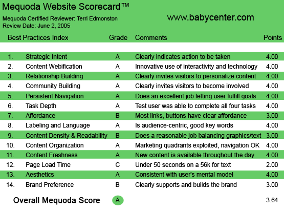
BabyCenter.com’s Mequoda Scorecard
[text_ad]
1. Strategic Intent – A
BabyCenter is a Hybrid model site, with revenues coming from both consumers (through paid subscriptions for the premium content and from the BabyCenter retail store), and sponsors. Like competitor site WebMD, online leader BabyCenter is taking a page from the old school, and announced they are launching a print magazine with controlled circulation in September 2005. This will extend their reach past the computer screen. Mom can now curl up on the couch with her just-fell-asleep baby, and her BabyCenter, on her lap.
This section of the scorecard asks the question “What is the intent” of both the user and the publisher. At BabyCenter.com the goal of the user is to find parenting advice, products and community support. The goals of BabyCenter include: to generate a large and loyal user base, to gather information on users for the advertisers and direct sales to users either for premium content or for products in the retail store. Now let’s see if the site is set up well to fulfill these goals.
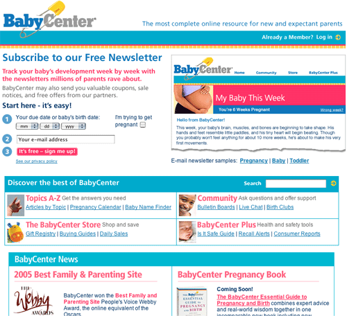
Upon landing on the homepage as a new visitor, I am immediately offered a sign up for a newsletter. Free of course. Why should I sign up? They offer an immediate benefit, I can “track my baby’s development week by week.” They ask for my due date, or my baby’s age. What mother could resist? Telling someone something about yourself that you are excited about—a baby due date for example—is an excellent involvement device. They also tell me—in text that isn’t flyspeck or grayed beyond readability—that they are also going to sell this information. “BabyCenter may also send you valuable coupons, sale notices, and free offers from our partners.” They are now off the hook—I have been duly warned.
I didn’t sign up right away; first I wanted to see what I could do without giving them any info. The answer—almost anything. I can read articles, shop and browse the community boards. I can’t comment or receive newsletters without signing up. The second level of membership—that is, paid—will give me access to Product ratings from Consumer Reports and Recall alerts. Everything is spelled out at a glance on the homepage. I see a lot of things that look interesting. Even though I don’t have kids, I really want to play on this site.
This Hybrid site has clearly identified for me how they make money (advertisers, retail and subscriptions), what they want from me (my information) and what they offer in return (personalized content and a like-minded community). It looks like an OK deal to me. I sign up.
A great bonus practice, in the confirmation email I am pitched again on the benefits of being a BabyCenter user. I’m reminded of expert answers, 43 interactive tools, community bulletin boards, and the fact that I can personalize my content. They go on to offer me an incentive to go back to the site—a 10 percent discount at the store, and they offer the 14 day free trial for the BabyCenter Plus premium content. They have their priorities straight, and they have clearly told me what they want and in a customer benefit-oriented manner.
What about the other customer base? With an online media kit (listing audience demographics, audience and email volume, standard units for ad sizes, and client case studies) and ample advertising space throughout the site (top banner, side square, skyscrapers and rich media capability, and newsletters) I know that this site is going to be just as responsive to advertisers. I was interested to notice the lack of certain tactics—such as sponsored site sections—that WebMD uses. But advertisers here are often selling a specific product, which is served through the “Free Stuff and Great Deals” section.
2. Content Webification – A
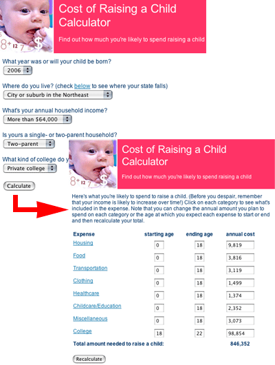
From the first moment I landed on this site I knew there were interactive tools to play with. The well promoted tools include such fun topics as predicting my child’s adult height, calculating the amount I’d spend on my child throughout his/her lifetime, and ovulation charts for the still-trying crowd. The tools were also well implemented. For example, the Baby Names section didn’t just list alphabetical and most popular, I could also filter my search through the data by ending letter, name origins and number of syllables.
3. Relationship Building – A
The content on the site is free and open—almost everything is available without a sign-up. What’s to induce me to give my name to a site that announces they’re going to share it? Easy—Personalization.
Visitors to this site will all have similar, yet slightly different concerns, depending on the stage they are in the parenting cycle. Prenatal mom’s to be will have very different information needs than parents with a one-year-old. BabyCenter has used the unique technology of the Internet to create a one-to-one experience while staying under one site roof. I simply enter the age of my baby, or baby to be, and the site is personalized for me. From now on whenever I log in I will immediately see content that is absolutely relevant to the moment of anxiety/excitement that I am feeling as a parent. And the site will grow with my baby! This month I’m worried about diaper rash, next time it will be toilet training and the content I see will reflect those predictable concerns.
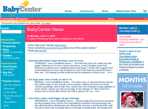
The personalization is continuously apparent in the top navigation bar—what seems like a design element becomes a unique timeline—with my Baby’s name and position within the timeline highlighted. Cool. I also get a little tip on the right side about the stage my baby is in—“Your Baby Emma is 7 months old. She may start to feel separation anxiety—don’t worry. Learn more…”
4. Community Building – A
BabyCenter is all about community—more than almost any other site I felt like I was literally at a community center where I could hear what other people like me were saying and have the chance to tell my own stories. Users are offered boards for posting, chat rooms for talking, and Birth Clubs to find other parents in the exact same place of child development as themselves. The editorial and user-generated content were extremely well integrated without losing editorial authority. For example, recent comments from readers are always present at the bottom of an article—and marked as reader comments. As a registered user, posting my own comment is completely painless. The boards are well populated, and people really speak to each other—even to the point of developing their own abbreviations lingo—see the Language section of this Mequoda Website Scorecard.
5. Persistent Navigation – A
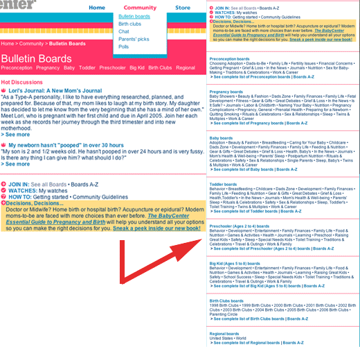
The navigation on BabyCenter facilitates user goals of accessing content, community and commerce easily. There are no unnecessary or arbitrary changes in the navigation links and bars. As appropriate, for example in a shopping or sign-in process, some navigation disappears, but as a user I am never lost and never unable to return to a location I wish to find again.
Part of the general design of the page includes a three-color horizontal stripe at the top, first a thick blue, then a thin red and then a toothed yellow. As I mentioned in the Relationship Building section, this is a unique navigation element. Aside from being pure design, on content areas of the site it becomes a cool timeline, a personalization tool that not only repeats the age of my children, but also helps me navigate to age-appropriate areas of the site. I can choose pre-natal, pregnancy by week, or baby age by week/month. This bonus navigation is a fun, unique way to browse around the site.
6. Task Depth – A
User tasks on BabyCenter include 1) Find answers to specific questions, 2) Read more about a headline, 3) Buy a product and 4) Subscribe to paid content. Each task was easy to figure out and fun to fulfill.
7. Affordance – B
The links that were visible were clearly links—either in a navigation bar or blue and underlined. However, there were too many non-obvious links. For example in the top navigation under “Home” and “Community” the user has to roll over to know there are submenus on a dropdown. Since all the navigation offered under the top nav is repeated in the left nav, the negative effect is negligible. They have avoided excess reliance on icons—the only one is a shopping cart in the upper right corner. The site for the most part is easy to navigate with a minimum of confusion.
8. Labeling and Language – A
Everyday English reigns on this site—perfectly appropriate to the consumer audience. I was surprised at the frankness, the use of the subhead “Sex for Baby-Making” for example. But then, parenting isn’t for the faint of heart, and the site’s language reflects the actual issues experienced by the audience.
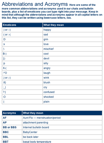
A particularly fun part of this site was the great glossary, created especially for the extremely high level of unusual abbreviations used in the boards. I found myself laughing as I read the usual web-head lingo right next to baby-centric terminology. For example:
CWIM: see what I mean CM: cervical mucus
I particularly found myself ROFL as I read BD: baby dance = sex.
9. Readability (Content Density) – B
While I like the aesthetics of the site, they have made one huge boo-boo in my book: the use of white text on a colored background, and colored text on a colored background. An average user will find this hard to read, as I did. A contrast ratio of 5:1 is an acceptable guideline, and they haven’t overstepped this. But the white text on a colored background is used for most of the navigation—the bold is readable, but the normal weight font starts to get lost. There is simply too much of it. The section heads in the content are white text on a colored background, this time on red. An even worse choice, this important area at the top of each content section became practically invisible.
Another interesting choice is the non-existence of black on white in the text blocks. The general text is a dark blue. I didn’t notice until I started really looking—so I can’t say it isn’t readable. But as it doesn’t add anything either, why do it? Colored text, even on a white background, doesn’t have the same legibility as black and white text. Use should be limited to emphasis within text or short headlines.
The pages felt heavy, as the navigation bars on either side were dark and loaded with links. There was always a picture, which was perhaps a little too large for the screen. The site gets a B because the most important part—the content—was easy to read in a white center column with a good width at a fixed 10-15 words.
10. Organization – A
Every quadrant is utilized to facilitate strategic objectives of the site—with site navigation for usability, advertising both internal and sponsor driven, and content presented in every quadrant. Here’s the breakdown:
- Upper left quadrant: clickable Logo; top banner sponsor ad; site navigation including Search.
- Upper right quadrant: login/signin/upgrade navigation; top banner sponsor ad; internal advertisement for the BabyCenter Store, personalized content.
- Lower left quadrant: site navigation; content links; sponsor ad spot.
- Lower right quadrant: internal ad spot, sponsor ad spot; personalized content.
The BabyCenter homepage presents us with a good example of appropriately exploited site real estate.
11. Content Freshness – A
There are two “In The News” headlines in the middle content of the homepage, with today’s date. Lower down we see that content is posted throughout the day as more news headlines include the time next to the headline. Additionally, of course the active boards encourage return visits and create continuously updated content.
12. Load Time – C
At 30 seconds on a 56K there is room for improvement according to the Web Page Analyzer. As a user on a fast connection, I found I was often watching the screen move around as some sections loaded before others. I would start to read a headline, and then it would move to the center of the page as the images loaded after I had already started reading. I will stick to the numbers here, and only give the page a C as established by the Mequoda Scorecard Usability Guidelines. Load time was the biggest headache that I experienced while using the site.
13. Aesthetics – A
The user mental model of a parenting site will definitely be on the fun, childlike side of aesthetic awareness, but stay away from visually talking down to your readers. The site is aimed at the parents, not the kids. So a primary palette of red, blue and yellow is an appropriate start, the colors are then brought into a more mature range by deepening the saturation.
In addition, this audience is looking for themselves. They want to see their issues reflected in the text, and their images in the pictures. Every page had smiling faces looking directly at the viewer—Babies, Moms and Dads, Toddlers. As a reader I always felt like someone was talking directly to me, and felt myself smiling at the Baby pictures. It felt good.
14. Brand Preference – B
BabyCenter almost never lets on that it’s a subsidiary of a major corporation—J&J. That’s great—the brand stands on it’s own two baby feet. But I am a little less thrilled by the confusion between BabyCenter, ParentCenter and BabyCenterUK. My login works for both BabyCenter and ParentCenter. The look and feel of the sites doesn’t change from one to the other, and segmenting between babies and children makes sense to me. Although, from a consumer viewpoint, I wish they were both under one brandname. ParentCenter logically should be the main company name with BabyCenter a specialized section. (If you have a baby, you’re a parent, but if you’re a parent you don’t necessarily have a baby.)
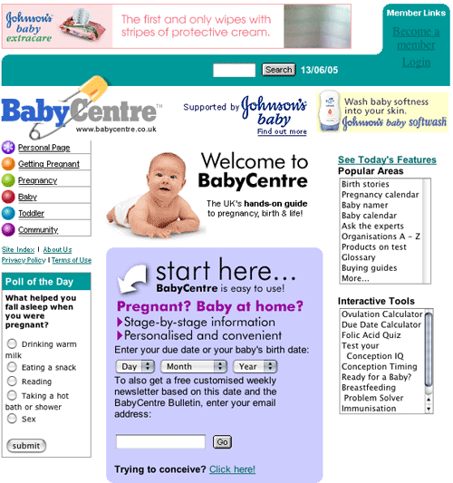
The part where they really lose it for me is BabyCenter UK. BabyCenter is only available to US users. This probably has to do with legal restrictions, and isn’t based on a strategy decision (The EU has different restrictions on personal and medical data than the U.S.) To see how the brand carries forward on the other side of the pond, I click to BabyCenterUK. http://www.babycentre.co.uk/ Oops! Brand is out the window. While some differences are expected—for example announcing that the site is “sponsored by J&J” is probably required, and the spelling of the brand name is changed to reflect proper British spelling (BabyCentre)—the problem lies with the unnecessary inconsistencies. The UK site has an amateur look and feel along with several usability mistakes. This absolutely harms the brand. The Starbucks coffee experience is the same in Europe as the US, why would a website be any different? I can only hope they are in the process of a re-launch.
Conclusion
BabyCenter offers a real value to their target audience, and they’ve taken every opportunity to facilitate the different needs of the user while still promoting their revenue-generating objectives. While Load Time and Readability need a good brush-up, this site scored excellently on the 14 Mequoda Scorecard Usability Guidelines. I’ll be checking back often when I want an example of how build an interactive and well-balanced hybrid site.


