Since we’re now coming out of a long, snowbound New England winter with a few more pounds on the frame than we had in September, we thought we might take a look at the weight loss websites and see if there’s a site that exemplifies a Mequoda Website Network. There are several popular diet sites: eDiets.com, WeightWatchers.com, Lowcarbfriends.com, JennyCraig.com and Atkins.com. In terms of popularity, and controversy, Atkins leads the pack of the low-carbohydrate movement. For over 30 years, the nutrition regimen created by Dr. Robert Atkins has generated heated debate, shelves of books, armies of competitors, a plethora of food products and fans and detractors from every walk of life, all over the world. Their website About Us page states:
- “Today, Atkins Nutritionals is a fast-growing international enterprise that provides a broad range of food and information products designed to serve the millions of consumers who have adopted the controlled-carbohydrate lifestyle.”
Apparently losing weight the Atkins way is big business.
Overview of Tasks
As always, when we review a website, we try to come to the site as any new user would—with a specific task or two in mind. For this review the tasks were built from the following scenario:
Your bathroom scale tells you that you’ve gained more weight this winter than you’re comfortable with. Your cubicle neighbor at work has been doing the Atkins diet with some pretty amazing results, so you decide to check the Atkins site out. Your goals are:
- To find out more about the diet plan.
- See if there’s something that tells you what you need to do to lose your targeted 10 lbs.
- Get some recipes and menus to help you get started.
- Find out where you can buy foods to help you get started today.

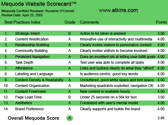
Atkins.com’s Mequoda Scorecard
[text_ad]
1. Strategic Intent, or Purpose – B
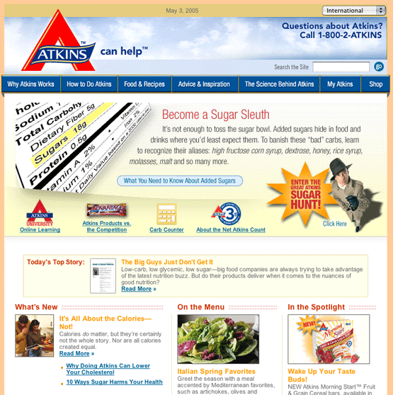
This is an information-rich website. Every quadrant on the homepage offers a drill-down on important information concerning the Atkins weight-loss and nutrition program. In addition to the pages and pages of information, there is a 1-800 number in the top right hand corner. Not having been to this site before, I don’t know if the Great Atkins Sugar Hunt promotion, which takes up most of the center of this page, is a temporary element or not. It does push Email and Membership sign-up below the fold and for this, we have to ding them a couple of points.
Improvement Alert: Atkins.com should make sure that periodic promotions don’t push their important email sign-up and member sign-up below the fold.
2. Content Webification – A
This site invites user participation and content creation. In addition to the personal storage features like the recipe box and file cabinet, there is the Atkins University where members can enroll in courses and discussion groups that are very successful in providing the kind of support and reinforcement dieters need. One of the most intriguing features is Atkins at Home™. You sign up online and receive “daily or weekly delivery programs of freshly prepared meals and snacks delivered right to your door!”
Improvement Alert: Atkins.com should make sure that there is someone answering the information line for this service 24/7. At $30 a day for the weekly service, they should be able to sign me up whenever I call.
3. Relationship Building – A
Not only does this website have an email newsletter to encourage monetization of its user base, it has five! From the flagship monthly Atkins Newsletter to the “hot off the press” Breaking News alerts, there is an opt-in way to keep in contact with the user. This site features a wide variety of tools, including a weight-loss journal, carb counters, a recipe box from which you can generate shopping lists, a file cabinet where you can keep articles and webpages that you want to save and revisit, and Atkins University, a collection of online classes and discussion groups.
4. Community Building – A
The Atkins site has two important community building features: “Advice & Inspiration” and the “Atkins University.” As mentioned before, constant support and reinforcing messages have proved critical to the success of any self-improvement program, especially weight-loss. “Advice & Inspiration” is a collection of articles, personal stories and a calendar of events all geared to keeping the dieter on target. Members help build content by submitting their own stories and photographs.
5. Persistent Navigation – A
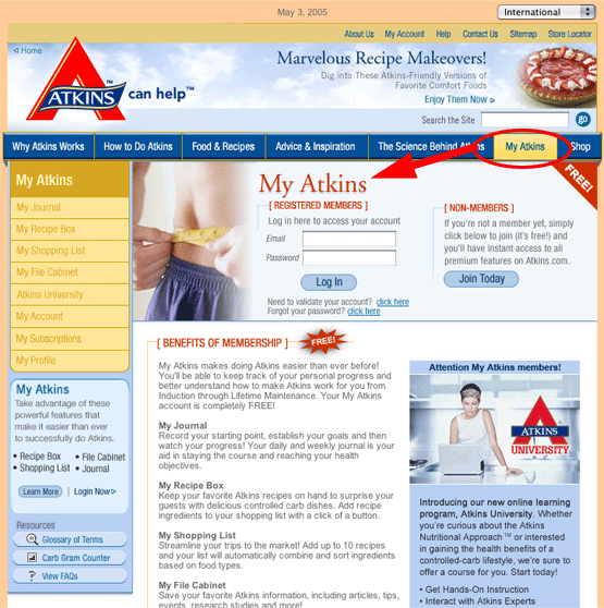
The main navigation for the site consists of a horizontal menu under the logo. Each of the main areas is listed and, when selected, uses a modified tab action to indicate to the user where they are on the site. In addition to the universal navigation, the site features persistent personalized navigation in the form of the “My Atkins” box under the contextual menu in each section. This personal menu provides access to the recipe box, the file cabinet, the shopping list and the journal from virtually every page on the website, once the user is logged in.

Each of the main areas is listed and, when selected, uses a modified tab action to indicate to the user where they are on the site.
6. Task Depth – A
Task #1—Find out more about the plan.
This was easy… and time consuming. At least three of the tabs in the persistent menu address information about the program. There was so much information so well categorized and cross-referenced that one could spend hours and hours drilling down for information. There are invitations to read more everywhere on every page. If there is anything to learn about Atkins, you will find it here.
Task #2—Find out what to do to lose weight.
Again, we had no problem finding this item. The tab “How To Do Atkins” is the second one in on the main menu bar, right after “Why Atkins Works.” Everything is spelled out and ordered… “Before you begin,” “Phase 1: Induction,” “Phase 2: Ongoing Weight Loss,” etc.
Task #3—Get some recipes and menus to get started.
The next tab is “Food & Recipes.” A simple search for “chicken” resulted in 184 search results. Each recipe tells you the phase it is good for and provides preparation and nutritional information. You can easily add the recipe to your recipe box or to your shopping list, as well as print it off, or email it to yourself or someone else.
Task #4—Find foods to get started.
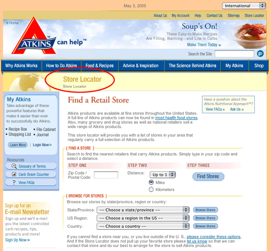
Atkins Nutritional doesn’t just sell their food and information products online. There are stores everywhere that stock their products and they help you find it with the Store Locator. Or you can purchase these items online. But, if you’re like me, you want to get going NOW—not in the three or four days it might take to get these products to you via UPS. The Store Locator turned up 11 locations within 10 miles of my zipcode, four of which were certified Atkins Full-line Retailers.

Atkins Nutritional doesn’t just sell their food and information products online. There are stores everywhere that stock their products and they help you find it with the Store Locator.
7. Affordance – A
Anyone who reads this newsletter on a regular basis will tell you that bad affordance is my pet peeve, the one thing that drives me crazy. Good affordance requires that something that is linked should look like it is linked and, conversely, those things that are not linked should not look like they are. That means that text links are colored and underlined. That gets you a good score. To get a perfect score the link color should change once you have visited that page. The Atkins site falls just short of perfection because the links don’t change color once they are visited.
Improvement Alert: Atkins.com should make the links change color when I’ve already visited a page. There’s so much information on this site it’s really difficult to keep track of all the places I’ve been and all the articles I’ve read.
8. Labeling and Language – A
What impressed me most about the main menu of the Atkins site was the simple and effective way the labels were worded. For the most part the reading level of the content is also very accessible—and for those terms that are of necessity more technical, there is a Glossary of terms and links to “Ask Us.”
9. Readability – A
There is a great deal of information in this website. Every page is packed with navigation, tools and articles, yet it never seems congested or busy. Skillful use of color and alignment give the user a sense of proportion and organization critical to this kind of information hub.
10. Organization (Marketing Quadrants) – A
As we point out in at the beginning of our scoring, the fact that the email sign-up has been pushed to the second screen of the homepage doesn’t impress us. Another opportunity to sign up should be present, at least on the homepage, preferably in Quadrant #1. That being said, there are plenty of opportunities to generate revenue form the links in all four of the homepage quadrants and each subpage features advertising blocks for books and food products in the Atkins Nutritionals line.
Improvement Alert: An email sign-up for unknown visitors should be placed in the first marketing quadrant (upper left of the homepage).
11. Content Freshness – A
It is member-provided content that keeps folks coming back to this site. However, there are plenty of articles that are constantly being added to the website, as well as events in the Event Calendar, press releases and, of course, the personal stories in the “Advice & Inspiration” section. This is more than enough fresh content to keep visitors coming back.
12. Load Time – B
Content-heavy websites often find managing page load time challenging. While there is a great deal of content on this site, most of it is text so some pages load quickly. Where the images are small, as on the recipe and personal story pages, they are fast-loading and provide the most impact. The homepage, unfortunately, was the slowest loading, clocking in at around 50 seconds—but this could be due to that large graphic touting the Sugar Hunt. The fastest pages are the article pages which clock in anywhere from 15-30 seconds.
Improvement Alert: Atkins.com should find a way to make large promotional graphics smaller and faster loading.
13. Aesthetics – A
All the various aesthetic elements work together to create a comforting, trustworthy site. The selection of color, images, and organizational framework reinforce the notion that this is a nutrition program anchored in science. The pages that deal with people’s true life stories help to reassure users that they too can successfully control their weight and live a happier, healthier life.

While the aesthetic elements of the homepage work together to create a comforting, trustworthy site, its slow load time could be due to the large graphic touting the Sugar Hunt.
14. Brand Preference – A
Atkins Nutritionals has partnered with a variety of service providers; eDiets for menu management, GNC and other stores for product merchandizing and distribution. But at no time did we feel like we were confused about the brand. Even when you click on the masthead banner that reads, “Get a Personalized Atkins Plan. Try the original low-carb lifestyle available online at eDiets. Learn more…” and get pushed off to eDiets, the logo in the top left corner is STILL Atkins. No question as to who’s the top dog brand here!
Conclusion
Atkins.com is, frankly, the first website we have seen that successfully uses a single interface to lace together the free editorial hub with a variety of commerce sites—the Atkins Shop, eDiets™ and Atkins at Home™. Their success is due, in part, to terrific branding. It’s also due to an excellent user interface design. Simple, easy to understand labels, personalized space that is dedicated and consistent, and good, reliable affordance make this a site that deserves an A.


