America’s Test Kitchen Website, a Network Hub Positioned to Extend Visitors from the Television to the Web to the Printed Word, Demonstrates Extraordinary Website Architecture in Satisfying Users’ Need for Added Value and Publisher’s Desire for Additional Revenue
Few websites represent successful attempts to integrate broadcast with broadband media. This is not so much because it is impossible to achieve this level of integration as because so few organizations have tried the cross-media model. America’s Test Kitchen, and its sister websites, represent just such an attempt. This site is positioned to provide visitors with a seamless experience extending from the television to the Web to the printed word. While clearly not rocket science, such integration can prove challenging, if only because it is attempted so seldom. The additional complexity of a set of integrated websites whose purpose is to enhance and extend the online marketing channel makes for a challenge worthy of America’s Test Kitchen.
- When visitors come to this site, they are expecting to find the content referenced on the America’s Test Kitchen television show. At the same time, the publishers of the site would like every visitor to become a registered visitor—the website design supports both of these objectives
- The site is all about capturing visitor email addresses and establishing relationships with those visitors—once this connection is established, AmericasTestKitchen.com directs visitors to the various sites in the network, presenting various offers and premiums from throughout the network
- The website design is scrupulous about providing visitors with continuity in navigation. Each page heading has the same content providing visitors with consistent navigation from page to page
- While AmericasTestKitchen.com is packed with content, the user is never confused about navigating the site. All links are text links. In addition, the links presented on this site are presented in a wholly consistent fashion
- The AmericasTestKitchen.com site does an excellent job of reinforcing brand by providing visitors with an easy to use, intuitive web site. The site provides an excellent landing point for those directed to the site by its companion television show
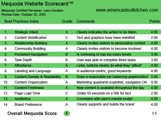
AmericasTestKitchen.com‘s Mequoda Scorecard
1. Strategic Intent, or Purpose – A
The strength of AmericasTestKitchen.com lies in the fact that most of its visitors come with a purpose in mind. They are, for the most part, driven to the site from the highly popular Public Television show, America’s Test Kitchen. When visitors come to this site, they are looking for recipes and recommended products and services that are highlighted on the television show. It becomes particularly important, as a result, that site design conforms to visitor expectations. When visitors come to this site, they are expecting to find the content referenced on the America’s Test Kitchen television show. It is this linear connection between these two media that create and fulfill a successful visitor experience. At the same time, the publishers of the site would like every visitor to become a registered visitor. From these registrations, the publishers can compile a direct marketing database from which they can mount marketing campaigns.
[text_ad]
The design of AmericasTestKitchen.com supports both of these objectives. The site uses a three-column grid design for the homepage. Visitors are clearly directed to the articles or recipes of interest, all of which appear in the left hand column. The center column is dedicated to promotional material that is intended to persuade visitors to take action. The right hand column presents the site sponsors. These sponsors are as much a source of recommendation lending credibility, as they are sources of income for the site publishers. The design of this site provides visitors with clean and efficient access to desired content, satisfying the expectations of site visitors.
2. Content Webification – C
The main purpose of AmericasTestKitchen.com is to make content available to visitors. This is a publishing site, and as such requires minimal interactive or multimedia content. As such, there is little if any content that distracts visitors from their objective, which is to consume site content. However, the site does make effective use of site search. Unlike other site, the search engine for this site generates highly relevant articles, as well as references to content on companion sites, offering the visitor the opportunity to register at these sites if the visitor is not already registered. In addition, visitors can participate in chat discussions by registering for the site bulletin board. This board is actually hosted by the CooksIllustrated.com website. This is an excellent example of how the America’s Test Kitchen network provides an integrated experience to visitors, offering content and functionality from a variety of websites.
3. Relationship Building – A
AmericasTestKitchen.com is all about capturing visitor email addresses and establishing relationships with those visitors. Once this connection is established, America’s Test Kitchen directs visitors to the various sites in the network, presenting various offers and premiums from throughout the network. The America’s Test Kitchen website takes a firm stand on registration. Visitors cannot, under any circumstances, drill past the first level of content without surrendering an email address. Once the site has this information, it unfolds all the recipes, testing, product and shopping information available on the America’s Test Kitchen network. In addition, the site pushes content to registered visitors in the form of an online newsletter. Clearly, this newsletter represents an ongoing opportunity to engage with subscribers. The content of these newsletters is compelling and give the recipient a tangible sense of the quality and substance available from AmericasTestKitchen.com. In addition, visitors are offered an upsell during the registration process, giving visitors an immediate and timely opportunity to access greater value from the America’s Test Kitchen network.
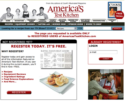
Visitors cannot, under any circumstances, drill past the first level of content without surrendering an email address.
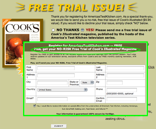
In addition, visitors are offered an upsell during the registration process, giving visitors an immediate and timely opportunity to access greater value from the America’s Test Kitchen network.
4. Community Building – A
While not its main focus, the America’s Test Kitchen network does provide visitors with an opportunity to participate in an electronic bulletin board offering visitors the ability to interact electronically and to create a sense of community. The main vehicle for community is the bulletin board that is hosted on the CooksIllustrated.com website. Visitors can register on the bulletin board and initiate discussions about recipes, food testing or any topic of interest. In addition, the publishers of the website host forums on various topics, presenting recipes and engaging in Q&A with participants on the bulletin board. This technique is extremely effective, as the participants in the bulletin board generate a significant amount of content that will keep visitors coming back to the site.
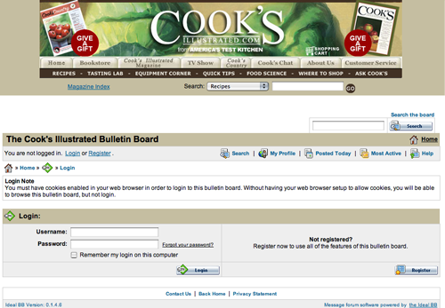
The main vehicle for community is the bulletin board that is hosted on the CooksIllustrated.com website..
5. Persistent Navigation – B
AmericasTestKitchen.com is scrupulous about providing visitors with continuity in navigation. Each page heading has the same content providing visitors with consistent navigation from page to page. The same can be said, for the most part, of the other sites in the network. For example, CooksIllustrated.com presents a similar page heading, with consistent top level navigation from page to page. There is a certain amount of loss of continuity when visitors traverse the network, going from one site to the next. And sites like Cook’s Country offer little in the way of global navigation, leaving the visitor no option other than to click the back button as their main method of navigation. This is clearly not consistent with Web design best practices.
6. User Task Depth – B
AmericasTestKitchen.com encourages visitors to “take the next step” in two ways. First, as noted earlier, visitors cannot satisfy their desire to achieve their objectives on the site without registering and becoming known to the site publishers. In many instances, this registration requirement could present a formidable barrier to entry. Not so for this site. Visitors to this site are motivated and have momentum as a result of having been directed to the site by the companion television show. The publishers of this site show good sense in not requiring that visitors provide a password in order to register. This requirement would make the registration process unnecessarily complex and could be a barrier to entry for some. As noted earlier, the registration process incorporates an opportunity to purchase a subscription to even more valuable and interesting content, offering visitors a clear “next step” alternative.
In addition, the network provides visitors with a shopping experience. The CooksIllustrated.com site sells cookbooks and cooking equipment. The shopping cart is clear and easy to follow, providing visitors with a simple and easily understood snapshot of products selected for purchase. However, the checkout process is likely to inhibit purchasing. Unregistered buyers are required to register at the very beginning of the checkout process in order to complete a purchase. This construct is inconsistent with the absolute priority of getting the sale. Many potential buyers will be put off by this requirement and never complete their purchase. It is highly preferable to give buyers the opportunity to register at the end of the checkout process, and to encourage them to do so by explaining the benefits of registering. In so doing, the registration process never inhibits the sale.
7. Affordance – A
While AmericasTestKitchen.com is packed with content, the user is never confused about navigating the site. All links are text links. In addition, the links presented on this site are presented in a wholly consistent fashion. Each link looks like all the rest. Links are presented in text format and are colored blue. The identity of these links have even greater emphasis as they are underlined. For the most part, this site avoids making it “the user’s problem.” The visitor is never put in the position of having to guess where to go next or how to get there.
Embedded linking enhances the usability of this site, and facilitates the ability of visitors to create their own paths through the site.
8. Labeling and Language – A
Given the nature and subject matter of this website, the language is highly accessible. There is no jargon or obscure language to inhibit visitors from having a positive experience on this site. Even in the recipe section, the site does not use abbreviations or terminology that wouldn’t be readily understood by the vast majority of visitors to the site. As an added incentive, the recipe pages offer links to related content to further enhance the visitor’s experience.
9. Content Density and Readability – B
This site does a good job of presenting content. Typically, information is presented in small chunks, with plenty of white space. The recipes are presented in a highly consumable manner, making them easy to follow on a step-by-step basis. As the site design is based on a three column grid, there is limited space for content. Adding to this slight claustrophobia is the fact that the grid covers only about half the available space in the browser window. Extending the content area to occupy at least another third of the browser window would make this site much more readable.
10. Organization – A
As noted earlier, this site uses the typical three column grid for its page layout. The top banner includes global navigation for the site. This navigation element in the top banner, as a result, gets plenty of visibility. The right hand column is used to promote highlighted content and to present banner ads. The main, active (center) window presents relevant content in the form of articles, recipes and other resources. The active window also displays banner ads and other promotions in the right column, sometimes to the detriment of site readability.
This site does a very good job of following recommended online marketing precepts. Visitors are not required to scroll to see important content or, equally important marketing messages. Consistently, from page to page, this site follows the concept of eye scanning, placing high priority content and promotional material on the page in a visible and easily identifiable fashion.
11. Content Freshness – A
This site updates its content on a regular basis by definition. There are constantly updated recipes, test results and reports presented on the site. Additional sources of freshness are the bulletin board, which is updated constantly with comments and contents from visitors, and the electronic newsletter, which is published on a recurring basis. As a publishing site, the content on AmericasTestKitchen.com and its freshness is an inherent aspect of the business model upon which the site is based. Ads change, offers change and content is updated regularly. The world of food is nothing if not dynamic, and America’s Test Kitchen keeps up with the changes, and when it is at its best, is ahead of the curve.
12. Load Time – C
The load time for the AmericasTestKitchen.com homepage is 45.97 seconds over a 56k connection. While the total number of HTML requests is limited, there are 44 images that are loaded with the page, including banners and navigation menu rollovers, and this is increasing the download time for the homepage, as well as interior pages. The total size of the homepage is over 229Kbytes, while the optimum size for rapid download is below 100Kbytes. Layering content by loading the most relevant content for users first will help reduce the perceived delay in download time.
13. Aesthetics – A
AmericasTestKitchen.com is clean looking, information rich and intuitive. As such, the design of the site will meet most people’s expectation for professionalism. The site is about information and communication, and its clean, no nonsense design support those objectives very effectively. The look and feel and overall design of AmericasTestKitchen.com is utilitarian. There are few if any extraneous content or design elements. No large and cumbersome images, other than banner ads, to get in the way of the main function of the site, which is information presentation.
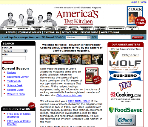
AmericasTestKitchen.com is clean looking, information rich and intuitive. As such, the design of the site will meet most people’s expectation for professionalism.
14. Brand Preference – A
On the Web, brand preference is established and reinforced by providing visitors with successful user experiences. Ease of use, relevance, visual consonance, credibility and confidence all contribute to a successful user experience. Unlike traditional media, indirect branding is seldom effective in the online environment. AmericasTestKitchen.com does an excellent job of reinforcing brand by providing visitors with an easy-to-use, intuitive website. The site provides an excellent landing point for those directed to it by its companion television show. The site provides further brand reinforcement by acting as a hub for the associated sites in this online network. Taken together, the sites in this network provide an interactive and referential experience for visitors that strongly reinforces the overall brand.
Conclusion
AmericasTestKitchen.com is well executed and extremely useful. This site together with its sister sites offers visitors practical, usable information that is easily translated into better eating and better nutrition. This site is an excellent example of the combination of utility and good marketing. All the sites in this network interact in such a way as to keep visitors coming back for more, while providing ever increasing opportunities for additional value, for visitors, and additional revenue sources, for the publishers. This site makes its visitors smarter about food and cooking. If that isn’t a recipe for success, I don’t know what is!


