AdAge.com demonstrates why it is the premier and authoritative source for industry news on marketing, media and advertising
AdAge.com is the website of Advertising Age, the 74-year-old flagship magazine of the Ad Age Group, a division of Crain Communications Inc.
The Ad Age Group publishes two print magazines, Advertising Age and Creativity, two websites, AdAge.com and AdCritic.com, two HTML newsletters, The Creativity E-Mail and Madison+Vine and the AdAge.com E-mail Alert.
Although similar, the content of Advertising Age and AdAge.com is not the same. AdAge.com does not contain the full editorial content of the print edition. Nor does the print edition contain all that is in the online edition each week. However, text-only articles from the print publication are available on AdAge.com approximately two weeks after publish date.

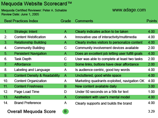
AdAge.com’s Mequoda Scorecard
[text_ad]
1. Strategic Intent – A
AdAge.com wisely wants to capture your email address immediately upon visiting the site. The user must register, at no charge, to read beyond the headlines and teasers. Once you register and provide your email and snail mail details, you are “cookied.” On subsequent visits to the site you are greeted by name.
This is smart and sophisticated use of the technology (see Content Webification below). We would expect nothing less from a publication that serves advertising and media professionals.
2. Content Webification – A
AdAge excels at webification. First, AdAge.com offers users RSS (Really Simple Syndication) news feeds from nine of its online properties.
As an upsell from the free AdAge.com, for a subscription fee, the publishers provide the Advertising Age magazine in a powerful, new digital form with the same layout, text, and advertisements as the print version.
The digital format offers a paper-like reading experience, but with many advantages possible only in digital format, including automatic delivery of every issue directly to your computer via the Internet and a hyperlinked table of contents that takes you directly to the articles, features and sections of the most interest to you.
The Digital Edition of Advertising Age is available each Sunday afternoon before it publishes in print on Monday. The publisher emphasizes that this is great for international readers and those who need a leg up on the competition. (Who doesn’t?)
Other examples of webification: on the free AdAge.com homepage there is a prominent search engine that enables the registered visitor to search all AdAge Group publications, including American Demographics and The Encyclopedia of Advertising.
American Demographics is Ad Age’s home for consumer trends, data and insights. It was published as a magazine from 1979-2004 and relaunched as a section on AdAge.com and in Advertising Age in February 2005. Archives go back to 1998. American Demographics articles are free for 30 days from the date they were first published. After 30 days, they may be accessed by using Ad Age PayPoints (see Relationship Building below.)
The Encyclopedia of Advertising features nearly 500 full-length articles and essays covering the history, trends, issues, people and companies that drive all aspects of marketing. All Encyclopedia articles are searchable and browsable by using Ad Age PayPoints.
If that weren’t enough, AdAge.com offers The Ad Age DataCenter, which provides exclusive advertising and marketing industry data compiled by the Ad Age Research Department. This is an enormous resource.
Finally, there’s even a QuickTime plug-in video that pitches Advertising Age’s Point magazine for CMOs (chief marketing officers?)
3. Relationship Building – A
AdAge is doing this as well or better than any website I have yet visited.
First, AdAge.com asks you to register. The articles and data here are accessible to registered users only. There is no fee for registration. Registered users can access all AdAge.com daily news stories without charge for 30 days after the date of their publication.
When registering, you can request highlights of the most important daily news from AdAge.com be delivered to your email inbox five days a week. And as major stories break, AdAge.com will email you succinct real-time news alerts. This is a free service.
Additionally, you can sign up for Hispanic news email alerts (delivered in English, but covering Hispanic-related news).
Next, you can opt to receive free weekly highlights from Madison+Vine, the Advertising Age publication covering cutting-edge campaigns pushing the content commerce envelope.
Then there is AdAge PayPoints, a convenient way to purchase premium articles and data offered on the website. Rather than commit to a lengthy subscription or use your credit card every time you need to read a premium article or report, PayPoints enables you to purchase packages of universal, non-expiring AdAge currency exchangeable for all types of premium site content.
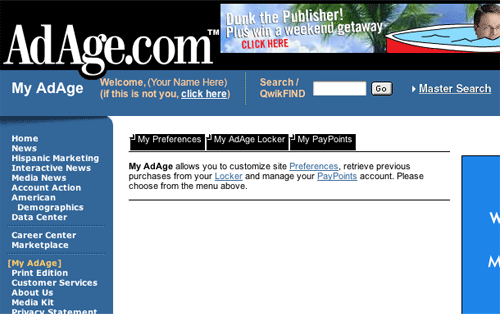
My AdAge enables you to customize site preferences, retrieve previous purchases from your MyAdAge Locker and manage your PayPoints account. The MyAdAge locker allows you to access premium PayPoint articles 14 days from the date of purchase.

4. Community Building – C
The only item of community building that we found on the AdAge.com website (and another example of good webification) is the AdAge.com Career Center, which includes a sophisticated search engine for job seekers. While there weren’t many positions posted when I last visited, it is surely a valuable component of the AdAge.com site and will no doubt gain popularity over time.
5. Persistent Navigation – A
Navigation of AdAge.com is simple and intuitive. No heavy lifting required.
However, a couple of display ads are links to other websites that do not open in a new window. This is one of my frequent criticisms of websites designers and makes no sense to me, especially because a few key strokes of HTML code makes it entirely unnecessary.
6. User Task Depth – C
Register, read, search, download, whatever—the thoughtful designers of AdAge.com have made is all quite easy and intuitive. The only surprising deficiency is the Subscribe link, which is hidden at the bottom of the homepage.
This is a major Achilles’ heel for an advertising website that does nearly everything else so well. Nevertheless, a major display ad linking to subscription information about the Advertising Age Digital Edition is prominent. Why not a more visible link to an order page for the print edition?
7. Affordance – C
One other disappointment in an otherwise exceptional advertising website: there is a strange inconsistency in the design of the links in the left navigation panel. They inexplicably change at the end of the list. A new element intrudes: a dropdown menu at a section called Custom Programs, which links to online examples of Advertising Age special editions.
Additionally, links are not underscored, nor do they change color when clicked.
8. Labeling and Language – A
The world of advertising may be filled with industry jargon, but there are no confusing words or labels in evidence on this site. What you see is what you get (which is not a claim that all of the advertising industry can make!)
9. Readability – A
The designer has done an excellent job of organizing an enormous amount of content without making the homepage unwieldy. The user has an unusually large number of choices, but frequent visitors will have no trouble finding the sections they want to see.
There is an attractive rhythm created with a variety of typefaces, type sizes and graphic icons.
10. Organization – A
The most frequently visited sections are linked above the fold. Everything appears to be easy to find except the Subscribe link. See above.
11. Content Freshnes – B
Breaking news is the general theme of the AdAge.com homepage and dominates the center column. Advertising industry professionals surely want to visit this site at least once a day.
12. Load Time – D
The Web Page Analyzer clocks the AdAge homepage as loading in 55.60 seconds at 56K. The total number of images on the homepage is 57 on a typical day. The total size of the homepage is nearly 278,000 bytes.
This is a very hefty load and far from optimal, but my guess is that subscribers 1) are willing to wait and 2) generally access the site from businesses equipped with higher speed Internet access (cable or ISDN).
13. Aesthetics – A
The AdAge.com homepage resembles the Advertising Age magazine, which industry professionals have been reading for decades (see Brand Preference below). This promotes a congruency that makes it consistent with the user mental model.
14. Brand Preference – A
The familiar marquee typeface from the Advertising Age print publication reinforces the brand.
A couple of display ads are links to other websites, which slightly diminishes the Advertising Age brand.

Conclusion
AdAge.com is one of the best examples of an advertising website that we have reviewed. This is to be expected from an industry that ought to know a lot about what works and what doesn’t. We hope more of AdAge’s constituents are paying attention. This site works and earns a Mequoda Website Scorecard grade of B.


Here you will be able to find out the best steps for start up windows 10 and can easily find out file and folder in this windows.
Good share,you article very great, very usefull for us
There’s a lot to learn from this.
Cool post, so sad I have some thing to handle right now, So I bookmark it to facebook. Will check this post later…Thanks.