The Accounts Payable Network describes itself as the most comprehensive, specialized resource available for accounts payable professionals by providing—in one convenient, online location—current solutions for AP strategy, technology, people and processes.
That’s a big promise, especially considering that the subscription website was launched less than three years ago by Financial Operations Networks LLC and its founder, Phil Binkow. But The Accounts Payable Network doesn’t disappoint; it overwhelms the AP professional with valuable tools and content.
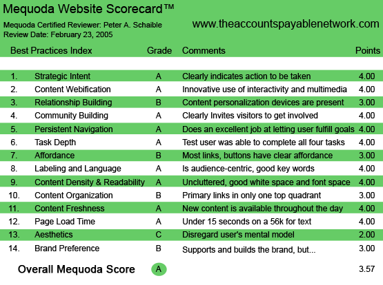
Using the Mequoda Website Scorecard™, The Accounts Payable Network does an exemplary job of implementing effective design practices. They are a prime example of a successful Mequoda Membership Website™.

TheAccountsPayableNetwork.com’s Mequoda Scorecard
[text_ad]
1. Strategic Intent – A
The Accounts Payable Network landing page is clean and simple. It states its offer and unique selling proposition clearly, displays a couple of subscriber testimonials, and offers a free trial, but not a free tour (not here—elsewhere).
The choices here are “Free Trial” or “Go to Member Home Page.” Clear enough. Signing up for the trial is straightforward and requires the users to tick a box and agree to the Terms of Service.
Trial membership confirmation arrives via email, which requires user activation. Within 30 minutes of registering, I received a personal phone call from Chris Willy, The Accounts Payable Network Membership Executive, who offered me access to some of the members-only sections not normally available to trial members.
This is very attentive customer service, of course, and not the completely automated service we were expecting from a well-designed website. Had I been half a world and eight or 10 times zones away, could I have expected to hear from Mr. Willy? No, he probably would have sent an email message with a similar offer.

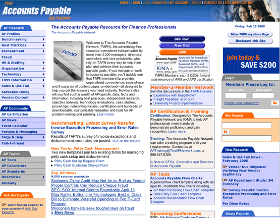
TheAccountsPayableNetwork.com’s Homepage
2. Content Webification – A
The Accounts Payable Network includes a comprehensive glossary (accounts payable and accounting terminology defined).
The Vendor Discount Calculator and eight other online calculators (Foreign Currency, Return on Investment, etc.) are interactive and useful, creating substantial additional value for Accounts Payable Network members. So are the LexisNexis news headlines gathered daily from 4,000 worldwide news sources.
An “Ask the Experts” feature enables members to post individual queries and in response, The Accounts Payable Network editorial team will do actual research for them. The results are then added to the Frequently Asked Questions section.
A total of 214 templates, forms and checklists are available for downloading—an outstanding value that probably is worth in excess of the annual Accounts Payable Network membership fee.
3. Relationship Building – B
The Accounts Payable Network offers a free seven-day trial. They also dedicate important real estate on their homepage to suggesting that users make TAPN their homepage or bookmark their site. This shows that TAPN is dedicated to promoting personalization.
Upon first glance, it seems as if TAPN does nothing to capture the prospective member’s email address, but after speaking with Mr. Binkow, we learned that they offer a monthly e-Bulletin. It goes to people who register or otherwise opt-in to the site, but don’t join as full members.
This allows The Accounts Payable Network to follow-up with casual visitors at a later date, using email communication to drive traffic back to the site.
4. Community Building – A
The site includes 10 discussion forums plus a job forum. An events calendar is also displayed.
Where The Accounts Payable Network clearly excels in community building is with the Accounts Payable Certification Programs it has developed with IOMA, the Institute of Management and Administration. The training program and certification plan is designed to help AP professionals meet high standards and recognize those who, by possessing related work experience and passing a comprehensive exam, have met stringent requirements for mastering the accounts payable body of knowledge. AP managers can pursue three levels of professional certification.
5. Persistent Navigation – A
Navigation is clear and consistent. See Affordance.
6. Task Depth – A
Signing up for the trial and joining The Accounts Payable Network is easy. Browsing and searching are consistent and intuitive. A Site Search tool appears on nearly every page. Non-members are continually frustrated (blocked) in their attempts to access premium information and politely encouraged to join.
7. Affordance – B
The use of the site primary colors—blue and orange—for links and mouseovers is distracting and unconventional. The site would do better to stick with traditional blue hypertext links and traditional red mouseover changes, with maroon indicating a previously-visited link.
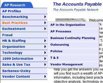
Pull-down menus are clearly marked and work as expected.

Several of the items in the left navigation popped pull-down menus, which made browsing very easy.
8. Labeling and Language – A
The Accounts Payable Network is a serious website designed for AP professionals. There is no way it can avoid using the technical jargon of the industry it serves. Wisely, the content appears to be aimed at both relative newcomers and seasoned veterans.
9. Content Density and Readability – A
Other than its very cluttered homepage, The Accounts Payable Network articles are well designed and employ adequate white space. I particularly applaud the selection of type sizes and typefaces. A printer-friendly option is included on all text-heavy content pages.
10. Content Organization – B
This is an extremely text-laden site with very few graphics. While the articles are well designed and can be easily scanned, the homepage is busy and cluttered. In order to cram everything on to the homepage, the designer has resorted to making the typefaces here smaller than elsewhere on the site—arguably a mistake.
Primary task links are visible above the fold, as recommended. See Aesthetics below.
11. Content Freshness – A
Some new content is added almost every day, and sometimes more than once a day.
12. Page Load Time – A
Very limited use of graphics files means the pages of The Accounts Payable Network site load very quickly. According to the Website Analyzer, the site loaded in 9.26 seconds on a 56K.
13. Aesthetics – C
I question the site’s choice of colors, which a professional color theorist might consider too garish for engendering the trust and confidence of financial professionals. The blue almost works, as blue almost always does, but I would have chosen a darker shade. The orange doesn’t work for me at all, but these are certainly subjective judgments.
There are too many blue, grey and orange color and tint changes used to define The Accounts Payable Network sections and departments. A simpler, more consistent design would be more attractive and orderly.
Four columns on the homepage is awfully busy for my taste, but packing this much content in one place certainly makes a convincing case for the plethora of information to be found at The Accounts Payable Network.
Better written (more tantalizing) headlines and sub-headlines would serve two purposes. First, by increasing search engine rankings for key words, and second, by drawing in a greater number of casual visitors who would click for more information. Of course, by doing so they immediately meet a barrier and are prompted to join or try the site demo.
14. Brand Preference – B
There is no distinctive Accounts Payable Network logotype or graphic identifier to help brand the site or its content. However, they do employ significant use of their abbreviation, TAPN, to brand their content throughout the homepage. The Accounts Payable Network could potentially send confusing messages with its very busy layout and an almost excessive number of choices from its member homepage. Here, references to its certification and training programs in partnership with IOMA, while impressive, could also potentially distract and dilute the brand.
However, advertising the certification and training programs “above the fold” increases response, according to Mr. Binkow, who has tested the response both ways. So how can you argue with the result? Measurement trumps argument. Additionally, Mr. Binkow says his busy layout is intentional. “I want people to come to our site and be immediately impressed with all the content we offer.”
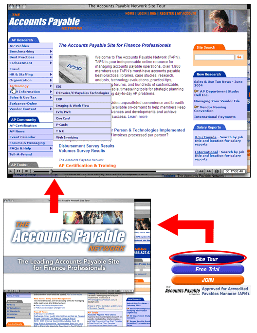
Also, this is the page at which a Site Tour is first offered—an excellent Flash video that whisks the viewer through the site’s many features and benefits in two minutes and 40 seconds. Very nicely done. Probably The Accounts Payable Network’s strongest selling tool. Every member site should have such a comprehensive video site tour.

The Site Tour is first offered—an excellent Flash video that whisks the viewer through the site’s many features and benefits in two minutes and 40 seconds. Very nicely done. Probably The Accounts Payable Network’s strongest selling tool.
Conclusion
The Accounts Payable Network serves its members very well. There is an enormous amount of content here, creating an invaluable resource. It’s hard to imagine an AP professional not wanting to join this member site or objecting to its $695 initial one-year membership fee.
[text_ad]


