A Harvard Business School (HBS) education doesn’t come cheap. But if you are willing to do a bit of detective work, and forgo the actual “sheepskin” of a diploma, there are a few lessons you can learn from HBS—absolutely free. We spent the past few weeks wandering the pages of HarvardBusinessOnline.org to see what the finest business minds of the country could teach us about subscription websites.
We had testers subscribe to the Harvard Business Review, peruse the general and educator sections of the site, and browse the extensive catalog of books and online courses and this was what we found. While many of Harvard Business School Publishers’ online subscription marketing practices were on par with other successful sites we’ve reviewed, there were three particular areas where HBSP successfully maneuvered challenges often mishandled in other subscription sites. We thought these lessons were important to bring to your attention.
1. How to address the needs of totally different audiences

HBSP, the publishing arm of Harvard Business School enjoys the patronage of two distinct audiences: business folk—managers and executives the world over, and educators—trainers and professors for whom the Harvard case-style of teaching is a keystone to their curricula. Other websites with multiple distinct audiences have taken the approach of creating splash pages that force a user to pick the link or “doorway” to the content that addresses their needs; an approach somewhat reminiscent of The Price is Right. However, this tactic ignores the fact that the needs of one audience might very well overlap with the needs of another. Or, as sometimes happens, the audience may not identify with the profile used by the website’s developers. For instance, a medical information site, whose users consisted of healthcare providers, researchers and patients, tried to segregate them by providing one of these multiple “doorway” splash pages. The developers discovered, after they did some user testing and scrutinized their web logs, that patients didn’t want to see the simplified content created for them—they wanted access to the same information as the researchers. The patients devised ingenious ways to hack into that part of the site to get to that information… and why not? This was what they really wanted to know.
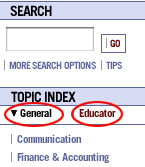
Instead of shutting out any of their users from audience-specific content, Harvard Business School Publishing allows the user the option of choosing a “lens” through which to view the material available.
Users that fall into one specific category can easily choose to view the content that is most important to them. For those of us who wear two hats—managers responsible for training or educators who also have consulting practices—not being pigeon-holed upon entry to the website makes us feel acknowledged and respected.
2. How to sell a wide variety of product types
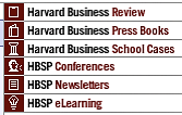
Most subscription websites have one major product and perhaps a few ancillary products. Wine Spectator, for example, does a great job of selling subscriptions to its magazines and then goes one step further by converting their back issues into individual items that can be sold like books. Harvard Business School Press is able to present an impressive array of premier products—partly because of Harvard Business School’s caché in education, the B-School case studies are used wherever the science of business is taught. But also partly because the website is about the brand. It is the “Harvard” in Harvard Business Review that gives prominence to whatever is sold at this site, whether that sale is targeted to a human resource manager, a CEO or a university professor. HBSP can go far beyond print products and include conferences and eLearning side by side with the Review, the impressive catalog of books, and the case studies for which they are known.

However, we have one issue with the design of the product links on the homepage. In informal task tests where we asked participants to find the Harvard Business Review, several missed the links arrayed on the right side of the page. It is possible that they would have had more success if the product links were placed on the left just above or below the search box area. Web users have been conditioned to expect navigation links in the left margin. Indeed, they get annoyed when links in the left, which look like navigation, turn out to be advertising. It is certainly worth testing to see if moving this block of links to the left side of the page would result in improved click-through rates.
As mentioned in our Cook’s Illustrated review, having an order process that fits the product type is fundamental to providing the user with a pleasant and useful buying experience. And, in general, HBSP does an admirable job. The subscription publications have a one-page subscription form and the books use a catalog and shopping cart flow. Task tests in each of these order flows were completed with both ease and speed.
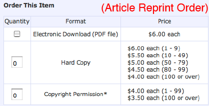
The one area where the user experience could be improved is in access to the articles. While HBR subscribers have unlimited online access to the current issue, there is no option to subscribe to the archive of HBR articles at any price. We are of the opinion that, by narrowly limiting access to previously published articles to reprints only, HBSP may be missing an important opportunity. It speaks to a pre-Web mentality regarding content—that published material is only made available piecemeal as print or virtual print, i.e. a downloadable PDF, even though it certainly exists somewhere in a digitized form.
And speaking of reprints, we were puzzled that clicking on any headline link brought up a reprint request page. Why did we not see an abstract or snippet of the article first so that we could sample the content, an important aspect of the buyer’s product research experience? In actuality, there is an abstract or “description” of the article in question, however it falls below the fold so that we must scroll down to read it. The reprints catalog uses the same shopping cart as the bookstore so we were curious as to why we didn’t get this same behavior when we were shopping for books. It turns out that books generally have only one price line while the reprints often have as many as eight, forcing the article description down the page into invisibility. A bit of tweaking here could improve the user experience—a link at the top to the description would ensure that users could check out the article before buying; placing the description at the top under the title would be even better.


3. How to create value-added personal space

Giving your users a place to save material they have spent precious time researching on your site is a boon to busy customers. Personally, we love the Wish List function on Amazon.com that allows us to save books, CDs and DVDs that we’ve come across browsing their catalog—items we couldn’t possibly purchase at that moment. We can even share this wish list with friends and family. But calling this functionality a Wish List is a little too consumer-like for B2B or B2P sites like HarvardBusinessOnline.org.
Instead, HBSP calls this functionality My Library—”a convenient online location for you to store and access the electronic products and product previews you’ve purchased and downloaded, as well as any item detail pages you’ve visited and would like to return to later.” Each and every item that is available for sale at the site can be saved to your personal library for see later, including downloads, conferences and eLearning programs! In addition to building “stickiness” and brand loyalty, HBSP is collecting invaluable data on what interests their users—data that can be used to tweak the editorial grid and help develop new products and product lines.
Conclusion
Clearly, a visit to the HBSP website can yield some important lessons. And just as in their famed HBS Case Studies, you can learn as much from what ISN’T there as you can from what is. We believe that if you are in the content business, you have to go beyond the boundaries of print and exploit the unique opportunities provided by the nature of the Web. Access to valuable content 24/7 in all its possible formats is worth a good deal to someone and the unit cost of providing access is negligible when that content is already digitized. Imagine the power of “My Library” paired with unlimited access to the entire archive of HBSP content from all of its printed products: books, newsletters and the esteemed Harvard Business Review! The legendary library of Alexandria could hardly compete.
References and Resources


