How WSJ.com Sells $84 Million in Subscriptions
The Wall Street Journal‘s website, WSJ.com, has achieved incredible success by selling print subscriptions online while simultaneously selling subscriptions to their online product. As a result, they are a great example of how to sell millions of dollars in subscriptions from one website. After perusing their site, we have identified seven marketing lessons to be learned from WSJ.com. If your online publication can manage to follow at least five of the seven lessons well, you should be able to increase print subscription sales from your website.
As of Q3 2004, WSJ.com reported having 701,000 online subscribers. Averaging $60 per subscriber ($79 for online-only subscribers and $39 if you’re a print subscriber), that means they’re generating just over $42 million dollars a year in online subscriptions. We’ve been told “off the record” that the revenue generated from their print subscriptions online exceeds the online subscription revenue substantially. While The Wall Street Journal has never been willing to confirm or deny, we can make an educated guess that the print subscriptions sold online must generate at least $42 million in revenue per year. This would bring the total subscription revenue from their website to almost, if not more than, $84 million per year.
Forget the myth that says consumers won’t pay for content online—OPA research indicates consumers spent more than $1.6 billion for paid content in 2003. The key to selling paid content online is knowing how to properly balance the relationship—paid content versus free content. There are certain kinds of content that are made most valuable by pulling them outside the “subscriber-only” area and having them be totally free and totally accessible. The best strategy is to find the balance that assigns the appropriate value to your content, creates maximum page views and makes paying for content logical to the user.
Print publishers must realize that people do go online to subscribe to print. For many Americans, especially young Americans, the Internet is a massive directory of things to buy. For subscription-based products, our research indicates that both young and old expect to be able to subscribe to a print product via their website. They may wish to call an 800 number to order and they may wish to be billed in the traditional way, but they are surprised if the publication’s homepage does not provide visible, easy access for subscribing to the print product.
[text_ad]
If your goal is to sell subscriptions to your print product online, while also selling subscriptions to your online product, look no farther than The Wall Street Journal. Here are 7 lessons to be learned from WSJ.com.
1. Place high value on your content
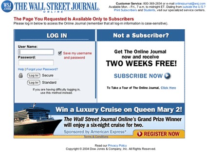
The clearest way to show the consumer that content is valuable is to ask to be paid. This requires money to change hands. At minimum you ask for registration to monetize the relationship and don’t provide unlimited free access for the same content you are selling in a different format. The Wall Street Journal doesn’t give away the content for free. When you click on a headline or content on the homepage, users are prompted to either sign in or subscribe to the online journal.
2. Provide multiple homepage “Subscribe” entry points
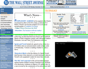
We look at a homepage in terms of four marketing quadrants (upper/lower, right and left). We would expect that at least two out of the four marketing quadrants including at least one of the upper quadrants, provide an opportunity to subscribe. WSJ.com has two subscribe entry points next to the masthead, along the top of the page.
3. Use entry and exit pop-ups effectively and appropriately
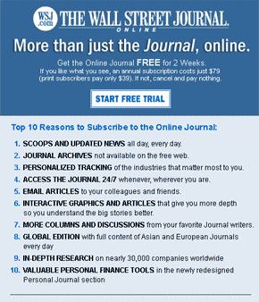
For unknown users, we know of no better way to signal to a user that we want a relationship with them than with a tasteful entry pop-up. A substitute would be a large block dedicated to the same message on the homepage displayed to unknown users only—one that clearly signals our intention to the user up front: “We’d like to have you as a paying customer.” We recognize that this is a controversial position, and that there are any number of Web marketing professionals that recommend against using pop-ups, but we stand by our position with regard to anyone who is an unknown user to your website. The pop-up used by WSJ.com outlines 10 reasons to subscribe to the online journal and provides a nice, clean “Start Free Trial” button. For the user, it provides a clear message—they want you to start a free trial. Additionally, it can be seen as a service to the user, a shortcut to getting the task accomplished.
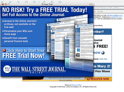
Given the high abandon rates on most order flows, an abandon pop-up that generates even a 5-10 percent save rate can become a meaningful part of the equation. And remember, only those who abandon the order flow see this device. Done well it becomes a customer service effort that attempts to overcome objections, reinforce benefits and explain the offer much the way a good sales person would do. No risk! Start free trial now! Get full access to the online journal! In the case of WSJ.com, they can propose a “What do you have to lose?” offer with their 14-day free trial. As a publisher, you should view implementing an exit pop-up much the same way. What do you have to lose?
4. Design an easy-to-follow order flow with clear order status
The order flow must be painlessly clear to follow, letting the user know where they are and what’s required and not presenting options or choices that are irrelevant or insignificant. Our testing indicates that a multi-page order flow that keeps all the information above the fold consistently converts better than a single-page order flow that requires the user to scroll down in order to complete the purchase—if only because the call-to-action (button) is always visible on the multi-page order flow.
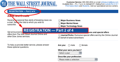
A confused customer is your worst nightmare. Second only to a lack of clarity about the price paid is a lack of clarity about where the consumer is in the order flow, and what is required to complete it. Customers love closure and by spelling out where they are (Step 1 of 4, Step 2 of 4, etc.) and what is required to complete the process, you will see a significant increase in the number of people who complete the order. The WSJ.com order flow is very clean. Split into two columns, this order flow is easy to follow and leaves no guessing as to where we are in the process of registering or buying.
5. Have price and terms clearly presented
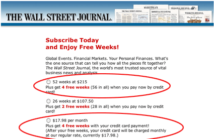
In10 years of ecommerce experience and study after study, the single most frequent reason for an order flow abandon is the consumer’s lack of clarity about the price and terms for the product being purchased. You should clearly present the price and the term options available as appropriate before requesting payment information. The age-old practice of indicating that one offer is the “best deal” or ordering them so that the best deal is at the top of the list are all tactics that will help improve conversion rates.
6. Give incentive for credit card continuous service
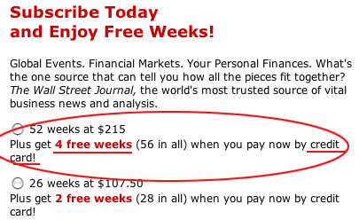
Given the vastly superior economics for the publisher of a credit card continuous service relationship, a substantial effort should be made to offer the customer a meaningful incentive to do business—in a way that is advantageous to the publisher. You should offer a clear, appropriate incentive for paying with a credit card: two weeks free, four weeks free, special price, 50 percent off, etc. or a gift that is tangible and appropriate. This example is for The Wall Street Journal print edition. If you subscribe for 52 weeks and pay by credit card, you get 4 weeks free. If you were to choose a “Bill Me” option, you would pay the same price, but wouldn’t receive 4 weeks free.
7. Up-sell on order confirmation
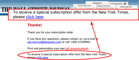
While you are saying “Thank you,” depending on the up-sell offer, we’ve seen take rates as high as 25-35 percent for an appropriately worded, compelling offer for a relevant product. This not only is a chance to enhance the economics of the transaction, but studies have shown that the second transaction reinforces your brand and improves and increases customer loyalty at this critical point in the relationship. While WSJ.com offers an example of what an up-sell offer looks like, we don’t believe it does the best job of promoting its own products. For someone who has just subscribed to the print publication we are stunned that they are not being offered a $39 offer for the online version of the publication… however they were being offered The New York Times print subscription. “I’ve got your credit card—and for just $39 more, you can also access The Wall Street Journal online 24/7!” &/or Barron‘s, Smart Money, or any of the other products we have available.”
Conclusion
If you want to increase subscriptions on your website, go back to the basics. Look to traditional direct mail and subscription marketing offers for online test ideas that boost response. Show the product. Include a product description, one that emphasizes benefits, not just features. Include risk-free guarantees and involvement devices, anything and everything you can to lift response.
Don’t forget about premiums and freemiums. They lift response. Use them. There must be something of perceived value to give away to subscribers with very little extra work and no added expenses. Like WSJ.com—they offer a 14-day free trial. This is costing them nothing and improving their conversion rates exponentially. Be creative. You can even let subscribers download the freemiums online as PDF files, so there are no fulfillment costs.
Don’t be afraid to use pop-ups to reclaim your abandoned customers. This works! WSJ.com purposfully uses a bigger exit pop than an entry pop. This signals to the user that as much as they want you to subscribe when you enter the site, they especially don’t want to lose you after you’ve made the initial decision to buy. You can also test a bunch of different offer variations, such as sweetening the deal by offering a premium to entice users back to the order form.
Speaking of order form, remember there’s no reason to use a four-page order form for an online edition when you’re using a one-page order form for the print edition. Remember to make each click count, no matter how many your order form requires. Submit means submit, don’t keep giving users the ability to get frustrated or change their minds! WSJ.com holds their order form to four pages and clearly demonstrates where the user is in the buying, or ordering process.
Finally, use your homepage real estate for subscription marketing. This one is a no-brainer. Claim the area in the online masthead. Try a mix of banner ads, graphics, text links and navigation all over the page to market subscriptions, much like WSJ.com does. If you scroll down the WSJ.com homepage, you’ll find additional links to subscribe under the fold. Do whatever you can to drive users to your order form. After all, if the primary goal of a subscription website is to make money, it only makes sense to provide multiple and easy opportunities to do so.


Agreed. However, Denver Post is not the same as WSJ. What can a paper with weaker franchise than WSJ do to get people to pay? Please refer the experience of Denver Times at http://www.npr.org/templates/story/story.php?storyId=104667625, where only 3000 people joined up, although 50,000 were expected at a price point of $5 per month.