Can a person (moi) who has never had a weight problem review a landing page that markets healthy recipes which enable someone to lose unwanted pounds? “Yes!” he emphatically says with a mouth full of rich, calorie-filled cheesecake. Ohannualrecipes.com is the name of this landing page, which belongs to Oxmoor House, a Time Warner Company.
Oxmoor House has licensed a book of healthy, delightfully scrumptious recipes from—you know ’em, you love ’em, in fact you might’ve tried them—”Weight Watchers.” In fact, that is how we found this landing page—by doing a Google search for Weight Watchers. Oxmoor House also licenses other products from other sites like CookingLight.com, Martha Stewart, etc.
- The precursor to Jenny Craig, Weight Watchers International has been around since 1963.
- This “Grand Poobah” of weight loss companies provides healthy weight management services with operations in 30 countries worldwide.
- Its business consists of weekly meetings that promote education and group support in conjunction with a flexible, healthy diet and exercise method.
- The USA is, unfortunately, a prosperous nation that has a weight problem, so this company has experienced exponential growth and branded itself into our consciousness.
- This is probably why Time Warner has decided to market this book, and they’ve pretty much done a good job of this landing page with a reservation or two.

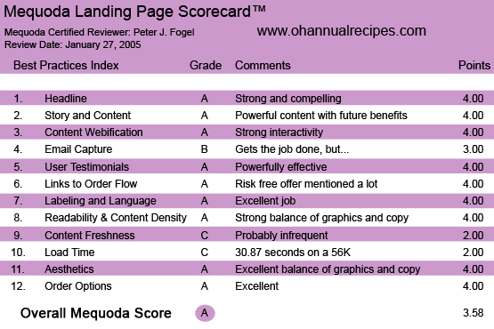
Ohannualrecipes.com’s Landing Page Scorecard
[text_ad]
1. Headline (Strategic Intent) – A
Now here’s a recipe for success. Take a strong brand, add into it a powerful headline, and sprinkle in an emotion-laden subhead and you have a compelling offer. Weight Watchers Annual Recipes for Success. Eat What You Love and Love Every Luscious Bite. The headline announces to the prospect if you’re here at this site, you’re probably wanting to lose weight and now you can with “these successful recipes.” The subhead does a good job of letting the prospect know that they can continue to enjoy eating what they love with no guilt on their part. Now who wouldn’t want that?

2. Story and Content – A
If ever there’s a compelling story it’s Weight Watchers. They use a convincing blend of copy and graphics to tell their story and deliver a strong benefit. Weight Watchers effective USP (unique selling proposition) delivers the magic pill. Eat whatever you want… and still lose weight! You can’t beat it. This three-decade-old brand does “the talking” and convinces the readers with a strong promise of losing weight and to show you how serious they are, they’re going to let you try their recipes out for FREE. This is what Jay Abraham calls “risk reversal.”
3. Content Webification – A
This is not a branding site. It’s a point-of-purchase page with a strong U.S.P. It’s “mean and lean” (no pun intended) in its design and the information it gives you. The person who deals with diets undoubtedly knows about Weight Watchers. The USP for Dominos Pizza is “hot pizza in under 30 minutes.” Weight Watchers is “Eat the foods you love.” And who wouldn’t? “You mean, I can eat the foods I love and still LOSE weight. Sign me up!” They also display Weight Watchers favorite point system.
That is dieting heaven. Strong and compelling and Oxmoor plays it up heavily in getting you to taste-test their book.
4. Email Capture (Relationship Building) – B
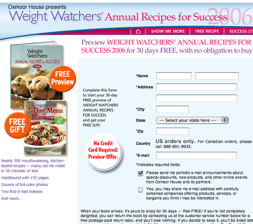
Effective. The site easily captures the prospect’s email well. In essence, the whole site is a squeeze page with a strong offer that lets you know… “Hey, you’re going to get the book to test drive for FREE… so if you want it, well, you’re going to have to give us your address, phone number etc.” Again, people are fickle, why wouldn’t they want to test drive the book for FREE? Well, some might not want to at this particular time. This is why this site should still have a pop-up that appears as the prospect is trying to exit the site. Something to the effect: “Hey, where are you going? The ‘Weight Watchers’ book is FREE for you for the month, why don’t you try the luscious recipes out yourself and prove it to yourself…” etc.

5. User Testimonials – A
Strong, convincing. Weight Watchers has built their brand on user testimonials for over three decades. At this site they’ve also added “before” and “after” photos which make testimonials, or otherwise called here, success stories, quite effective.
6. Links to Order Flow – A
Effective. With its link, the site continually reminds the prospect that they’re getting the opportunity to test drive this sensational “Weight Watchers’ Successful Recipes” for FREE for 30 days. This is not a very complicated portal site, it’s a micro site, with one goal in mind: to get you to order this book as quickly and efficiently, as possible—now.
7. Labeling and Language – A
I love it… and I am really hungry now. The copywriter and Web designer hit the “hot button” of the diet conscience person big time here. They accomplish this in a compelling way using excellent graphics of food that you can devour while still maintaining your desirable weight or losing excess pounds. Your mouth starts watering just looking at the points you gain or lose as you gander at the wonderful recipes you’re going to get and at how successful you are going to be! Remember: people buy on emotion and justify their purchase with logic. This site is a good example of it.

8. Content Density and Readability – A
Clean, neat and easy to read. You’re not confused in what they want you to do… to keep reading and get excited about the great recipes you can have and the success you’ll get from losing weight.
9. Content Freshness and Urgency – C
Unfortunately, I can’t or don’t know how much Oxmoor House changes the content here. I’d have to go back and view it a few more times, but I believe, again, that this is a point- of-purchase landing site that wants your information. I am sure they’ll keep after you with other fresh offers via email, but nothing earth shattering. This site is to sell a book and get your contact info. Something every online marketer should do.
10. Page Load Time – C
Here’s the problem: I think the whole world uses DSL or cable. And if they do, then this site loads quite fast for those connections. Unfortunately, NOT everyone has DSL or cable. Using our trusty Web analyzer, here are the connection rates:
- 14.4K – 119.47 seconds (zzzz’s)
- 28.8K – 59.83 seconds (OK, I am waking up a bit)
- 33.6K – 51.31 seconds (Stretches, but still groggy)
- 56K – 30.87 seconds (Can’t lift myself out of bed, but almost there)
- ISDN 128K – 9.59 seconds
- T1 1.44Mbps – 1.02 seconds (Now we’re cookin’ with fire)
So if we’re to use the Mequoda model, I’d unfortunately have to give it a C if using dial-up connections.
11. Aesthetics – A
Strong use of graphics. Here we see again, happy-go-lucky folks who have successfully become thin (hopefully from eating Weight Watchers recipes). It displays an empathetic balance of graphics showing us people that have lost weight eating the foods they love. And isn’t that what life is all about?
12. Order Options – A
Whether you market off-line or on, you need to give the prospect as many options as possible to acquire your product or service. Toll-free and fax numbers are present at this site along with a simple form to fill out. Plus, they ask the prospect’s permission to send you more info on other products. Yes, they’re priming you for more up-selling.
Conclusion
Very strong, neat and concise. A compelling offer for folks who want to continue to eat the foods they love and become thin. Language, labeling, and graphics are used effectively here. But wait there’s more: Oxmoor also gives you a FREE book for you to keep even if you decide to return the main recipe book. This marketing uses standard direct response advertising concepts and strategies.


Hello there, You have performed an excellent job. I will definitely digg it and in my opinion suggest to my friends. I’m sure they will be benefited from this web site.
Excellent goods from you, man. I have remember your stuff prior to and you are simply too wonderful. I really like what you’ve got here, certainly like what you’re stating and the best way in which you are saying it. You are making it entertaining and you still care for to stay it sensible. I cant wait to read much more from you. That is really a great website.