Reviewing a website published by Jakob Nielsen is a little like giving driving lessons to your father. It feels as though the roles ought to be reversed. Nielsen has a Ph.D. and holds 78 U.S. patents, most of them on ways for making the Internet easier to use. I, ahem, do not. The New York Times calls Nielsen “the guru of webpage usability.” U.S. News & World Report calls him the world’s leading expert on web usability.” A popular German publication calls him “the world’s leading expert on user-friendly design.”
You get the idea. Nielsen and his colleagues have impressive credentials and a world of experience in website design and usability. Much of that experience came from usability testing. Their conclusions are based on good measurement. Then again, so is the Mequoda System, which is a model based on measurable good practices. So I approached the task of reviewing a sales landing page for Nielsen’s new report, Web Usability for Senior Citizens: 46 Design Guidelines Based on Usability Studies with People Age 65 and Older, with due respect, but not intimidation. I look at it this way: None of us is perfect. Regardless of how loudly we proclaim our values, each of us fails to achieve perfection in our work, despite our best intentions. Moreover, even the best physician cannot remove his own appendix. Despite being an advertisement for a product by the legendary Jakob Nielsen, the Usability for Senior Citizens Report landing page is far from perfect. Here’s how I rate it using the Mequoda Sales Letter Landing Page Scorecard.
- Even when the product is a report that is self-described by its title, you need to state a compelling benefit in the headline—this landing page headline does not
- They have followed their own advice with regard to graphic design—they know how to make a website that is both functional and attractive
- This site does not benefit from the testimonials of others who have bought the report. It does, however, list some of the companies that participated in the usability testing—they help add credibility
- The Usability for Senior Citizens Report landing page loads in 4.20 seconds at 56K according to the webpage analyzer—outstanding!
- While the Usability for Senior Citizens Report landing page does not conform to my model of what a good sales page/landing page ought to be, owing to the credentials of Jakob Nielsen, the report’s author, it probably succeeds in spite of itself

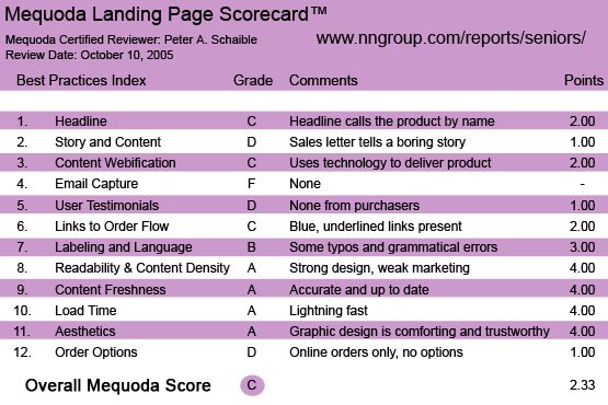
NNGroup’s Web Usability for Senior Citizens Landing Page Scorecard
1. Headline (Strategic Intent) – C
Here’s a lesson from Advertising 101: the name of your business or product is not a headline for your advertisement. Even when the product is a report that is self-described by its title, you need to state a compelling benefit in the headline. This landing page headline does not. It’s weak and unimaginative. It’s not creative because it doesn’t sell. It doesn’t sell because it doesn’t answer the user’s first question, which is inevitably, “What’s in it for me?”
Perhaps when you’re the Nielsen Norman Group, you feel your product stands on its own and doesn’t need any hype. I disagree. Even if The New York Times calls you the world’s foremost expert, you need to tell your potential customer what the benefits of your product are. In addition, you need to give them reasons to make a preferential decision in favor of your product or service.
[text_ad]
The Ford Motor Company has one of the strongest brands in the world, but that doesn’t stop them from aggressively advertising their products to the tune of several millions of dollars a week. Reputation and name recognition alone are not nearly enough.
2. Story & Content – D
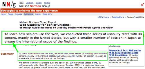
The lead sentence of the Usability for Senior Citizens Report landing page sales letter is so tired, it contains a typo that makes it ungrammatical. Yawn. Did anybody even bother to proofread this website?
The letter does tell a short story, but the storyteller is not identified. The story is believable, but far from compelling. The whole effort is an exercise in how to put your audience to sleep.
I’m betting nobody bought this report based on this landing page sales letter. They may have decided, for reasons of their own, that they need the information in this report. However, this sales letter didn’t win over any skeptics.
I’ll bet sales letters to morticians have more energy.

The lead sentence of the landing page sales letter is so tired, it contains a typo that makes it ungrammatical.
3. Content Webification – C
OK, so if you’re determined to buy Web Usability for Senior Citizens: 46 Design Guidelines Based on Usability Studies with People Age 65 and Older you can download it immediately after entering your credit card details. Standard stuff.
The order page includes a convenient currency converter. That’s cool. Otherwise, this site is not exactly cutting-edge high tech.
4. Email Capture (Relationship Building) – F
There is absolutely no attempt to capture the user’s email address or otherwise request permission to contact them until they get to the order page and enters their credit card details.
5. User Testimonials – D
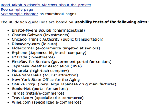
This site does not benefit from the testimonials of others who have bought the report. It does, however, list some of the companies (Bristol-Myers Squibb; Charles Schwab, etc.) that participated in the usability testing. They help add credibility.
Additionally, there are hypertext links to press coverage on the topic of Web usability for senior citizens, but not to specific reviews of this Nielsen Norman Group report.

This site does not benefit from the testimonials of others who have bought the report. It does, however, list some of the companies (Bristol-Myers Squibb; Charles Schwab, etc.) that participated in the usability testing. They help add credibility.
6. Links to Order Flow – C
The standard icon for an Adobe Acrobat PDF download is displayed, along with the words “Download Report,” which is an obvious hypertext link. There is no attractive “Order Now” button or any other more demonstrative device present.
The order flow to the shopping cart page is direct and clear.
7. Labeling and Language – B
Overall, the sales letter uses clear language and avoids terms not commonly understood by target users. There is some inexcusable carelessness relative to grammar and spelling.
8. Readability & Content Density – A
The first thing that strikes a visitor to the Nielsen Norman Group website is the elegance of the sans-serif typeface in relation to the white space. I’ve viewed this site in three different browsers and with every available optional font size and it never looks horsy.
These folks have read their own books and followed their own advice with regard to graphic design, at least. They know how to make a website that is both functional and attractive.
9. Content Freshness & Urgency – A
“In the United States alone, 12 million people older than 65 were online as of October 2005,” states the Usability for Senior Citizens Report landing page. As this Mequoda Sales Letter Landing Page review is being written during the first week of October 2005, the site is certainly timely and current.
How often the site is changed is anybody’s guess. When I consulted the Internet Archive, a.k.a., “The Way Back Machine,” I received the following message: “We’re sorry, access has been blocked by the site owner via robots.txt.” That’s a means by which website publishers can instruct automated systems not to crawl their sites.
I found this very curious. Most website publishers work very hard at search engine optimization because they desperately want their site to be crawled and indexed. At useit.com: Jakob Nielsen’s website (another one) on usability and Web design, there do not appear to be any systems in place to prevent spiders from crawling the site. The sites rank one and two for a Google search of “Jakob Nielsen.”
10. Load Time – A
The Usability for Senior Citizens Report landing page loads in 4.20 seconds at 56K according to the webpage analyzer.
Outstanding! Lightning fast because there are no graphics on the page. No room for improvement here.
11. Aesthetics – A
This site is designed entirely with typography and uses no graphic images. Its aesthetic appeal is based on the designer’s deft use of type and white space. It reflects the Swiss school of design. It’s very clean and functional. Commendable. (See #8 above.)
12. Order Options – D
The product is a $125 downloadable report in the Portable Document Format. A site license is $260. The order flow is clear and straightforward. The user can only pay via credit card. There is a convenient currency converter built into the site.
Surprisingly, there are no options for fax orders, bill me, or pay-by-check. There is no toll-free number for telephone orders. Not very accommodating, especially considering the audience and authors.

The product is a $125 downloadable report in the Portable Document Format. The order flow is clear and straightforward. The user can only pay via credit card.
Conclusion
I come from a school of marketing that believes “it’s not creative unless it sells.”
My beliefs include:
- Great graphic design is subordinate to copy writing.
- A headline is an advertisement for an advertisement.
- Clever headlines are only appropriate if they move the reader to go further into the text.
- Benefits are far more important than features.
For me, these are fundamental beliefs about the craft of marketing, in which I have worked for much of my adult life.
The Usability for Senior Citizens Report landing page does not conform to my model of what a good sales page/landing page ought to be.
Nevertheless, owing to the credentials of Jakob Nielsen, the report’s author, it probably succeeds in spite of itself.


Computer technology changes so fast