Does the Burgeoning Self-Help Market Niche Respond Better to a Hard-Hitting Letter with a Bold, Brassy Design or to Dignified Persuasion and a More Elegant Graphic Treatment?
In our NicheADay.com Landing Page Review we examined an information product designed for opportunity-seekers. That’s a large and ever-changing market niche comprised of would-be business owners.
These are people who are dissatisfied with their jobs, or have recently become unemployed, and suddenly decide to go into business for themselves. They may suddenly embrace the “American Dream” of being self-employed and start what they hope will become a profitable business. They even call themselves entrepreneurs. One of my mentors, Michael Gerber, calls that “having an entrepreneurial seizure.”
There are new entrants into the opportunity-seekers niche every week, while others abandon the dream, leave the niche and move on to alternative employment. But the desire to improve one’s life, whether through self-employment or through some other self-help activity, is always a powerful force that creates a large and hungry market niche.
In his book SHAM—How the Self-Help Movement Made America Helpless, journalist Steve Salerno offers an exposé on how “experts” dispense advice on everything from mental health to relationships to diet to personal finance to business strategy. Americans spend upward of $8 billion every year on self-help programs and products, Mr. Salerno says.
- Perhaps you think self-help gurus such as Dr. Phil, Dr. Laura, Tony Robbins and John Gray are a godsend to troubled Americans.
- Alternatively, you may believe, as Mr. Salerno does, that many motivational speakers and their how-to books and other quick fixes often eradicate personal responsibility and do more harm than good.
- Either way, there is no denying that the self-help actualization movement represents a huge—$8 billion annually!!— market for information products.
- One entrant in the self-help actualization movement market niche is The Power of Positive Habits, an eBook by author Dan Robey.
- Let’s how see its online sales letter rates on the Mequoda Landing Page Scorecard.
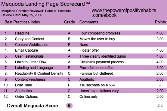
ThePowerofPositiveHabits.com’s Landing Page Scorecard
1. Headline (Strategic Intent) – A
There are actually four headlines at work here (or one headline and three subheads) each of them shouting a promise.
- “Make 2006 your Best Year Ever!”
- “Order Today and get the Apple IPod AudioBook version FREE plus over $1,200 dollars in other amazing bonuses!”
- “In just a Few Minutes you can Learn How to Re-Program your Mind and Body and Reach your Goals Automatically… Guaranteed!”
- “Research Author reveals a Scientific Secret that will Show You How To Re-Program Your Mind and Body to Achieve More Success Automatically, Lose Weight Automatically, Improve Your Health Automatically, have Unlimited Energy and Motivation every day and much more!”
Each of these engages the reader with a benefit and urges her to read further. (Everything is “automatic.”)
[text_ad]
2. Story & Content – B
The sales letter tells a story that will be credible to those who want to be convinced and incredible to those who are skeptical. Doesn’t every sales letter do this —convince those who are ready to buy to do so, or convince those who are not ready to buy not to do so?
The important factor here is the story itself, and this letter (“Dear Success Seeker”) has one. The writer, Mr. Robey, identifies himself in the first paragraph and quickly moves the motivated user along the path to a buying decision. If you believe it will help you, you’ll choose to buy it.
Or as Miss Jean Brodie said, “For those who like that sort of thing, that is the sort of thing they like.”
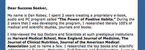
The writer, Mr. Robey, identifies himself in the first paragraph and quickly moves the motivated user along the path to a buying decision.
3. Content Webification – F
There is no attempt to use multi-media technology here. While the sales letter has excellent testimonials (see #5 below), they are text only. Audio and video clips could be used, but they are not.
4. Email Capture (Relationship Building) – A
A “floater” offers a free “Positive Habits E-course and Weekly Newsletter (Value $59.00),” promising the user will learn how to 1) achieve more success automatically, 2) lose weight automatically, 3) improve your health automatically, 4) have more energy automatically, 5) be more motivated automatically and more. Everything is automatic if you just learn how to “program your mind and body.”
Interestingly, the free e-course and weekly newsletter is offered only in the floater. If the user closes the floater, there is not way to sign up elsewhere. This is a missed opportunity—two missed opportunities, actually.
A sign-up box could be included in the online sales letter. Additionally, the floater could be made to reappear if the user abandons the order flow process. Enabling the user to close it once and for all is a costly mistake.
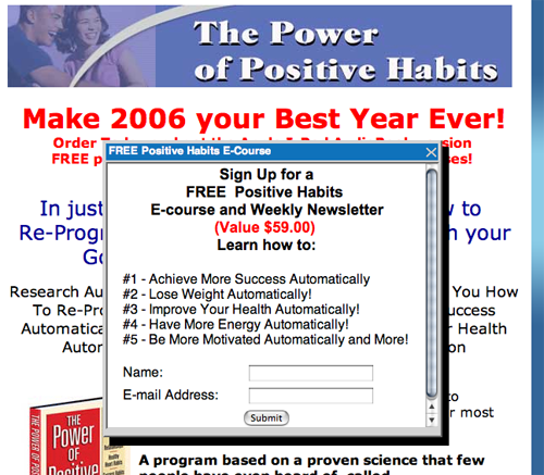
Interestingly, the free e-course and weekly newsletter is offeredonly in the floater.
5. User Testimonials – A
Two other well-known, self-help gurus, Jack Canfield, author of Chicken Soup for the Soul and Brian Tracy, author of Create Your Own Future, provide high-powered endorsements of The Power of Positive Habits.
Promises that the program will “transform your life” and help you “develop the lifelong habits for great success” from these two publishing giants must be very credible with the self-help actualization movement target users.
John Gray, author of Men Are from Mars, Women Are from Venus, also weighs in with praise for the product.
In the self-help actualization movement market segment, it doesn’t get a whole lot better.
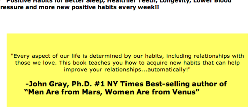
John Gray, author of Men Are from Mars, Women Are from Venus, also weighs in with praise for the product.
6. Links to Order Flow – A
The sales letter landing page includes a blue, underlined link and a couple of well-designed order buttons. Payment is via the familiar ClickBank system.
7. Labeling and Language – B
To create excitement and urgency, the sales letter uses “power words” that describe 33 downloadable bonuses.
This is known as the ginsu knife technique of creating additional value. The name is derived from the TV infomercials featuring legendary product developers such as Ron Popeil.
We’ve all heard the sales pitch… But wait, there’s more! You get the carving knife, you get the paring knife, you get the six steak knives… etc.
The idea is to add on so many extra valuable bonuses that the user eventually gives up all resistance, thinking to himself “Look at all they’re offering here. I’d be crazy not to buy this now… .”
Some users will see this as an example of offering outstanding value for the money, of delivering more than expected for a very reasonable price.
Other users will see this as an eclectic collection of disparate downloadable information products that have been cobbled together with little or no congruence. For them, the disparity and incongruence will have a negative effect on the purchase decision.
8. Readability & Content Density – C
We have come to expect from websites like this an overuse of boldface typography, red headlines, yellow highlighted text passages, centered vs. flush left headlines, exclamation points, italics, etc.
Why is this? Is it because so many of these sites look this way that everyone copies the same design style? Or is there convincing evidence somewhere (which I have not seen) that this boraxed (graphic designer slang for “cheap and tasteless”) treatment works best at creating sales?
I admit, I don’t know. But I find it hard to believe that such a design enhances readability, credibility or response. Only split testing would tell us for certain.
9. Content Freshness & Urgency – C
This sales letter includes no date stamp and no reply-by date in the call to action. The content appears to be stagnant. Only the reference to 2006 makes the page seem at all current.
10. Load Time – F
Download time was 116.72 seconds at 56K as measured by the Webpage Analyzer.
The graphic images for all those bonuses slows the download time to a crawl.
While waiting, I got in touch with my inner child. It was restless and cranky!
11. Aesthetics – C
See #8 above. Do sales letter landing pages like this one work well because they are designed this way or in spite of the graphic design? Do we simply expect them to be designed this way because we’ve grown accustomed to tasteless, frenetic graphics for products that make big promises? Or do designers copy this format because it has proven to work well?
The target user’s mental model (expectations) are the issue here. Aesthetics is all subjective until you can measure results. I don’t respond well to pages that look like this one. Perhaps other users do.
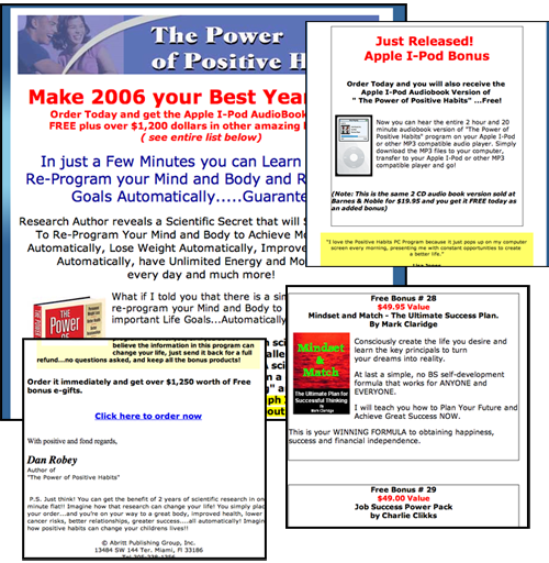
I don’t respond well to pages that look like this one. Perhaps other users do.
12. Order Options – C
ClickBank enables payment via credit card or PayPal, but there are no phone order or fax options offered here. More missed opportunities.
Conclusion
There are some smart and some not-so-smart techniques at work in this online sales letter.
Smart is characterizing the product and bonuses as MP3 audio format files that the user can enjoy on an Apple iPod. That makes them seem very chic. It’s a lot more hip than merely calling them audio downloads.
Smart is this sales point: “With this format, we’ve made it very easy for you to have it immediately. You can start changing your life in a matter of minutes!”
Not-so-smart is providing a link to the affiliate program at the end of the sales letter. That’s an unnecessary distraction.
If you’re going to offer an affiliate program, offer it only to customers—those who have actually bought your product. And offer it to them only after they have proven themselves to be happy with it. Satisfied customers make the best sales affiliates.
Make that one of your powerful positive habits.


Why do asians need fitness? Most of them are skinny. For #1 they had to go out of their way to find a chubby lady.