The South Beach Diet Newsletter Could be the Best Thing Ever Printed… but we’d Never Know it from this Landing Page
Are there any subjects more mulled over and carefully considered than our health and appearance? If you can do something to make the population more slender and likely to live longer, you should be able to make a fortune—shouldn’t you?
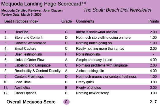
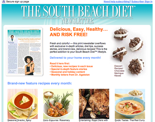
Maybe not… at least if you make all the mistakes and miss all the opportunities that The South Beach Diet Newsletter does on its landing page. This is a sales page that offers pretty pictures instead of compelling reasons to buy and a glorified order form instead of a sales pitch. But to be fair, let’s take a moment and see how it stacks up to the Mequoda Landing Page Scorecard.
- This is really a glorified online version of a direct mail order form.
- There’s not much storytelling or compelling copy to convince us that the newsletter will benefit us in any way.
- The lack of testimonials makes me think that maybe they’re not so good at improving health and restoring youthful figures.
- There is a lot more that could be done with this landing page.
- Most of all, it fails to convince.

The South Beach Diet Newsletter’s Landing Page Scorecard
1. Headline (Strategic Intent) – C
The intent is a little weak here. Sure, they mention the word “newsletter” in the title at the top of the page, but there’s not much to let you know at a glance that this page wants you to buy a subscription. It could just as well be selling the South Beach Diet book or a meal plan or whatever. “RISK FREE!” is a nice thought, but it still doesn’t tell us what they want us to do.
[text_ad]
2. Story and Content – D
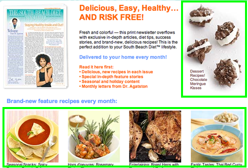
This is really a glorified online version of a direct mail order form. There’s not much storytelling or compelling copy to convince us that the newsletter will benefit us in any way. The food pictures look nice (except maybe the roast hens which look a little burned to me), but I’d like to be convinced of the product’s merits. The “Exclusive articles like:” section wasn’t very moving… and not all that “exclusive” if you ask me. “Women on the Beach?” Can that be exclusive? Seems like just about every publication on the planet has used that. Perhaps they are depending on prior publicity and public knowledge of the vaunted South Beach Diet and don’t feel the need to promote. I think that’s a big mistake.

3. Content Webification – D
This page makes little use of available Web technology. They could have easily linked to copy describing the newsletter or an example of their recipes or testimonials.
4. Relationship Building – C
Perhaps it depends upon how you define the word “relationship.” If your definition includes having someone offer you a standard subscription pitch for a newsletter… then this might be for you. However, the Internet is full of free information on nutrition and diet and healthy living. These folks don’t seem to be doing much more than offering a standard advertisement: we’ve got this newsletter and we’ll sell it to you. There’s not much relationship building in that.
5. User Testimonials – F
This is a publication that offers to improve your health, reduce your body fat and give you great ideas for food you will love. You’d think that they would have legions of testimonials. The lack of testimonials makes me think that maybe they’re not so good at improving health and restoring youthful figures.
6. Links to Order Flow – A
It’s relatively easy to sign up for this product… even if they haven’t done a very effective job of selling it.

7. Labeling and Language – C
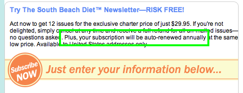
The language on the site is relatively clear and easy to understand. I am curious, however, how the “Plus, your subscription will be auto-renewed annually…” plays with the general public. A great many people won’t understand how that is a benefit, and some will certainly resent being subjected to anything “auto.” What if they want to make their own decisions about expenditures? There has to be a better way to express the offer and terms.

8. Readability & Content Density – A
This site is easy to read. The colors and the photos are pleasant… and I like seeing the newsletter pictured at the top of the page, although I still think they missed a good opportunity to sell the subscription with a better headline.
9. Content Freshness & Urgency – D
I couldn’t find any reason to hurry up and subscribe. And there was nothing to indicate that the people who mounted this website ever visit it or provide new content. The examples of articles seemed generic enough to have been there for months… there is nothing that lets us know that this publication is on top of developments in diet and nutrition.
10. Load Time – B
The site loaded up quickly on my broadband service, but came in just over 21 seconds on a 56K. But then, why shouldn’t it? There’s very little going on that would slow down load time.
11. Aesthetics – B
They provide some nice photos of food. Plus, the site is very tidy and not overcrowded.

12. Order Options – B
This is pretty standard order language. You know how many issues you’ll get and how much it costs you. And you know that you can get a refund if you wish.
Conclusion
There is a lot more that could be done with this site. Most of all, it fails to convince. That’s particularly disturbing in a site that offers a publication full of self-improvement ideas. The newsletter could be the best thing ever printed… but we’d never know it from this page.


