The Hume Group has been in the self-help education arena since 1974. Like Nightingale Conant, they’re one of the granddaddies of that genre. They specialize in providing financial security education with real estate and stay-at-home, do-it-yourself investment programs. To quote the company’s mission statement: Our goal is to help you achieve personal financial security with investments that are most suitable to your life… (works for me).
They’re a strong brick-and-mortar direct response company that market heavily in direct mail and are quite successful at it. You’ll know this is true if you get their offers in the mail. We applaud their off-line product line, but wonder why they’ve dropped the ball online.
- More time and more specificity have to be shown with the headline to allow it to get into the hearts and minds of the prospect
- Strong inviting copy should be the first thing that the reader sees, so they have the desire to hit other links
- There isn’t any strong USP (Unique Selling Proposition) weaved throughout the copy
- Their direct mail packages always include testimonials of satisfied, “now wealthy” customers—but online, testimonials are nowhere to be found
- They have put all their energy into offline marketing and not enough time into their online presence—they should create a sense of an online community by offering an ezine or a blog
Introduction
I’m guilty as charged. I’m a junkie. A self-help junkie, that is. As a copywriter/author, I write for, market to and appreciate this arena of information. Throughout “my journey” (and notice how I just threw in that new age self-help phrase), I’ve had the pleasure of acquiring The Hume Group‘s superior programs over the years, which include commodities, stock market and real estate investing.
Their courses are the real deal and provide strong content which includes their company’s goal of educating the “Average Joe and Josie” so they can reach fulfillment and prosperity through investing. But whereas self-help advocates who believe everyday folks should improve their lives, The Hume Groupshould start with their (ouch!) own website.
This site is not far from making a real impact with online customers, but it needs a makeover.

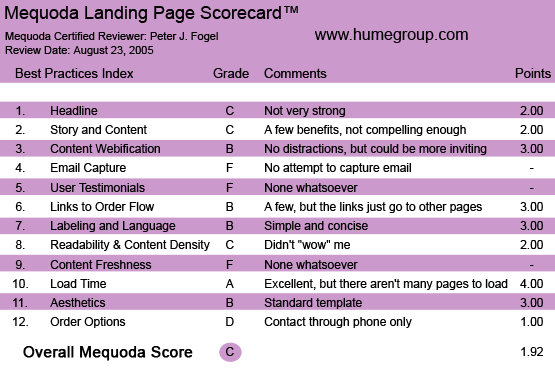
The HumeGroup.com’s Landing Page Scorecard
1. Headline (Strategic Intent) – C
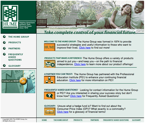
Helping Americans Achieve Their Financial Goals Since 1974. Well loyal reader of the Mequoda Library reviews, don’t be fooled into thinking that this is the site’s headline. It’s not. This copy is located near the company’s logo, off to the left and in a small font.
This is, in fact, the company’s “branding slogan.” The folks at The Hume Group mention 1974 to give the company credibility and to announce to their prospect, “Hey, we’re not some fly-by-night company. No sir. We’ve been in business since Nixon resigned, Starsky and Hutch was a hit series and gas prices were REALLY high.” (Déjà vu all over again?)
[text_ad]
Now the headline: the intention was admirable, but it missed the mark. Don’t forget the purpose of a headline. It’s the ad for YOUR ad in your website. Its job is to stop Mr. Busy Surfer Dude, or Dudette, in their tracks so they immediately know what’s in it for them. You do this by describing a strong benefit, or arousing such curiosity that they have no choice but to read about your offer.
Let’s look at “Take Control of Your Financial Future.” (beat… as I ponder) OK, is that a command? Is it giving me a solution to my problem? Of course I know I should take control of my financial future. But what’s of importance to me is if The Hume Group’s going to help me do it. More time and more specificity have to be shown with this headline to allow it to get into the hearts and minds of the prospect so they read further into the offer!

This headline does not offer me a solution to my problem.
2. Story and Content – C
In website copy you want to deliver as many benefits as you can and take your reader on a journey (there’s that phrase again). This is especially important when a) trying to motivate the future customer, and b) painting a picture in your reader’s mind of what their life will be like AFTER they purchase the product or service. On The Hume Group homepage are links that take you to the facts page, contact page, partner’s page and the all-important products page.
Strong, inviting copy should be the first thing that the reader sees, so they have the desire to hit other links.
On the products page you’d think they’d go into overdrive and present deeper, more meaningful copy that gives the reader strong product benefits, PLUS show how their lives will be drastically changed. But alas, it doesn’t happen. I would’ve had a strong headline to start the copy off, and then went with the title of the product, “Successful Investing & Money Management.”
Instead, the motivation to buy the product dropped harder than Wile E. Coyote falling off a cliff chasing the Road Runner. Again, The Hume Group’s products are top-notch—their copy isn’t. Like the line from Jerry Maguire: I want you to “Show Me the Money!”
3. Content Webification – B
Simple and inviting in design. They specifically used the color green in their design for obvious reasons. The graphics of happy couples were used successfully here, but there isn’t a, “Wow, I have to surf this site for more goodies” type of feeling that I would’ve wanted. Again, the webmaster and the powers that be have to decide what their goals are for their site. Do they “just” want a Web presence? (For better or worse, they got it!) Do they want to sell their products? (Evidence shows they do not.)
Presently, there isn’t any strong USP (Unique Selling Proposition) weaved throughout the copy. And because there isn’t, there’s also no reason for the reader to bookmark this URL and come back again.
Once again, no strong call-to-action. When The Hume Group “teases” you to “click here” to know more at the products page, you think there’d be more inviting copy here. Instead, they tell you at the end of a short page of copy to call a toll-free number for more info.
They’re counting on the prospect to actually do that? Why aren’t they selling their product with the Internet real estate they’ve purchased? (He says, scratching his head in mock disbelief.)

They shouldn’t count on the prospect to call for more information. Instead, they should use the website real estate they’ve already purchased to do that.
4. Email Capture – F
Nada. Nunca. Goose egg. How can The Hume Group NOT want to capture the prospect’s email address so they can sell them later, or at least give them a free report? Enough said.
5. User Testimonials – F
As you know, The Hume Group‘s been in business since 1974 so they must be doing something right. I’ve received plenty of their direct mail where they succinctly use testimonials of satisfied, “now wealthy” customers. I am nonplussed as to why there aren’t any on this site. I would’ve at least liked to have read about their program instructors and their backgrounds.
6. Links to Order – B
Again, the site has no real, strong call-to-action. The links just take you to different parts of the site. Nothing more, nothing less. It does its job.
7. Labeling and Language – B
Clear and concise. No compelling reason to really spend a lot of time at this website, although the language in the copy they use is effective. Yes, you get a strong idea of what the site is about and what The Hume Group has to offer, but this reviewer feels that this particular website portal is really just a colorful online brochure.

Yes, you get a strong idea what the site is about, but this particular website portal is really just a colorful online brochure.
8. Readability and Content – C
Strong Web design, pleasing to the eye, but the copy is average with no strong bullets or subheads to keep the reader moving forward.
9. Content Freshness and Urgency – F
I don’t see much freshness or uniqueness about the offer or the copy. The only urgency I get is at the end of the product description—the reminder to call their toll-free number to get more information on ordering their products. They do describe the other partners in business with them… just in case you want to deal with them, too.
10. Load Time – A
Not a lot of webpages to upload so the load time was excellent. Quick and breezy, just like my vacations.
11. Aesthetics – B
Very clean and easy to read. The website design comes off as a standard Web template.
12. Ordering Options – D
No ordering options here. No fax or email options for the prospect. Forgive me for being redundant as an Al Sharpton diatribe, but the only call-to-action you get is the message to call their toll-free number for more information on ordering their products. It seems this website is dealing more with image advertising that with direct response marketing.
If you want to improve your financial situation and you’re interested in taking a course in it, thenThe Hume Group “hopes” you’ll call the toll-free phone number and talk to a live operator who will answer questions (and God willing, sell you on the phone).
Conclusion
My feeling is that this fine company has put all their energy into offline marketing and certainly not enough time into their online presence. They haven’t created a sense of an online community by offering an ezine or a blog, and they should.
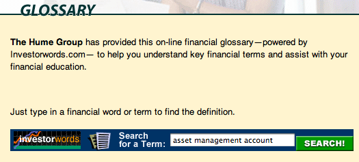
I found this to be a cool feature—the company has a glossary section for prospects to use if they want to look up financial terms.

This is a cool feature that allows prospects to search for financial terms.
The site doesn’t distract that much, but it doesn’t attract. They could get away with keeping the website design, but if they put more effort into expanding and improving their copy, the results could be staggering.
Overall I give this portal website a C.


Wow! Great article. I have a question I hope you can answer. I’m trying to contact the Hume group but not having any luck. I wish to purchase one of their manuals called Successful Real Estate Investing. Can you help? Thanks.