If the advent of the World Wide Web and the superabundance of information it puts within easy reach has done anything for me, it’s made me a much better consumer of medical services and a greater participant in my own healthcare.
For most members of the wired world, the Internet has become our first stop for information about disease—both prevention and cure. Consider this: the word “cancer” was searched about 25,000 times a day at Yahoo! in March of 2006. And that’s just one search engine.
With this demand for information about illness and health, it’s not surprising that many physicians and traditional publishers have teamed up to begin online newsletters that address these issues. Many of these publications are highly specialized and focus on a single topic or ailment.
Others take a shotgun approach and attempt to address the public’s infolust across a wide spectrum of disease prevention, physical ailments and medical remedies. The wider editorial focus that targets a greater number of potential subscribers at a relatively lower price point has a different revenue model from the smaller niche, higher price newsletter. And it creates a special problem for the newsletter marketer and copywriter.
That’s because most people don’t search for general health or illness prevention information. No, most people search for very ailment-specific information. If you discover that you have hypertension, for instance, you’re much more likely to search high blood pressure cure than general health and wellness newsletter.
And you’re more likely to respond to a sales letter that promises information about your specific ailment—in this case, high blood pressure—than to a sales letter that promises general health care advice.
That’s the conundrum facing the publishers of The Blaylock Wellness Report. One sales letter landing page for that newsletter isn’t nearly enough.
Now, whenever I see a URL with a number in the last part of the address, such as the one for this site—www.newsmax.com/blaylock/20.cfm—I always explore what other pages might be available if I simply change the number. You can get a great lesson in advertising copywriting this way. Have a look.
- The URL www.newsmax.com/blaylock/20.cfm is a general, all-purpose sales letter landing page for The Blaylock Wellness Report. It talks about measles, mumps, chicken pox and all the other common maladies, and evokes concern about “sleeper germs and hidden infections.”
- The URL www.newsmax.com/blaylock/17.cfm addresses concerns about a grumbling stomach and the fear of lower gastrointestinal tract ailments and prescribes a subscription to The Blaylock Wellness Report.
- The URL www.newsmax.com/blaylock/14.cfm addresses obesity and recommends a diet of The Blaylock Wellness Report.
- The URL www.newsmax.com/blaylock/12.cfm recommends The Blaylock Wellness Report as a cure for diabetes.
Each of these is a well-crafted sales letter landing page targeted at a different subset, or niche, of health and illness-prevention information seekers.
Let’s examine just one of this collection of sales letter landing pages used by the publishers ofThe Blaylock Wellness Report. The URL www.newsmax.com/blaylock/13a.cfm targets users concerned about hypertension. Let’s see how it measures up on the Mequoda Sales Letter Landing Page Scorecard.
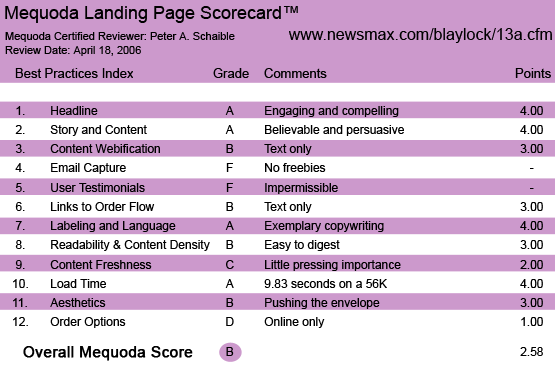
The Blaylock Wellness Report Landing Page Scorecard
1. Headline (Strategic Intent) – A
The headline engages the target user with a compelling user benefit.
Headline: Discover What No One Else Will Tell You About The Deadly Disorder Hypertension
Sub-headline: Nearly 50% Of Americans Are At Risk – Right Now – For Blood Pressure Problems…
That’s an attention grabbing combo, but so are these alternatives from the URL www.newsmax.com/blaylock/13.cfm, at which the publisher has a different sales letter landing page for The Blaylock Wellness Report that also focuses on hypertension. It appears there might be a split test being conducted here:
Headline: There are over 50 million Americans suffering from HIGH BLOOD PRESSURE… And many don’t even know it!
Sub-headline: ARE YOU ONE OF THE THEM? Then you’ll want this new surgeon’s report that shows you how to CONQUER HYPERTENSION.
Both versions are intriguing and compelling. If it is a split test, the publisher is testing two entirely different sales letters, not just headlines.
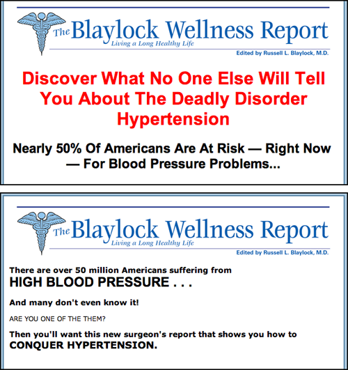
The headline engages the target user with a compelling user benefit. It appears there might be a split test being conducted.
2. Story and Content – A
Returning to www.newsmax.com/blaylock/13a.cfm, which is the subject of this review, the sales letter tells a story about Dr. Russell Blaylock, identifying him as “not your usual doctor… he’s out there in the trenches, spreading the truth about simpler, cheaper and safer ways to prevent and manage disease.”
It’s a persuasive story—a good read—especially for someone who wants to be “sold” on a natural alternative that flies in the face of conventional medical wisdom.
3. Content Webification – B
There is no use of technology here to enhance the sales message. This letter could (and perhaps does) appear in print without significant changes. Its effectiveness is in its power to persuade with words alone. The only graphic is a picture of the very photogenic Dr. Blaylock, which convinces us that he really exists and is not some invented persona such as Betty Crocker.
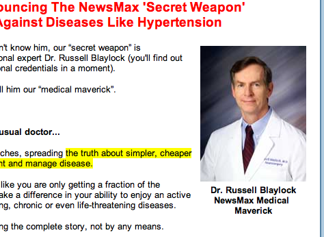
The only graphic is a picture of the very photogenic Dr. Blaylock, which convinces us that he really exists and is not some invented persona such as Betty Crocker.
4. Email Capture (Relationship Building) – F
The sales letter landing page for The Blaylock Wellness Report atwww.newsmax.com/blaylock/13a.cfm goes directly for the subscription sale. It does not offer a free downloadable report in exchange for an email address and permission to contact the user.
There is no attempt here to capture the site visitor’s email address.
5. User Testimonials – F
There are no user testimonials. Perhaps there can’t be any. If, for legal reasons, the publisher can’t make any specific health claims or promises, presumably testimonials from users would be either worthless or also impermissible.
As an alternative to user testimonials, the sales letter runs an extensive sidebar that is Dr. Blaylock’s thumbnail resume. It is appropriate and convincing.
6. Links to Order Flow – B
Strategically placed throughout the sales letter landing page are four blue, underlined links to a data-capture-page order form. They are clear and well designed. There are no order buttons employed. Again, this is a text-only sales letter.
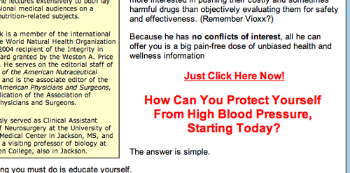
Strategically placed throughout the sales letter landing page are four blue, underlined links to a data-capture-page order form.
7. Labeling and Language – A
The sales letter uses clear language and good grammar. It promises an easy-to-read newsletter and uses exceptionally well-written, mouth-watering benefits statements to argue the case for subscribing.
8. Readability and Content Density – B
The sales letter landing page at www.newsmax.com/blaylock/13a.cfm uses the familiar Arial and Helvetica sans serif typeface family, which is easy enough to read in this context. The layout is uncluttered, simple to follow and makes adequate use of white space.
The designer uses a lot of boldface and italics for emphasis and to create a rhythm. It’s a bit overdone for my taste, but not entirely obnoxious. The color red for sub-headlines must be executed with care and is often a bad choice. But it seems to work well enough here.
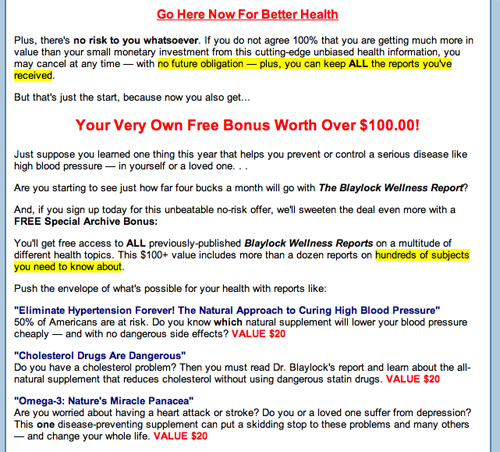
It’s a bit overdone for my taste, but not entirely obnoxious.
9. Content Freshness and Urgency – C
The content and references are presumed to be accurate and up to date, but there is no way to confirm this easily. The sales letter does not include a date stamp.
Strangely, while the letter begins with the salutation “Dear Friend,” there is no valediction and no signature. We presume that Dr. Blaylock himself is the author of the message.
The offer of free bonus reports with a paid subscription is characterized as a limited time, 50 percent off, no-risk, subscription opportunity, but is not very convincing. The skeptic in me wonders if the newsletter is always available at a “discounted” price.
10. Load Time – A
Download time was 9.83 seconds at 56K as measured by the Webpage Analyzer.
11. Aesthetics – B
The look and feel supports and reinforces the sales letter’s flow, but gets right up to the edge of being frenetic and boraxed (graphic designer slang for “cheap and tasteless”). As a consumer, I am part of the generation that expects a degree of dignity in messages associated with health, fitness and the practice of medicine—although considering the recent trend toward vulgar television commercials for prescription drugs, this mental model is rapidly eroding.
12. Order Options – D
This sales letter is followed by a usable online order flow, but there is no toll-free number for phone orders, no printable order form for fax orders and no option to have a sales representative contact the user to place orders. These are missed opportunities which, if added, would doubtless increase sales and profitability.
Conclusion
While this sales letter is worthy of a journeyman copywriter, there are additional tweaks in design and layout that would improve its performance.


I read the information re: Dr.Blaylocks Wellness Report. This sounded very informative but after reading these remarks, etc. I will talk to someone I know about all this that is a Dr. in Nutritional information, vitamins, etc…
My Dr. is knowledgeable re: all this type of information.
Some of what I read is very good information and I will keep that in mind.
I feel that I have gained by all this and will proceed to do better re: my health..
I ordered on line more than a week ago and have not received newsletter yet. How long before i get it?
I bought a new computer and cant sign in for Dr Blaylocks newsletters. please advise.
Theresa L. Bailey
Watch this group! I never received the free report and had a heck of a time trying to find out how to reach them. Their e-mail addresses do not work. Never again with them!
I wish to cancell my subscription to Newsmax and The Wellness Newsletters. We got a call on the phone but we could not understand what the person wanted and he spoke so fast. Please advise me about my order status. I want a good portion of my $54.00 returned to my credit card. Thank you, Cherril
Irene,
Mequoda Group is not associated with Blaylock Wellness. I’d suggest you contact them with your grievances.
All the best,
Chris
I received a voice message on my phone advising that if I did not cancel on line a 3 month supply of blaylock wellness report would be charged to my credit card. I am cancelling and wish for you NOT to leave such messages on my phone. You can call back and speak with the homeowner. We are not difficult to reach by phone.You will receive a written notice of this as well. Thank you Irene Malone
whoah this weblog is great i like reading your articles. Stay up the great work! You recognize, lots of persons are hunting around for this info, you can help them greatly.
I need to know your phone number so I can cancel my newsletter
I was not aware about this report, but now it is clear to me.
Hi Dennis,
Sorry, we’re not affiliated in any way with Newsmax or the Blaylock Wellness Report.
Try calling their customer service line at: 800-485-4350.
– Amanda
Hi Peter,
I’m not sure, but they appear to be owned by NewsMax. Their customer service line is: 800-485-4350 according to this site: http://shop.newsmax.com/shop/index.cfm?page=products&categoryid=51
Hope that helps 🙂
I think Blaylock only offers the newsletter. You might want to try http://www.johnshopkinshealthalerts.com/bookstore/ for single reports like that. They also have tons of free special reports on the topics you mentioned.