One of the most fun—and frustrating—things about Internet marketing is that the rules and best practices are constantly changing, based on innovation and discovery of new methods that work better than the old. I say “fun” because there are few thrills in direct marketing as big as creating a new promotion that significantly outperforms the old one. I say “frustrating” because implementing these new strategies can involve a lot of time and work—often forcing us to redo old online promotions that we thought were all set.
One of the major changes in online information marketing is the flow and structure of landing pages. Until recently, all information marketers basically used some variation of the following: drive traffic to a long copy landing page where the consumer can read a sales letter about the product. At various points on the landing page, the visitor can click through to an order page to buy the product. If the visitor clicks away from the landing or order pages without placing an order, she is served a pop under with a free content offer, the purpose of which is to capture her email address.
- A growing number of online marketers are reversing the process: capturing the email address up front—before the visitor can access the long-copy landing page—rather than as an optional step when leaving the landing page.
- This is done by sending the visitor first to a short, abbreviated version of the main sales letter. I call this a “preview page.”
- Leon Klepfish, an Internet marketer and creator of SqueezePageGenerator.com, calls it a “squeeze page.”
- Don Nicholas of the Mequoda Library calls this approach the “Squeeze eCommerce Conversion Architecture Internet Marketing Strategy.”
- A good example of this strategy is Leon’s SqueezePageGenerator.com, a website selling an information product aimed at serious Internet marketers who want to increase email capture and conversions with squeeze pages.
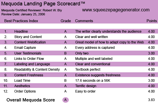
SqueezePageGenerator.com’s Landing Page Scorecard
1. Headline (Strategic Intent) – A
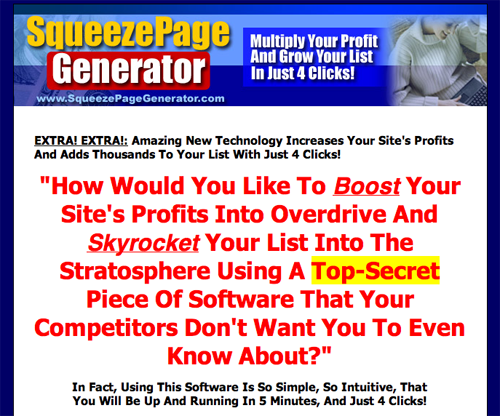
The preview page uses a basic question headline: “How would you like to boost your site’s profits into overdrive using a top-secret piece of software your competitors don’t want you to know about?”
It works because the copywriter clearly understands the concerns and mindset of the target audience: Internet marketers who want to increase their sales.
Pre-heads and subheads expand on the promise of the headline making a variety of attractive claims, including “Multiply your profit and grow your list in just 4 clicks” and “Increase your site’s profits.”
The same headline appears on the landing page, except it is personalized with the visitor’s first name, demonstrating a huge advantage of preview pages: by capturing the visitor’s name, you can serve them a personalized sales message on the long-copy landing page.
The one flaw I see in the first screens of both the preview page and the landing page is there is no attempt to build credibility up front. We are not told who Leon is, what he has accomplished online, or the success others have attained using his squeeze-page marketing method and software tool.
Visitors to your landing page are highly skeptical. You need to overcome this skepticism by establishing your credibility right up front.
One way to do this is with a couple of strong testimonials just before or right under the headline. Another method is to give your most impressive credential or accomplishment right up front.
2. Story and Content – A
The long-copy landing page clearly explains what a squeeze page is, the benefits of using them, how the product (a piece of software) can help you create them and the benefits of creating squeeze pages with this software vs. doing it yourself. It also demonstrates how the software works, and the demonstration makes it look easy.
In doing so, it not only helps sell the software being advertised, but it also gives the reader a valuable—and free—education in an important aspect of Internet marketing: the squeeze page strategy. Even if you don’t buy the software, you are rewarded simply for having read the copy.
[text_ad]
3. Content Webification – A
Leon doesn’t miss a trick; this is a great model of how to take long copy and adapt it to the Web. In particular, the graphics—nicely rendered illustrations of the products and premiums—convey an impression of weight, substance and value.
4. Email Capture – A
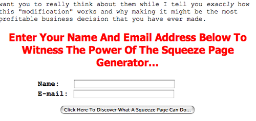
The squeeze page model captures the email address of every visitor who wants to read the long-copy landing page. That’s an advantage over traditional micro-sites that rely on pop-under windows to grab the email address after the fact. If the visitor doesn’t want to bother getting the content the pop-under offers, the visitor’s email address is lost and the name isn’t captured.
5. User Testimonials – B
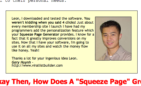
I usually recommend a minimum of three testimonials, and there are two here. They are strong and specific, with customer photos. It would be stronger if at least one of the satisfied customers was a big name in Internet marketing.
6. Links to Order Flow – A
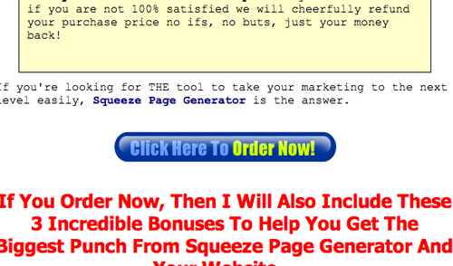
There are multiple, well-labeled links you can click on to go immediately to the order page.
The order buttons don’t appear until you are well into the landing page. One could make a case for testing a version with an extra order button that comes much earlier; perhaps Leon already did that and found that the current version generates the highest conversion.
7. Labeling and Language – A
Everything, from the sales copy and testimonials, to the guarantee and order page, is clearly labeled using conventional language.
8. Readability and Content Design – A
The design is textbook perfect: easy-to-read Courier typeface for body copy; big, bold subheads; borders to call attention to guarantees and special offers; picture of the free bonus gifts and colorful buttons to click on when you are ready to order.
9. Content Freshness and Urgency – A
It isn’t clear how often this page is updated. But squeeze pages are such a relatively new idea, that the entire page comes across as important news. A pre-head above the headline adds to the sense of freshness and urgency by talking about “amazing new technology.”
10. Load Time – B
On SqueezePageGenerator.com landing page downloaded in 17.60 seconds over a 56 Kbps connection—a more than adequate response time.
11. Aesthetics – A
As stated earlier, the design here is terrific: easy to read, bold and attractive. No jumbling of type styles, sizes and fonts as we see on so many landing pages these days.
12. Order Options – A
The site makes it easy to place your order online. Links to the order page do not appear until you are well into the copy, which appears to be a deliberate decision, probably arrived at based on testing, given the marketer’s apparent savvy.
Conclusion
By forcing visitors to register before they are allowed to access the long-copy landing page, SqueezePageGenerator.com captures the email address of everyone reading the sales letter.
The SqueezePageGenerator.com is a nearly flawless execution of the “Squeeze eCommerce Conversion Architecture Internet Marketing Strategy.”
The preview page is long enough that it convinces the visitor it’s worth registering to click through and read the landing page copy.
Yet it’s short enough to maximize conversion from search engine traffic—organic and pay-per-click—as well as e-zines and emails.


