The Internet is a competitive marketplace, and the late Corey Rudl, founder of the Internet Marketing Center, once told me the most important strategy for Internet marketing success is to find a niche market that you are passionate about. Since people love their dogs, I would assume the founders of SitStayFetch.net have done just that.
In my last landing page review, I looked at PrayerPower.com, a site I believe to be effective despite its awkward design, crude layout and unpolished copy.
But SitStayFetch.net is the opposite: a slick, well-thought-out, powerfully written, cleanly designed micro-site. It is designed to sell a single product, an eBook on dog obedience, titled SitStayFetch, and serves as a model on how to create a successful eBook microsite.
- The landing page is incredibly long. Once you get past the headline and subhead, the copy is pided into three major sections.
- Daniel Stever, the ebook’s author, correctly recognizes that ebook buyers like bonuses, and the more, the better.
- Not only are there testimonials from 10 users, but each is a detailed story with full attribution, including the customer’s name and location.
- www.sitstayfetch.net is laid out in a clean, graphically pleasing presentation—what’s missing are bold graphics that are effective at calling attention to important benefits or features on landing pages.
- Discover the common graphic technique used by this landing page that is very effective for increasing readership.

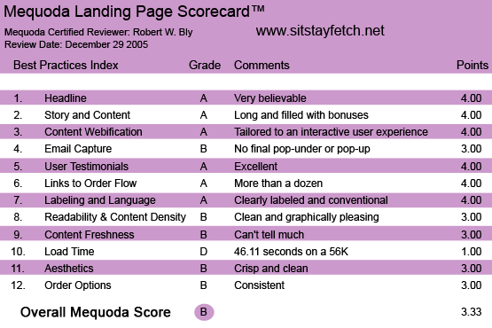
SitStayFetch.net’s Landing Page Scorecard
1. Headline (Strategic Intent) – A
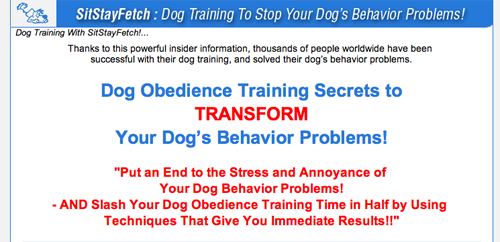
The headline, “Dog Obedience Training Secrets to TRANSFORM Your Dog’s Behavior Problems,” is straightforward and powerful. People are attracted to “secrets,” and dog owners want their dogs to behave better and be more obedient. I see no reason to put the word TRANSFORM in all caps here.
[text_ad]
Above the headline is a “pre-head”—a line of copy—whose purpose is to establish instant credibility. It reads: “Thanks to this powerful insider information, thousands of people worldwide have been successful with their dog training and solved their dog’s behavior problems.”
This lets us know that these techniques have worked for thousands of dog owners, making the claim in the headline more believable.

The headline is straightforward and powerful. I see no reason to put the word TRANSFORM in all caps here.
2. Story and Content – A
The landing page is incredibly long. Once you get past the headline and subhead, the copy is divided into three major sections.
The first is an introductory letter from the eBook’s author Daniel Stever. There are two links in this letter, one to get you to sign up for his free e-zine, and the second to the order page for his eBook.
We are not told much about Daniel, his dog or his qualifications for writing the eBook. Is he a breeder, trainer, vet or other dog expert—or just a passionate dog owner who figured out how to train his dog when obedience school didn’t work?
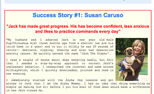
The next section contains ten detailed success stories of how dog owners got great results using the methods in Daniel’s eBook.
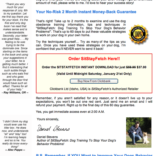
The third section is a long-copy sales letter from Daniel selling his program, offering the eBook, and describing the free bonus gifts, of which there are four. Stever correctly recognizes that eBook buyers like bonuses, and the more, the better.
3. Content Webification – A
The content is totally tailored to an interactive user experience on the Web.
For instance, at the end of each of the ten success stories (except the last) are three links that give you these choices: a) “Find out more,” which takes you to the long-copy sales letter selling the eBook, “Sign up to my FREE Dog Training Course,” which links you to a subscription page for the free email newsletter or c) “Get SitStayFetch Now” which skips the long-copy sales letter and goes directly to the order page.
Normally, you might say it is a mistake to go directly to the order page before the prospect is completely “sold” on the product. But the order page has long copy, sufficient to sell the product on its own, so this option works here.
4. Email Capture – B
There are more than a dozen links on the landing page to the registration page for the free email newsletter, which is offered in exchange for the visitor’s email address.
However, when you leave the landing page without placing an order or signing up for the free email newsletter, you are not served a pop-under making one last attempt to get your email address in exchange for free content. According to our Mequoda guidelines, that’s a mistake.

5. User Testimonials – A
Not only are there testimonials from 10 users, but each is a detailed story with full attribution (the customer’s name and location), a headline summarizing the story, a first-person testimonial in the customer’s own words and a photo of the owner and/or the dog.

There are testimonials from 10 users, and each is a detailed story with full attribution (the customer’s name and location), a headline summarizing the story, a first-person testimonial in the customer’s own words and a photo of the owner and/or the dog.
6. Links to Order Flow – A
There are more than a dozen links on the landing page to the long-copy order page.
The visitor can click onto the order page from almost anywhere on the landing page, so if he is ready to buy, he can—and the long-copy order page has sufficient sales copy to close the deal.
7. Labeling and Language – A
Everything, from the sales copy and testimonials, to the email newsletter sign-up page and order page, is clearly labeled using conventional language.
8. Readability and Content Design – B
A graphic designer would probably give this page an “A” in design, and I agree.
In direct marketing, ugly layouts can often work. But so can clear, neat layouts and SitStayFetch.net is clearly in the latter category.
Unlike PrayerPower.com, with its jumble of type sizes and fonts and odd copy placement, SitStayFetch.net is laid out in a clean, graphically pleasing presentation.
I rate it a B instead of an A because it is a little too clean and perfect. What’s missing is large blue type, yellow highlights, handwritten red arrows and other bold graphics that are effective at calling attention to particularly important benefits or features.
9. Content Freshness and Urgency – B
You can’t really tell whether there is new content on the site or when content was last updated. But on a long-copy landing page selling a single product, it isn’t really as critical as it would be on a corporate website. The easiest way for the author to keep the site updated and fresh would be to periodically add new success stories.
10. Load Time – D
On WebsiteOptimization.com, the SitStayFetch.net landing page downloaded in 46.11 seconds over a 56 Kbps connection. On my broadband, it took only a couple of seconds.
11. Aesthetics – B
As stated earlier, this is a crisp, clean site with a pleasing layout. It uses a number of graphic techniques to break up the long copy and make it more readable.
Case studies, for instance, are each in their own boxed sidebar containing a headline, text and photo.
On the first page, under the headline and subhead, there is a photo of a man with a dog. I assume this must be the author and his dog. But there’s no caption, so we don’t know who they are.
The subhead “Put an End to the Stress and Annoyance of Your Dog Behavior Problems” appears in quotation marks, even though it’s not a quote. This is a common graphic technique and very effective for increasing readership: people’s eyes are drawn to copy in quotation marks.

As stated earlier, this is a crisp, clean site with a pleasing layout. It uses a number of graphic techniques to break up the long copy and make it more readable.
12. Order Options – B
The site consistently drives visitors to three options: a) sign up for the free e-zine, b) read the long-copy landing page for more information on the dog training program presented in the eBook or c) go directly to the order page for the eBook where you can read shorter copy and place your order.
Conclusion
One of the most popular products to sell online is eBooks, and with good reason: there’s no manufacturing cost, no shipping and handling costs, delivery of the product is virtually instantaneous and the profit margin is nearly 100 percent.
If you want to sell information products on the Internet, you should consider starting with eBooks. And if you want a model of how to design an effective eBook microsite or landing page, look no further than SitStayFetch.net.


