Landing Page Scorecard: Rose-Growing-Secrets.com
Internet Explorer, the pundits tell us, accounts for up to 95 percent of all Web browser traffic. So why should we care about that small minority of surfers who prefer alternative browsers such as Netscape Communicator, Mozilla Firefox, Opera and Safari?
And why waste time with those non-conformist non-Windows users who are stuck with the Mac version of IE?
Answer: Because you care. Or ought to care.
For the same reason you use a spellchecker, or ought to.
Because being sloppy about details is a sign of arrogance and laziness.
Because it drastically reduces your credibility if your site appears to be amateurish or unreadable.
Most users view webpages in the 800 x 600 format. But the 640 x 480 and 1024 x 768 screen resolutions are also popular. You want your webpages to be viewable in each.
- BrowserCam.com creates screen captures of your webpages loaded in any browser, and on any operating system, so you can see if your webpages look good—and work right—on any platform.
- You can see your site with or without Flash. Check for consistency across pages. See that redirects and pop-ups are all working properly. Check to see that your dynamically generated pages are behaving.
- The designers of Rose Growing Secrets ought to use BrowserCam.com, because in my IE Web browser, and my Mozilla Firefox browser, this sales letter landing page is nearly impossible to read.
- It should be using a table width that is about 75 percent of the current page. That’s its first of numerous mistakes.
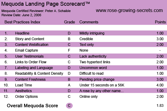
- Let’s see how the Rose Growing Secrets landing page measures up on the Mequoda Sales Letter Landing Page Scorecard.

Rose-Growing-Secrets.com’s Landing Page Scorecard
1. Headline (Strategic Intent) – D
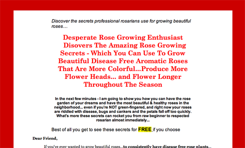
Assuming the visitor gets past the browser problem I’m experiencing while viewing this page, and wants to see what’s being offered here, she may be intrigued by the headline “Frustrated Rose Gardener Disovers (sic) The Amazing Secrets To Growing Beautiful Aromatic Roses”.
That’s right. The word “discovers” is misspelled in the headline. Unfortunately, things don’t get much better from there.
[text_ad]
2. Story & Content – B
The story and story teller seem credible, although the tale is bit disjointed and not well told. Just when I was about to nod off, I discovered this subheadline: Revealed: The Four-Legged Animal Who Is Your Biggest Ally In Transforming Your Roses For The Better
That got my attention. But unfortunately, the critter is not identified. You need to buy the $27.97 book to find out. Bummer.
3. Content Webification – C
This landing page makes absolutely no innovative use of interactive technology. It’s having a hard enough time getting straight text to work.
4. Email Capture (Relationship Building) – F
I would guess you could start quite a popular email newsletter around the topic of growing roses. Yahoo! Groups has several such groups, each with more than 1,000 members.
Capturing the names of site visitors should be a top priority for Rose Growing Secrets. But the publisher of this site offers no free email newsletter or any other downloadable freebie.
5. User Testimonials – C
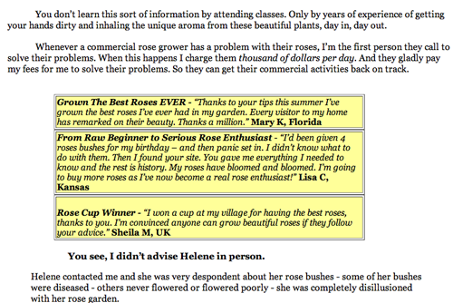
Four user testimonials are integrated into the sales letter flow, but the customers are not identified by name.
I’m happy that “Mary K, Florida” has grown the best roses ever, but I’m not convinced that she’s a real person and not simply the invention of a zealous (albeit amateurish) copywriter.

Four user testimonials are integrated into the sales letter flow, but the customers are not identified by name.
6. Links to Order Flow – C
The landing page does not include a well-designed button and relies on only two hypertext links. Dismal.

The landing page does not include a well-designed button and relies on only two hypertext links. Dismal.
7. Labeling and Language – D
In addition to the misspelled headline gaff, the copywriter uses the word rosarian. I looked it up, just to be certain. A rosarian, as you guessed, is a person with expertise or a special interest in the cultivation of roses.
I was unfamiliar with the word, which makes me suspect that other literate people are unfamiliar with it, too. If you think of yourself as a rosarian, you probably don’t need the book offered here.
8. Readability & Content Density – D
OK, so my browser renders this landing page too large to read easily. But if we get beyond that nearly fatal flaw, the typeface is familiar, comforting and easy to read online. But that’s a big if. A familiar typeface doesn’t make up for mediocre copy.
9. Content Freshness & Urgency – B
The sales letter urges the user to buy today and threatens that at the end of the month, the price is going to increase to $37.97. Otherwise, there is no date stamp or other sign of content freshness.
10. Load Time – A
Download time was 6.90 seconds at 56K as measured by the website optimization tool.
11. Aesthetics – D
Nobody is going to give this site a beauty prize. It’s mediocre at best.
With a subject like roses, you’d think the graphics would take your breath away. Rosarians are people who admire beauty. The site ought to be more consistent with target user mental models.
The red border is inappropriate for this niche market; it’s not rose red. The bulletin copy points should have a line space between them. The testimonials are set off in amateurish text boxes against a yellow/ochre background. Ugh!
All in all, this page is no garden of delights.

Nobody is going to give this site a beauty prize. It’s mediocre at best.
12. Order Options – C
ClickBank is used to enable payment via credit card or PayPal. There are no phone order or fax options offered.
Conclusion
If their experience is anything like mine, and they can’t view this landing page without a lot of effort, most visitors to this site are going to click away without reading the offer or ordering the product.
But even if the page were more legible, the design is still substandard and the copywriting is lame and unconvincing.
“No rose without a thorn. But many a thorn without a rose.”
— Arthur Schopenhauer, German philosopher, 1788 – 1860


