With a few judicious tweaks to this sales letter landing page, he might sell even more.
Perry Marshall is something of a Renaissance man—engineer, advertising copywriter, technical writer, marketer and philosopher.
Among Internet marketers, he has ascended to the rank of high priest of Google AdWords. As one of the world’s leading specialists on buying search engine traffic, he has published a very popular how-to book, conducted high-ticket seminars and is a much-sought-after personal coach.
Prior to his consulting career, he helped grow a Chicago tech company from $200,000 to $4 million in sales in four years, then sell it to a public company for $18 million.
Mr. Marshall has an engineering degree and is co-author of a book for control engineers on the essentials of Ethernet and TCP/IP. Additionally, he has worked as a stereo audio speaker designer, industrial sales manager and marketing consultant.
Mr. Marshall’s book, The Definitive Guide to Google AdWords, is marketed from a sales letter landing page on his website.
Here’s how it measures up on the Mequoda Sales Letter Landing Page Scorecard.
- This is an example of how to use two headlines, each of which addresses a different prospective customer. Both are effective because they are clear, easy to read and engage the target user with the promise of a compelling benefit.
- Even when visitors skim and scan an online sales letter, they unconsciously expect a certain order or structure. It’s part of the mental model we bring to the online experience—grammar, logic, rhetoric. This letter doesn’t conform.
- There are more than three dozen glowing validations of Mr. Marshall’s work republished on this page. It’s a very convincing display and, in this reviewer’s opinion, the strongest feature of this sales letter.
- Eventually we learn that there are actually three versions of Mr. Marshall’s AdWords toolkit. I wouldn’t introduce that notion until the user had decided to buy and had clicked to order. Per Fred Gleeck, “the confused mind always says ‘no’.”
- There is no toll-free number for phone orders and no printable order form for fax orders. These represent missed opportunities, especially for corporate sales.
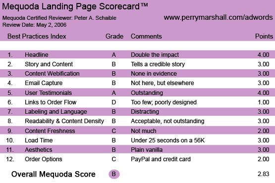
PerryMarshall.com’s The Definitive Guide to Google AdWords Landing Page Scorecard
1. Headline (Strategic Intent) – A
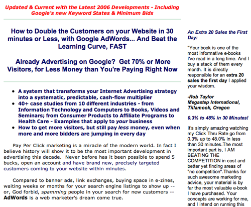
This is an example of how to use two headlines, each of which addresses a different prospective customer.
How to Double the Customers on your Website in 30 minutes or Less, with Google AdWords… And Beat the Learning Curve, FAST takes direct aim at the AdWords novice.
Already Advertising on Google? Get 70% or More Visitors, for Less Money than You’re Paying Right Now targets the AdWords veteran.
Both are effective because they are clear, easy to read and engage the target user with the promise of a compelling benefit. Less obviously, but equally important, the first headline assures the reader that she can do this. The 30 minutes or less and beat the learning curve phrases take direct aim at our fears that AdWords mastery might require too much time or brainpower.
This is an example of how to use two headlines, each of which addresses a different prospective customer.
2. Story and Content – B
Mr. Marshall goes against convention by not making this a “Dear Friend” letter with a signature and several post script messages. He doesn’t introduce himself as the writer until more than 325 words into the text, but the letter appears on PerryMarshall.com, so it can be assumed that we know.
The letter begins with three bulleted points about his book, followed by some general background information that sets the stage.
“Pay Per Click marketing is a miracle of the modern world. In fact, I believe history will show it to be the most important development in advertising this decade. Never before has it been possible…”
Part of storytelling is to capture interest, get rapport with the reader and enable her to “buy into” or agree with your original premise. In salesmanship, it’s called “getting a minor close.”
First you get a minor agreement, then you move the reader along to additional minor closing points, gradually getting agreement until you actually close the sale.
Mr. Marshall might have led with the background info, then plugged the bullets in further down, making them easier to read by separating each with a line space.
Even when visitors skim and scan an online sales letter, they unconsciously expect a certain order or structure. It’s part of the mental model we bring to the online experience—grammar, logic, rhetoric. This letter doesn’t conform.
3. Content Webification – B
This is a straight text sales letter with OK copy and simple graphics.
Technology should never diminish the advertising message. The letter is for the sale of a book, after all, so perhaps multi-media technology is less effective if the target audience prefers to get information through reading rather than listening or watching.
4. Email Capture (Relationship Building) – B
This landing page goes right for the sale without offering a free downloadable report in exchange for an email address and permission to contact the user.
It’s an upsell landing page. Visitors arrive here from www.perrymarshall.com/google, where, if they provide an email address and sign up for Mr. Marshall’s no-cost, five-day Google AdWords email mini-course, they are automatically directed to www.perrymarshall.com/adwords.
However, inasmuch as not every visitor will arrive here from the name squeeze page, Mr. Marshall might consider using an effective pop-under to capture the prospect’s email, as a fall back to an abandoned order flow.
5. User Testimonials – A
You can tell a lot about an Internet marketer by the company he keeps. This sales letter is accompanied by numerous testimonials, and some are other well-known and reputable Internet marketing professionals. Of course, testimonials can be a two-edged sword. These days, no one is seeking product endorsements from O.J.
More relevant, if you think some online marketer it a scoundrel and a snake oil salesman, you won’t be disposed to do business with his friends.
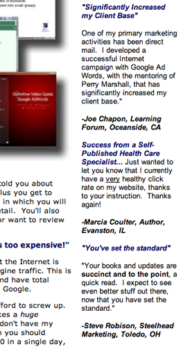
There are more than three dozen glowing validations of Mr. Marshall’s work republished on this page. Many are from marketers and copywriters with solid-gold credentials and reputations. It’s a very convincing display and, in my opinion, the strongest feature of this sales letter.
There are more than three dozen glowing validations of Mr. Marshall’s work republished on this page.
6. Links to Order Flow – D
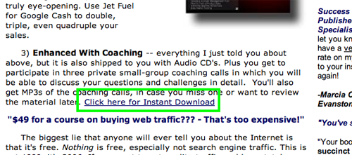
This landing page includes three hypertext links to the data capture page. There ought to be more of them interspersed throughout the sales letter.
Additionally, their design and text are inconsistent. Plus, they’re hard to find. I’d design a very clear order button and display it at least half a dozen times in the editorial.
When the customer is ready to order, don’t put obstacles in his way.
This landing page includes three hypertext links to the data capture page. There ought to be more of them interspersed throughout the sales letter.
7. Labeling and Language – B
This sales letter uses clear language and good grammar.
I recommend one significant change. The initial offer is for a book, but eventually we learn that there are actually three versions of Mr. Marshall’s AdWords toolkit. I wouldn’t introduce that notion until the user had decided to buy and had clicked to order.
Why confuse the issue at this stage in the process? That asks the user to consider one-too-many ideas while she is still undecided whether to buy at all. Per Fred Gleeck, “the confused mind always says ‘no’.”
I’d sell the basic book and reveal its price on this page, then go for the upsell and offer deluxe versions of the “toolkit” on subsequent pages of the order flow.
Plus, I’d delete the link to the affiliate program. It’s another unnecessary distraction that interrupts the buyer’s smooth transition through the order process.
8. Readability and Content Density – B
The layout, typeface, background color and white space are all acceptable. There is a judicious but imprecise use of color, boldface, italics, etc. In general, the appearance of the letter is comforting, uncluttered, easy-to-follow, etc., but could be improved.
The column of testimonials that appears to the right of the sales letter should be separated from it with a very thin vertical rule.
9. Content Freshness and Urgency – C
“Don’t put this off! You can double your Web traffic in 30 minutes. You can slash your marketing cost, and have more control than ever before.”
That’s the extent of the urgency expressed in this letter. There are no reply-by dates, date stamps or other features that indicate the timeliness of the offer.
The letter makes a very strong case for its “simple, no-hassle, three-part, money-back guarantee.” Within 30 days for any reason; within 90 days if you don’t cut the cost per click of your existing campaigns by an absolute minimum of 25 percent. And within 90 days if you’re not able to test new ideas at lower cost, find new markets and discover new customers by using this toolkit.
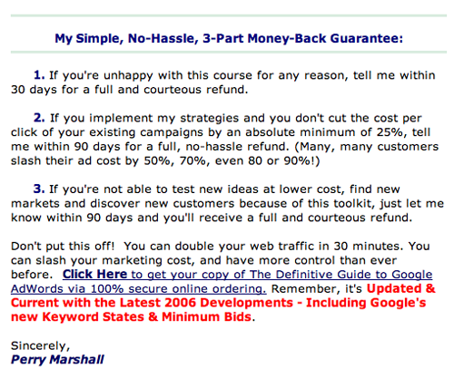
The letter makes a very strong case for its “simple, no-hassle, three-part, money-back guarantee.”
10. Load Time – B
Download time was 21.46 seconds at 56K as measured by the Webpage Analyzer.
11. Aesthetics – B
The graphic design is comforting and trustworthy for the target user. The paragraphs are indented and the sub-headlines are centered, which is a tad out of the ordinary and not my favorite design convention.
For reasons that I can’t fully understand, this page—especially the bullets—looks slightly better when viewed with the Mozilla Firefox browser than the Internet Explorer Web browser.
It’s always a good idea to review your webpages in several browsers to determine how others will view them.
12. Order Options – C
The user can buy The Definitive Guide to Google AdWords and pay online with a credit card or a PayPal account.
However, there is no toll-free number for phone orders and no printable order form for fax orders. These represent missed opportunities, especially for corporate sales.
Conclusion
No matter what you pay per click to drive visitors to your website, your letter must close the sale or the entire exercise is of little value. I’m certain Mr. Marshall drives a lot of traffic to www.perrymarshall.com/adwords and sells a lot of toolkits to happy customers.
With a few judicious tweaks to this sales letter landing page, he might sell even more.


