Landing Page Conversions Gets Personal
For decades, direct marketers have been using personalization to increase direct mail response rates. When you send out a laser-printed sales letter with the prospect’s name in it, you gain his or her attention.
Personalization works equally well online, yet your name doesn’t appear within the copy of most of the landing pages you click on. Glen Hopkins wants to change all that with Page Personalizer.
Page Personalizer is software that enables you to build personalized landing pages and websites.
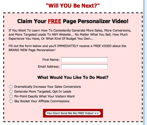
- The visitor enters his name and whatever information you require on a short preview page (also known as a squeeze page), usually with a free offer as an incentive to do so.
- After entering his information, he clicks to get the free gift.
- When he does, he is served a long-copy landing page or website selling an offer, and the copy on the page is personalized with the information he entered.
- Hopkins sells his Page Personalizer on a landing page made with the very software he is marketing, so the landing page itself, PagePersonalizer.com, is a live demo of the system, making it extremely powerful.
- But let’s see how the rest of his sales site stacks up.
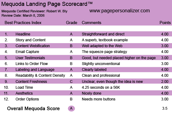
PagePersonalization.com’s Landing Page Scorecard
1. Headline (Strategic Intent) – A
The headline of his preview page is straightforward and direct—and it works.
Discover How to Instantly Increase Your Sales, Conversions, and Email Lists by Adding Our New Page Personalization Technology to Your Website.
It clearly states the important benefits an Internet marketer cares about (sales, conversions, list building), offers us something new (“new technology”) and tells us what the method is (“page personalization”).
[text_ad]
When you click through the preview page, the same ideas are carried through to the long landing page headline, which states them in a slightly different, but equally effective way.
New Breakthrough Technology Automatically Personalizes Any Web Page and Dramatically Explodes Your Sales, Conversions, and Email Lists…
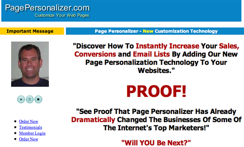
The headline of his preview page is straightforward and direct—and it works.
2. Story and Content – A
A lot of the landing page copy I see these days—particularly on the topic of Internet marketing and “how to make money on the Web”—is so hype-filled it makes me want to barf.
Hopkins’ superb copy for PagePersonalizer.com is a textbook example of how to write effective copy without all that hype. It’s everything good copy should be: clear, enthusiastic, authoritative, friendly, conversational, warm, positive and utterly convincing.
You often hear so-called Web marketing gurus and traditional direct marketers tell you to only talk about benefits. But Hopkins knows that when you are selling business software, the buyer wants to get an idea of how it works and what it does—in other words, the features—before making a decision to purchase.
So under a subhead “Using Page Personalizer is Super Easy,” he walks us through how the software works step by step, even showing the screens you will use to build your personalized webpages.
3. Content Webification – B
The content is well adapted to the Web. There is a short menu of hyperlinks in the left margin of the preview page where you can order, log-in if you are already a member (the software is sold on a subscription basis) or read testimonials. You can also click to hear a message from Glen.
The design of the site is slightly unconventional. In most long copy landing pages, you click a link to order; the link takes you to a shopping cart or other order form.
Here, the order form is already part of the landing page, and appears at the end. There are no intermediate “Order Now” buttons on the main landing page; you can only order when you go to the end.
4. Email Capture – A
When you use the preview page or squeeze page strategy, which is what the Page Personalizer does, you automatically capture the email address of every visitor to your long-copy sales page… because they can’t access the sales page until they submit their email address to you.
5. User Testimonials – B
Hopkins is smart. He doesn’t just use testimonials, but testimonials from proven Internet marketing heavyweights like Michel Fortin and John Reese.
Testimonials are spaced evenly throughout the long-copy landing page, but they don’t begin until you are a few screens into the copy. I would have reproduced condensed versions of the Fortin and Reese quotes and placed them at the very top of the first screen, above the headline, to establish instant credibility.
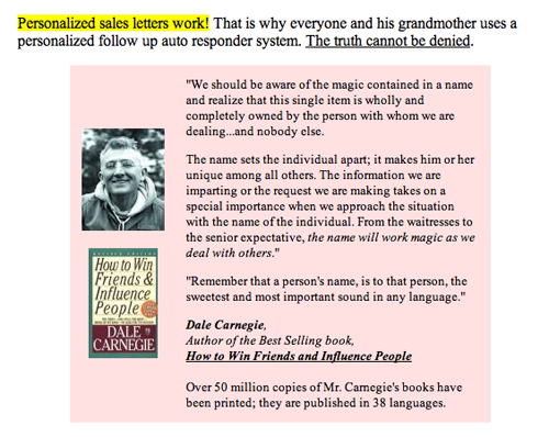
He doesn’t just use testimonials, but testimonials from proven Internet marketing heavyweights like Michel Fortin and John Reese.
6. Links to Order Flow – B
As I mentioned earlier, the design of the site is slightly unconventional. Instead of clicking on “Order Now” buttons that are links to a shopping cart or other order form, the order form here is part of the landing page (it appears at the end).
Hopkins is a smart marketer, so I am guessing he tested this approach and found it works best. Otherwise, I’d be more inclined to stick with the traditional method of “Order Now” buttons in various places within the copy hyperlinking to a separate transaction page.
7. Labeling and Language – A
Everything, from the sales copy and testimonials, to the guarantee and order page, is clearly labeled using conventional language.
The only thing that is the least bit confusing is the copy at the end showing the discounts you can get by ordering now instead of later. It is based on how many “members” are using the Page Personalizer. But this isn’t a club, so the word “member” may not resonate.
8. Readability and Content Density – A
Increasingly, I see micro-site and landing page design falling into two camps.
The first takes a clean, professional approach to graphic design, aesthetically pleasing and easy on the eye, with all elements orderly and clear.
The second takes a “junk look” approach. Elements, typefaces and fonts are used seemingly at random, with no discernible scheme.
There is a theory in direct mail that “ugly sells,” meaning that homemade, crude direct mail packages outpull nicely designed ones. The “junk look” approach to website design applies this principle to the Internet.
Hopkins’ PagePersonalizer.com is clearly from the clean-looking, professional design school, and it works for me. It’s nice to look at and makes the copy extremely easy to follow and read.
9. Content Freshness and Urgency – C
It isn’t clear how often this page is updated. But page personalization is a relatively new idea, so the entire page comes across as important news. A pre-head above the headline on the preview page adds to the sense of freshness by talking about “new customization technology.”
A minor quibble: Hopkins probably used “customization” on the pre-head instead of “personalization” to avoid the repetition of the word “personalization,” but I am not sure they mean the same thing.
10. Load Time – A
On the Web Page Analyzer, the PagePersonalizer.com short copy landing page downloaded in 4.25 seconds over a 56K connection—a more than adequate response time for a slow dial-up connection.
11. Aesthetics – A
As stated earlier, the design here is nicely done: easy to read, bold and attractive. No jumbling of type styles, sizes, and fonts as we see on so many landing pages these days.
12. Order Options – B
A “No-Risk Secure Acceptance Form” for placing orders appears at the end of the long-copy landing page.
If you are one of the first to sign up for the monthly Page Personalizer system, you get a better price than if you wait and sign up later. However, it took me a minute to figure this out; the presentation of these options is not crystal clear, or at least it wasn’t to me.
At the bottom of the No-Risk Secure Acceptance Form it says “ORDER NOW” in large red type, but when you click on it, nothing happens; there is no hyperlink. You have to move your cursor beneath it to the image of a credit card with the words “BUY NOW” in tiny type to order. It’s a small glitch, but to me, a glitch nonetheless.
When you click on the “BUY NOW” you are taken to a transaction page where you can place an order. If he hasn’t already done so, Hopkins might want to test having a few “Order Now” buttons with hyperlinks to this transaction page appear earlier in the copy.
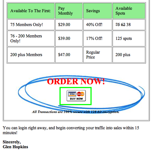
At the bottom of the No-Risk Secure Acceptance Form it says “ORDER NOW” in large red type, but when you click on it, nothing happens; there is no hyperlink. You have to move your cursor beneath it to the image of a credit card with the words “BUY NOW” in tiny type to order. It’s a small glitch, but to me, a glitch nonetheless.
Conclusion
There is an argument to be made that B2B copy must be clear and straightforward, while consumer copy often works by being somewhat outrageous or focusing on a big benefit rather than the product or service itself.
Is selling ecommerce products such as Page Personalizer to Internet marketers a B2B or B2C sale? Hopkins has treated it as B2B, opting for a sensible, educational approach to explaining his software.
But he also understands exactly what the serious Internet marketer wants and does a great job of convincing us that his product can deliver those benefits and features. The result is a page that works for me, and—I would bet money—works for Hopkins, too.
Even if you’re not going to buy the Page Personalizer to personalize your websites, go to PagePersonalizer.com and submit your email address on the preview page.
You’ll be served an aggressive series of email follow-up messages via autoresponder that attempt to convert you to a Page Personalizer buyer. And like the landing page itself, these are worth studying as “best practice” models of their genre.


Very much like mattresses, mattress toppers come many styles. Each one offers something different, and what may be the right choice for one person will not work for another.