Clayton Makepeace is a legend in the direct response advertising business. He has the respect of both his clients and peers—the hallmark of a real professional.
He has a huge portfolio of winning direct mail packages, commands top dollar for his work and in April of 2006 conducted a $5,000-per-seat, how-to seminar for aspiring copywriters. I can’t imagine anyone not putting his name on their top-10 list.
At MakepeaceTotalPackage.com Mr. Makepeace displays his considerable skill with one objective: to get other copywriters to sign up for his free email newsletter.
Let’s see how the Copywriting and Marketing Secrets Revealed landing page measures up on the Mequoda Sales Letter Landing Page Scorecard.
- There was a time, not too long ago, when it was relatively easy to capture an email address in exchange for a free report or newsletter. But things are changing.
- As Web surfers become more sophisticated and weary of dealing with a mailbox full of unwanted, time-consuming, low-value messages and online newsletters, it is getting harder to capture the names of prospects.
- Your offer—even for a truly valuable free report or email newsletter—must be persuasive.
- Good, persuasive copywriting is essential to online sales. Mr. Makepeace knows this as well as anyone, and demonstrates it in this landing page.

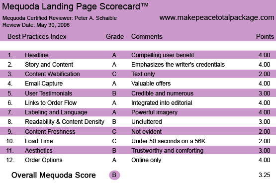
MakepeaceTotalPackage.com’s Landing Page Scorecard
1. Headline (Strategic Intent) – A
Effective headlines are Mr. Makepeace’s forte.
“Get The Makepeace Magic: My Proven Secrets For Producing Bigger Winners, More Often – FREE!” states his free offer clearly and powerfully.
I especially like his use of the word “magic.” It adds mystery, along with the other magical word, “secrets.”
[text_ad]
2. Story & Content – A
The sales letter tells a story about Mr. Makepeace’s “obsession with producing bigger winners more often.” He recites some of the many achievements of his 33 years in the business.
This is no time to be modest. When you have a proven track record for success, you are expected to state it loudly and clearly. Mr. Makepeace does.
3. Content Webification – C
This landing page makes no use of multi-media technology or interactive technology. It’s a straight text letter with a couple of photos.
The writer knows this medium best. This is an online sales letter but, without significant changes, it could just as easily be a printed letter.
4. Email Capture (Relationship Building) – A
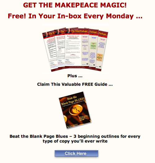
The landing page offers a free downloadable report, as well as a regular, weekly email newsletter in exchange for an email address.
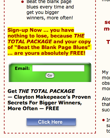
“Sign-up Now… you have nothing to lose, because THE TOTAL PACKAGE and your copy of Beat the Blank Page Blues… are yours absolutely FREE!”
It’s difficult to resist free information that promises help with your job, hobby or similar passion.
At first blush, this appears to be a tightly focused niche—copywriters and aspiring marketers. But when you consider the entire universe of entrepreneurs who want to make money online, there are lots of prospects.
What’s the value of a name and an email address? It depends on the upsell offer and the conversion ratio, of course.
Shortly after I signed up for the free report and online newsletter, I received the first upsell from Mr. Makepeace—for a $25 online seminar.
The upsell after that was for the $5,000 convention and how-to seminar that featured more copywriting secrets from Mr. Makepeace and inspiration from business motivational speaker Harvey Mackay.

The landing page offers a free downloadable report, as well as a regular, weekly email newsletter in exchange for an email address.
5. User Testimonials – B
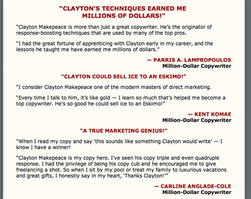
The testimonials are credible. Half affirm the value of the free Makepeace report and email newsletter. The other half attest to the veracity of Mr. Makepeace. Only about half of the users are completely identified.
The testimonials are integrated into the sales letter flow and reflect the target users and their heroes.

The testimonials are credible.
6. Links to Order Flow – A
Inasmuch as the offer is for a free report and email newsletter, the order flow does not need to collect credit card information and details. That simplifies things.
This landing page includes two, well-designed order forms within the editorial. There are at least five, well-placed buttons scattered throughout the sales letter that enable the motivated reader to jump to the order form instantly.

There are at least five, well-placed buttons scattered throughout the sales letter.
7. Labeling and Language – A
Mr. Makepeace uses “power words” to create excitement and urgency. I like his folksy, down-to-earth style.
“Nitty-gritty, nuts-and-bolts copywriting,” he calls it. It’s peppered with metaphors like “Headline Tinker-Toys” and similes such as “easy ways to make your body copy sing like Maria Callas on Opening Night.”
8. Readability & Content Density – B
The sans serif typeface is familiar, and the layout is uncluttered and easy to follow, with good use of white space.
Mr. Makepeace makes especially effective use of copy bullets. Bullets may be formulaic, but they are nevertheless effective—easy to scan.
9. Content Freshness & Urgency – C
The sales letter includes no date stamp or reply-by date. It simply creates urgency by offering valuable information to a niche market of nascent professional advertising copywriters.
10. Load Time – C
Download time was 34.97 seconds at 56K as measured by the website optimization tool.
The total size of this page is 174,459 bytes, and the total size of its images is 40,509 bytes—quite large. This issue could be addressed with image optimization software, which would speed up the image downloads.
11. Aesthetics – B
The graphic design is generally consistent with the target user mental model. I would not have used green and yellow, and recommend sticking with only the black type and blue border.
The designer has chosen to use dark red sub-headlines that are centered vs. flush left. Presumably, Mr. Makepeace has tested these design elements.
In general, I recommend against using the color red for typography, but if you must, at least make it very dark and closer to maroon, as this shade is.
12. Order Options – A
This sales letter does not include any phone or fax order options, nor should it. This is, after all, an offer for a free online newsletter. If the user can’t signup for it online, he shouldn’t subscribe.
Conclusion
There was a time, not too long ago, when it was relatively easy to capture an email address in exchange for a free report or newsletter. But things are changing.
As Web surfers become more sophisticated and weary of dealing with a mailbox full of unwanted, time-consuming, low-value messages and online newsletters, it is getting harder to capture the names of prospects.
Your offer—even for a truly valuable free report or email newsletter—must be persuasive.
Good, persuasive copywriting is essential to online sales. Mr. Makepeace knows this as well as anyone, and demonstrates it at Copywriting and Marketing Secrets Revealed—The Total Package.


