If you want a good example of a soft offer in direct response advertising, all you have to do is pick up a copy of the National Enquirer at your local supermarket. (Yes, yes, I know you scan “only” the cover and the headlines, but wouldn’t dare buy one.) But if you did—and you actually read some of the advertisements inside, you’d come across a strong two-step method of getting a targeted prospect to raise his/her hand.
Then you could capture the prospect’s interest with an offer such as “FREE Report: Ten Proven Ways To Get The IRS Off Your Back Forever!”
The report would direct the prospect to send a S.A.S.E. for the report. If the prospect took the time to mail it, then you knew you had either a) someone who likes FREE things or b) someone who likes free things and has the IRS after them. This “loss leader” method allows the marketer to use your address and contact you in the future, for such things as perhaps selling you an audit proof tax course. Using a focused niche market as its target, InstantRealEstateNewsletter.com landing page uses this two step method, but more importantly—now you can too.
- Kris KNOWS her audience well, but there could have been some urgency on this landing page—such as “get the information NOW before your competitors do…” or perhaps giving a deadline to get the information
- The copy on this landing page, for the most part, is engaging and successfully gives benefits to the reader and shows them how their professional life is going to improve exponentially with the customized newsletter that they’ll give their clients
- Effective, strong testimonials with photos and voice clips of “happy campers” who have purchased the newsletter are important sellers—voice, print and photos help
- The short-copy landing page along with the main landing and order page are presented to the reader in an easy, understandable way—but personally, I’d like to see a font other than “Times New Roman”
- Strong copy, excellent offer and a decent graphic layout. Marketers might want to try this two step method for their own landing page campaign to see if it works for them
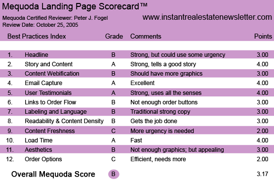
InstantRealEstateNewsletter.com’s Landing Page Scorecard
[text_ad]
Introduction
Mark Victor Hansen always says a person should become “rich within their niche.” I agree. (Mark is also man who knows how to brand himself and who also likes rhymes.) Kris Asquith, owner of InstantRealEstateNewsletter.com brands herself (with an personal audio clip speaking directly to her audience) as well as with her landing site, to solve the prospect’s big time problem.
As you know Real Estate marketers are all over the Internet. There’s the: Buying, Fixing, Flipping Method… Buying and Holding Method, No Money Down Method, Using Your Brother-In-Law’s Money Method etc. And now you have a site that deals primarily with the pain of the rest estate agent: how they can get clients.
Kris, being a real estate agent (or a former one), knows first hand the pain that her brethren go through and decided to create a solution for them: showing other real estate agents how to keep in contact with new prospects and former clients via an information newsletter that can be customized for them. This is a take off of Yanik Silver’s InstantSalesLetter.com site.
Let’s look at the first headline of the short landing page that targets the prospect: the beleaguer tired, aggravated real estate agent.
1. Headline – B
If You’re Sick and Tired of Cold Calling and Begging for Business or Cut Your Fees to the Bone Just to Get the Deal or Wasting Time and Money on “Dead-End” Leads, Then I Urge You To Listen Up…
“Introducing ‘Done For You’ Newsletter That Is Guaranteed To Fill Your Pipeline With Highly-Qualified Buyers And Sellers With No Cold Calls and Absolutely No Pressure Or Rejection!”
Just Fill In A Few Blanks And Voila… Out Pops A Brilliantly Worded And Perfectly Crafted Newsletter 100% Customized For You!
BOOM! POW! No… that’s not sound effects from the old Batman series… it’s the sound a pretty strong headline—with an effective lead that grabs the prospect by the shoulders and hits his hot buttons with a stun gun. Kris KNOWS her audience well. I only gave it a B because there could have been some urgency—such as “get the information NOW before your competitors do…” or perhaps giving a deadline to get the information.
For better or worse, Kris WANTS your email address… NOW! And will give you the information to take away your pain, if you hand it over to her.
Here’s what got my attention with this landing page. Normally when someone tells you that you’re going “to receive information” that can benefit you, one thinks it’s a report or e-book that’s coming their way. Uh, uh, uh… and with this headline that’s what you “think” you’re going to get. The copy doesn’t say it, it (ahem, clears throat) implies it.
You see, what happens next is that you’re whisked in a matter of seconds to a longer landing sales site. Yes, you, as the prospect, who has given your email address is now going to get the information in the form of a long sales letter telling about an offer that will change the way you do business. Once you get to the site… the homepage is basically the same as the short landing site, which I am sure saved Kris money with her designer.
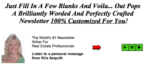
Kris KNOWS her audience well. I only gave it a B because there could have been some urgency—such as “get the information NOW before your competitors do…” or perhaps giving a deadline to get the information.
2. Story and Content – A
Impressive. Kris knows her audience’s wants, needs and desires and what keeps them up at night. That’s getting and keeping more clients. One cost effective way to do that is to market a customized newsletter to them. The writer gives a convincing argument on the benefits of this particular newsletter and in the way that it’s prepared for the real estate agent every month. At the same time, the copy shows them how they’ll have the freedom to work on their business and NOT worry about writing that newsletter.
3. Content Webification – B
The copy, for the most part, is engaging and successfully gives benefits to the reader and shows them how their professional life is going to improve exponentially with the customized newsletter that they’ll give their clients. The graphics are appealing, but doesn’t “wow” me. Yes, they “attract and do not distract.” And there I go rhyming like Mark Victor Hansen. ALTHOUGH (Uh,oh… he’s using caps so this must be important)… the only way to get back into the site is to go back to the short landing page, place your email into the box which will directly take you the sales page. You can bypass this by bookmarking the site at InstantRealEstateNewsletter.com. How many prospects are lost by making them take this extra step, I don’t know.
4. Email Capture – A
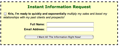
Short form to long landing page—in a snap! This market strategy piqued my interest. As stated before, the marketer gets your email address immediately and refuses to give you the info until you “give it up”—the address, that is.
But I would have had a POP-UP available (anyway), so when the prospect clicked away they would be offered another FREEBIE—that would go right into their mail box again. I imagine the marketer felt that since they got the reader’s email address, no other tactic was needed. It didn’t have any fallback bonus that the freebie would give, but, in essence, it didn’t need one, because they got the address. Mission Accomplished.
5. User Testimonials – A
Effective, strong testimonials with photos and voice clips of “happy campers” who have purchased the newsletter are important sellers. The higher the perceived value of a product or service is, the more engaging and believable your testimonials should be. Voice, print and photos help. And they’re here.
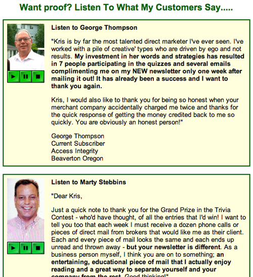
Effective, strong testimonials with photos and voice clips of “happy campers” who have purchased the newsletter are important sellers.
6. Links to Order Flow – B
The links get the job done and are simple to follow. You’re teased with short copy, taken to long copy and the selling process begins. Kris puts her full address and all pertinent contact information at the bottom of the site so that the potential customers know that she’s the real deal. There’s an offer of a free $1 trial period for the newsletter—which I feel is an effective sales tool—along with the “click here to order” button. But I’d prefer to place it more throughout the copy, instead of near the end of the piece.
7. Labeling and Language – B
Labeling and language are easy to follow. The “usual suspects” of copywriting and marketing are present in this sales piece—”Order,” “Click Here,” “bonuses,” “Double guarantee,” “I’m taking all the risk here,” etc.
8. Readability and Content Density – B
I found this site pretty easy to read. The short-copy landing page along with the main landing and order page are presented to the reader in an easy, understandable way. Personally, I’d like to see a font other than “Times New Roman.” In this direct response piece, there aren’t many graphics, except of the newsletters that keep my eyes glued to the screen.
9. Content Freshness and Urgency – C
This is a powerfully written sales piece. but one needs more urgency to “help” close the deal. When they order they get a FREE e-course, but no other freebie except what they get in their mail box earlier for giving Kris their email address.
We all love freebies, don’t we? And we know that to get them we have to act FAST! There should be a nice freebie that the customer gets if they act by a certain date.
10. Load Time – A
Pretty fast-loading site. That goes for short copy and long copy page.
This is a fast-loading website. When tested on Web Page Analyzer, the front-end, short-copy introductory landing page downloaded in just 1.67 seconds over a 56K connection, while the long copy version downloaded in 26.55 seconds.
11. Aesthetics – B
As on many other effective landing sites, this long copy has bulletin lists and smartly uses what little graphics it has. Again, I’d like the font to be bigger. Graphics? I would have shown naked merry real estate agents dancing around a bonfire throwing dollar bills in the air, thrilled that they got my clients all from the newsletter.
OK, not really. I just wanted to see if you were still reading. But you get the idea. Graphics are so important to the sales equation: people take information in by feeling, reading and listening. Excite all the senses for optimal results. Remember: this is your Web presence, exploit it as best you can.
Make no mistake: people aren’t interested in your product or service. They’re interested in the results they’re going to get from using it. Show your reader the results of what their life will be AFTER they order your product or service.
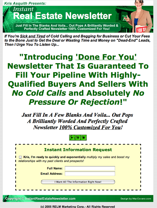
Instant Real Estate Newsletter’s Homepage
12. Order Options – C
It does have a secure ordering device. It should and it doesn’t, as I stated earlier, ask for the sale enough times. The landing page isn’t doing enough to get the prospect to the ORDER page quick enough. Sometimes a reader will have read enough copy—gotten enough information—and wants to buy NOW! So this site should provide the prospect ample opportunity to do that.
Conclusion
I liked this short and long copy landing site(s). It captured the email address swiftly which will send information to the prospect by getting them to the sales page and then an auto responder that will hit their mailbox. Once Kris gets their email they will continue to get follow up information. (I did.)
Strong copy, excellent offer and a decent graphic layout. Marketers might want to try this two step method for their own campaign to see if it works for them.


