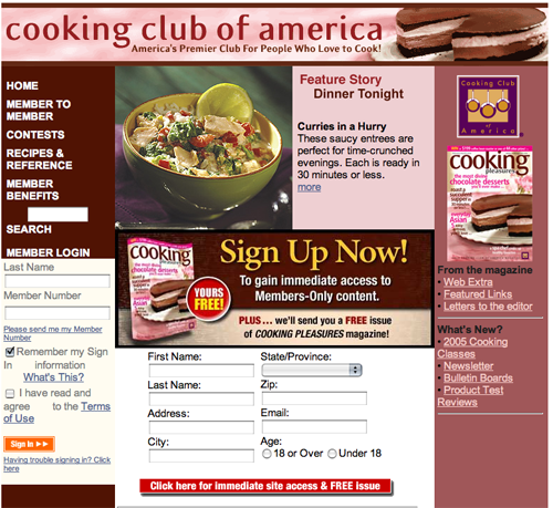
Cooking Club of America is an efficient, user friendly membership site. We found this site by typing “Cooking Club of America” into Google, and this is the first page that showed up in the organic listings.
While this page serves as the home page of this membership website, it also serves as a rapid conversion landing page, as it immediately offers a free issue of Cooking Pleasures magazine in exchange for a free trial membership to Cooking Club of America.
CookingClub.com is a strong membership website landing page and one you should model. So let’s get to it.
- Cooking Club of America has a strong compelling headline, BUT their headline focuses more on the feature as opposed to the benefit.
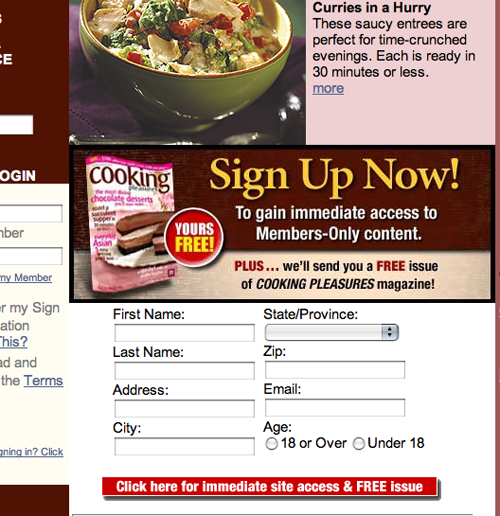
- The minute you get to the site, it’s apparent they want your email. Want to become a member? Give us the email address! Want a free issue of our magazine and a cool, neat grater? Give us your email address.
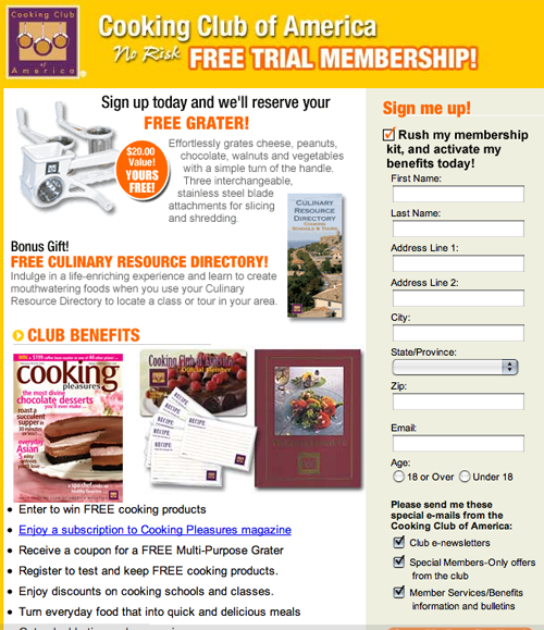
- Strategically placed all over, they keep dangling a carrot to you. Sign up for the FREE membership and get lots of cool freebies (Deals & Discounts, Club Credit Card, Recipe Reprints, Phone Discounts).
- Decent use of graphics, but not much use of compelling copy to get the prospect and future club member interested in the benefits of the club.
- When using graphics to sell your product… people want to see the end result of what your product or service will do for them. Give it to them. It’s not done at all here.

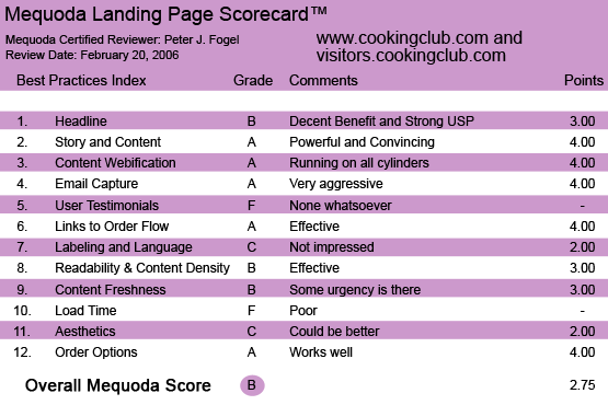
CookingClub.com’s Landing Page Scorecard
[text_ad]
1. Headline – B
Cooking Club of America, with no relation to Automobile Club of America, has a strong compelling headline: Cooking Club of America – America’s Premier Club for People Who Love To Cook!
You know exactly what it is… and what is being offered to you. We’ve always wanted to belong to something “bigger” than ourselves. And one way to make someone feel like they’re part of something bigger is have them join a club. Being in one tells the reader that they’re among like-minded people. BUT their headline focuses more on the feature.
Yes, it’s an elite club for people that love to cook, but what is it going to offer you? Perhaps: (headline) America’s Premier Club for People Who Love To Cook, (sub head) Learn Super Star Chefs’ Incredible Recipes For A Successful Meal.

2. Story and Content – A
Appealing graphics with good copy and you have a strong story. “Join us,” it tells us, “and you’ll be among friends that love cooking just like you. You’ll also receive lots of goodies, member benefits, a free issue of our magazine and a grater (I must get one of those).”
We know it’s a membership website because they want you to sign in and get a username and password. It’s FREE and it’s their way, I am sure, to keep sending you LOTS of other offers.
3. Content Webification – A
This is what we call a portal site. And it gets the job done. Lots of information on cooking. Not like the “Weight Watchers” site that is a niche site for people who love to eat and lose weight. This is for people that come high or hell water… love to cook!
It has a strong USP. And it says it in its headline, or I should say sub-headline. This really is the “Premier Club” of its kind. That’s why, dear marketers, it’s so important to get the right domain name that will capture the attention of your prospect. Cooking.com was taken, but thankfully CookingClub.com wasn’t.
4. Email Capture – A
The minute you get to the site, it’s apparent they want your email. And they do it in a variety of ways. Want to become a member? Give us the email address! Want a free issue of our magazine and a cool, neat grater? Give us your email address. Here’s the part that I am not a fan of… and perhaps they should do a split test.
I am NOT a fan of giving a home address out. An email sure—but not a home address. Again, I will NOT get any member benefits into the site unless I give them all the information they request. Now they might lose folks at this request, but the people that llllllllllllove to cook will give all the contact information they want.

5. User Testimonials – F
They’ve done other things pretty well, so why did they leave out user testimonials of thrilled cooks/subscribers?
6. Links to Order Flow – A
Strategically placed all over, they keep dangling a carrot to you. Sign up for the FREE membership and get lots of cool freebies (Deals & Discounts, Club Credit Card, Recipe Reprints, Phone Discounts).

7. Labeling and Language – C
Decent use of graphics, but not much use of compelling copy to get the prospect and future club member interested in the benefits of the club. Mostly ho-hum. Again, this is what I got from the homepage where you have to get the person interested in giving the all-important contact information. In direct response advertising you are in a courtship with your prospect. There’s a much stronger use of copy and graphic at the Weight Watcher’s book site which also deals with food.
8. Content Density and Readability – B
Pretty clean. You’re not overwhelmed with lots of links. Again, graphics are “decent.” I would still prefer to see happy, joyous people cooking in the kitchen, or some pictures of some well-known chefs that want to help you reach your goals of becoming a better cook.
9. Content Freshness & Urgency – B
I am giving this site the benefit of the doubt and figure there is content freshness. Only because folks who love to cook are going to come back and want to get MORE RECIPES for cooking. There is some urgency to get you to give them your contact information and that’s accomplished by the free issue of their magazine.
10. Load Time – F
If you have 14.4k connection still, then perhaps I have a rotary phone you’d like to buy. The site is yes, a tad heavy on graphics, but on the Mequoda scorecard 40.07 for 56K is NOT fast unless you like watching paint dry.
Connection Rate Download Times
- 14.4K – 155.26 seconds
- 28.8K – 77.73 seconds
- 33.6K – 66.66 seconds
- 56K – 40.07 seconds
- ISDN 128K – 12.41 seconds
- T1 1.44Mbps – 1.26 seconds
11. Aesthetics – C
This is a cooking site, a club for cooking enthusiasts. I would like to see, as mentioned earlier, graphics of happy people toiling over a stove in a fun way. People want to think of themselves as Emeril—Don’t forget: when using graphics to sell your product… people want to see the end result of what your product or service will do for them. Give it to them. It’s not done at all here.

12. Order Options – A
Company provides email contact information along with a toll free number for ordering purposes.
Conclusion
This landing page is good, not great and is on the cusp of doing some effective promotion and direct response advertising. Their copy can be stronger although there are benefits galore. BUT their choice of graphics has a lot to be desired. Look at other cooking sites and see what they do to capture the hearts and minds of their subscribers. Food is a very emotional product and it means a lot to people—so the company should work on that aspect of it. They do have a strong community bond with their subscribers at their bulletin boards where folks can give feedback on recipes.


I’m personally a big fan of the 12 ounce curl.