Some wag once said “the perfect is the enemy of the good.” In other words, the goal of achieving perfection in a new venture often gets in the way of accomplishing an outcome that is “good enough” to succeed. Often an idea for a big, bold new product is one that never gets completed. Meanwhile, simple products quickly get created, marketed and sold, often bringing significant financial success to their developers.
That’s the impression I got reviewing the website at the URL Baby-Model.com. The product doesn’t excite me. The landing page design is not flashy. The copywriting is effective, but not exactly riveting. The graphics are not exceptional, except for one very cute baby photo. In fact, Baby-Model.com is entirely unremarkable except for the fact that it works. The site sells a downloadable eBook entitled Baby Modeling Secrets for $47. The sales letter copy for the book doesn’t specify the exact length but does refer to page 81, so we know it’s at least that long.
- The site is registered to Richard Schefren, who claims to own more than 30 profitable sites, all selling unique products in targeted niches.
- This sales letter landing page uses three hypertext links and one graphic button for a total of four opportunities to buy the Baby Model Secrets eBook.
- The bulleted “secrets” that Baby Model Secrets promises to reveal are the strongest elements of this landing page.
- This landing page will never win a beauty contest, but it’s perfectly appropriate for its audience.
- The Baby-Model.com landing page sequence is a simple, garden variety online sales letter that appears to work despite its mediocrity.
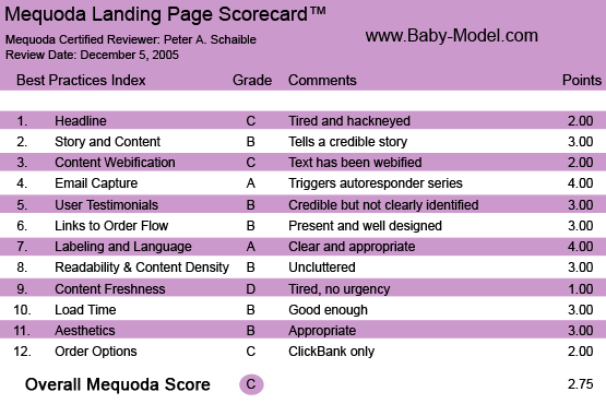
Baby-Model.com’s Landing Page Scorecard
Introduction
The site is registered to Richard Schefren, who claims to own more than 30 profitable sites, all selling unique products in targeted niches. These include Baby-Food-Secrets.com, Baby-Sitting-Secrets.com, Baby-Sleeping-Secrets.com, Bedwetting-Secrets.com, Breastfeeding-Secrets.com,Smart-Baby-Secrets.com and Stop-Toddler-Biting.com, among others. With that many backend products, Mr. Schefren no doubt has a plan to upsell buyers of Baby Modeling Secrets.
Mr. Schefren says he first entered the business world by taking over a failing, bankrupt used clothing store, and four years later the store was grossing $6.5 million annually, enabling him to retire at age 26. Too young to stay retired, he then built a recording studio and a record label. This brought him national recognition on CNN, ABC, CBS, NBC, FOX, FOX NEWS and MSNBC, and profiles on the front page of the The Wall Street Journal, Newsweek, Cosmopolitan, Elle, Vogue and GQ, before he sold it. Next, he built a $7.5 million dollar chain of hypnosis clinics in less than four years, and created a direct mail offer that grabbed an unbelievable response rate of 77 percent selling an information product for an average price of $12,500.
[text_ad]
These are impressive credentials to bring to an online publishing enterprise. We decided to see what we could ascertain about his online marketing prowess by measuring Baby-Model.com against the Mequoda Sales Letter Landing Page Scorecard.
1. Headline (Strategic Intent) – C
“Who Else Wants To Discover The Fastest, Easiest And Most Effective Method For Getting Your Baby Into The Lucrative World Of Baby Modeling!” asks Baby-Model.com.
The “Who Else Wants” headline has been around for about 50 years and is still used to sell everything from cosmetic face cream to information products to workshops and seminars. I’ve always thought this formula headline is ineffective at defining a unique selling proposition, or proclaiming a strong user benefit.
In my opinion, the “Who Else Wants” is no longer very intriguing or thought-provoking, because it’s so tired and overused. Nevertheless, it must still work because copywriters continue to use it. Hey, if your tests prove that it gets a good response, why not?
In any event, the strategic intent of this landing page is to capture 1) your first name, 2) your baby’s first name and 3) your email address. This enables the website publisher to then deliver to you a second online sales letter that weaves both your name and your baby’s name into the text. Not a bad idea, but an imperfect execution. The site botched up the precise insertion of the baby’s name. In fact, this online sales letter has several typos and misspellings (e.g. Sakes (sic) Fifth Avenue).
Gary Ryan Blair, The Goals Guy, would say that Everything Counts!™, and I agree. You could argue, as I often do, that sloppiness diminishes credibility.
The site’s headline engages the user with a benefit (“Getting Your Baby Into The Lucrative World Of Baby Modeling”) and is clear and easy to read.
The headline on the second landing page—the personalized one you get to after providing your name, baby’s name and email address—has a better promise and user benefit, and is more engaging. It reads “Follow These Simple, Easy To Follow…. Step By Step Instructions And Your Baby Can Be A High-Paid Top-Model Almost Overnight!”
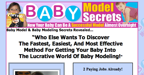
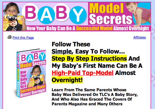
Headlines on Baby-Model.com Landing Pages
2. Story and Content – B
This sales letter’s authors identify themselves as Debi and Rich Schefren, parents of baby models Ava and Elle. Their story sounds credible and leads the reader to buy their eBook. The claims are not extravagant. “You’ll learn all about the dos and don’ts of baby modeling, including little known tricks that get you called back over and over again,” they say.
If you’re a would-be stage mother or baby-model-mom wannabe, the content of this letter will push all your buttons and get your greed glands working. (Subhead: “Imagine Having Enough $$$ To Pay For College In Less Than 2 Years… Our daughter Ava has over $8,753 in the bank!”)
3. Content Webification – C
Beyond the personalization device of inserting the mother’s and baby’s names into the sales letter, there is no other content webification.
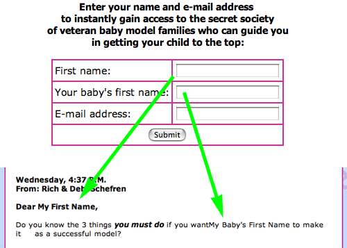
There is no other content webification other than the personalization device of inserting the mother’s and baby’s names.
4. Email Capture (Relationship Building) – A
Once the user submits their email address, an autoresponder starts a series of five baby modeling lessons from Debi (“Ava & Elle’s Mommy”), delivered once a day for five consecutive days.
These messages are short on valuable content (e.g., “One tip is to remember that patience is golden. There is no reason to get discouraged or disheartened.”) and long on promoting the Schefrens’ Baby Model Secrets book. Presumably the really valuable content is revealed in the paid product, as it should be.
5. User Testimonials – B
The Schefrens integrate five customer testimonials into the second landing page sales letter. Only one identifies its writer completely, but each letter is specific and credible. Using the customer’s full name, city and state would be more convincing.
Abbreviating these details makes the reader skeptical of the testimonial’s authenticity.

Abbreviating details makes the reader skeptical of the testimonial’s authenticity.
6. Links to Order Flow – B
This sales letter landing page uses three hypertext links and one graphic button for a total of four opportunities to buy the Baby Model Secrets eBook. That seems like about the right number for a letter of this length.
The links are appropriately underscored and colored blue; they change to maroon when clicked. The order form follows the standard ClickBank protocol.
7. Labeling and Language – A
The bulleted “secrets” that Baby Model Secrets promises to reveal are the strongest elements of this online sales letter. In fact, the words the copywriter uses are practically a textbook lesson in how to create interest in a product. For example:
- “The little known method…”
- “The very first step you must take…”
- “How you can start…”
- “Exactly how to quickly and easily determine…”
- “The surprising facts about…”
- “The truth about how…”
- “The critical information about what…”
- “Why you don’t even need to worry about…”
- “The nuts and bolts of how…”
- “Advice about the real…”
These are the kind of bullets experienced copywriters have used for years to rope in customers with the promise of revealing “insider secrets.” Gotta’ love that word—secrets. In this landing page ad, the copywriter uses it more than a dozen times.
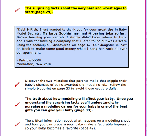
These are the kind of bullets experienced copywriters have used for years to rope in customers with the promise of revealing “insider secrets.”
8. Readability (Content Density) – B
The layout and typefaces are appropriate, and there is sufficient white space.
9. Content Freshness – D
There is no date stamp or urgent call to action. The copyright date is still 2004, although this is December of 2005. There is no evidence of any content having been updated.
10. Load Time – B
You might expect this site to feature numerous pictures of beautiful, photogenic babies, but it doesn’t. That enables the page to download in 15.51 seconds at 56K as measured by the Webpage Analyzer.
The second, personalized landing page sales letter downloaded in 32.40 seconds. Good enough to keep the user from clicking away.
11. Aesthetics – B
This landing page will never win a beauty contest, but it’s perfectly appropriate for its audience. The colors, pink and baby blue, are consistent with the user’s mental model.
12. Order Options – C
This product is strictly available by download following a credit card, eCHECK or PayPal payment to ClickBank. There is no toll-free phone number, printable order form for fax orders or other options.
Conclusion
The Baby-Model.com landing page sequence is a simple, garden variety online sales letter that appears to work despite its mediocrity. This proves once again the sage advice from one of my earliest marketing advisors.
“You don’t have to get it perfect,” he said. “You have to get it started.”


