Well-executed landing page that does honor to its inspiration and the legacy of Corey Rudl.
It wasn’t long ago that I was reviewing the landing page for the Internet Marketing Center, the very long and very well done Internet sales letter developed by late Web marketing guru Corey Rudl. When I heard of his tragic death in an automobile racing accident, I figured we’d probably seen the last of IMC.
Now, however, it seems that one of Rudl’s protégés is taking up where the master left off. Derek Gehl is the heir apparent. His landing page is every bit as long and hard-hitting as the one Rudl himself appeared in. The question is… will it be as successful as Rudl’s remarkable site? The following is an examination of this new IMC incarnation using the same Mequoda Scorecard I applied to Corey Rudl’s earlier effort.
- There is no doubt that Mr. Gehl was paying attention to his mentor when it comes to headlines.
- There’s something about this kind of copywriting that carries with it an implied camaraderie between seller and prospect.
- The testimonials were full of credible language, whole names and compelling stories.
- This is very accessible, upbeat, optimistic language that puts the reader completely at ease.
- This is an easy product to be sold by people who know the value of keeping the order language and options easy to understand and participate in.

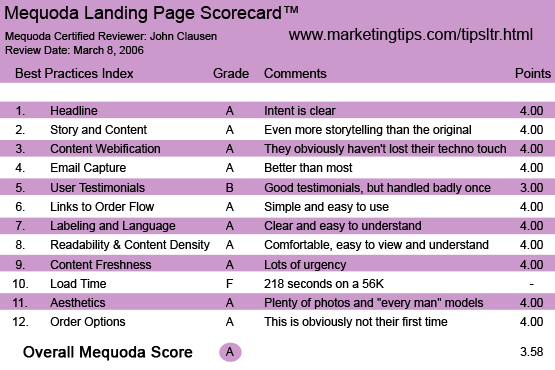
Internet Marketing Center’s Landing Page Scorecard
1. Headline (Strategic Intent) – A
There is no doubt that Mr. Gehl was paying attention to his mentor when it comes to headlines. Cash millionaire, immediate results and life-changing income… those are all pretty powerful motivators.
[text_ad]
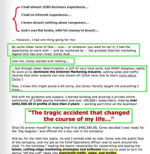
2. Story and Content – A
It would be pretty ghoulish if Mr. Gehl had done nothing but insert his name where Rudl’s used to be. Effective, perhaps… but ghoulish. Instead, Mr. Gehl made the landing page into a combination pitch for new customers and memorial for his late friend and boss. I’m fairly sure that Rudl himself would have approved of this tactic… basically turning a tragedy into a solid sales tool.

3. Content Webification – A
I’ve always liked the streaming video clips that Corey Rudl used. The ones in this version are still very effective. Just for fun I turned them all on at once. It was a cacophony of success stories that sounded sort of like a cocktail party at an Amway convention.
4. Relationship Building – A
There’s something about this kind of copywriting that carries with it an implied camaraderie between seller and prospect. He starts off talking about the big money that can be made and has been made… but pretty soon in the copy you’ll find out that he was once quite poor and inept in the world. Lousy car, bad job, not enough money… probably just like the prospect. Now, however, because Mr. Gehl wants you to enjoy the same successes he has, you can lift yourself above your station and start living the good life. This is the same kind of daydream planting that occurs in PowerBall or any other inexpensive gamble for big money. Almost everyone likes to think about being rich and nearly idle. I also liked the free newsletter, which is scarcely something new, but is nonetheless one of the more effective things on the site for capturing contact info.
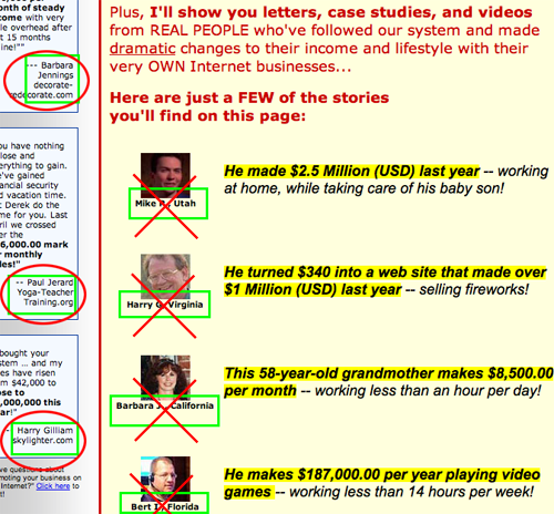
5. User Testimonials – B
Mostly I liked the testimonials a lot, especially the streaming video ones. They were full of credible language, whole names and compelling stories. I did not, however, like the one in the first part of the letter that gave first names, last initial and a general area where they lived. These are not credible at all in my view. If Joe Blow wants to give a testimonial, let’s give him his full name and some other info. The first name, last initial approach makes that section lose a lot of credibility.

6. Links to Order Flow – A
Like the Rudl letter before it, this pitch makes it very easy to sign up.
7. Labeling and Language – A
The language on the site is clear and easy to understand. Again, Mr. Gehl must have been listening carefully when his mentor talked about language. This is very accessible, upbeat, optimistic language that puts the reader completely at ease.
8. Readability & Content Density – A
This site is extremely readable. The paragraph structure is not daunting and the flow of the copy invites the reader to keep going. It takes a lot to get people to read pages this long, but I think they pulled it off.
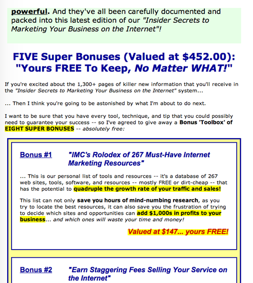
9. Content Freshness & Urgency – A
The site is teeming with urgency, particularly in the later stages. I liked the use of the handful of “limited” bonuses that follow the regular bonus list. You get these only if you’re one of the “next” 250 people to sign up. By the way, the complete set of limited bonuses is worth $1,050… if you wish to believe the copywriter. So, plenty of urgency, but I’d like to see it a little earlier in the letter.

10. Load Time – F
The site loaded up quickly on my broadband service, but a check on the Web Page Analyzer showed that the site takes 218 seconds to load on a 56K. This is well above the 15 seconds specified in the Mequoda guidelines. My guess is the streaming video and multiple pictures are responsible for the lag time.
11. Aesthetics – A
The site is packed full of photos of the people who have been helped by this site. I was glad to see that they were ordinary looking folks, not matinee idols or fashion queens. The photos and the general aesthetic of the site really enhance the feeling of community.
12. Order Options – A
One supposes that a site that offers tips and “life-changing” financial opportunities would also know how to work the order flow. They clearly know how to work the cash register. This is an easy product to be sold by people who know the value of keeping the order language and options easy to understand and participate in.
Conclusion
This is a solid, well-written, well-executed landing page that does honor to its inspiration and the legacy of Corey Rudl.


