With gardening season upon us, it seemed like a good idea to check out the landing page for Gardening Secrets and Tips.
There are few hobbies or avocations that rival gardening when it comes to the need for secret methods and helpful tips. And there are few activities that attract more avid practitioners. So, with that in mind, I took a long, Mequoda Landing Page Scorecard look at GardeningSecretsandTips.com.
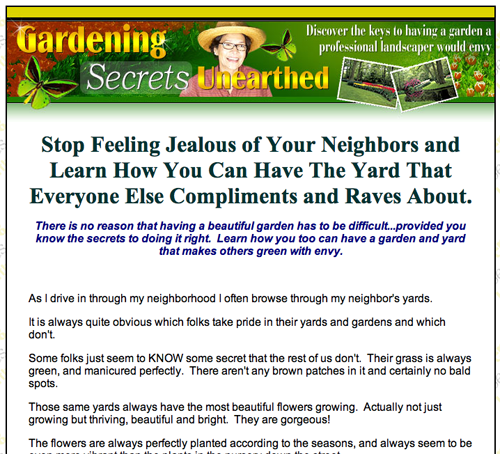
- The headline exhorts the prospect to “stop feeling jealous” of his or her neighbors and learn how to have a yard that “everyone else compliments and raves about.” As a serious benefit, I don’t see the ability to stop feeling jealous as a real motivator.
- I’d probably be more interested in buying the book and I’m sure others would as well… if we only know early on what the book can do for us.
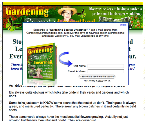
- No free newsletter as far as I could determine, and even the little floater that drops in during the ordering process to sell the email course really doesn’t make you feel really warm and fuzzy about the book.
- Unless you count the comments of the letter’s author, there are no testimonials whatsoever… and they really could use them here effectively.
- There is no sense that one must hurry up and order. There’s no emotional pull, no “fear of loss of gain” as one of my old ad agency buddies used to say.
- The landing page screams for an early-in-the-letter Johnson Box round up of the order options. Let the prospects know what’s coming. What are we selling? What are they getting for free?
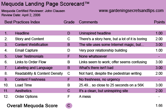
GardeningSecretsandTips.com’s Landing Page Scorecard
1. Headline (Strategic Intent) – D
The headline exhorts the prospect to “stop feeling jealous” of his or her neighbors and learn how to have a yard that “everyone else compliments and raves about.” As a serious benefit, I don’t see the ability to stop feeling jealous as a real motivator. The afterthought that one can have a garden to rave about is a bit more like it, although it’s not very specific. Suppose some well-adjusted erstwhile gardener just home from his or her therapist looks at this headline and thinks, “Well, I’m not the jealous type. I love my neighbors and I totally support their lawn and garden obsessions.” What will happen then? Wouldn’t it be much better to concentrate on the serious benefits of this book?
2. Story and Content – C
Personally, I don’t care all that much about the angst suffered by the author of this letter when he or she glides through the neighborhood eyeballing the neighbors’ geraniums and such. Get to the point. Get to the benefits. Tell me why I should buy this book. What’s it going to do for my gardening efforts. There’s a good bit of information later on in the letter that addresses what one gets in the book. I’d probably be more interested in buying the book and I’m sure others would as well…if we only know early on what the book can do for us.
3. Content Webification – B
They use the usual “order now” buttons and commonplace webification devices of that nature, but nothing like streaming video or some other device to make the site seem like something is happening.
4. Relationship Building – D
The Erma Bombeck-like ranting about the neighbors’ gardens in the beginning of the letter had a relationship-destroying effect on me. I found it annoying. They do mention a 7-part email gardening course, but it isn’t clear right away whether they are giving you the course or selling it to you. No free newsletter as far as I could determine, and even the little floater that drops in during the ordering process to sell the email course really doesn’t make you feel really warm and fuzzy about the book.
5. User Testimonials – F
Unless you count the comments of the letter’s author, there are no testimonials whatsoever… and they really could use them here effectively. And why not use them? Somebody must have read and liked this book, possibly turning their garden into… well, a garden spot.
6. Links to Order Flow – B
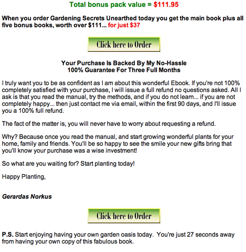
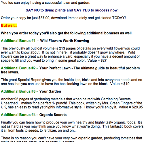
I like the bonuses (1 through 5) that are valued at $111 total, but they weren’t very clear early on that these were part of the $37 book fee. And we don’t know if we’re going to be downloading the book and all the bonus books ourselves, which would entail hundreds of pages and quite a little time. I’m assuming that they will send you the books in a traditional print format. They hint that it only takes 27 seconds to obtain the book, although they don’t elaborate about what occurs during that 27 seconds. All of this gives me the impression that they haven’t thought this out very well and that they may only be in this to liberate my $37.
7. Labeling and Language – B
The labels aren’t hard to understand, but the writing in the letter is less than extraordinary. The copywriter was probably trying to make the prose seem down-to-earth and common-man-like. However, bad grammar and awkward phrasing do not necessarily translate into accessible writing.
8. Readability & Content Density – C
This is extremely easy to read, perhaps because there is so little sales copy and the order language is so standard. Not hard to read and not dense at all.
9. Content Freshness & Urgency – F
This is pretty lackadaisical for a site that deals with growing seasons and planting times and other matters of some urgency. There is no sense that one must hurry up and order. There’s no emotional pull, no “fear of loss of gain” as one of my old ad agency buddies used to say. And there’s nothing to indicate that this site is fresh as a daisy or something left over from last year.
10. Load Time – B
Loading time was 25.49 seconds on a 56K connection. The Mequoda Scorecard offers a B to anyone under 25 seconds. They’re so close…
11. Aesthetics – C
The page is not hard to look at. But it’s still quite dull, considering what their topic is… beautiful plants. Maybe they could have come up with some photos (along with the nonexistent testimonials) of happy gardeners amongst gorgeous plants.
12. Order Options – F
It’s fairly common knowledge that if you blow the order language, you might as well stamp out the fire and head for the ranch. Nothing is going to work if the offer doesn’t work. I like the bonuses (1 through 5) that are valued at $111 total, but they weren’t very clear early on that these are part of the $37 book fee. And we don’t know if we’re going to be downloading the book and all the bonus books ourselves, which would entail hundreds of pages and quite a little time. I’m assuming that they will send you the books in a traditional print format. They hint that it only takes 27 seconds to obtain the book, although they don’t elaborate about what occurs during that 27 seconds. All of this gives me the impression that they haven’t thought this out very well and that they may only be in this to liberate my $37. The site screams for an early-in-the-letter Johnson Box round up of the order options. Let the prospects know what’s coming. What are we selling? What are they getting for free?
Conclusion
This is a mess of a landing page. Lots of missed opportunities, plenty of mistakes…probably not a garden that will bear a lot of fruit.


